- VB.Net - Home
- VB.Net - Overview
- VB.Net - Environment Setup
- VB.Net - Program Structure
- VB.Net - Basic Syntax
- VB.Net - Data Types
- VB.Net - Variables
- VB.Net - Constants
- VB.Net - Modifiers
- VB.Net - Statements
- VB.Net - Directives
- VB.Net - Operators
- VB.Net - Decision Making
- VB.Net - Loops
- VB.Net - Strings
- VB.Net - Date & Time
- VB.Net - Arrays
- VB.Net - Collections
- VB.Net - Functions
- VB.Net - Subs
- VB.Net - Classes & Objects
- VB.Net - Exception Handling
- VB.Net - File Handling
- VB.Net - Basic Controls
- VB.Net - Dialog Boxes
- VB.Net - Advanced Forms
- VB.Net - Event Handling
- VB.Net - Regular Expressions
- VB.Net - Database Access
- VB.Net - Excel Sheet
- VB.Net - Send Email
- VB.Net - XML Processing
- VB.Net - Web Programming
- VB.Net Useful Resources
- VB.Net - Quick Guide
- VB.Net - Useful Resources
- VB.Net - Discussion
VB.Net - TreeView Control
The TreeView control is used to display hierarchical representations of items similar to the ways the files and folders are displayed in the left pane of the Windows Explorer. Each node may contain one or more child nodes.
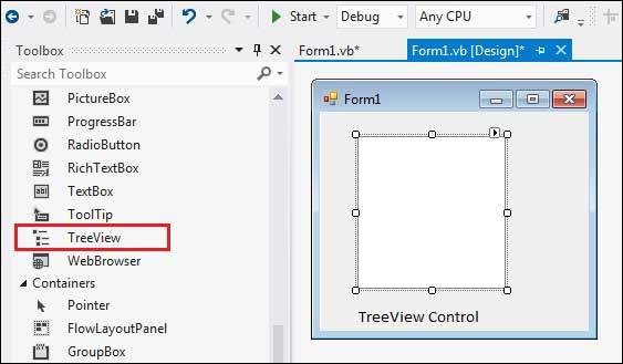
Let's click on a TreeView control from the Toolbox and place it on the form.
Properties of the TreeView Control
The following are some of the commonly used properties of the TreeView control −
| Sr.No. | Property & Description |
|---|---|
| 1 | BackColor Gets or sets the background color for the control. |
| 2 | BackgroundImage Gets or set the background image for the TreeView control. |
| 3 | BackgroundImageLayout Gets or sets the layout of the background image for the TreeView control. |
| 4 | BorderStyle Gets or sets the border style of the tree view control. |
| 5 | CheckBoxes Gets or sets a value indicating whether check boxes are displayed next to the tree nodes in the tree view control. |
| 6 | DataBindings Gets the data bindings for the control. |
| 7 | Font Gets or sets the font of the text displayed by the control. |
| 8 | FontHeight Gets or sets the height of the font of the control. |
| 9 | ForeColor The current foreground color for this control, which is the color the control uses to draw its text. |
| 10 | ItemHeight Gets or sets the height of each tree node in the tree view control. |
| 11 | Nodes Gets the collection of tree nodes that are assigned to the tree view control. |
| 12 | PathSeparator Gets or sets the delimiter string that the tree node path uses. |
| 13 | RightToLeftLayout Gets or sets a value that indicates whether the TreeView should be laid out from right-to-left. |
| 14 | Scrollable Gets or sets a value indicating whether the tree view control displays scroll bars when they are needed. |
| 15 | SelectedImageIndex Gets or sets the image list index value of the image that is displayed when a tree node is selected. |
| 16 | SelectedImageKey Gets or sets the key of the default image shown when a TreeNode is in a selected state. |
| 17 | SelectedNode Gets or sets the tree node that is currently selected in the tree view control. |
| 18 | ShowLines Gets or sets a value indicating whether lines are drawn between tree nodes in the tree view control. |
| 19 | ShowNodeToolTips Gets or sets a value indicating ToolTips are shown when the mouse pointer hovers over a TreeNode. |
| 20 | ShowPlusMinus Gets or sets a value indicating whether plus-sign (+) and minus-sign (-) buttons are displayed next to tree nodes that contain child tree nodes. |
| 21 | ShowRootLines Gets or sets a value indicating whether lines are drawn between the tree nodes that are at the root of the tree view. |
| 22 | Sorted Gets or sets a value indicating whether the tree nodes in the tree view are sorted. |
| 23 | StateImageList Gets or sets the image list that is used to indicate the state of the TreeView and its nodes. |
| 24 | Text Gets or sets the text of the TreeView. |
| 25 | TopNode Gets or sets the first fully-visible tree node in the tree view control. |
| 26 | TreeViewNodeSorter Gets or sets the implementation of IComparer to perform a custom sort of the TreeView nodes. |
| 27 | VisibleCount Gets the number of tree nodes that can be fully visible in the tree view control. |
Methods of the TreeView Control
The following are some of the commonly used methods of the TreeView control −
| Sr.No. | Method Name & Description |
|---|---|
| 1 |
CollapseAll Collapses all the nodes including all child nodes in the tree view control. |
| 2 |
ExpandAll Expands all the nodes. |
| 3 |
GetNodeAt Gets the node at the specified location. |
| 4 |
GetNodeCount Gets the number of tree nodes. |
| 5 |
Sort Sorts all the items in the tree view control. |
| 6 |
ToString Returns a string containing the name of the control. |
Events of the TreeView Control
The following are some of the commonly used events of the TreeView control −
| Sr.No. | Event & Description |
|---|---|
| 1 | AfterCheck Occurs after the tree node check box is checked. |
| 2 | AfterCollapse Occurs after the tree node is collapsed. |
| 3 | AfterExpand Occurs after the tree node is expanded. |
| 4 | AfterSelect Occurs after the tree node is selected. |
| 5 | BeforeCheck Occurs before the tree node check box is checked. |
| 6 | BeforeCollapse Occurs before the tree node is collapsed. |
| 7 | BeforeExpand Occurs before the tree node is expanded. |
| 8 | BeforeLabelEdit Occurs before the tree node label text is edited. |
| 9 | BeforeSelect Occurs before the tree node is selected. |
| 10 | ItemDrag Occurs when the user begins dragging a node. |
| 11 | NodeMouseClick Occurs when the user clicks a TreeNode with the mouse. |
| 12 | NodeMouseDoubleClick Occurs when the user double-clicks a TreeNode with the mouse. |
| 13 | NodeMouseHover Occurs when the mouse hovers over a TreeNode. |
| 14 | PaddingChanged Occurs when the value of the Padding property changes. |
| 15 | Paint Occurs when the TreeView is drawn. |
| 16 | RightToLeftLayoutChanged Occurs when the value of the RightToLeftLayout property changes. |
| 17 | TextChanged Occurs when the Text property changes. |
The TreeNode Class
The TreeNode class represents a node of a TreeView. Each node in a TreeView control is an object of the TreeNode class. To be able to use a TreeView control we need to have a look at some commonly used properties and methods of the TreeNode class.
Properties of the TreeNode Class
The following are some of the commonly used properties of the TreeNode class −
| Sr.No. | Property & Description |
|---|---|
| 1 | BackColor Gets or sets the background color of the tree node. |
| 2 | Checked Gets or sets a value indicating whether the tree node is in a checked state. |
| 3 | ContextMenu Gets the shortcut menu that is associated with this tree node. |
| 4 | ContextMenuStrip Gets or sets the shortcut menu associated with this tree node. |
| 5 | FirstNode Gets the first child tree node in the tree node collection. |
| 6 | FullPath Gets the path from the root tree node to the current tree node. |
| 7 | Index Gets the position of the tree node in the tree node collection. |
| 8 | IsEditing Gets a value indicating whether the tree node is in an editable state. |
| 9 | IsExpanded Gets a value indicating whether the tree node is in the expanded state. |
| 10 | IsSelected Gets a value indicating whether the tree node is in the selected state. |
| 11 | IsVisible Gets a value indicating whether the tree node is visible or partially visible. |
| 12 | LastNode Gets the last child tree node. |
| 13 | Level Gets the zero-based depth of the tree node in the TreeView control. |
| 14 | Name Gets or sets the name of the tree node. |
| 15 | NextNode Gets the next sibling tree node. |
| 16 | Nodes Gets the collection of TreeNode objects assigned to the current tree node. |
| 17 | Parent Gets the parent tree node of the current tree node. |
| 18 | PrevNode Gets the previous sibling tree node. |
| 19 | PrevVisibleNode Gets the previous visible tree node. |
| 20 | Tag Gets or sets the object that contains data about the tree node. |
| 21 | Text Gets or sets the text displayed in the label of the tree node. |
| 22 | ToolTipText Gets or sets the text that appears when the mouse pointer hovers over a TreeNode. |
| 23 | TreeView Gets the parent tree view that the tree node is assigned to. |
Methods of the TreeNode Class
The following are some of the commonly used methods of the TreeNode class −
| Sr.No. | Method Name & Description |
|---|---|
| 1 |
Collapse Collapses the tree node. |
| 2 |
Expand Expands the tree node. |
| 3 |
ExpandAll Expands all the child tree nodes. |
| 4 |
GetNodeCount Returns the number of child tree nodes. |
| 5 |
Remove Removes the current tree node from the tree view control. |
| 6 |
Toggle Toggles the tree node to either the expanded or collapsed state. |
| 7 |
ToString Returns a string that represents the current object. |
Example
In this example, let us create a tree view at runtime. Let's double click on the Form and put the follow code in the opened window.
Public Class Form1
   Private Sub Form1_Load(sender As Object, e As EventArgs) Handles MyBase.Load
      'create a new TreeView
      Dim TreeView1 As TreeView
      TreeView1 = New TreeView()
      TreeView1.Location = New Point(10, 10)
      TreeView1.Size = New Size(150, 150)

      Me.Controls.Add(TreeView1)
      TreeView1.Nodes.Clear()
      'Creating the root node
      Dim root = New TreeNode("Application")
      TreeView1.Nodes.Add(root)
      TreeView1.Nodes(0).Nodes.Add(New TreeNode("Project 1"))
      'Creating child nodes under the first child

      For loopindex As Integer = 1 To 4
         TreeView1.Nodes(0).Nodes(0).Nodes.Add(New  _
            TreeNode("Sub Project" & Str(loopindex)))
      Next loopindex
      ' creating child nodes under the root
      TreeView1.Nodes(0).Nodes.Add(New TreeNode("Project 6"))
      'creating child nodes under the created child node

      For loopindex As Integer = 1 To 3
         TreeView1.Nodes(0).Nodes(1).Nodes.Add(New  _
            TreeNode("Project File" & Str(loopindex)))
      Next loopindex
      ' Set the caption bar text of the form.
      Me.Text = "tutorialspoint.com"
   End Sub
End Class
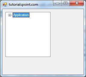
When the above code is executed and run using Start button available at the Microsoft Visual Studio tool bar, it will show the following window −
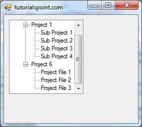
You can expand the nodes to see the child nodes −