- Ruby - Home
- Ruby - Overview
- Ruby - Environment Setup
- Ruby - Syntax
- Ruby - Classes and Objects
- Ruby - Variables
- Ruby - Operators
- Ruby - Comments
- Ruby - if...else
- Ruby - Loops
- Ruby - Methods
- Ruby - Blocks
- Ruby - Modules
- Ruby - Strings
- Ruby - Arrays
- Ruby - Hashes
- Ruby - Date & Time
- Ruby - Ranges
- Ruby - Iterators
- Ruby - File I/O
- Ruby - Exceptions
- Ruby Advanced Topics
- Ruby - Object Oriented
- Ruby - Regular Expressions
- Ruby - Database Access
- Ruby - Web Applications
- Ruby - Sending Email
- Ruby - Socket Programming
- Ruby - Ruby/XML, XSLT
- Ruby - Web Services
- Ruby - Tk Guide
- Ruby - Ruby/LDAP Tutorial
- Ruby - Multithreading
- Ruby - Built-in Functions
- Ruby - Predefined Variables
- Ruby - Predefined Constants
- Ruby - Associated Tools
- Ruby Useful Resources
- Ruby - Quick Guide
- Ruby - Cheatsheet
- Ruby - Useful Resources
- Ruby - Discussion
- Ruby - Ruby on Rails Tutorial
Ruby/TK - SpinBox Widget
Description
A Spinbox widget allows users to choose numbers (or in fact, items from an arbitrary list). It does this by combining an entry-like widget showing the current value with a pair of small up/down arrows which can be used to step through the range of possible choices.
Spinboxes are capable of displaying strings that are too long to fit entirely within the widget's window. In this case, only a portion of the string will be displayed; commands described below may be used to change the view in the window.
Spinboxes use the standard xscrollcommand mechanism for interacting with scrollbars.
Syntax
Here is a simple syntax to create this widget −
TkSpinbox.new(root) {
   .....Standard Options....
   .....Widget-specific Options....
}
Standard Options
activebackground
background
borderwidth
cursor
exportselection
font
foreground
highlightbackground
highlightcolor
highlightthickness
justify
relief
repeatdelay
repeatinterval
selectbackground
selectborderwidth
selectforeground
takefocus
textvariable
xscrollcommand
These options have been described in the previous chapter.
Widget Specific Options
| Sr.No. | Options & Description |
|---|---|
| 1 | buttonbackground => String The background color to be used for the spin buttons. |
| 2 | buttoncursor => String The cursor to be used for over the spin buttons. If this is empty (the default), a default cursor will be used. |
| 3 | buttondownrelief => String The relief to be used for the upper spin button. |
| 4 | command => String Specifies a Ruby/Tk callback to invoke whenever a Spinbutton is invoked. The callback has these two arguments appended to any existing callback arguments: the current value of the widget and the direction of the button press (up or down). |
| 5 | disabledbackground => String Specifies the background color to use when the Spinbox is disabled. If this option is the empty string, the normal background color is used. |
| 6 | disabledforeground => String Specifies the foreground color to use when the Spinbox is disabled. If this option is the empty string, the normal foreground color is used. |
| 7 | format => String Specifies an alternate format to use when setting the string value when using the from and to range. |
| 8 | from => Integer A floating-point value corresponding to the lowest value for a Spinbox, to be used in conjunction with to and increment. |
| 9 | increment => String A floating-point value specifying the increment. When used with from and to, the value in the widget will be adjusted by increment when a spin button is pressed (up adds the value, down subtracts the value). |
| 10 | state => String Specifies one of three states for the Spinbox: normal, disabled, or readonly. |
| 11 | to => Integer A floating-point value corresponding to the highest value for the Spinbox, to be used in conjunction with from and increment. When all are specified correctly, the Spinbox will use these values to control its contents. This value must be greater than the from option. If values is specified, it supercedes this option. |
| 12 | validate => String Specifies the mode in which validation should operate: none, focus, focusin, focusout, key, or all. It defaults to none. When you want validation, you must explicitly state which mode you wish to use. |
| 13 | validatecommand => String Specifies a script to evaluate when you want to validate the input in the widget. |
| 14 | values => Integer Must be a proper list value. If specified, the Spinbox will use these values as to control its contents, starting with the first value. This option has precedence over the from and to range. |
| 15 | width => Integer Specifies an integer value indicating the desired width of the Spinbox window, in average-size characters of the widget's font. |
| 16 | wrap => Boolean Must be a proper boolean value. If on, the Spinbox will wrap around the values of data in the widget. |
Validation Stages
Validation works by setting the validatecommand option to a callback, which will be evaluated according to the validate option as follows −
none − Default. This means no validation will occur.
focus − validatecommand will be called when the Spinbox receives or loses focus.
focusin − validatecommand will be called when the Spinbox receives focus.
focusout − validatecommand will be called when the Spinbox loses focus.
key − validatecommand will be called when the Spinbox is edited.
all − validatecommand will be called for all above conditions.
Manipulating Spinbox
Here is a list of few important methods to play with Spinbox −
delete(first, ?last?) − Deletes one or more elements of the Spinbox. First is the index of the first character to delete, and last is the index of the character just after the last one to delete. If last isn't specified it defaults to first+1, i.e. a single character is deleted. This command returns an empty string.
get − Returns the Spinbox's string.
icursor(index) − Arrange for the insertion cursor to be displayed just before the character given by index. Returns an empty string.
identify(x, y) − Returns the name of the window element corresponding to coordinates x and y in the Spinbox. Return value is one of: none, buttondown, buttonup, entry.
index(index) − Returns the numerical index corresponding to index.
insert(index, string) − Insert the characters of string just before the character indicated by index. Returns an empty string.
invoke(element) − Causes the specified element, either buttondown or buttonup, to be invoked, triggering the action associated with it.
set(?string?) − f string is specified, the Spinbox will try and set it to this value, otherwise it just returns the Spinbox's string. If validation is on, it will occur when setting the string.
validate − This command is used to force an evaluation of the validatecommand independent of the conditions specified by the validate option. This is done by temporarily setting the validate option to all. It returns 0 or 1.
xview(args) − This command is used to query and change the horizontal position of the text in the widget's window.
Event Bindings
Tk automatically creates class bindings for Spinboxes that gives them the default behavior. Few important behaviors are given below −
Clicking mouse button 1, positions the insertion cursor just before the character underneath the mouse cursor, sets the input focus to this widget, and clears any selection in the widget. Dragging with mouse button 1, strokes out a selection between the insertion cursor and the character under the mouse.
Double-clicking with mouse button 1, selects the word under the mouse and positions the insertion cursor at the beginning of the word. Dragging after a double click will stroke out a selection consisting of whole words.
Triple-clicking with mouse button 1, selects all of the text in the Spinbox and positions the insertion cursor before the first character.
The ends of the selection can be adjusted by dragging with mouse button 1, while the Shift key is down; this will adjust the end of the selection that was nearest to the mouse cursor when button 1 was pressed. If the button is double-clicked before dragging then the selection will be adjusted in units of whole words.
Clicking mouse button 1 with the Control key down, will position the insertion cursor in the Spinbox without affecting the selection.
If any normal printing characters are typed in a Spinbox, they are inserted at the point of the insertion cursor.
The view in the Spinbox can be adjusted by dragging with mouse button 2. If mouse button 2 is clicked without moving the mouse, the selection is copied into the Spinbox at the position of the mouse cursor.
If the mouse is dragged out of the Spinbox on the left or right sides while button 1 is pressed, the Spinbox will automatically scroll to make more text visible (if there is more text off-screen on the side where the mouse left the window).
The End key, or Control-e, will move the insertion cursor to the end of the Spinbox and clear any selection in the Spinbox. Shift-End moves the cursor to the end and extends the selection to that point.
The Home key, or Control-a, will move the insertion cursor to the beginning of the Spinbox and clear any selection in the Spinbox. Shift-Home moves the insertion cursor to the beginning of the Spinbox and also extends the selection to that point.
Control-/ selects all the text in the Spinbox.
Control-\ clears any selection in the Spinbox.
The Delete key deletes the selection, if there is one in the Spinbox. If there is no selection, it deletes the character to the right of the insertion cursor.
The BackSpace key and Control-h delete the selection, if there is one in the Spinbox. If there is no selection, it deletes the character to the left of the insertion cursor.
Control-d deletes the character to the right of the insertion cursor.
Meta-d deletes the word to the right of the insertion cursor.
Control-k deletes all the characters to the right of the insertion cursor.
Example
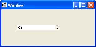
require 'tk'

root = TkRoot.new
root.title = "Window"
Sb = TkSpinbox.new(root) do
   to 100
   from 5
   increment 5
   pack("side" => "left",  "padx"=> "50", "pady"=> "50")
end

Tk.mainloop
Output
This will produce the following result −