- Ruby - Home
- Ruby - Overview
- Ruby - Environment Setup
- Ruby - Syntax
- Ruby - Classes and Objects
- Ruby - Variables
- Ruby - Operators
- Ruby - Comments
- Ruby - if...else
- Ruby - Loops
- Ruby - Methods
- Ruby - Blocks
- Ruby - Modules
- Ruby - Strings
- Ruby - Arrays
- Ruby - Hashes
- Ruby - Date & Time
- Ruby - Ranges
- Ruby - Iterators
- Ruby - File I/O
- Ruby - Exceptions
- Ruby Advanced Topics
- Ruby - Object Oriented
- Ruby - Regular Expressions
- Ruby - Database Access
- Ruby - Web Applications
- Ruby - Sending Email
- Ruby - Socket Programming
- Ruby - Ruby/XML, XSLT
- Ruby - Web Services
- Ruby - Tk Guide
- Ruby - Ruby/LDAP Tutorial
- Ruby - Multithreading
- Ruby - Built-in Functions
- Ruby - Predefined Variables
- Ruby - Predefined Constants
- Ruby - Associated Tools
- Ruby Useful Resources
- Ruby - Quick Guide
- Ruby - Cheatsheet
- Ruby - Useful Resources
- Ruby - Discussion
- Ruby - Ruby on Rails Tutorial
Ruby/TK - ListBox Widget
Description
A ListBox displays a list of single-line text items, usually lengthy, and allows the user to browse through the list, selecting one or more.
When first created, a new listbox has no elements. Elements may be added or deleted using provided methods. In addition, one or more elements may be selected from the listed items.
It is not necessary for all the elements to be displayed in the listbox window at once. Listboxes allow scrolling in both directions using the standard xscrollcommand and yscrollcommand options.
Syntax
Here is a simple syntax to create this widget −
TkListbox.new(root) {
   .....Standard Options....
   .....Widget-specific Options....
}
Standard Options
background
borderwidth
cursor
disabledforeground
exportselection
font
foreground
hight
highlightbackground
highlightcolor
highlightthickness
offset
relief
selectbackground
selectborderwidth
selectforeground
setgrid
takefocus
tile
width
xscrollcommand
yscrollcommand
These options have been described in the previous chapter.
Widget Specific Options
| Sr.No. | Options & Description |
|---|---|
| 1 | activestyle => String Specifies the style in which to draw the active element. This must be one of dotbox, none or underline. The default is underline. |
| 2 | height => Integer Specifies the desired height for the window, in lines. If zero or less, then the desired height for the window is made just large enough to hold all the elements in the listbox. |
| 3 | listvariable => Variable Specifies the reference of a variable. The value of the variable is an array to be displayed inside the widget; if the variable value changes then the widget will automatically update itself to reflect the new value. |
| 4 | selectmode => String Specifies one of several styles for manipulating the selection. The value of the option may be arbitrary, but the default bindings expect it to be either single, browse, multiple, or extended; the default value is browse. |
| 5 | state => String Specifies one of two states for the listbox: normal or disabled. If the listbox is disabled then items may not be inserted or deleted. |
| 6 | width => Integer Specifies the desired width for the window in characters. If the font doesn't have a uniform width then the width of the character "0" is used in translating from character units to screen units. If zero or less, then the desired width for the window is made just large enough to hold all the elements in the listbox. |
Manipulating the Listbox Items
There are various ways to play with a list box −
The listvariable − variable allows you to link a variable (which must hold a list) to the listbox. Each element of this list is a string representing one item in the listbox. So to add, remove, or rearrange items in the listbox, you can simply manipulate this variable as you would any other list.
The insert idx item ?item... ? method is used to add one or more items to the list; "idx" is a 0-based index indicating the position of the item before which the item(s) should be added; specify "end" to put the new items at the end of the list.
The delete first ?last? method is used to delete one or more items from the list; "first" and "last" are indices as per the "insert" method.
The get first ?last? method returns the contents of a single item at the given position, or a list of the items between "first" and "last".
The size method returns the number of items in the list.
The curselection method is used to find out which item or items in the listbox the user has currently selected. This will return the list of indices of all items currently selected; this may be an empty list.
The selection clear first ?last? method is used to deselect either a single item, or any within the range of indices specified.
The selection set first ?last? method is used to select an item, or all items in a range.
The xview(args) method is used to query and change the horizontal position of the information in the widget's window.
The yview(?args?) method is used to query and change the vertical position of the text in the widget's window.
Indices
Many of the methods for listboxes take one or more indices as arguments. An index specifies a particular element of the listbox, in any of the following ways −
number − A decimal number giving the position of the desired character within the text item. 0 refers to the first character, 1 to the next character, and so on.
active − Indicates the element that has the location cursor. This element will be displayed with an underline when the listbox has the keyboard focus, and it is specified with the activate method.
anchor − Indicates the anchor point for the selection, which is set with the selection anchor method.
end − Indicates the end of the listbox. For some commands this means just after the last element; for other commands it means the last element.
Event Bindings
Ruby/Tk creates class bindings for listboxes that give them Motif-like behavior. Much of the behavior of a listbox is determined by its selectmode option, which selects one of four ways of dealing with the selection.
If the selection mode is single or browse, at most one element can be selected in the listbox at once. In both modes, clicking button 1 on an element selects it and deselects any other selected item. In browse mode, it is also possible to drag the selection with button 1.
If the selection mode is multiple or extended, any number of elements may be selected at once, including discontiguous ranges. In multiple mode, clicking button 1 on an element toggles its selection state without affecting any other elements. In extended mode, pressing button 1 on an element selects it, deselects everything else, and sets the anchor to the element under the mouse; dragging the mouse with button 1 down extends the selection to include all the elements between the anchor and the element under the mouse, inclusive.
Most people will probably want to use the browse mode for single selections and the extended mode for multiple selections; the other modes appear to be useful only in special situations.
In addition to the above behavior, there are many other additional behaviors associated with a listbox, which are not covered in this tutorial −
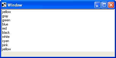
Example 1
require "tk"

root = TkRoot.new
root.title = "Window"

list = TkListbox.new(root) do
   width 20
   height 10
   setgrid 1
   selectmode 'multiple'
   pack('fill' => 'x')
end

list.insert 0, "yellow", "gray", "green",
  "blue", "red", "black", "white", "cyan",
  "pink", "yellow", "orange", "gray"

Tk.mainloop
Output
This will produce the following result −
Example 2
Following is the example using listvariable option to populate list items −
require "tk"

$names = %w{ yellow gray green
              blue red black white cyan
              pink yellow orange gray}
$colornames = TkVariable.new($names)

root = TkRoot.new
root.title = "Window"

list = TkListbox.new(root) do
   width 20
   height 10
   setgrid 1
   listvariable $colornames
   pack('fill' => 'x')
end

Tk.mainloop
Output
This will produce the following result −
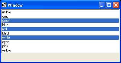
Example 3
Following example explains how to use TkScrollbar widget along with list box.
require "tk"

$names = %w{ yellow gray green
              blue red black white cyan
              pink yellow orange gray}
$colornames = TkVariable.new($names)

root = TkRoot.new
root.title = "Window"

list = TkListbox.new(root) do
   listvariable $colornames
   pack('fill' => 'x')
end

list.place('height' => 150,
           'width'  => 100,
           'x'      => 10,
           'y'      => 10)

scroll = TkScrollbar.new(root) do
   orient 'vertical'
   place('height' => 150, 'x' => 110)
end

list.yscrollcommand(proc { |*args|
   scroll.set(*args)
})

scroll.command(proc { |*args|
   list.yview(*args)
})

Tk.mainloop
Output
This will produce the following result −