- Power BI - Home
- Power BI - Introduction
- Power BI - Installation Steps
- Power BI - Architecture
- Power BI Desktop
- Power BI - Desktop
- Power BI - Desktop Window
- Power BI Service
- Power BI - Window Supported Browsers
- Power BI - Generating Reports
- Power BI Desktop Service
- Power BI - Desktop vs Service
- Power BI - Supported Data Sources
- Power BI - Comparison Tools
- Power Query Editor
- Power Query Editor - Introduction
- Power Query Editor - Data Discrepancy
- Power Query Editor - Merge Queries (Part 1)
- Power Query Editor - Merge Queries (Part 2)
- Power BI - Develop Star Schema
- Data Modeling Concepts
- Power BI - Data Modeling
- Power BI - Manage Relationships
- Power BI - Cardinality
- Power BI - Dashboard Options
- Power BI Report Visualizations
- Power BI - Visualization Options
- Power BI - Visualization Charts
- Power BI - Stacked Bar Chart
- Power BI - Stacked Column Chart
- Power BI - Clustered Chart
- Power BI - 100% Stacked Chart
- Power BI - Area Chart and Stacked Area Chart
- Power BI - Line and Stacked Column Chart
- Power BI - Line and Clustered Column Chart
- Power BI - Ribbon Chart
- Power BI - Table and Matrix Visuals
- Power BI Map Visualizations
- Power BI - Creating Map Visualizations
- Power BI - ArcGIS Map
- Power BI Miscellaneous
- Power BI - Waterfall Charts
- Funnel Charts and Radial Gauge Chart
- Power BI - Scatter Chart
- Power BI - Pie Chart and Donut Chart
- Power BI - Card and Slicer Visualization
- Power BI - KPI Visual
- Power BI - Smart Narrative Visual
- Power BI - Decomposition Tree
- Power BI - Paginated Report
- Power BI - Python Script & R Script
- Power BI - Multi-row Card
- Power BI - Power Apps & Power Automate
- Power BI - Excel Integration
- Power BI Dashboard
- Power BI - Sharing Dashboards
- Power BI Sales Production Dashboard
- Power BI - HR Analytics Dashboard
- Power BI - Customer Analytics Dashboard
- Power BI - DAX Basics
- Power BI - Administration Role
- Power BI - DAX Functions
- Power BI - DAX Text Functions
- Power BI - DAX Date Functions
- Power BI - DAX Logical Functions
- Power BI - DAX Counting Functions
- Power BI - Depreciation Functions
- Power BI - DAX Information Functions
Power BI - Quick Guide
Power BI - Introduction
Power BI is a Data Visualization and Business Intelligence tool that converts data from different data sources to interactive dashboards and BI reports. Power BI suite provides multiple software, connector, and services - Power BI desktop, Power BI service based on Saas, and mobile Power BI apps available for different platforms. These set of services are used by business users to consume data and build BI reports.
Power BI desktop app is used to create reports, while Power BI Services (Software as a Service - SaaS) is used to publish the reports, and Power BI mobile app is used to view the reports and dashboards.
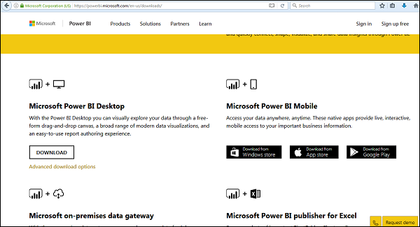
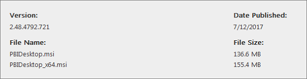
Power BI Desktop is available in both 32-bit and 64-bit versions. To download the latest version, you can use the following link −
https://powerbi.microsoft.com/en-us/downloads/
Power BI - Installation Steps
To check the system requirements, installation files detail, users have to navigate to Advanced download options. Following are the system requirements to download Power BI tool −
Supported Operating Systems
Windows 10, Windows 7, Windows 8, Windows 8.1, Windows Server 2008 R2, Windows Server 2012, Windows Server 2012 R2
Microsoft Power BI Desktop requires Internet Explorer 9 or higher
Microsoft Power BI Desktop is available for 32-bit (x86) and 64-bit (x64) platforms
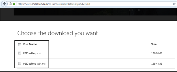
Users can select a language in which they want to install Power BI and following files are available for download.
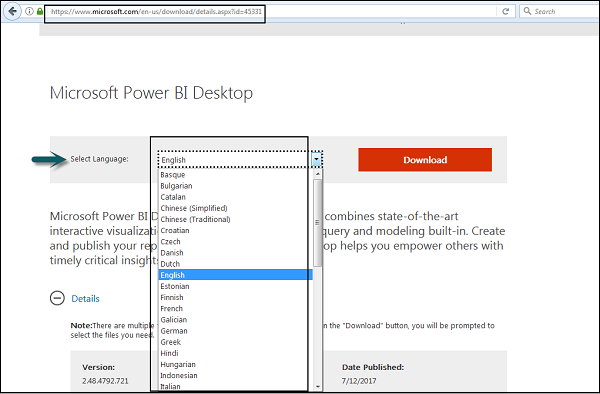
This is the link to directly download Power BI files −
https://www.microsoft.com/en-us/download/details.aspx?id=45331


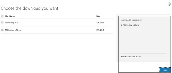
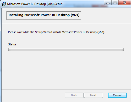
PBIDesktop_x64.msi shows a 64-bit OS file. Select the file you want to install as per OS type and click Next. Save the installation file on the local drive.
When you run the installation file, following screen is displayed.
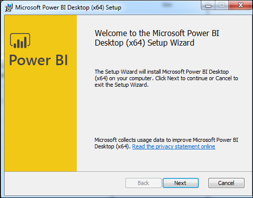
Accept the license agreement and follow the instructions on the screen to finish the installation.
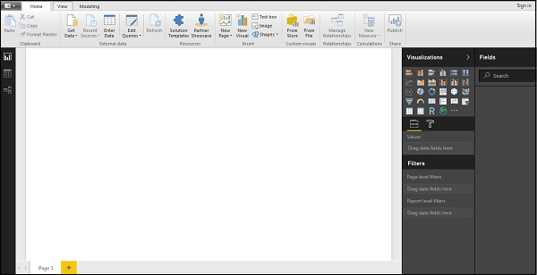
When Power BI is installed, it launches a welcome screen. This screen is used to launch different options related to get data, enrich the existing data models, create reports as well as publish and share reports.
Power BI - Architecture
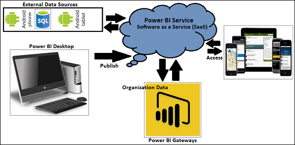
Power BI includes the following components −
Power BI Desktop − This is used to create reports and data visualizations on the dataset.
Power BI Gateway − You can use Power BI on-premises gateway to keep your data fresh by connecting to your on-premises data sources without the need to move the data. It allows you to query large datasets and benefit from the existing investments.
Power BI Mobile Apps − Using Power BI mobile apps, you can stay connected to their data from anywhere. Power BI apps are available for Windows, iOS, and Android platform.
Power BI Service − This is a cloud service and is used to publish Power BI reports and data visualizations.
Power BI - Supported Data Sources
Power BI supports large range of data sources. You can click Get data and it shows you all the available data connections. It allows you to connect to different flat files, SQL database, and Azure cloud or even web platforms such as Facebook, Google Analytics, and Salesforce objects. It also includes ODBC connection to connect to other ODBC data sources, which are not listed.
Following are the available data sources in Power BI −
- Flat Files
- SQL Database
- OData Feed
- Blank Query
- Azure Cloud platform
- Online Services
- Blank Query
- Other data sources such as Hadoop, Exchange, or Active Directory
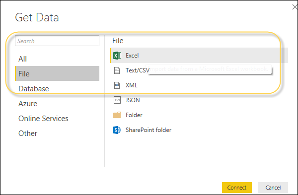
To get data in Power BI desktop, you need to click the Get data option in the main screen. It shows you the most common data sources first. Then, click the More option to see a full list of available data sources.
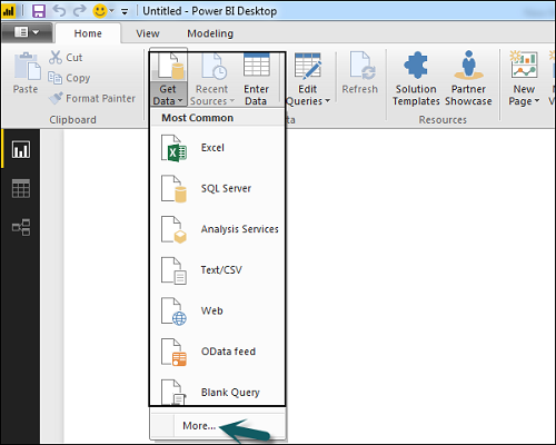
When you click More.. tab as shown in the above screenshot, you can see a new navigation window, where on the left side it shows a category of all available data sources. You also have an option to perform a search at the top.
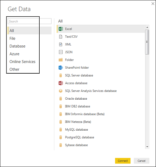
Following are the various data sources listed −
All
Under this category, you can see all the available data sources under Power BI desktop.
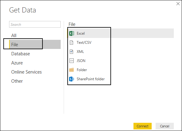
File
When you click File, it shows you all flat file types supported in Power BI desktop. To connect to any file type, select the file type from the list and click Connect. You have to provide the location of the file.
Database
When you click the Database option, it shows a list of all the database connections that you can connect to.
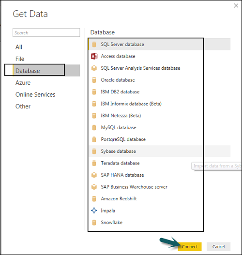
To connect to any database, select a Database type from the list as shown in the above screenshot. Click Connect.
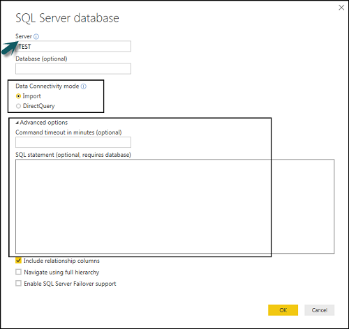
You have to pass Server name/ User name and password to connect. You can also connect via a direct SQL query using Advance options. You can also select Connectivity mode- Import or DirectQuery.
Note − You cant combine import and DirectQuery mode in a single report.
Import vs DirectQuery
DirectQuery option limits the option of data manipulation and the data stays in SQL database. DirectQuery is live and there is no need to schedule refresh as in the Import method.
Import method allows to perform data transformation and manipulation. When you publish the data to PBI service, limit is 1GB. It consumes and pushes data into Power BI Azure backend and data can be refreshed up to 8 times a day and a schedule can be set up for data refresh.
Advantages of Using DirectQuery
Using DirectQuery, you can build data visualizations on large datasets, which is not feasible to import in Power BI desktop.
DirectQuery doesnt apply any 1GB data set limit.
With the use of DirectQuery, the report always shows current data.
Limitations of Using DirectQuery
There is a limitation of 1 million row for returning data while using DirectQuery. You can perform aggregation of more number of rows, however, the result rows should be less than 1 million to return the dataset.
In DirectQuery, all tables should come from a single database.
When a complex query is used in the Query editor, it throws an error. To run a query, you need to remove the error from the query.
In DirectQuery, you can use Relationship filtering only in one direction.
It doesnt support special treatment for time-related data in tables.
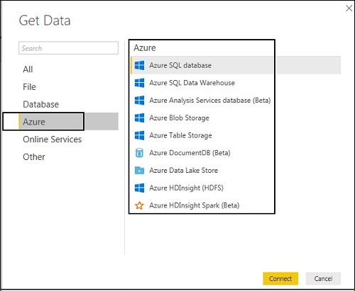
Azure
Using the Azure option, you can connect to the database in Azure cloud. Following screenshot shows the various options available under Azure category.
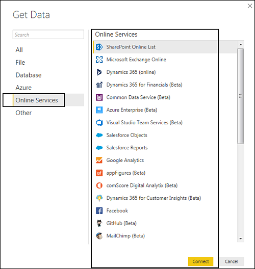
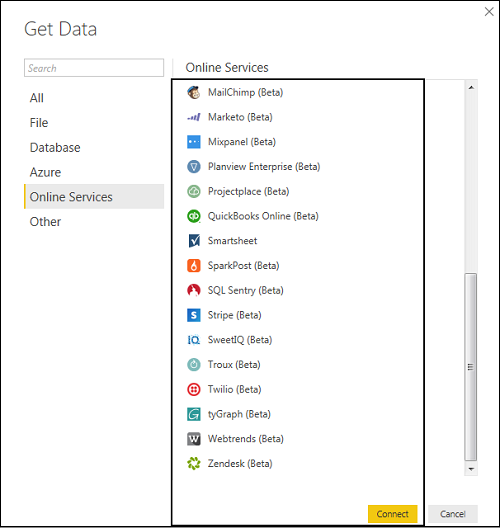
Online Services
Power BI also allows you to connect to different online services such as Exchange, Salesforce, Google Analytics, and Facebook.
Following screenshots shown the various options available under Online Services.
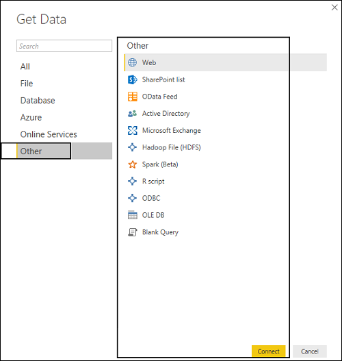
Other
Following screenshot shows the various options available under other category.
Power BI - Comparison with Other BI Tools
In this chapter, a comparison between Power BI and other BI tools such as Tableau and SSRS is carried out.
Power BI vs Tableau
Tableau is considered as one of the leading tools in the BI market. Power BI is considered as an emerging tool in close competition with Tableau because of its backend data manipulation features and connectivity with the list of data sources. Tableau is one of the best data visualization tools in the market and is used by medium and large enterprises. Power BI is closely integrated with Office 365 suite, and hence it is compatible other sources such as SharePoint.
| Feature | Tableau | Power BI |
|---|---|---|
Data Visualization |
Tableau provides strong data visualization and is one of the main data visualization tool in the market. |
Power BI provides a strong backend data manipulation feature with access to simple visualizations. |
Size of Dataset |
Tableau can connect much larger datasets as compared to Power BI. |
Power BI has a limit of 1GB data in free version. |
Data Sources |
Tableau covers a vast range of data sources to connect with for data visualization. In Tableau, you select the dataset first and visualizations are used on the fly. |
Power BI covers most of the data sources available in Tableau. It is closely integrated with Office 365, hence provides connectivity to SharePoint. Power BI online version also supports direct visualization on Search Engine, though, only Bling is supported at this point. |
Costing |
Tableau is expensive as compared to Power BI but still under budget for small and medium enterprise. |
Power BI provides a free version with 1GB limit on dataset. Power BI Pro is also a cheaper solution when compared with any other BI tool. |
License and Pricing |
Tableau Desktop Profession: USD70/user/month and it can connect to hundreds of data sources. Tableau Desktop Personal: USD35/user/month and it can connect to data sources such as Google Sheets and Excel files. Tableau Server: Minimum 10 users with the cost of USD35/user/month Tableau Online with private cloud: USD 42/user/month |
Power BI: Free 1 GB storage 10k rows/hour data streaming Power BI Pro: USD9.99/user/month 10 GB storage 1 million rows/hour |
Implementation |
Tableau provides different implementation types as per organizational needs panning from few hours to few weeks. |
Power BI uses cloud storage and includes simple implementation process. |
Power BI vs SSRS
| Feature | SSRS | Power BI |
|---|---|---|
Data Visualization |
SSRS is mostly used for Pixel perfect reporting and average dash-boarding features. |
Power BI provides a strong backend data manipulation feature with access to simple visualizations. |
Size of Dataset |
No such limit in SSRS. It can connect to much larger datasets as compared to Power BI. |
Power BI has a limit of 1GB data in free version. |
Data Sources |
SSRS covers a vast range of data sources to connect with for BI reporting. |
Power BI covers most of the data sources available in Tableau. It is closely integrated with Office 365, hence provides connectivity to SharePoint. Power BI online version also supports direct visualization on Search Engine, though, only Bling is supported at this point. |
Costing |
SSRS pricing details are available only upon request. |
Power BI provides a free version with 1GB limit on dataset. Power BI Pro is also a cheaper solution when compared with any other BI tool. |
License and Pricing |
SQL Server Enterprise License. It is available on cloud - AWS, Azure, and other providers. |
Power BI: Free 1 GB storage 10k rows/hour data streaming Power BI Pro: USD9.99/user/month 10 GB storage 1 million rows/hour |
Implementation |
SSRS implementation is complex as compared with Power BI. |
Power BI uses cloud storage and includes simple implementation process. |
Power BI - Data Modeling
In this chapter, you will learn about data modeling in Power BI.
Using Data Modeling and Navigation
Data Modeling is one of the features used to connect multiple data sources in BI tool using a relationship. A relationship defines how data sources are connected with each other and you can create interesting data visualizations on multiple data sources.
With the modeling feature, you can build custom calculations on the existing tables and these columns can be directly presented into Power BI visualizations. This allows businesses to define new metrics and to perform custom calculations for those metrics.
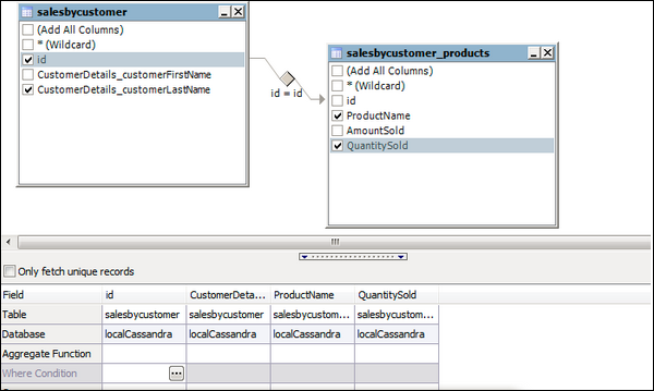
In the above image, you can see a common data model, which shows a relationship between two tables. Both tables are joined using a column name Id.
Similarly, in Power BI, you set the relationship between two objects. To set the relationship, you have to drag a line between the common columns. You can also view the Relationship in a data model in Power BI.
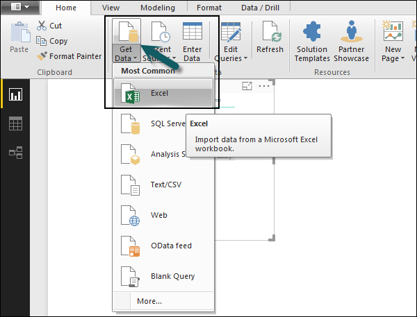
To create data model in Power BI, you need to add all data sources in Power BI new report option. To add a data source, go to the Get data option. Then, select the data source you want to connect and click the Connect button.
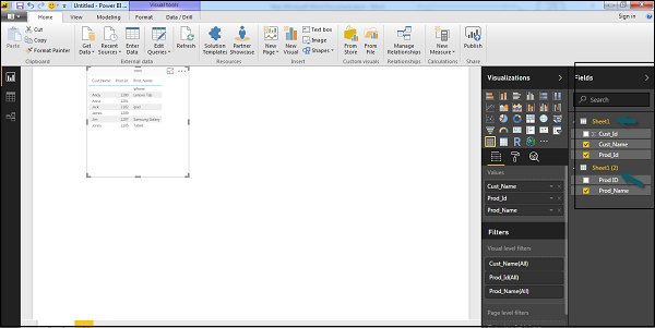
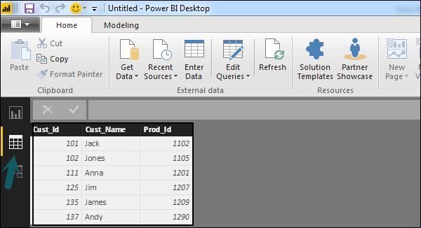
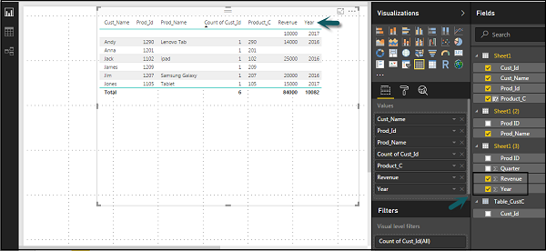
Once you add a data source, it is presented on the right side bar. In the following image, we have used 2 xls file to import data - Customer and Product.
In Power BI on the left side of the screen, you have the following three tabs −
- Report
- Data
- Relationships
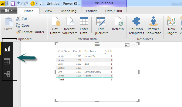
When you navigate to the Report tab, you can see a dashboard and a chart selected for data visualization. You can select different chart types as per your need. In our example, we have selected a Table type from available Visualizations.
When you go to the Data tab, you can see all the data as per the defined Relationship from the data sources.
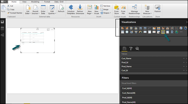
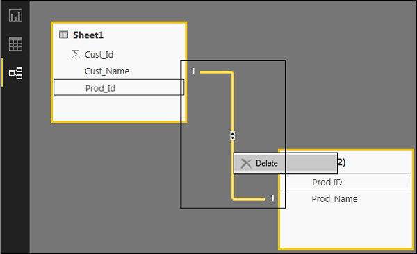
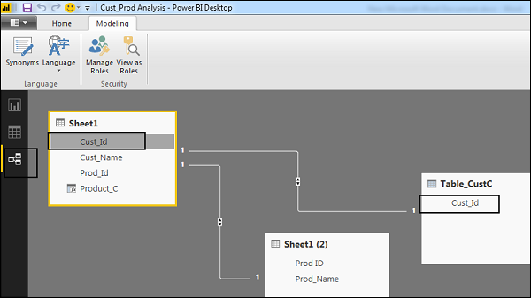
In the Relationship tab, you can see the relationship between data sources. When you add multiple data sources to Power BI visualization, the tool automatically tries to detect the relationship between the columns. When you navigate to the Relationship tab, you can view the relationship. You can also create a Relationship between the columns using Create Relationships option.

You can also add and remove relationships in data visualization. To remove a relationship, you have to right-click and select the Delete option. To create a new Relationship, you just need to drag and drop the fields that you want to link between the data sources.
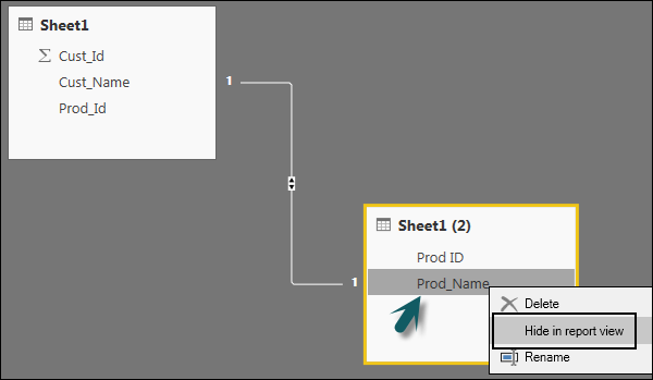
You can also use the Relationship view to hide a particular column in the report. To hide a column, right-click on the column name and select the Hide in report view option.
Creating Calculated Columns
You can create calculated columns in Power BI by combining two or more elements of the existing data. You can also apply calculation on an existing column to define a new metric or combine two columns to create one new column.
You can even create a calculated column to establish a relationship between the tables and it can also be used to setup a relationship between two tables.
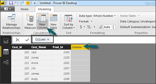
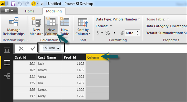
To create a new calculated column, navigate to Data View tab on the left side of the screen and then click Modeling.
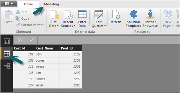
When you navigate to the Modeling tab, you can see a New Column option at the top of the screen. This also opens the formula bar, where you can enter DAX formula to perform calculation. DAX- Data Analysis Expression is a powerful language also used in Excel to perform calculations. You can also rename the column by changing the Column text in the formula bar.
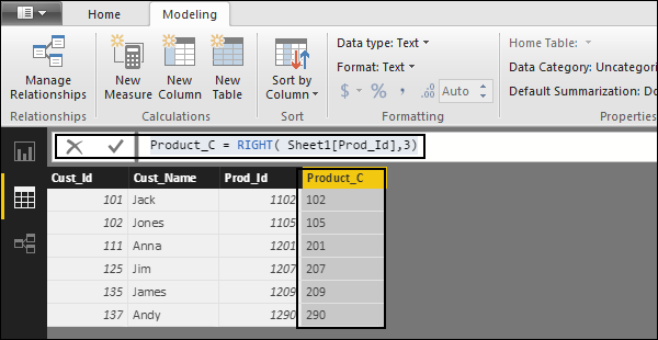
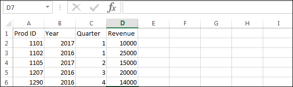
In the following example, let us create a new column: Product Code (Product_C), which is derived from the last three characters of Prod_Id column. Then, write the following formula −
Product_C = RIGHT( Sheet1[Prod_Id],3)
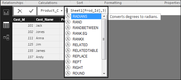
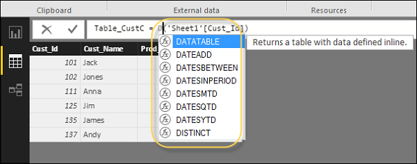
A long list of formulas is also provided that you can use for creating calculated columns. You have to enter the first character of formula to be used in calculations as shown in the following screenshot.
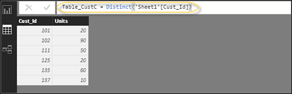
Creating Calculated Tables
You can also create a new calculated table in data modeling in Power BI. To create a new table, navigate to the Data View tab on the left side of the screen, and then go to the Modeling option at the top of the screen.
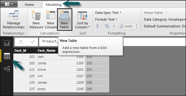
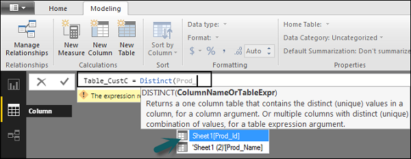
DAX expression is used to create the new table. You have to enter the name of a new table on the left side of the equal sign and DAX formula to perform the calculation to form that table on the right. When the calculation is complete, the new table appears in the Fields pane in your model.
In the following example, let us define a new table - Table_CustC that returns a one column table containing unique values in a column in another table.
A new table is added under the Fields section in Power BI screen as shown in the following screenshot. Once the calculated column and calculated tables are created as per your requirement, you can use the fields in the Report tab in Power BI.
To add these objects, you have to select a checkbox and a relationship is automatically detected if possible. If not, then you can drag the columns that you want to connect.
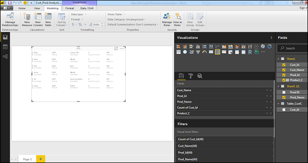
To view the report, you navigate to the Report tab and you can see both Calculated columns and fields from the new Calculated table in the report view.
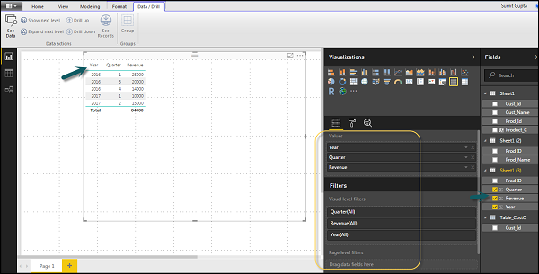
Managing Time-Based Data
Power BI allows to drill through time-based data by default. When you add a date field in your analysis and enable drill on your data visualization, it takes you to the next level of time-based data.
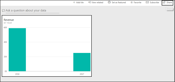
Let us consider we have added Time-based table in Power BI visualization. We have added Revenue and Year column in our report.
We can enable the drill feature in visualizations using the option at the top. Once we enable the drill feature and click the bars or lines in the chart, it drills down to the next level of time hierarchy. Example: Years → Quarters → Months.
We can also use Go to the next level in the hierarchy option to perform a Drill.
Power BI - Dashboard Options
In this chapter, you will learn about the various dashboard options available in Power BI.
Exploring Different Datasets
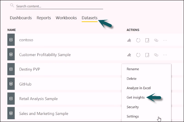
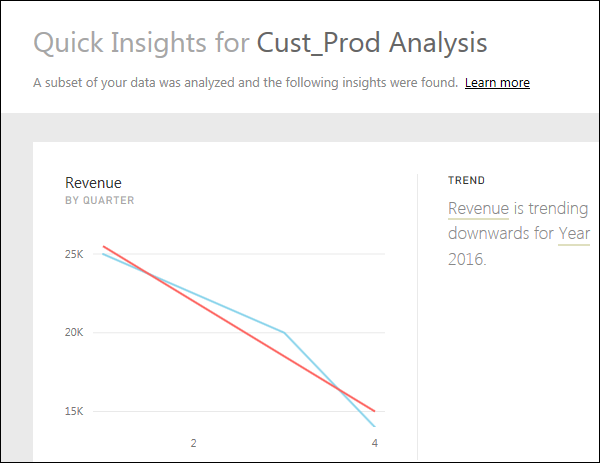
Power BI tool provides a lot of options to explore the datasets. When you are working on your BI report or dashboards, you can use Power BI look for quick insights. Navigate to the datasets section on the left side of the tool UI, click the 3 dots () and click Get Insights.
When you select the Get Insights option, it runs all the algorithms in your dataset and once it is complete, you get a notification that insight is ready for your dataset.

You can click the View Insights option and the tool will show you all chart representations of your data insights. You can any time go to this option and check insights option in your dataset.
When you publish a report to Power BI service, you also get an option of Quick Insight on the first page.
Creating Dashboards
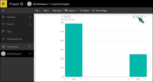
In Power BI, you can create a dashboard by pinning visualizations from BI reports that are published using Power BI desktop. All the visualizations that are created using Power BI service are also available for pinning to create dashboards.
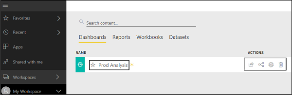
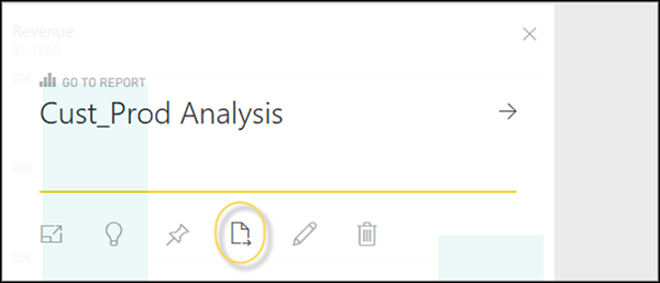
In Power BI, if you want to pin a visual, open the BI report on the Power BI service. At the top of the visual, select the pin icon.
When you use the Pin option as shown as shown in the above screenshot, a new dialog box appears as shown in the following screenshot. It asks you to create a new dashboard or select an existing dashboard to put the visual from the dropdown list. If you dont have an existing dashboard, then this option is greyed out.
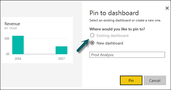
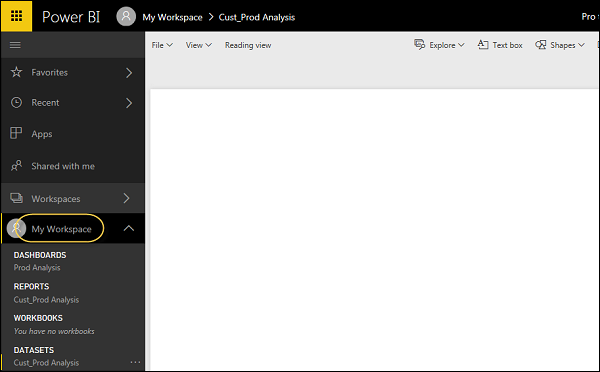
Once you click the Pin button, you will get a confirmation that your visualization is Pinned to the dashboard. You can click My Workspace and check the dashboard.
Once your dashboard is created, you can use different options to configure the dashboard.
Sharing Dashboards
When you publish your BI report to Power BI service, you can share reports and dashboards with other users in your organization. Sharing a dashboard is very easy in Power BI.
You have to open the dashboard in Power BI service and click the Share option at the top right corner of the screen.
The sharing feature is only available with Power BI Pro version. You can also use the 60-days free trial for Power BI Pro as shown in the following screenshot.
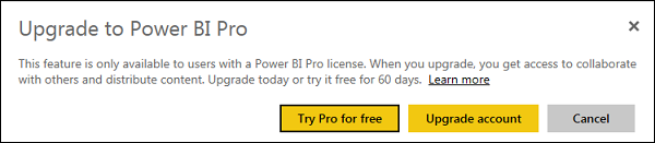
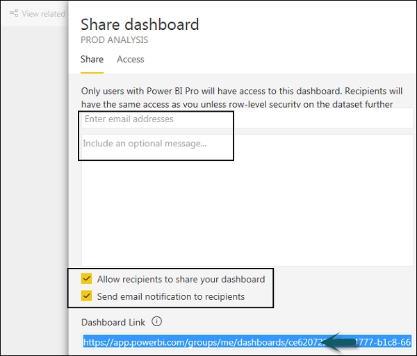
Click the Try Pro for free to start a trial. Select the Start Trial and Finish, and you will get a confirmation that 60-days trial has started. When you click the Share dashboard, you will get options in a new window. You have to enter the email Id of the user with whom you want to share this dashboard.
You can allow recipients to share the dashboard with other users or send email notifications. You can also provide a direct URL to users and they can access the dashboard directly.
Tiles in Dashboard
When you check More Options in the dashboard, you can see an option of Focus Mode and other different options in the dashboard.
Focus Mode is used to take a closer look at your dashboard data. When you have multiple values in the dashboard, you can use the Focus Mode for a better view of the objects in the dashboard. If there are any columns, which are not shown due to space issues, you can also view those using the Focus Mode.
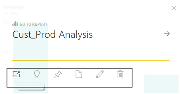
Focus Mode is used to see all the data in the dashboard/report. It is also possible to pin the visual directly from Focus Mode to a different dashboard by selecting the Pin icon.
To exit the Focus Mode, you can select the Exit Focus Mode option.

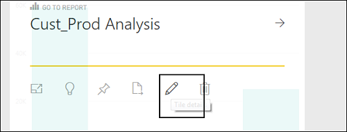
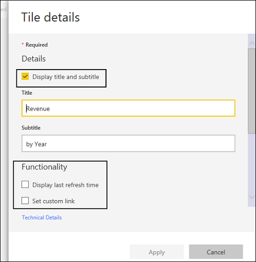
You can also use the Tile Details option to edit few formatting changes. This option allows to change the tile's title, subtitle, last refresh time and date, and other details, such as creating a custom link for your dashboard.
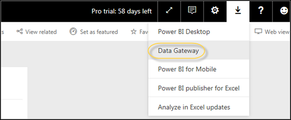
Data Gateway
You can connect on-premise data sources to Power BI service using a data gateway. You can also use a version of data gateway that doesnt include any administration configuration and it is called as Personal Gateway.
You can set up Personal Gateway by logging into Power BI service. You have to select the download icon on the top right hand corner of the screen and click Data Gateway.
As per Power BI official site, using Data Gateway with the on-premises gateways, you can keep your data fresh by connecting to your on-premises data sources without the need to move the data. Query large datasets and benefit from your existing investments. The gateways provide the flexibility you need to meet individual needs, and the needs of your organization.
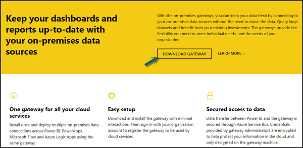
To set up download gateways, you have to run the setup till it is downloaded and the installation wizard is complete.
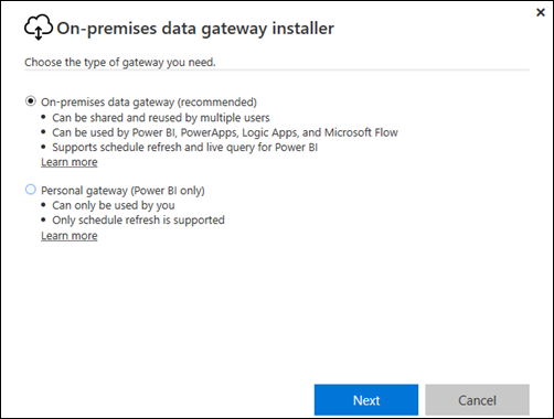
You have an option to select either −
- On-premise data gateway or
- Personal gateway (Power BI only)
Once you launch Power BI Gateway, you have to login to Power BI gateway service.
You can also enable automatic updates by navigating to Schedule Refresh and frequency of the schedule.
Power BI - Visualization Options
In this chapter, you will learn about the various visualization options in Power BI.
Creating Simple Visualizations
Visualizations are used to effectively present your data and are the basic building blocks of any Business Intelligence tool. Power BI contains various default data visualization components that include simple bar charts to pie charts to maps, and also complex models such as waterfalls, funnels, gauges, and many other components.
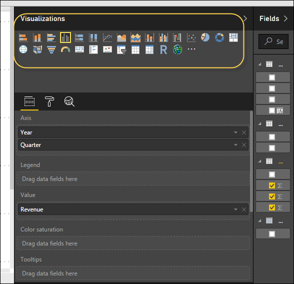
In Power BI, you can create visualization in two ways. First is by adding from the right side pane to Report Canvas. By default, it is the table type visualization, which is selected in Power BI. Another way is to drag the fields from right side bar to the axis and value axis under Visualization. You can add multiple fields to each axis as per the requirement.
In Power BI, it is also possible to move your visualization on the reporting canvas by clicking and then dragging it. You can also switch between different type of charts and visualizations from the Visualization pane. Power BI attempts to convert your selected fields to the new visual type as closely as possible.
Creating Map Visualizations
In Power BI, we have two types of map visualization - bubble maps and shape maps. If you want to create a bubble map, select the map option from the visualization pane.
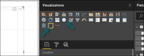
To use a bubble map, drag the map from Visualizations to the Report Canvas. To display values, you have to add any location object to the axis.
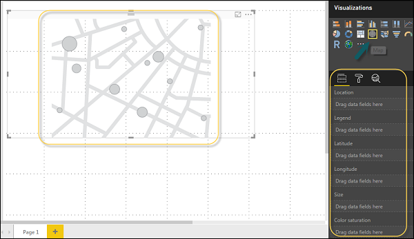
In the value fields, you can see that it accepts values axis such as City and State and or you can also add longitude and latitude values. To change the bubble size, you need to add a field to the value axis.
You can also use a filled map in data visualization, just by dragging the filled map to the Report Canvas.
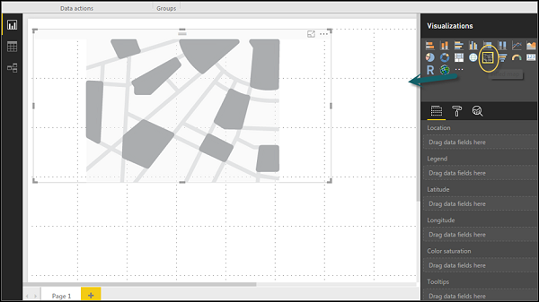
Note − If you see a warning symbol on top of your map visualization, it means that you need to add more locations to your map chart.
Using Combination Charts
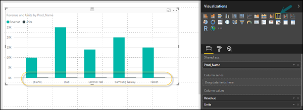
In data visualization, it is also required to plot multiple measures in a single chart. Power BI supports various combination chart types to plot measure values. Let us say you want to plot revenue and unit_solds in one chart. Combination charts are the most suitable option for these kind of requirement.
One of the most common Combination chart in Power BI is Line and Stacked column charts. Let us say we have a revenue field and we have added a new data source that contains customer-wise unit quantity and we want to plot this in our visualization.
Once you add a data source, it will be added to the list of fields on the right side. You can add units to the column axis as shown in the following screenshot.
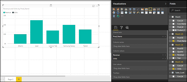
You have other type of combine chart that you can use in Power BI - Line and Clustered Column.
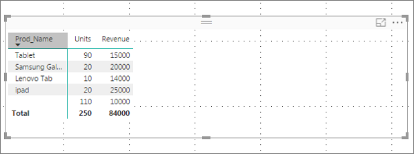
Using Tables
In Power BI, when you add a dataset to your visualization, it adds a table chart to the Report canvas. You can drag the fields that you want to add to the report. You can also select the checkbox in front of each field to add those to the Report area.
With the numerical values in a table, you can see a sum of values at the bottom.
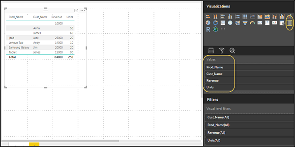
You can also perform a sort in the table using an arrow key at the top of the column. To perform ascending/descending sort, just click the arrow mark, and the values in the column will be sorted.
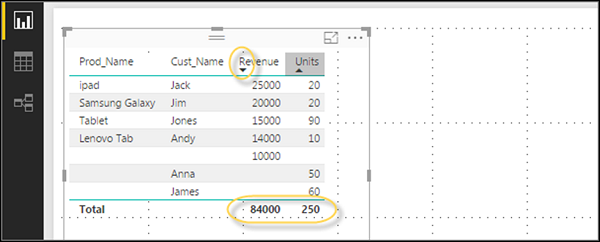
The order of the columns in a table is determined by the order in the value bucket on the right side. If you want to change the order, you can delete any column and add the other one.
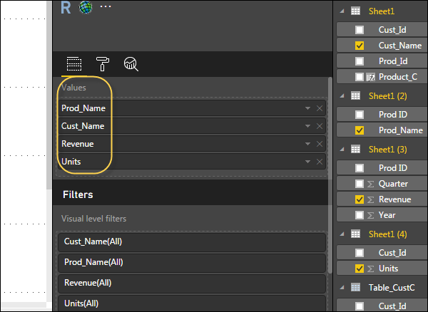
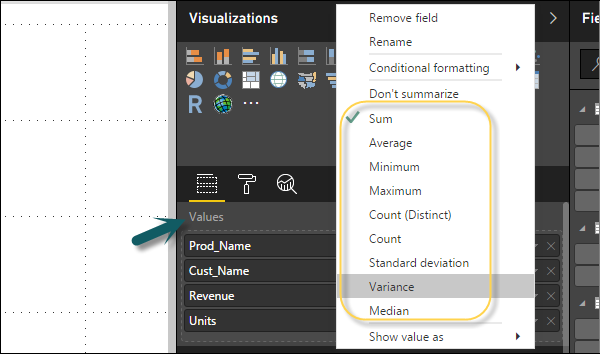
You can also undo summarize or apply different aggregate function on numerical values in the table. To change the aggregation type, click the arrow in the value bucket in front of the measure and you will see a list of formulas that can be used.
Another table type in Power BI is the matrix table that provides a lot of features such as auto sizing, column tables, and setting colors, etc.
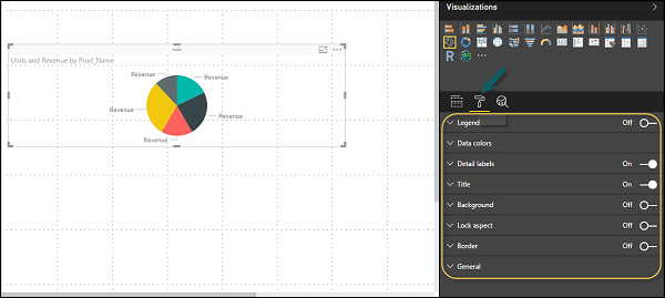
Modify Colors in Charts
In Power BI, you can also modify the colors in the chart. When you select any visualization, it has an option to change the color. Following options are available under the Format tab −
- Legend
- Data Colors
- Detail Label
- Title
- Background
- Lock Aspect
- Border
- General
To open these options, go to the Format tab as shown in the following screenshot. Once you click, you can see all the options available.
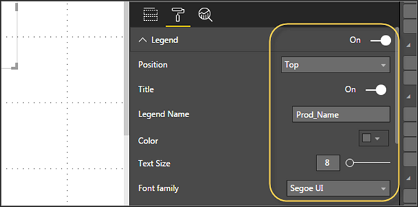
When you expand the Legend field, you have an option where you want to display the legend. You can select −
- Position
- Title
- Legend Name
- Color
- Text Size
- Font Family
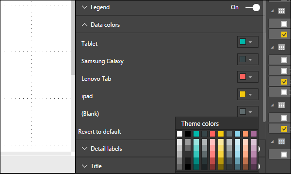
Similarly, you have data colors. In case, you want to change the color of any data field, you can use this option. It shows all objects and their corresponding colors in the chart.
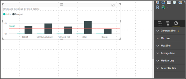
You also have Analytics feature in the tool, where you can draw lines as per requirement in data visualization. You have the following line types in data visualization −
- Constant Line
- Min Line
- Max Line
- Average Line
- Median Line
- Percentile Line
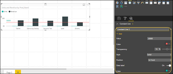
You can opt for a dashed, dotted, or a solid line. You can select Transparency level, color, and position of the line. You can also switch on/off data label for this line.
Adding Shapes, Images and Text box
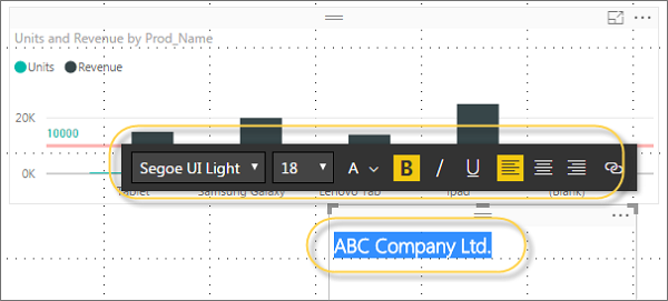
Sometimes it is required that you need to add static text, images, or shapes to your visualization. In case you want to add header/footer or any static signatures, messages to data visualization this option can be used.
You can also add URLs in the text box and Power BI uses those link to make it live.
To add shapes, images and text box, navigate to the Home tab and at the top you will find an option to add images.
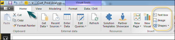
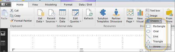
You can insert different shapes in data visualization. To see the available shapes, click the arrow next to the Shapes button.
When you click on the text box, it adds a text box in your Report canvas. You can enter any text in the text box and use the rich text editor to make formatting changes.
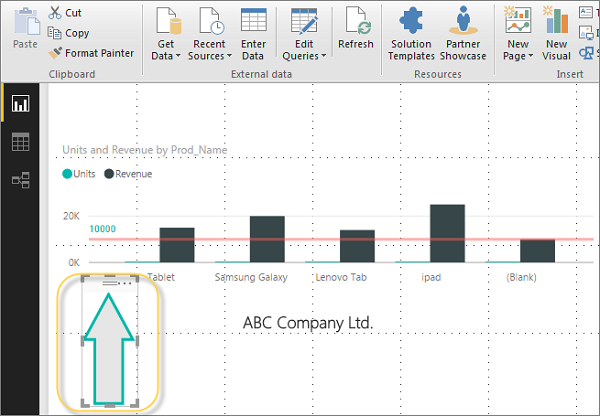
Similarly, images can be added to data visualization to add logos or other images to data visualization. When you click the Image option, it asks for a path to pass the image file.
You can add shapes by selecting any shape from the dropdown list. You can also resize it using different options.
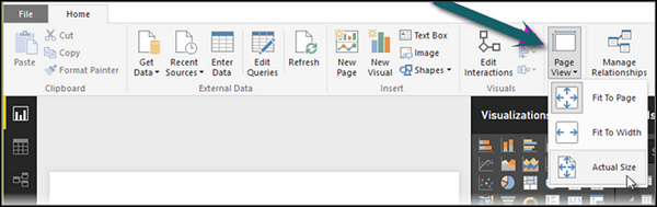
Styling Reports
In Power BI, you have flexible options to adjust the page layout and formatting such as orientation and page size of your report. Navigate to Page View menu from the Home tab and the following options are provided.
- Fit to Page
- Fit to Width
- Actual Size
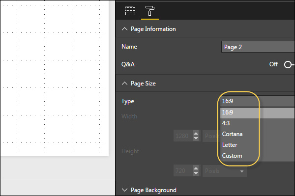
By default, the page size in a report is 16:9; however, it is also possible to change the page size of the report. To change the page size, navigate to the Visualization pane and select Paint brush.
Note − To change page size, no visualization should be added to the Report canvas. You have the following options available under Page layout −
- Page Information
- Page Size
- Page Background
Under Page Information, you have Name and Q&A.
Under Page Size, you can select from the following options −
- Type
- Width
- Height
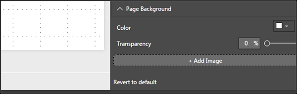
Under Page Background, you can select from the following options:
- Color
- Transparency
- Add Image
Duplicating Reports
In some scenarios, you may want to use the same layout and visuals for different pages. Power BI provides an option to create a copy of the page. When you use Duplicate Page option, a new page is added with similar layout and visuals.
To duplicate a page, right-click the Page and select Duplicate Page option. This will create a copy of the same page with the name - Duplicate of Page1.
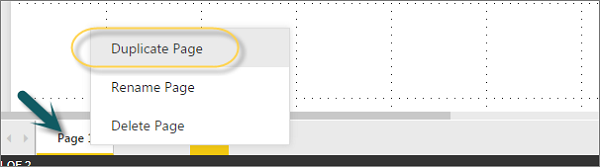
Now, if you want to rename an existing page or delete a page, you can use other options as shown in the above screenshot.
Power BI - Excel Integration
In this chapter, you will learn how to integrate excel with Power BI.
Using Excel Data
Using Power BI, you can also import Excel workbook file from the local drive into Power BI. To import data from the excel sheet, you have to ensure that each column has a proper name. To import an Excel file in Power BI, navigate to Get Data → Files → Local Files.
Importing xls Files
In Power BI Service, navigate to My Workspace → File → Local File.
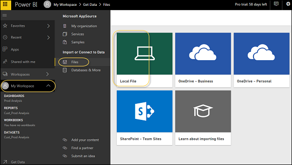
Also note that it is not necessary your Excel file should only be saved on the Local Drive. You can also import an Excel workbook from OneDrive or even from SharePoint.
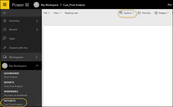
Once the dataset is imported, you are ready to create the reports in Power BI. Imported dataset is available under DATASETS option in Power BI menu.
Double-click Datasets. Then, navigate to the Explore tab. This will open a new Report Canvas. All the fields from your table and corresponding columns are available under the Fields option on the right side of the screen.
To create a report, select any visualization and add the fields from the table to visualization.
Sharing Power BI Dashboards
In this chapter, you will learn how to share Power BI dashboard for report sharing, printing, publishing, etc.
Using Power BI Desktop for Report Sharing
Once BI reports are created in Power BI desktop, you can also share the reports with other business users. All BI reports, dashboards, and data can be shared with other colleagues and business users in the organization.
You can share reports using the following methods −
Publish reports using Power BI Service
Content Packs combine dashboard, report, and datasets obtained in BI desktop tool
Create Groups and assign specific rights to different users for report sharing
Use Power BI mobile apps to access share dashboards and reports
Let us see how to publish a BI report using Power BI desktop tool.
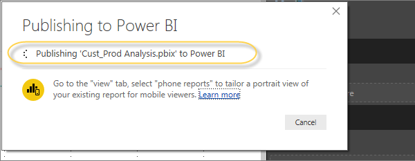
Once the report is created, navigate to the Publish button on the Home tab in Power BI desktop.
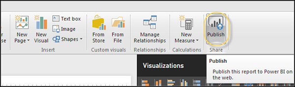
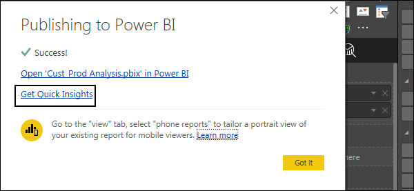
Once you select the Publish service, your visuals, custom measures and reports are all packaged and published to Power BI service. Power BI files have an extension .pbix files. When the upload is in process, you get a dialog box that Publishing is in process.
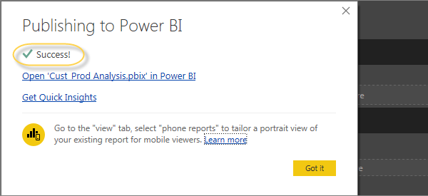
Once the upload is complete, you will get a confirmation message announcing the Success. You can also view Quick Insights and open the shared report from the dialog box.
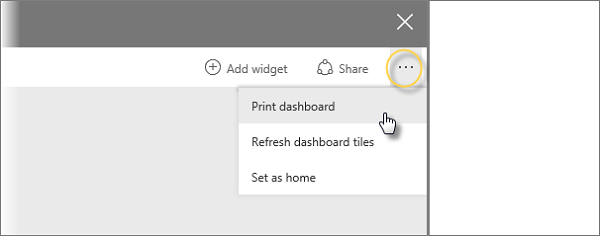
Printing Power BI Dashboards
It is also required sometimes to take printouts of your reports and dashboards. With Power BI, you can take prints of your BI reports and dashboards. To take a Printout of the report, navigate to Power BI service and click the option.
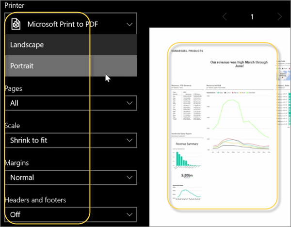
It will open a Print dialog box. You can select the Printer on which you want to take the printout of the report. You can also select different Print options such as Portrait/Landscape, Margins, Header or Scale.
Export Options
In Power BI, you can also use different Export options to export data from BI report. To use the export option, navigate to Power BI service and select the BI report you want to export.
When you click the Export to option, it generates a CSV file. In Power BI, you can also export/view a report directly by navigating to File → Print option.
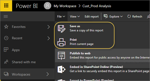
Publishing Report to Web
In Power BI, it is also possible to publish a BI report to web or share it via email. To publish a report to the web, you have to navigate to Power BI service → My Workspace.
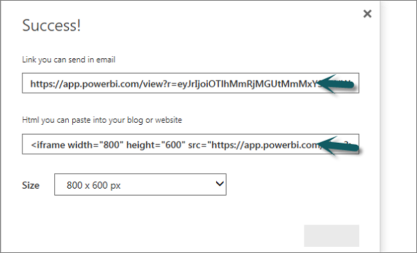
Once you open the report that you want to publish, navigate to the File tab → Publish to Web. Once you select this option, it opens a new dialog that creates an embed code for this report to include in the website or email.
Option says: Get a link or embed code that you can include on a public website. You may use publish to web functionality to share content on a publicly available website. You may not use this functionality to share content internally, which includes through your email, your internal network, or intranet site. Publish a live version that will remain synchronized with the source report in Power BI. Any changes you make to the report will immediately be reflected in the published public version.
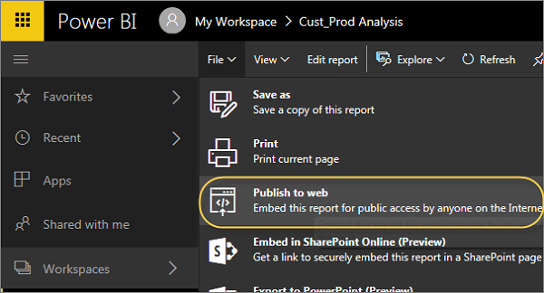
When you select - Create Embed code, Power BI prompts that you want to share your data with everyone on the internet.
The following message is displayed: You are about to create an embed code for this report. Once published, anyone on the Internet will be able to access the report and the data it contains, and Microsoft may display the report on a public website or a public gallery.
Before publishing this report, ensure you have the right to share the data and visualizations publicly. Do not publish confidential or proprietary information, or an individual's personal data. If in doubt, check your organization's policies before publishing.
Note − You can publish the report as a web page and any user with the link can view it. The link can be sent via email or it can be used as an iframe in a web page.
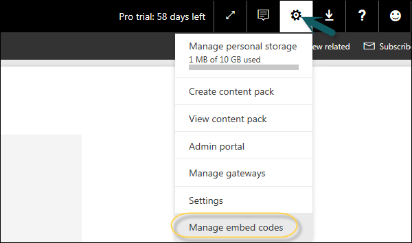
Deleting an Embed Code
Let us say, you want to delete an embed code. Navigate to the Gear icon at the top of the screen as shown in the following screenshot. Then go to Manage Embed codes.
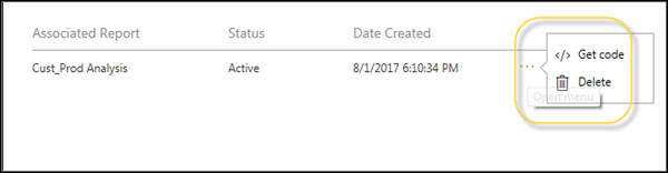
To remove an embed code click the ellipsis mark () in front of the report name and select the Delete option.
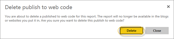
When you click the Delete option, it will ask you if you want to delete publish to web code. Once you are sure, click Delete.
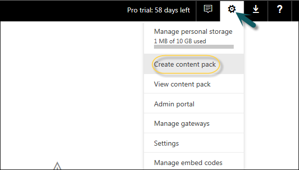
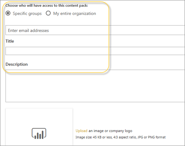
Using Content Pack
In Power BI, you can also share dashboard, report, and dataset as a package with your colleagues. To create a content pack, click the Gear box icon in Power BI workspace as shown in the following screenshot.
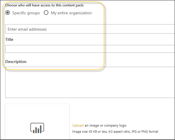
Once you select Create content pack, you will be prompted with a new dialog box. You can choose if you want to distribute this content pack with Specific Groups or My Entire Organization.
If you want to share this with specific people, you have to enter email addresses. You can also add a Title and description of the content pack as shown in the following screenshot.
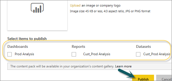
At the bottom of the page, you have an option to select the components you want to publish. You can select from the following −
- Dashboards
- Reports
- Datasets
Editing Content Pack
When a content pack is created, you can also go back and edit the shared objects of the content pack. Whenever you update any dashboard, BI report, you are prompted if you want to update the shared content.
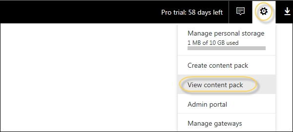
Click the Gear box icon under My Workspace → View Content Pack.
If you see a small icon in front of the name of the content pack, it shows that the content pack is updated. When you select the edit button, you will reach the home screen, where you can create a new content pack.
Power BI accepts all the changes you make to the content pack and publishes the updated content pack to the content pack gallery.
DAX Basics in Power BI
In this chapter, you will learn how to use various DAX functions in Power BI.
DAX Introduction
DAX (Data Analysis Expressions) is a formula expression language and can be used in different BI and visualization tools. DAX is also known as function language, where the full code is kept inside a function. DAX programming formula contains two data types: Numeric and Other. Numeric includes - integers, currency and decimals, while Other includes: string and binary object.
Following is an example of DAX formula, which uses a function to calculate a column in a table.
DAX function can also include other functions, conditional statements, and value references.
DAX Functions
In Power BI, you can use different function types to analyze data, and create new columns and measures. It includes functions from different categories such as −
- Aggregate
- Text
- Date
- Logical
- Counting
- Information
Power BI provides an easy way to see the list of all functions. When you start typing your function in the formula bar, you can see the list of all functions starting with that alphabet.
Aggregate Functions
DAX has a number of aggregate functions.
- MIN
- MAX
- Average
- SUM
- SUMX
Counting Functions
Other counting functions in DAX include −
- DISTINCTCOUNT
- COUNT
- COUNTA
- COUNTROWS
- COUNTBLANK
Logical Functions
Following are the collection of Logical functions −
- AND
- OR
- NOT
- IF
- IFERROR
TEXT Functions
- REPLACE
- SEARCH
- UPPER
- FIXED
- CONCATENATE
DATE Functions
- DATE
- HOUR
- WEEKDAY
- NOW
- EOMONTH
INFORMATION Functions
- ISBLANK
- ISNUMBER
- ISTEXT
- ISNONTEXT
- ISERROR
DAX Calculation Types
In Power BI, you can create two primary calculations using DAX −
- Calculated columns
- Calculated measures
When you navigate to the Modeling tab, you can see a New Column option at the top of the screen. This also opens the formula bar where you can enter DAX formula to perform the calculation. DAX - Data Analysis Expression is a powerful language used in Excel to perform calculations. You can also rename the column by changing the Column text in the formula bar.
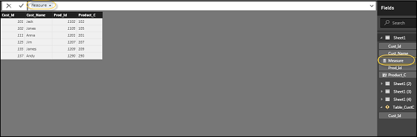
In the following example, we have created a new column: Product Code (Product_C), which is derived from the last 3 characters of Prod_Id column. Following is the formula −
Product_C = RIGHT( Sheet1[Prod_Id],3)
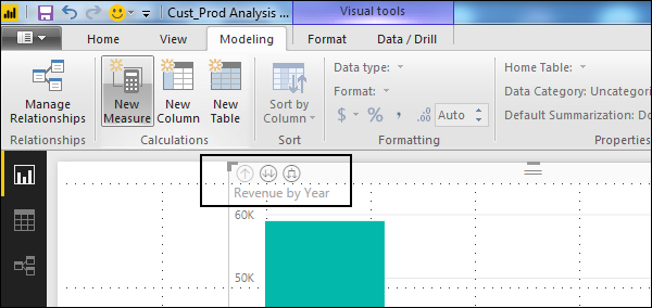
To create a calculated measure, navigate to New Measure tab under Modeling. This will add a new object under the Fields tab with the name Measure.
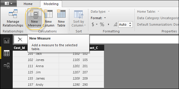
You can write DAX formula to calculate the value of the new measure, as we did for the new calculated column.
Power BI - Administration Role
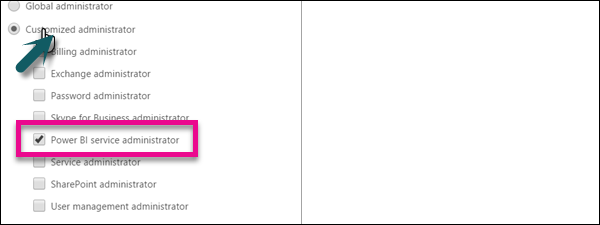
Power BI administration role is assigned to those who require admin privilege on BI Admin portal, without granting Office 365 access.
To provide admin access, navigate to Office 365 Admin Center, select Users and then Active Users.
Navigate to the Roles tab and click the Edit option.

Navigate to the Customized Administrator tab and select Power BI Service Administrator.
Purchasing
Power BI is a newly designed tool from Microsoft, which consists of the following components −
- Power BI Desktop
- Power BI Service
- Connector Gateway
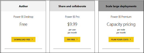
Power BI desktop is a free tool that can be installed from the Microsoft site without any additional cost.
https://powerbi.microsoft.com/en-us/pricing/
This is the link to directly download Power BI files −
https://www.microsoft.com/en-us/download/details.aspx?id=45331
Power BI Pro has 60-days free trial and then it can be purchased for 9.99$/user/month. Power BI Premium is as per the capacity pricing per node/month.
Power BI also provides on-premise report server, which can be used for publishing a report with the flexibility to move to the cloud environment later.
https://powerbi.microsoft.com/en-us/report-server/
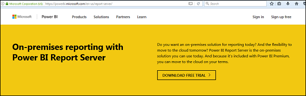
A trial version is also available for Power BI Pro Report Server and as per the company website - Power BI Report Server provides access to data and insights, and the enterprise reporting capabilities of SQL Server Reporting Services in a modern, on-premises solution.
It assists in visually exploring data and quickly discovering patterns to make better, faster decisions. At the same time, it generates precisely formatted reports based on the business needs. Youll also be able to confidently scale to thousands of users as Power BI Report Server is based on a proven, enterprise-grade platform.
REST API
In Power BI, it is also possible to push data in real time using REST APIs. With Power BI REST API, you can create data sets, dashboards, add and delete rows and get groups.
A Power BI REST API can be created using any of the following technologies −
- .NET
- JQuery
- Ruby
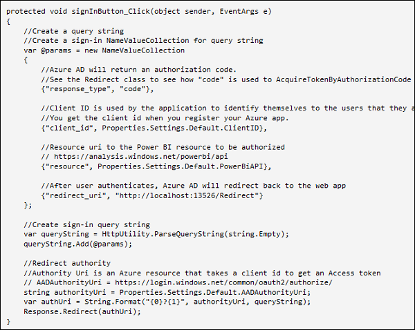
To authenticate Power BI, you need to get an Azure Active Directory token and this can allow your app to access Power BI dashboards.
Following is the C# code to get an authorization code from Azure AD in Power BI service.
Security
Azure Active Directory (AAD) authentication is used in Power BI when a user authenticates using Power BI service. Power BI login credentials can be an email account used by users to set up their BI account and is an effective username.
Power BI provides security level used by Azure cloud that includes the following level of security −
- Multitenant Environment Security
- Networking Security
- AAD based Security
For data storage, there are two different repositories used in Power BI −
- Azure BLOB
- Azure SQL Database
Azure BLOB storage is used for data uploaded by users and Azure SQL database is used to store system data. Power BI security is mostly based on data and network security features available in Azure cloud and authentication is also based on Azure AD.