Master Data Visualization with Tableau
Take your Data Skills to the next level

Lectures -15
Resources -1
Duration -53 mins

30-days Money-Back Guarantee
Get your team access to 10000+ top Tutorials Point courses anytime, anywhere.
Course Description
In this course, you will be learning various tools and techniques used in Tableau Public and Tableau Desktop for creating Visualization Dashboards. Organizations are sitting on a giant pile of data, of different forms- usage, sales, social, and others. Everyone from Giant corporates to small enterprises and even individuals have access to a variety of data sets generally arranged in form of Spreadsheets or Database table. There is a huge demand for professionals who can take this data to generate meaningful insights in form of charts, maps and other visualizations that can help Organizations spot the outliers, understand the trend, find Key Performance Indicators and decode the responsible factors. Tableau is one of the powerful Business Intelligence software that can enable you to do this massive task of Data Cleaning and Visualization in streamlined and intuitive manner. These visualizations can provide insights that can be used for decision making.
In this course you will be learning Tableau right from the basics to some of the advanced concepts. This is a practical based course where you will learn various concepts and techniques with hands-on examples. You will be learning following-
Adding an Excel or csv file
Various Chart types
Map Visualization
Converting Measures to Dimension and Dimension to Measures
Calculating a Measure and Creating a dual axis chart
Creating multiple worksheets
Creating a Dashboard and adding Visualizations
Using Map as a Filter
Creating a custom Filter
Adding Filters to the Dashboard
Creating an Analytics Dashboard with filters
Creating a Calculated Field
Keep Learning!
Goals
What will you learn in this course:
- In this course you will learn various tools and techniques in Tableau used for Data Visualization.
- You will learn to create various types of Visualization charts such as Pie, Bar, Bubble, Area, Treemap, Scatterplot, Dual Axis Bar, Map, and more
- You will learn to create Filters based on certain categories
- You will also learn to Create Calculated Fields and use various types of cards such as Color, Size, Tooltip and more
- You will learn to create Analytics Dashboard reports for Data Analytics
Prerequisites
What are the prerequisites for this course?
- There is no prerequisite before taking this course, but if you are familiar with Microsoft Excel or any Spreadsheet or Data visualization tool then it would be helpful.

Curriculum
Check out the detailed breakdown of what’s inside the course
Introduction
2 Lectures
-
Introduction 01:27 01:27
-
Tableau Resource files
Getting Started with Tableau
3 Lectures

Converting Measures to Dimension and vice versa
1 Lectures

Dual Axis Chart
2 Lectures

Creating an Analytics Dashboard
1 Lectures

Adding Filters
4 Lectures

Calculated Field
1 Lectures

Instructor Details

Harshit Srivastava
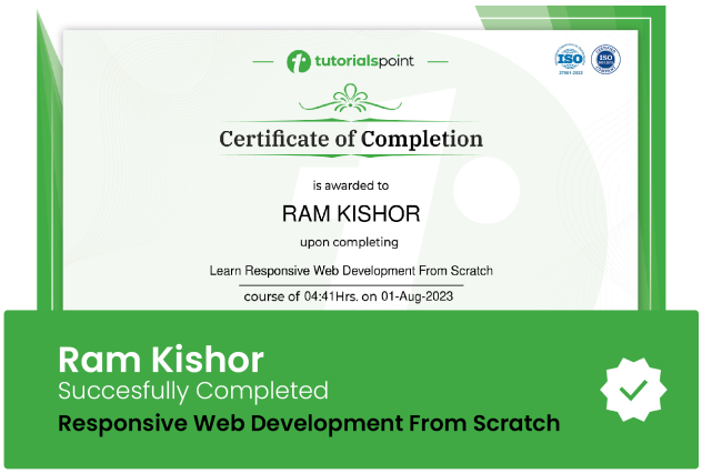
eCourse Certificate
Use your certificate to make a career change or to advance in your current career.
Our students work
with the Best






Related Video Courses
View MoreAnnual Membership
Become a valued member of Tutorials Point and enjoy unlimited access to our vast library of top-rated Video Courses
Subscribe now
Online Certifications
Master prominent technologies at full length and become a valued certified professional.
Explore Now


 Updated on Apr, 2024
 Language - English