
Article Categories
- All Categories
-
 Data Structure
-
 Networking
-
 RDBMS
RDBMS
-
 Operating System
-
 Java
Java
-
 MS Excel
-
 iOS
iOS
-
 HTML
HTML
-
 CSS
CSS
-
 Android
-
 Python
-
 C Programming
-
 C++
C++
-
 C#
C#
-
 MongoDB
-
 MySQL
MySQL
-
 Javascript
-
 PHP
PHP
-
 Economics & Finance
How to Reorder Chart Series in Excel?
This post will teach you how to reorder data series in Excel charts so that your data's insights are more effectively communicated. Excel's charts provide an effective way to see data patterns, but occasionally the default series order may not be the best. Understanding the significance of series order for data visualisation can help you easily reorder your chart series using Excel's "Select Data" tool. This tutorial will provide you the knowledge and skills you need to produce appealing and instructive charts that clearly tell the story of your data, whether you're working with bar charts, line charts, pie charts, or other chart kinds. Let's examine how to rearrange chart series in Excel and look at some extra suggestions to make your charts look and read better.
We will walk you through the process of reordering chart series in Excel in this step-by-step tutorial. Knowing how to rearrange the series will be a crucial ability in your data visualisation toolkit, whether you want to highlight particular data, examine patterns, or simply show your data more clearly.
Reorder Chart Series
Here we will make changes to the legend entries to complete the task. So let us see a simple process to learn how you can reorder chart series in Excel.
Step 1
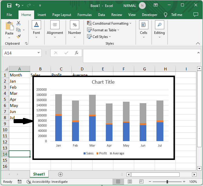
Consider an Excel sheet where a chart with multiple series is similar to the below image.
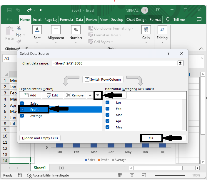
First, right-click on the chart and click on select data.
Right-click and > Select Data.
Step 2
Then click on the series you want to move, use the arrows to move the series, and click OK. Then you will see that the series will be moved according to your needs.
Edit > Series > Allows > OK.
This is how you can reorder chart series in Excel.
Conclusion
In this tutorial, we have used a simple example to demonstrate how you can reorder chart series in Excel to highlight a particular set of data.

441 Views
