
Article Categories
- All Categories
-
 Data Structure
-
 Networking
-
 RDBMS
RDBMS
-
 Operating System
-
 Java
Java
-
 MS Excel
-
 iOS
iOS
-
 HTML
HTML
-
 CSS
CSS
-
 Android
-
 Python
-
 C Programming
-
 C++
C++
-
 C#
C#
-
 MongoDB
-
 MySQL
MySQL
-
 Javascript
-
 PHP
PHP
-
 Economics & Finance
How to No Overlap Bubble in Bubble Chart in Excel?
Excel's bubble charts are a useful tool for comparing and visualising large data sets. The X and Y axes indicate two variables, and the size of the bubbles represents the magnitude of a third variable. They are frequently used to depict three-dimensional data. The chart is challenging to precisely understand since bubbles have a tendency to overlap as the number of data points rises. This tutorial will walk you through several methods to avoid overlapping bubbles in an Excel bubble chart in order to solve this problem.
Understanding how to manage overlapping bubbles can greatly improve the clarity and efficacy of your data visualisations, regardless of whether you are an analyst, a business professional, or a data enthusiast. You may produce visually stunning and instructive bubble charts that express your data's insights without losing readability by following the instructions provided in this lesson.
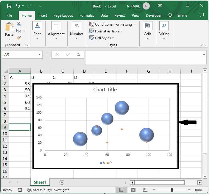
No Overlap Bubble in Bubble Chart
Here we will edit the legend entries to complete the task. So let us see a simple process to know how you cannot overlap bubbles in a bubble chart in Excel.
Step 1
Consider an Excel sheet where you have a bubble chart similar to the below image.
First, right-click on the chart and click on select data.
Right Click > Select Data.
Step 2
Then click series A and move the series to the bottom. To move the series to the bottom, click the series, then use the arrow button.
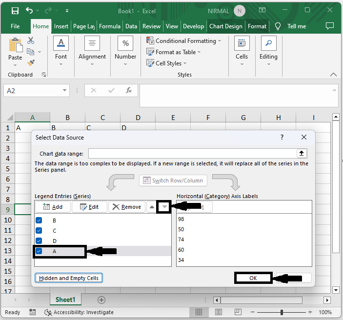
Note
Move the smallest bubble to the bottom to make it more visible.
This is how you can't overlap bubbles in a bubble chart in Excel.
Conclusion
In this tutorial, we have used a simple example to demonstrate how you can not overlap bubbles in a bubble chart in Excel to highlight a particular set of data.

1K+ Views
