
Article Categories
- All Categories
-
 Data Structure
-
 Networking
-
 RDBMS
RDBMS
-
 Operating System
-
 Java
Java
-
 MS Excel
-
 iOS
iOS
-
 HTML
HTML
-
 CSS
CSS
-
 Android
-
 Python
-
 C Programming
-
 C++
C++
-
 C#
C#
-
 MongoDB
-
 MySQL
MySQL
-
 Javascript
-
 PHP
PHP
-
 Economics & Finance
Selected Reading
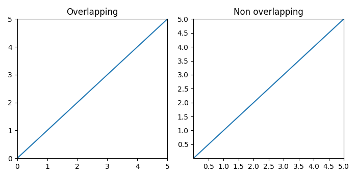
Overlapping Y-axis tick label and X-axis tick label in Matplotlib
To reduce the chances of overlapping between x and y tick labels in matplotlib, we can take the following steps −
Create x and y data points using numpy.
Add a subplot to the current figure at index 1 (nrows=1 and ncols=2).
Set x and y margins to 0.
Plot x and y data points and add a title to this subplot, i.e., "Overlapping".
Add a subplot to the current figure at index 2 (nrows=1 and ncols=2).
Set x and y margins to 0.
Plot x and y data points and add a title to this subplot, i.e., "Non Overlapping".
The objective of MaxNLocator and prune ="lower" is that the smallest tick will be removed.
To display the figure, use show() method.
Example
import matplotlib.pyplot as plt
from matplotlib.ticker import MaxNLocator
import numpy as np
plt.rcParams["figure.figsize"] = [7.00, 3.50]
plt.rcParams["figure.autolayout"] = True
xs = np.linspace(0, 5, 10)
ys = np.linspace(0, 5, 10)
plt.subplot(121)
plt.margins(x=0, y=0)
plt.plot(xs, ys)
plt.title("Overlapping")
plt.subplot(122)
plt.margins(x=0, y=0)
plt.plot(xs, ys)
plt.title("Non overlapping")
plt.gca().xaxis.set_major_locator(MaxNLocator(prune='lower'))
plt.gca().yaxis.set_major_locator(MaxNLocator(prune='lower'))
plt.show()
Output

Updated on: 2021-05-06T13:11:58+05:30
4K+ Views

Advertisements