
Article Categories
- All Categories
-
 Data Structure
-
 Networking
-
 RDBMS
RDBMS
-
 Operating System
-
 Java
Java
-
 MS Excel
-
 iOS
iOS
-
 HTML
HTML
-
 CSS
CSS
-
 Android
-
 Python
-
 C Programming
-
 C++
C++
-
 C#
C#
-
 MongoDB
-
 MySQL
MySQL
-
 Javascript
-
 PHP
PHP
-
 Economics & Finance
Selected Reading
How to visualize the normality of a column of an R data frame?
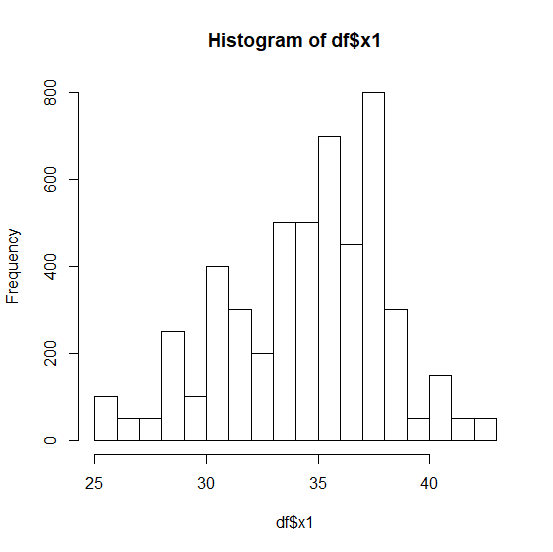
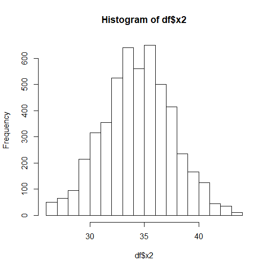
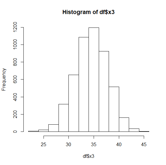
The first step to analyze a variable is checking whether it is normally distributed or not and to visually do this, we create a histogram. If the histogram depicts a bell then we consider that the variable is normally distributed otherwise, it is not. We can create a histogram for any column of an R data frame by using hist function.
Example
Consider the below data frame −
set.seed(9)
df<-data.frame(x1=rbinom(100,50,0.7),x2=rbinom(1000,50,0.7),x3=rbinom(5000,50,0.7))
Creating the histograms for x1, x2, and x3 −
hist(df$x1)
Output
hist(df$x2)
Output
hist(df$x3)
Output

Updated on: 2020-08-21T06:28:32+05:30
271 Views

Advertisements