
Article Categories
- All Categories
-
 Data Structure
-
 Networking
-
 RDBMS
RDBMS
-
 Operating System
-
 Java
Java
-
 MS Excel
-
 iOS
iOS
-
 HTML
HTML
-
 CSS
CSS
-
 Android
-
 Python
-
 C Programming
-
 C++
C++
-
 C#
C#
-
 MongoDB
-
 MySQL
MySQL
-
 Javascript
-
 PHP
PHP
-
 Economics & Finance
How to create quantile regression plot with larger width of lines using ggplot2 in R?
To create quantile regression plot with larger width of lines using ggplot2 in R, we can follow the below steps −
First of all, create a data frame.
Then, use stat_quantile function with size argument and geom_point function of ggplot2 package to create quantile regression plot.
Example
Create the data frame
Let’s create a data frame as shown below −
x<-rpois(25,2)
y<-rpois(25,5)
df<-data.frame(x,y)
df
Output
On executing, the above script generates the below output(this output will vary on your system due to randomization) −
   x y
1  1 6
2  1 1
3  3 4
4  4 9
5  4 7
6  2 5
7  1 7
8  1 4
9  2 7
10 3 3
11 4 3
12 2 5
13 4 7
14 2 7
15 0 8
16 5 0
17 3 4
18 0 2
19 3 0
20 0 5
21 2 5
22 2 5
23 6 7
24 2 2
25 0 3
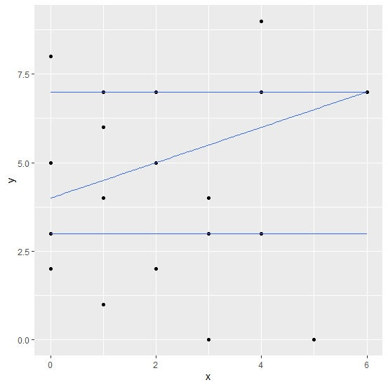
Create quantile regression plot with larger width of lines
Using stat_quantile function with size argument and geom_point function of ggplot2 package to create quantile regression plot for the data stored in data frame df −
x<-rpois(25,2)
y<-rpois(25,5)
df<-data.frame(x,y)
library(ggplot2)

ggplot(df,aes(x,y))+geom_point()+stat_quantile(formula=y~x,quantiles=c(0.25,0.50,0.75
))
Output
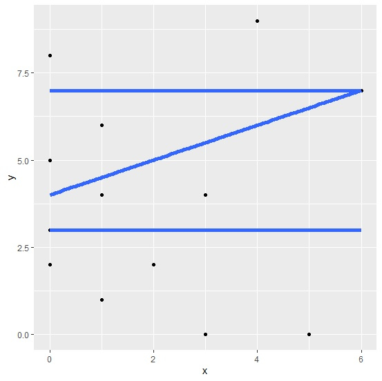
Create quantile regression plot with larger width of lines
Using stat_quantile function with size argument and geom_point function of ggplot2 package to create quantile regression plot with larger width of lines for the data stored in data frame df −
x<-rpois(25,2)
y<-rpois(25,5)
df<-data.frame(x,y)
library(ggplot2)
ggplot(df,aes(x,y))+geom_point()+stat_quantile(formula=y~x,quantiles=c(0.25,0.50,0.75
),size=2)
Output

371 Views
