
Article Categories
- All Categories
-
 Data Structure
-
 Networking
-
 RDBMS
RDBMS
-
 Operating System
-
 Java
Java
-
 MS Excel
-
 iOS
iOS
-
 HTML
HTML
-
 CSS
CSS
-
 Android
-
 Python
-
 C Programming
-
 C++
C++
-
 C#
C#
-
 MongoDB
-
 MySQL
MySQL
-
 Javascript
-
 PHP
PHP
-
 Economics & Finance
Selected Reading
How to create barplot for some top values in an R data frame?
To create barplot for some top values in an R data frame, we can subset the required top values inside the barplot function.
For example, if we have a data frame called df that contains a categorical column say C and a numerical column for frequency defined as F then the barplot for top five values can be created by using the below mentioned command −
barplot(df$F[1:5],names.arg=df$C[1:5])
Example
Following snippet creates a sample data frame −
Category<-LETTERS[1:20]
count<-rpois(20,50)
df<-data.frame(Category,count)
df
Output
The following dataframe is created −
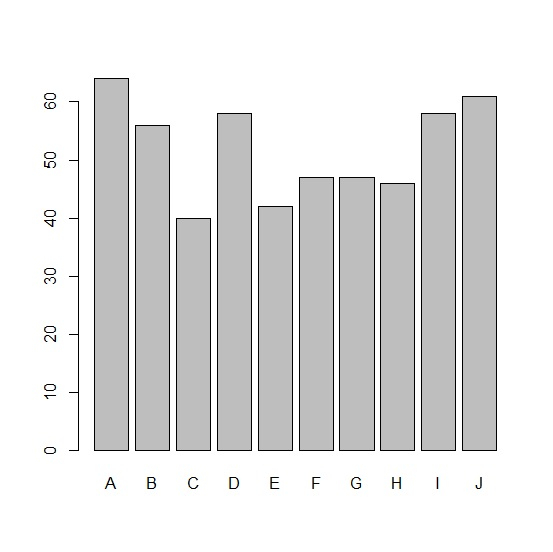
Category count
1  A    64
2  B    56
3  C    40
4  D    58
5  E    42
6  F    47
7  G    47
8  H    46
9  I    58
10 J    61
11 K    55
12 L    46
13 M    54
14 N    64
15 O    53
16 P    43
17 Q    58
18 R    42
19 S    44
20 T    58
In order to create a barplot for top ten values in df, add the following code to the above snippet −
Category<-LETTERS[1:20]
count<-rpois(20,50)
df<-data.frame(Category,count)
barplot(df$count[1:10],names.arg=df$Category[1:10])
Output
If you execute all the above given snippets as a single program, it generates the following output −

Updated on: 2021-11-05T08:15:06+05:30
2K+ Views

Advertisements