
Article Categories
- All Categories
-
 Data Structure
-
 Networking
-
 RDBMS
RDBMS
-
 Operating System
-
 Java
Java
-
 MS Excel
-
 iOS
iOS
-
 HTML
HTML
-
 CSS
CSS
-
 Android
-
 Python
-
 C Programming
-
 C++
C++
-
 C#
C#
-
 MongoDB
-
 MySQL
MySQL
-
 Javascript
-
 PHP
PHP
-
 Economics & Finance
Selected Reading
How to create bar chart using ggplot2 with chart sub-title in R?
There are different ways to express any chart. The more information we can provide in a chart, the better it is because a picture says thousand words. Since nobody likes to read a long-reports, we should have better reporting of charts. Therefore, we can add a chart title as well as chart sub-title in ggplot2 to help the readers.
Example
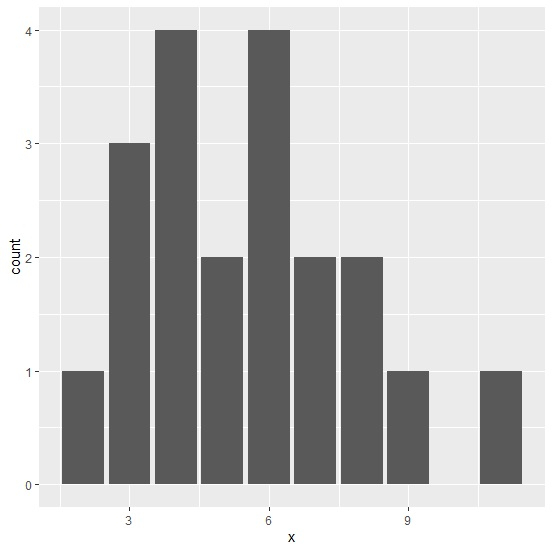
Consider the below data −
> set.seed(1)
> x<-rpois(20,5)
> table(x)
x
2 3 4 5 6 7 8 9 11
1 3 4 2 4 2 2 1  1
> df<-data.frame(x)
Loading ggplot2 package −
> library(ggplot2)
Creating a simple bar chart −
> ggplot(df,aes(x))+
+ geom_bar()
Output
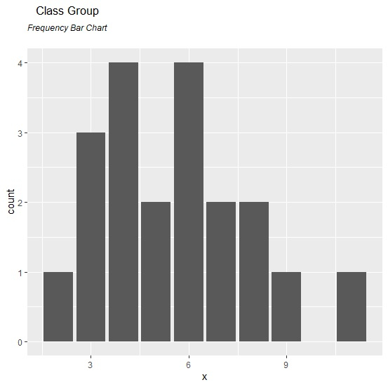
Creating a bar chart with title and sub-title −
> ggplot(df,aes(x))+
+ geom_bar()+
+ ggtitle(expression(atop("Class Group", atop(italic("Frequency Bar Chart")))))
Output

Updated on: 2020-08-10T14:21:44+05:30
273 Views

Advertisements