
Article Categories
- All Categories
-
 Data Structure
-
 Networking
-
 RDBMS
RDBMS
-
 Operating System
-
 Java
Java
-
 MS Excel
-
 iOS
iOS
-
 HTML
HTML
-
 CSS
CSS
-
 Android
-
 Python
-
 C Programming
-
 C++
C++
-
 C#
C#
-
 MongoDB
-
 MySQL
MySQL
-
 Javascript
-
 PHP
PHP
-
 Economics & Finance
How to create a scatterplot in R using ggplot2 with different designs of points?
Scatterplot helps us to identify the linear relationship between two variables and it is the first step of determining a predictive model. Before using any predictive modeling technique we must draw a scatterplot between independent and dependent variables to check what kind of relationship exists between them. A scatterplot generally represented by circular points on the plot area but we can have different types of points such as square, rectangle, diamond, etc. In ggplot2, pch argument of geom_point can help us to create scatterplot with these types of points.
Example
Consider the below data frame −
set.seed(123)
x <-rnorm(10,0.5)
y <-rpois(10,5)
df <-data.frame(x,y)
library(ggplot2)
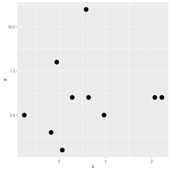
Creating the scatterplot with circular points −
ggplot(df,aes(x,y))+geom_point(pch=16,size=5)
Output
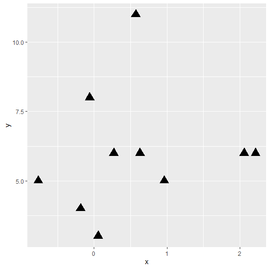
Creating the scatterplot with triangular points
ggplot(df,aes(x,y))+geom_point(pch=17,size=5)
Output
Creating the scatterplot with diamond points −
ggplot(df,aes(x,y))+geom_point(pch=18,size=5)
Output

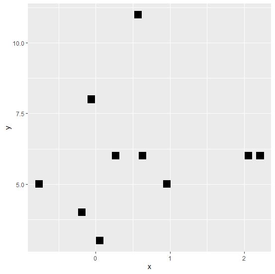
Creating the scatterplot with square points −
ggplot(df,aes(x,y))+geom_point(pch=15,size=5)
Output

434 Views
