
Article Categories
- All Categories
-
 Data Structure
-
 Networking
-
 RDBMS
RDBMS
-
 Operating System
-
 Java
Java
-
 MS Excel
-
 iOS
iOS
-
 HTML
HTML
-
 CSS
CSS
-
 Android
-
 Python
-
 C Programming
-
 C++
C++
-
 C#
C#
-
 MongoDB
-
 MySQL
MySQL
-
 Javascript
-
 PHP
PHP
-
 Economics & Finance
Selected Reading
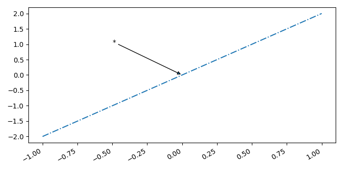
How does one insert statistical annotations (stars or p-values) into Matplotlib plots?
To insert statistical annotation, we can take the following steps −
Create lists (x and y) of numbers.
Using subplots() method, create a figure and a set of subplots.
Using plot() method, plot the data that contains dates with linestyle "-.".
Annotate a point in the plot using annotate() method, mean of x and y.
To display the figure, use show() method.
Example
import numpy as np
from matplotlib import pyplot as plt
plt.rcParams["figure.figsize"] = [7.00, 3.50]
plt.rcParams["figure.autolayout"] = True
x = np.linspace(-1, 1, 5)
y = np.linspace(-2, 2, 5)
mean_x = np.mean(x)
mean_y = np.mean(y)
fig, ax = plt.subplots()
ax.plot(x, y, linestyle='-.')
ax.annotate('*', (mean_y, mean_y), xytext=(-.50, 1), arrowprops=dict(arrowstyle='-|>'))
fig.autofmt_xdate()
plt.show()
Output

Updated on: 2021-05-07T08:16:37+05:30
492 Views

Advertisements