
Article Categories
- All Categories
-
 Data Structure
-
 Networking
-
 RDBMS
RDBMS
-
 Operating System
-
 Java
Java
-
 MS Excel
-
 iOS
iOS
-
 HTML
HTML
-
 CSS
CSS
-
 Android
-
 Python
-
 C Programming
-
 C++
C++
-
 C#
C#
-
 MongoDB
-
 MySQL
MySQL
-
 Javascript
-
 PHP
PHP
-
 Economics & Finance
Change the outline color for histogram bars using ggplot2 in R.
To change the outlines color of histogram bars using ggplot2, we can use col argument inside geom_histogram function of ggplot2 package.
For Example, if we have a data frame called df that contains a column say X then we can create the histogram of X with different outline color of bars using the below command −
ggplot(df,aes(X))+geom_histogram(bins=30,col=I("red"))
Example
Following snippet creates a sample data frame −
x<-rnorm(20000)
df<-data.frame(x)
head(df,20)
The following dataframe is created −
          x
 1 -1.31426410
 2 -2.62316895
 3 -0.19231545
 4  0.89701476
 5 -0.10409584
 6  0.23481007
 7  1.53117888
 8 -0.63855632
 9  0.85309492
10  0.04791316
11  0.37854603
12  1.24928336
13 -0.65170883
14  2.58938742
15 -0.82602063
16  0.97524621
17  0.36930032
18  0.07720108
19 -0.66050878
20  0.66199644
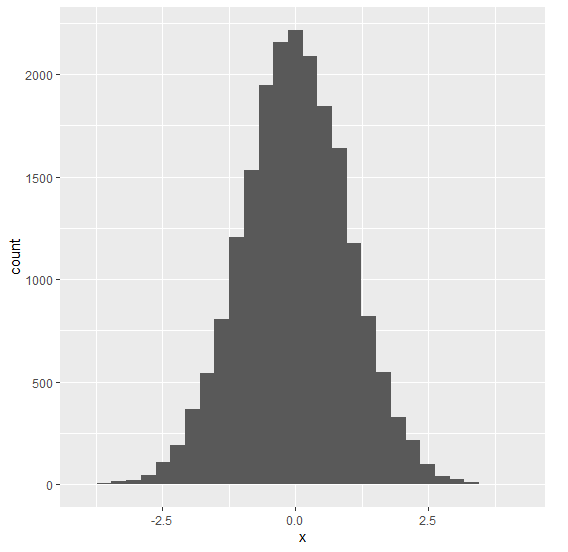
To load the ggplot2 package and to create a histogram of x, on the above created data frame, add the following code to the above snippet −
x<-rnorm(20000)

library(ggplot2)
ggplot(df,aes(x))+geom_histogram(bins=30)
Output
If you execute all the above given snippets as a single program, it generates the following Output −
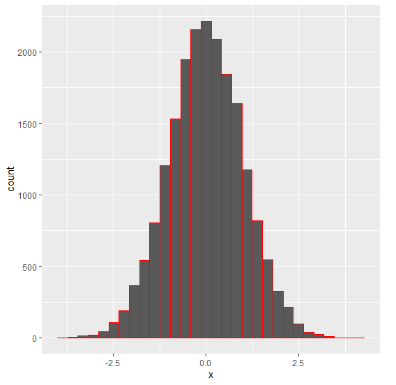
To create a histogram of x with red colored outline of bars, on the above created data frame, add the following code to the above snippet −
x<-rnorm(20000)

library(ggplot2)
ggplot(df,aes(x))+geom_histogram(bins=30,col=I("red"))
Output
If you execute all the above given snippets as a single program, it generates the following Output −

5K+ Views
