
Article Categories
- All Categories
-
 Data Structure
-
 Networking
-
 RDBMS
RDBMS
-
 Operating System
-
 Java
Java
-
 MS Excel
-
 iOS
iOS
-
 HTML
HTML
-
 CSS
CSS
-
 Android
-
 Python
-
 C Programming
-
 C++
C++
-
 C#
C#
-
 MongoDB
-
 MySQL
MySQL
-
 Javascript
-
 PHP
PHP
-
 Economics & Finance
Pictograph and Interpretation of a Pictograph
Introduction
Pictographs are graphs used to represent data using symbols and images associated with the data. Pictographs are a way of expressing data using images. Each image of the icon represents a specific number. That is, the icon uses images and symbols to convey information about the data provided. Pictograms need to be used very carefully and are very convenient to use, but they can also misinterpret the data. When drawing a pictogram, the data is most often interpreted visually and should look visually correct. You can easily interpret your data using various image representations of your data, such as bar charts, line charts, and pie charts.
In this tutorial, we will discuss Pictograph and the Interpretation of a Pictograph
Definition
In mathematics, pictograms, also known as pictograph, are visual representations of data using images, icons, or symbols. You can use symbols and images associated with pictograms to represent the frequency of your data. Pictograms are one of the easiest ways to represent data.
Each image of the icon represents a specific one. Pictograms define the frequency of data through images or symbols associated with the data. Pictograms are very easy to understand and are one of the easiest ways to view statistical data. The pictogram uses a key that indicates the value of the symbol. If you use icons or images, all icons must be the same size.
Advantages of Pictogram
Some of the main advantages of using pictograms (pictographs) are
Pictograms are used to represent large amounts of information in a simple way.
Easy to read because all the information is available at a glance.
Since it is universally used, no further explanation is needed.
It attracts the attention of viewers and readers because it contains many attractive images.
Interpretation of a Pictograph
Pictograms, also known as pictograms, represent the frequency of data in the form of images or symbols. Each image or symbol can represent one or more data units. Important note about pictographs All symbols must be the same size and we can also display the data using some of the symbols.
Different ways of Pictorial Expression
There are several other ways to visually represent your data. They are bar charts, line charts, line charts, and pie charts.
Bar Graph
A bar graph is a very simple chart used to compare different entities. It is very easy to use a bar graph to show how the subject's characteristics change over time. They are widely used in the industry today for presentations and reports. They make it possible to identify different trends and patterns of data from bar charts.
Line Graph.
The line graph is also called a line chart, and it is used to understand the change in the value of something over a period of time. The data is displayed as data points in the (x, y) format. There are two axes: The horizontal axis and the Vertical axis. This is a straight line connected by a data point. It is widely used today in the industry to make forecasts and forecasts.
Pie Chart
A pie chart is a circular representation of the data that forms a circle. It is split into slices and shows the total number of data and its share. These are typically used to represent percentages. You can summarize large amounts of data and view it visually in a simple way.
How to Make a Pictograph?
The various steps to make a pictograph are
Step 1: Collect data
The first step in creating a pictogram is to collect the relevant information you want to express. Once the data has been collected, create a table or list of data.
Step 2: Select one or more icons
Select any image or icon to view the data. For example, if your data represents precipitation in different cities, use cloud images or other images related to your data.
Step 3: Assign a Symbol or key
If you want the image to represent data, use the key that specifies the value of the image. If the data is too frequent, the image is not enough to represent the data. This is how to use numbers called "keys", which you need to write with your pictograph.
Step 4: Draw a pictogram
When you create a pictogram, use two columns that represent categories and dates. Finally, draw a pictogram with a frequency symbol/image. If the frequency is not an integer, the symbol can be plotted as a fraction.
Step 5: Check the data and pictograph
After drawing the pictogram, make sure that the image accurately represents the data and captions of the pictograph.
Solved Examples
1) Draw a pictograph of bike colors and the number of bikes in a Bike agency.
| Bike colors | Black | Blue | Green | White | Red |
|---|---|---|---|---|---|
| Number of bikes | 10 | 20 | 30 | 10 | 40 |
Answer Since the data is given and collected so now we have to assign a symbol. Let the  represent the number of bikes, where one represents 10 bikes.
| Bike colors | Black | Blue | Green | White | Red |
|---|---|---|---|---|---|
| Number of bikes | |
 |
 |
|
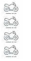 |
Where the key is and one represents 10 bikes.
2) The table provided shows the number of fans sold by the salesman between January and March. Draw a table pictograph.
| Month | January | February | March |
|---|---|---|---|
| Number of fans | 5 | 10 | 20 |
Answer Since the data is given and collected so, now, we have to assign a symbol. Let the  represent the number of fans, where one represents 5 fans.
| Month | January | February | March |
|---|---|---|---|
| Number of fans |  |
 |
 |
3) A hospital maintains the records number of patients with age and then draws the pictograph
| Age of the patients | 20 | 40 | 60 | 80 |
|---|---|---|---|---|
| Number of patients | 35 | 15 | 20 | 30 |
Answer: The data are given, so now we have to assign a symbol. Let the  represent the number of patients, where one represents 5 patients. Now, draw the pictograph,
| Age of the patients | 20 | 40 | 60 | 80 |
|---|---|---|---|---|
| Number of patients |  |
 |
 |
 |
Conclusion
Pictographs are a way of expressing data using images. A key is often included in a pictograph that shows what each symbol or image represents. All symbols in a pictogram must be the same size, but you can use the fractional part of the symbol to display each decimal (fraction) part of that amount.
FAQs
1. What do you mean by pictograph?
Pictographs are a way of expressing data using images. Each image of the icon represents a specific number. It is known as pictograms, also known as pictographs, represents the frequency of data in the form of images or symbols.
2. What are the advantages of pictographs?
Pictograms are used to represent large amounts of information in a simple way.
Easy to read because all the information is available at a glance.
Since it is universally used, no further explanation is needed.
It attracts the attention of viewers and readers because it contains many attractive images.
3. What is the bar graph?
A bar graph is a very simple chart used to compare different entities. It is very easy to use a bar graph to show how the subject's characteristics change over time.
4. What is a line graph?
The line graph is also called a line chart, it is used to understand the change in the value of something over a period of time. The data is displayed as data points in the (x, y) format.
5. What is the pie graph?
A pie chart is a circular representation of the data that forms a circle. It is split into slices and shows the total number of data and its share.
6. What is the use of a pictograph?
we can use pictograms whenever we want to make simple data more visually interesting, memorable, and attractive. Whether you're displaying the size of important statistics or visualizing fractions or percentages, you can use pictograms to visually influence simple data.

566 Views
