
Article Categories
- All Categories
-
 Data Structure
-
 Networking
-
 RDBMS
RDBMS
-
 Operating System
-
 Java
Java
-
 MS Excel
-
 iOS
iOS
-
 HTML
HTML
-
 CSS
CSS
-
 Android
-
 Python
-
 C Programming
-
 C++
C++
-
 C#
C#
-
 MongoDB
-
 MySQL
MySQL
-
 Javascript
-
 PHP
PHP
-
 Economics & Finance
Selected Reading
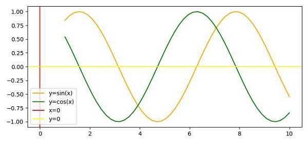
Show the origin axis (x,y) in Matplotlib plot
To show the origin, we can take the following Steps −
Create the points x, y1 and y2 using numpy.
Plot the sine and cosine curves using plot() methods.
Plot the vertical line, i.e., x=0.
Plot the horizontal line, i.e., y=0.
Intersection point of (Step 3 and 4), could be the origin.
To display the label of lines, use legend() method.
To display the figure, use show() method.
Example
import numpy as np
from matplotlib import pyplot as plt
plt.rcParams["figure.figsize"] = [7.50, 3.50]
plt.rcParams["figure.autolayout"] = True
x = np.linspace(1, 10, 50)
y1 = np.sin(x)
y2 = np.cos(x)
plt.plot(x, y1, c="orange", label="y=sin(x)")
plt.plot(x, y2, c="green", label="y=cos(x)")
plt.axvline(x=0, c="red", label="x=0")
plt.axhline(y=0, c="yellow", label="y=0")
plt.legend()
plt.show()
Output

Updated on: 2021-04-09T08:32:44+05:30
13K+ Views

Advertisements