
Article Categories
- All Categories
-
 Data Structure
-
 Networking
-
 RDBMS
RDBMS
-
 Operating System
-
 Java
Java
-
 MS Excel
-
 iOS
iOS
-
 HTML
HTML
-
 CSS
CSS
-
 Android
-
 Python
-
 C Programming
-
 C++
C++
-
 C#
C#
-
 MongoDB
-
 MySQL
MySQL
-
 Javascript
-
 PHP
PHP
-
 Economics & Finance
How to show a checkbox in reactnative?
Checkboxes are a common component that we often use in mobile UI. React Native provides several ways of implementing checkboxes in your applications.
The core React Native package does not include checkbox support, so you need to install a third-party package to work with it.
Installation
The following package needs to be installed to display checkboxes:
npm install react-native-paper
Basic Checkbox Component
The basic checkbox component structure is as follows:
<Checkbox status={checkboxstatus} onPress={onCheckboxCheckedfunc} />
Important Properties
Let us explore the important properties available for the checkbox component:
| Props | Description |
|---|---|
| status | The value that can be given to status are checked, unchecked and indeterminate |
| disabled | The value is boolean. It can be used to enable/disable the checkbox |
| onPress | The function that will be called when the checkbox is pressed |
| color | The color to be given to the checkbox when checked |
| uncheckColor | The color for the checkbox in unchecked mode |
Managing Checkbox State
The useState hook is used to manage the checked/unchecked status for the checkbox:
const [checked, setChecked] = React.useState(false);
The state is maintained inside the checked variable and setChecked method is used to update it when the user interacts with the checkbox:
onPress={() => {
    setChecked(!checked);
}}
Complete Example
import * as React from 'react';
import { StyleSheet, Text, SafeAreaView } from 'react-native';
import { Checkbox } from 'react-native-paper';

const MyComponent = () => {
    const [checked, setChecked] = React.useState(false);

    return (
        <SafeAreaView style={styles.container}>
            <Checkbox
                status={checked ? 'checked' : 'unchecked'}
                onPress={() => {
                    setChecked(!checked);
                }}
                color={'green'}
                uncheckColor={'red'}
            />
            <Text>Checkbox</Text>
        </SafeAreaView>
    );
};

const styles = StyleSheet.create({
    container: {
        flex: 1,
        justifyContent: 'center',
        alignItems: 'center'
    },
});

export default MyComponent;
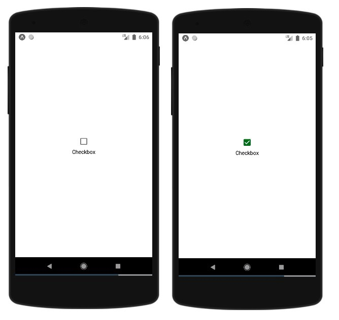
Output
The above code will render a checkbox that toggles between checked and unchecked states. When checked, it appears in green color, and when unchecked, it shows in red color.
Conclusion
React Native checkboxes using react-native-paper provide a simple way to add interactive checkboxes to your mobile applications. The component offers customization options for colors and handles state management efficiently with React hooks.

3K+ Views
