
Article Categories
- All Categories
-
 Data Structure
-
 Networking
-
 RDBMS
RDBMS
-
 Operating System
-
 Java
Java
-
 MS Excel
-
 iOS
iOS
-
 HTML
HTML
-
 CSS
CSS
-
 Android
-
 Python
-
 C Programming
-
 C++
C++
-
 C#
C#
-
 MongoDB
-
 MySQL
MySQL
-
 Javascript
-
 PHP
PHP
-
 Economics & Finance
Selected Reading
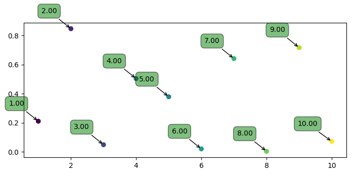
How to improve the label placement for Matplotlib scatter chart?
To imporove the label placement for matplotlib scatter chart, we can first plot the scatter points and annotate those points with labels.
Steps
Create points for x and y using numpy.
Create labels using xpoints.
Use scatter() method to scatter points.
Iterate the labels, xpoints and ypoints and annotate the plot with label, x and y with different properties.
To display the figure, use show() method.
Example
import numpy as np
from matplotlib import pyplot as plt
plt.rcParams["figure.figsize"] = [7.00, 3.50]
plt.rcParams["figure.autolayout"] = True
xpoints = np.linspace(1, 10, 10)
ypoints = np.random.rand(10)
labels = ["%.2f" % i for i in xpoints]
plt.scatter(xpoints, ypoints, c=xpoints)
for label, x, y in zip(labels, xpoints, ypoints):
   plt.annotate(
      label,
      xy=(x, y), xytext=(-20, 20),
      textcoords='offset points', ha='right', va='bottom',
      bbox=dict(boxstyle='round,pad=0.5', fc='green', alpha=0.5),
      arrowprops=dict(arrowstyle='->', connectionstyle='arc3,rad=0'))
plt.show()
Output

Updated on: 2021-05-06T13:49:25+05:30
1K+ Views

Advertisements