
Article Categories
- All Categories
-
 Data Structure
-
 Networking
-
 RDBMS
RDBMS
-
 Operating System
-
 Java
Java
-
 MS Excel
-
 iOS
iOS
-
 HTML
HTML
-
 CSS
CSS
-
 Android
-
 Python
-
 C Programming
-
 C++
C++
-
 C#
C#
-
 MongoDB
-
 MySQL
MySQL
-
 Javascript
-
 PHP
PHP
-
 Economics & Finance
Selected Reading
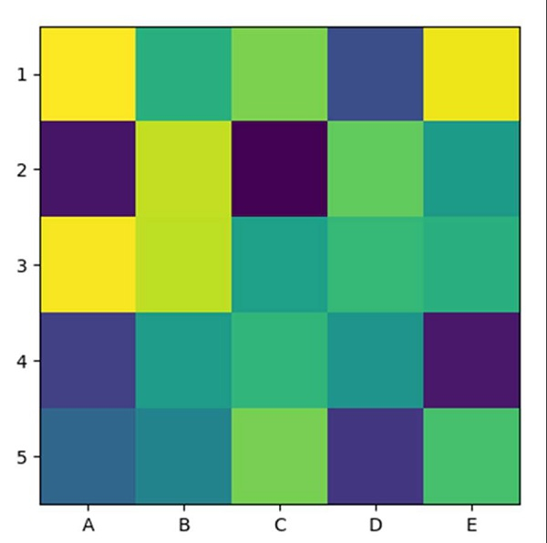
How can I plot a confusion matrix in matplotlib?
Using imshow method, we can create an image with an input (5, 5) array dimension. After that, we can use the xticks and yticks method to mark the ticks on the axes.
Steps
Return random floats in the half-open interval [5, 5) and interpolation='nearest'.
Display data as an image, i.e., on a 2D regular raster, with step 1 data.
Get or set the current tick locations and labels of the X-axis, using xticks method.
Get or set the current tick locations and labels of the Y-axis, using yticks method.
Use plt.show() to show the figure.
Example
import matplotlib.pyplot as plt
import numpy as np

plt.imshow(np.random.random((5, 5)), interpolation='nearest')
plt.xticks(np.arange(0, 5), ['A', 'B', 'C', 'D', 'E'])
plt.yticks(np.arange(0, 5), ['1', '2', '3', '4', '5'])

plt.show()
Output

Updated on: 2021-03-15T08:15:47+05:30
1K+ Views

Advertisements