
Article Categories
- All Categories
-
 Data Structure
-
 Networking
-
 RDBMS
RDBMS
-
 Operating System
-
 Java
Java
-
 MS Excel
-
 iOS
iOS
-
 HTML
HTML
-
 CSS
CSS
-
 Android
-
 Python
-
 C Programming
-
 C++
C++
-
 C#
C#
-
 MongoDB
-
 MySQL
MySQL
-
 Javascript
-
 PHP
PHP
-
 Economics & Finance
Selected Reading
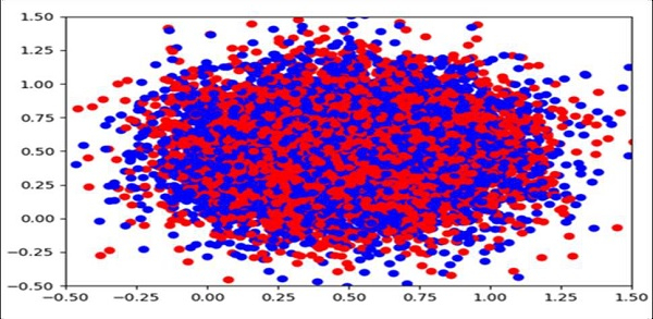
How can I make a scatter plot colored by density in Matplotlib?
We can create a dict for color and a value. If the same value comes up, we can use a scatter method and if the closer values have the same set of colors, that could make the plot color denser.
Steps
Create a new figure, or activate an existing figure.
Add an ~.axes.Axes to the figure as part of a subplot arrangement.
Get the x and y values using np.random.normal() method. Draw random samples from a normal (Gaussian) distribution.
Make a color list with red and blue colors.
To make it denser, we can store the same color with the same value.
Plot scatter point, a scatter plot of *y* vs. *x* with varying marker size and/or color.
Set the x-view limit.
Set the y-view limit.
To show the figure, use the plt.show() method.
Example
import random
import numpy as np
import matplotlib.pyplot as plt

fig = plt.figure()
ax = fig.add_subplot(1, 1, 1)

x = np.random.normal(0.5, 0.3, 10000)
y = np.random.normal(0.5, 0.3, 10000)

colors = ['red', 'blue']

color = dict()
for i in x:
   if i not in color:
      color[i] = colors[random.randint(1, 10) % len(colors)]

ax.scatter(x, y, c=[color.get(i) for i in x])

ax.set_xlim(-0.5, 1.5)
ax.set_ylim(-0.5, 1.5)

plt.show()
Output

Updated on: 2021-03-16T10:49:08+05:30
2K+ Views

Advertisements