
Article Categories
- All Categories
-
 Data Structure
-
 Networking
-
 RDBMS
RDBMS
-
 Operating System
-
 Java
Java
-
 MS Excel
-
 iOS
iOS
-
 HTML
HTML
-
 CSS
CSS
-
 Android
-
 Python
-
 C Programming
-
 C++
C++
-
 C#
C#
-
 MongoDB
-
 MySQL
MySQL
-
 Javascript
-
 PHP
PHP
-
 Economics & Finance
Selected Reading
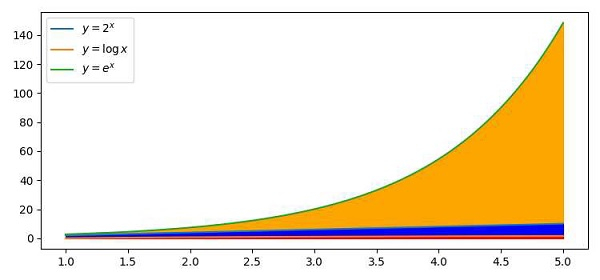
How can I create a stacked line graph with matplotlib?
To create a stacked lines graph with Python, we can take the following Steps −
Create x, y, y1 and y2 points using numpy.
Plot the lines using numpy with the above data (Step 1) and labels mentioned.
Fill the color between curve y=e^x and y=0, using the fill_between() method.
Fill the color between curve y=2x and y=0, using the fill_between() method.
Fill the color between curve y=log(x) and y=0, using fill_between() method.
Place the curve text using the legend() method.
To display the figure, use the show() method.
Example
import matplotlib.pyplot as plt
import numpy as np
plt.rcParams["figure.figsize"] = [7.50, 3.50]
plt.rcParams["figure.autolayout"] = True
x = np.linspace(1, 5, 100)
y = x * 2
y1 = np.log(x)
y2 = np.exp(x)

plt.plot(x, y, label=r'$y=2^x$')
plt.plot(x, y1, label=r'$y=\log{x}$')
plt.plot(x, y2, label=r'$y=e^x$')
plt.fill_between(x, y2, 0, color='orange')
plt.fill_between(x, y, 0, color='blue')
plt.fill_between(x, y1, 0, color='red')
plt.legend()
plt.show()
Output

Updated on: 2021-04-10T08:07:21+05:30
1K+ Views

Advertisements