
Article Categories
- All Categories
-
 Data Structure
-
 Networking
-
 RDBMS
RDBMS
-
 Operating System
-
 Java
Java
-
 MS Excel
-
 iOS
iOS
-
 HTML
HTML
-
 CSS
CSS
-
 Android
-
 Python
-
 C Programming
-
 C++
C++
-
 C#
C#
-
 MongoDB
-
 MySQL
MySQL
-
 Javascript
-
 PHP
PHP
-
 Economics & Finance
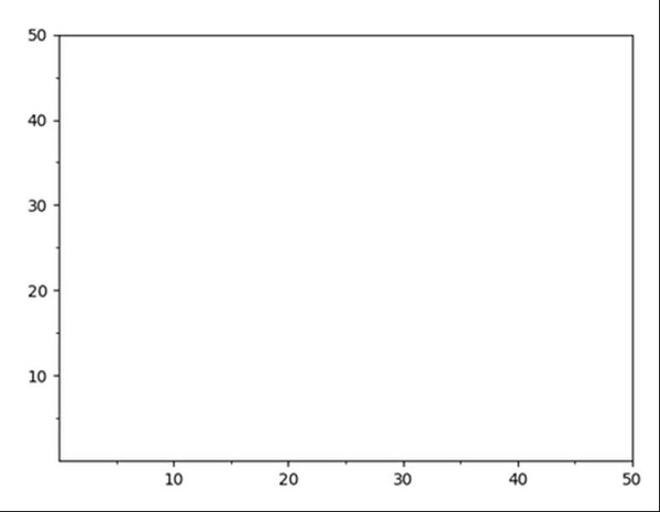
Change grid interval and specify tick labels in Matplotlib
Using plt.figure() method, we can create a figure and thereafter, we can create an axis. Using set_xticks and set_yticks, we can change the ticks format and ax.grid could help to specify the grid interval.
Steps
Create a new figure, or activate an existing figure, using fig = plt.figure() method.
Add an `~.axes.Axes` to the figure as part of a subplot arrangement, where nrow = 1, ncols = 1 and index = 1.
Get or set the current tick locations and labels of the X-axis.
Get or set the current tick locations and labels of the X-axis. With minor = True, Grid.
Get or set the current tick locations and labels of the Y-axis.
Get or set the current tick locations and labels of the Y-axis. With minor = True, Grid.
Lay out a grid in current line style, using grid() method.
To show the figure we can use the plt.show() method.
Example
import matplotlib.pyplot as plt

fig = plt.figure()
ax = fig.add_subplot(1, 1, 1)
major_tick = [10, 20, 30, 40, 50]
minor_tick = [5, 15, 25, 35, 45]
ax.set_xticks(major_tick) # Grid
ax.set_xticks(minor_tick, minor=True)
ax.set_yticks(major_tick) # Grid
ax.set_yticks(minor_tick, minor=True)

ax.grid(which='both')

ax.grid(which='minor', alpha=1)
ax.grid(which='major', alpha=2)

plt.show()
Output

5K+ Views
