
Article Categories
- All Categories
-
 Data Structure
-
 Networking
-
 RDBMS
RDBMS
-
 Operating System
-
 Java
Java
-
 MS Excel
-
 iOS
iOS
-
 HTML
HTML
-
 CSS
CSS
-
 Android
-
 Python
-
 C Programming
-
 C++
C++
-
 C#
C#
-
 MongoDB
-
 MySQL
MySQL
-
 Javascript
-
 PHP
PHP
-
 Economics & Finance
Selected Reading
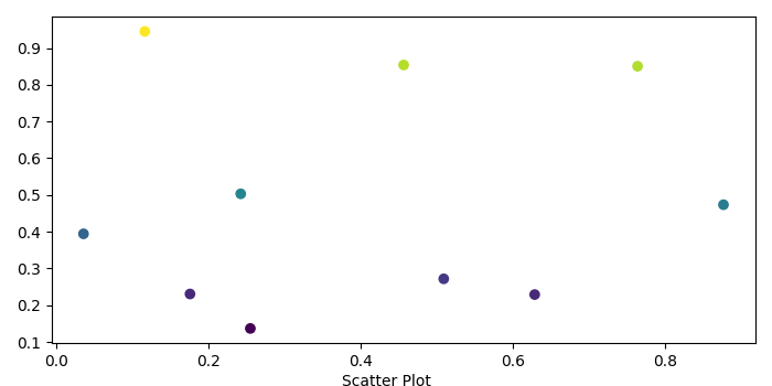
Adding caption below X-axis for a scatter plot using Matplotlib
To add caption below X-axis for a scatter plot, we can use text() method for the current figure.
Steps
Create x and y data points using numpy.
Create a new figure or activate an existing figure using figure() method.
Plot the scatter points with x and y data points.
To add caption to the figure, use text() method.
Adjust the padding between and around the subplots.
To display the figure, use show() method.
Example
import numpy as np
from matplotlib import pyplot as plt
plt.rcParams["figure.figsize"] = [7.00, 3.50]
plt.rcParams["figure.autolayout"] = True
x = np.random.rand(10)
y = np.random.rand(10)
fig = plt.figure()
plt.scatter(x, y, c=y)
fig.text(.5, .0001, "Scatter Plot", ha='center')
plt.tight_layout()
plt.show()
Output

Updated on: 2021-05-06T13:00:19+05:30
5K+ Views

Advertisements