- WPF Tutorial
- WPF - Home
- WPF - Overview
- WPF - Environment Setup
- WPF - Hello World
- WPF - XAML Overview
- WPF - Elements Tree
- WPF - Dependency Properties
- WPF - Routed Events
- WPF - Controls
- WPF - Layouts
- WPF - Nesting Of Layout
- WPF - Input
- WPF - Command Line
- WPF - Data Binding
- WPF - Resources
- WPF - Templates
- WPF - Styles
- WPF - Triggers
- WPF - Debugging
- WPF - Custom Controls
- WPF - Exception Handling
- WPF - Localization
- WPF - Interaction
- WPF - 2D Graphics
- WPF - 3D Graphics
- WPF - Multimedia
- WPF Useful Resources
- WPF - Quick Guide
- WPF - Useful Resources
- WPF - Discussion
WPF - Togglebutton
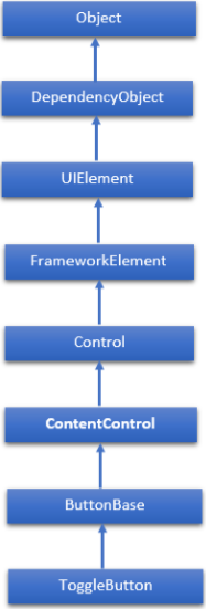
A Toggle Button is a control that can switch states, such as CheckBox and RadioButton. The hierarchical inheritance of ToggleButton class is as follows −
Commonly Used Properties in ToggleButton Class
| Sr. No. | Property & Description |
|---|---|
| 1 | IsChecked Gets or sets whether the ToggleButton is checked. |
| 2 | IsCheckedProperty Identifies the IsChecked dependency property. |
| 3 | IsThreeState Gets or sets a value that indicates whether the control supports three states. |
| 4 | IsThreeStateProperty Identifies the IsThreeState dependency property. |
Commonly Used Events in ToggleButton Class
| Sr. No. | Event & Description |
|---|---|
| 1 | Checked Fires when a ToggleButton is checked. |
| 2 | Indeterminate Fires when the state of a ToggleButton is switched to the indeterminate state. |
| 3 | Unchecked Occurs when a ToggleButton is unchecked. |
Example
- Let’s create a new WPF project with WPFToggleButtonControl.
- Drag a text block and a toggle button from the toolbox.
- Change the background color of the text block from the properties window.
- The following example shows the usage of ToggleButton in an XAML application.
- The following XAML code creates a ToggleButton and initializes it with some properties.
<Window x:Class = "WPFToggleButtonControl.MainWindow"
   xmlns = "http://schemas.microsoft.com/winfx/2006/xaml/presentation"
   xmlns:x = "http://schemas.microsoft.com/winfx/2006/xaml"
   xmlns:d = "http://schemas.microsoft.com/expression/blend/2008"
   xmlns:mc = "http://schemas.openxmlformats.org/markup-compatibility/2006"
   xmlns:local = "clr-namespace:WPFToggleButtonControl"
   mc:Ignorable = "d" Title = "MainWindow" Height = "350" Width = "604">

   <StackPanel>
      <ToggleButton x:Name = "tb" Content = "Toggle"
         Checked = "HandleCheck" Unchecked = "HandleUnchecked"Margin = "20"
         Width = "108"HorizontalAlignment = "Center" />
      <TextBlock x:Name = "text2" Margin = "20" Width = "300"
         HorizontalAlignment = "Center" FontSize = "24" Background = "#FFFDE0E0" />
   </StackPanel>

</Window>
Here is the C# implementation of Checked and Unchecked events.
using System.Windows;

namespace WPFToggleButtonControl {
   /// <summary>
      /// Interaction logic for MainWindow.xaml
   /// </summary>

   public partial class MainWindow : Window {

      public MainWindow() {
         InitializeComponent();
      }

      private void HandleCheck(object sender, RoutedEventArgs e) {
         text2.Text = "Button is Checked";
      }

      private void HandleUnchecked(object sender, RoutedEventArgs e) {
         text2.Text = "Button is unchecked.";
      }

   }
}
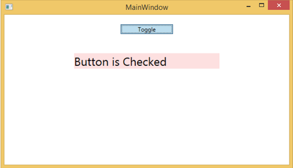
When you compile and execute the above code, it will produce the following window. When you click the button, it will change the color and update the text block.
We recommend that you execute the above example code and try the other properties and events of ToggleButton.