- Windows 10 Development Tutorial
- Windows 10 - Home
- Windows 10 - Introduction
- Windows 10 – UWP
- Windows 10 – First App
- Windows 10 - Store
- Windows 10 - XAML Controls
- Windows 10 - Data Binding
- Windows 10 - XAML Performance
- Windows 10 - Adaptive Design
- Windows 10 - Adaptive UI
- Windows 10 - Adaptive Code
- Windows 10 - File Management
- Windows 10 - SQLite Database
- Windows 10 – Communication
- Windows 10 - App Localization
- Windows 10 - App Lifecycle
- Windows 10 - Background Execution
- Windows 10 - APP Services
- Windows 10 - Web Platform
- Windows 10 - Connected Experience
- Windows 10 - Navigation
- Windows 10 - Networking
- Windows 10 - Cloud Services
- Windows 10 - Live Tiles
- Windows 10 - Sharing Contract
- Windows 10 - Porting to Windows
- Windows 10 Useful Resources
- Windows 10 - Quick Guide
- Windows 10 - Useful Resources
- Windows 10 - Discussion
Windows 10 Development - Quick Guide
Windows 10 Development - Introduction
This tutorial is designed for people who want to learn how to develop Windows 10 applications. In this tutorial, we are going to learn −
- Windows 10 application development
- Updates of the new OS released by Microsoft
- New features for the developers in the updates
A lot of interesting app scenarios are now possible that were not available to us in the first release. Microsoft has not only added new APIs, they have also extended the existing APIs.
Universal Windows app
A Universal Windows app was first introduced in Windows 8 as the Windows Runtime, which was built upon the Universal Application Platform.
Now, in Windows 10, the name of the Universal Application Platform has been changed to Universal Windows Platform (UWP). You can build modern and fully immersive apps by targeting Windows 10 devices for Windows Store such as PC, tablet, phone, etc.
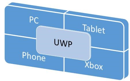
In Windows 10, you can easily develop applications to reach all the devices supported on Windows 10 with just −
- One API set
- One app package
- And one store
The Universal Windows Platform also supports different screen sizes and different interaction models such as touch pad, mouse & keyboard, a game controller, or a pen.
Characteristics of UWP apps
Here are some of the characteristics of Universal Windows apps, which make it superior to Windows 10.
You can target device families and not OS like Windows 8.1.
Apps are packaged and distributed using the .AppX packaging format, which ensures that your apps can be deployed and updated seamlessly.
You can submit your application to the Windows store and it will make it available on all device families, or only those devices you choose. You can easily manage all your apps for Windows devices in one place.
You can limit the availability of your application to the particular device family.
The core APIs of Universal Windows Platform (UWP) are the same across all Windows device families. So your app can run on all Windows 10 devices if it is uses only the core APIs.
With the help of Extension SDKs, you can light up your application for particular devices.
Development Choices
Universal Windows applications can be created in any of the following languages −
- C# or Visual Basic with XAML
- JavaScript with HTML
- C++ with DirectX and/or XAML
You can also write components in one language and use them in an application that is developed in another language.
Windows 10 Development - UWP
Windows Runtime (WinRT) is a platform-homogeneous application architecture, which supports development in C++/CX, C#, VB.NET and JavaScript. WinRT applications natively support both the x86 and ARM architectures. Some important features are.
It was first introduced in Windows Server 2012 in September 2012.
WinRT APIs provide access to all core platform features using JavaScript, C#, Visual Basic, and C++.
WinRT components support multiple languages and APIs such as native, managed and scripting languages.
Universal Windows Platform (UWP)
A Universal Windows app is built upon Universal Windows Platform (UWP), which was first introduced in Windows 8 as the Windows Runtime. In Windows 10, Universal Windows Platform (UWP) was introduced, which further advances the Windows Runtime (WinRT) model.
In Windows 8.1, WinRT, for the first time, was aligned between Windows Phone 8.1 applications and Windows 8.1 applications with the help of Universal Windows 8 apps to target both Windows phone and Windows application using a shared codebase.
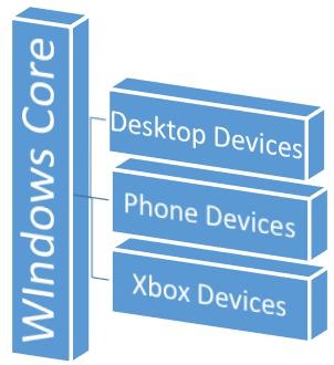
Windows 10 Unified Core, which is known as Windows Core now, has reached to a point where UWP, now, provides a common app platform available on every device that runs on Windows 10.
UWP not only can call the WinRT APIs that are common to all devices, but also APIs (including Win32 and .NET APIs) that are specific to the device family that the app is running on.
Devices Supported by Windows 10
Windows 8.1 and Windows Phone 8.1 apps target an OS; either Windows or Windows Phone. Windows 10 applications do not target an OS but they target one or more device families.
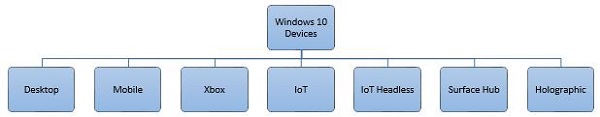
Device families have their own APIs as well, which add functionality for that particular device family. You can easily determine all the devices, within a device family, on which your applications can be installed and run from the Windows Store. Here is the hierarchical representation of the device family.
Advantages of UWP
Universal Windows Platform (UWP) provides a handful of things for developers. They are −
- One Operating System and One Unified Core for all the devices.
- One App Platform to run the applications across every family.
- One Dev Center to submit application and dashboard.
- One Store for all the devices.
Setup for UWP Development
The following steps need to be followed to start creating your own Universal Windows Platform (UWP) apps for Windows 10.
Windows 10 OS − UWP apps need the latest version of Windows to develop. You can also develop UWP applications on Windows 8.1 but there is no support for UI designer Window.
Windows 10 developer tools − In Visual studio 2015, you can design, code, test, and debug your UWP apps. You can download and install the free Microsoft Visual Studio Community 2015 from https://dev.windows.com/en-us/downloads
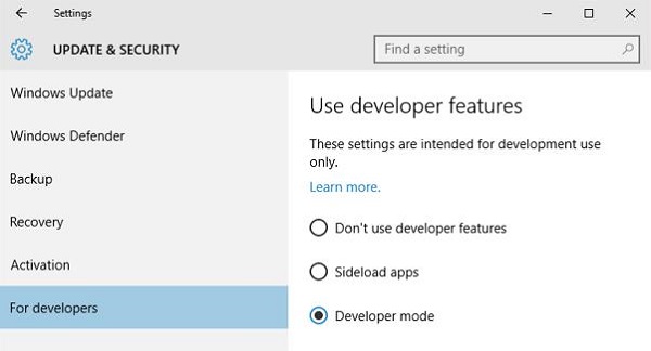
Enable development mode for Windows 10 −
Go to Start > Settings.
Select Update & security.
Then select "For developers".
Click on the Developer mode
For UWP apps, it is important to test your applications on devices.
Register as an app developer − You can start developing apps, but to submit your apps to the store, you need a developer account. You can create your developer account here https://msdn.microsoft.com/enus/library/windows/apps/bg124287.aspx
After following the above steps, you are now ready to start the development of a Universal Windows Platform (UWP) application.
Windows 10 Development - First App
In this chapter, we will be creating our first simple application "Hello world" in Universal Windows Platform (UWP) using XAML and C# on Windows 10. We will demonstrate how a single UWP application created in Visual Studio can be run and executed on any Windows 10 device.
Let us start creating the App by following the steps given below.
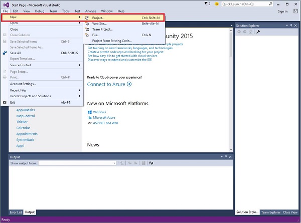
Launch Visual Studio 2015.
Click on the File menu and select New > Project.
The following New Project dialog window will be displayed. You can see the different types of templates on the left pane of the dialog box.
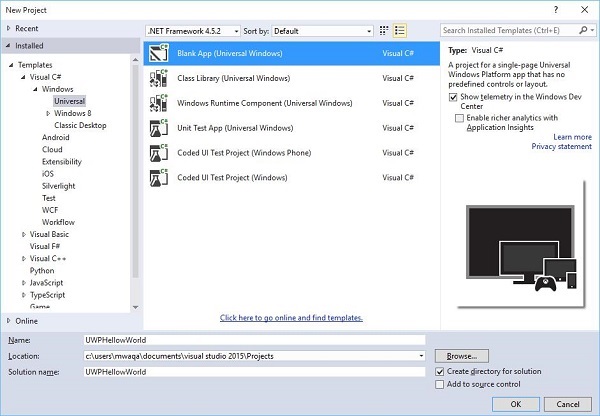
In the left pane, you can see the tree view. Select Universal template from Templates > Visual C# > Windows.
From the center pane, select the Blank App (Universal Windows) template
Give a name to the project by writing UWPHelloWorld in the Name field.
Click OK to create a new UWP project.
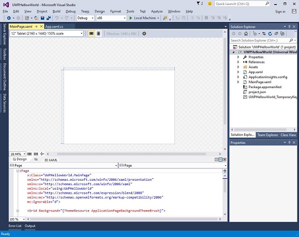
You can see the newly created project in the Solution Explorer.
This is a blank app but it contains many files, which is the minimum requirement for any UWP application.
MainPage.xaml and MainPage.xaml.cs run when you execute your application.
By default, MainPage.xaml file contains the following information.
<Page
   x:Class = ”UWPHellowWorld.MainPage”
   xmlns = ”http://schemas.microsoft.com/winfx/2006/xaml/presentation”
   xmlns:x = ”http://schemas.microsoft.com/winfx/2006/xaml”
   xmlns:local = ”using:UWPHellowWorld”
   xmlns:d = ”http://schemas.microsoft.com/expression/blend/2008”
   xmlns:mc = ”http://schemas.openxmlformats.org/markup-compatibility/2006”
   mc:Ignorable = ”d”>

   <Grid Background = ”{ThemeResource ApplicationPageBackgroundThemeBrush}”>
   </Grid>

</Page>
Given below is the default information available in MainPage.xaml.cs.
using System;
using System.Collections.Generic;
using System.IO;
using System.Linq;
using System.Runtime.InteropServices.WindowsRuntime;

using Windows.Foundation;
using Windows.Foundation.Collections;

using Windows.UI.Xaml;
using Windows.UI.Xaml.Controls;
using Windows.UI.Xaml.Controls.Primitives;
using Windows.UI.Xaml.Data;
using Windows.UI.Xaml.Input;
using Windows.UI.Xaml.Media;
using Windows.UI.Xaml.Navigation;

// The Blank Page item template is documented at
   http://go.microsoft.com/fwlink/?LinkId=402352&clcid=0x409

namespace UWPHellowWorld {

   /// <summary>
      /// An empty page that can be used on its own or navigated to within a Frame.
   /// </summary>

   public sealed partial class MainPage : Page {
      public MainPage(){
         this.InitializeComponent();
      }
   }

}
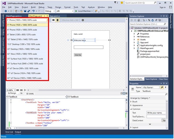
Let us add some Text Blocks, a textbox, and a button as shown in the XAML code below.
<Page
   x:Class = ”UWPHellowWorld.MainPage”
   xmlns = ”http://schemas.microsoft.com/winfx/2006/xaml/presentation”
   xmlns:x = ”http://schemas.microsoft.com/winfx/2006/xaml”
   xmlns:local = ”using:UWPHellowWorld”
   xmlns:d = ”http://schemas.microsoft.com/expression/blend/2008”
   xmlns:mc = ”http://schemas.openxmlformats.org/markup-compatibility/2006”
   mc:Ignorable = ”d”>

   <Grid Background = ”{ThemeResource ApplicationPageBackgroundThemeBrush}”>

      <StackPanel HorizontalAlignment = ”Center”>
         <TextBlock Text = ”Hello, world!”  Margin = ”20”  Width = ”200”
            HorizontalAlignment = ”Left”/>

         <TextBlock Text = ”Write your name.” Margin = ”20” Width = ”200”
            HorizontalAlignment = ”Left”/>

         <TextBox x:Name = ”txtbox”  Width = ”280” Margin = ”20”
            HorizontalAlignment = ”Left”/>

         <Button x:Name = ”button” Content = ”Click Me” Margin = ”20”
            Click = ”button_Click”/>

         <TextBlock x:Name = ”txtblock” HorizontalAlignment = ”Left”
            Margin = ”20”/>
      </StackPanel>

   </Grid>

</Page>
- Given below is the click-event button in C#.
using System;
using System.Collections.Generic;
using System.IO;
using System.Linq;

using System.Runtime.InteropServices.WindowsRuntime;
using Windows.Foundation;
using Windows.Foundation.Collections;

using Windows.UI.Xaml;
using Windows.UI.Xaml.Controls;
using Windows.UI.Xaml.Controls.Primitives;
using Windows.UI.Xaml.Data;
using Windows.UI.Xaml.Input;
using Windows.UI.Xaml.Media;
using Windows.UI.Xaml.Navigation;

// The Blank Page item template is documented at
   http://go.microsoft.com/fwlink/?LinkId=402352&clcid=0x409

namespace UWPHellowWorld {

   /// <summary>
      /// An empty page that can be used on its own or navigated to within a Frame.
   /// </summary>

   public sealed partial class MainPage : Page {
      public MainPage() {
         this.InitializeComponent();
      }

      private void button_Click(object sender, RoutedEventArgs e) {
         if (txtbox.Text != “”)
            txtblock.Text = “Hello: “ + txtbox.Text;
         else
            txtblock.Text = “You have not write your name”;
      }

   }

}
In the UWP project, device preview option is available on the Design Window, with the help of which you can change the layout easily, to fit into the screen size of all the devices in a device family you are targeting for your application.
You can run and test your app either on a local machine, a simulator or an emulator, or on a remote device. You can select the target device from the following menu as shown below −
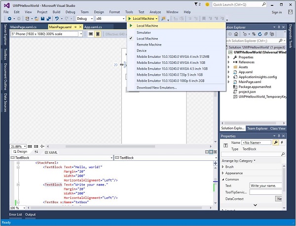
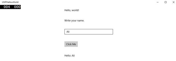
Let us run the above code on a local machine and you will see the following window. Now, write any name in the text box and click the button Click Me.
Now, if you want to test your app on an emulator, you can select a particular emulator from the menu and execute your application. You will see the following emulator −
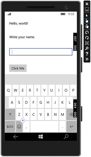
We recommend you to execute the above application with different devices.
Windows 10 Development - Store
The benefit of Windows Store for developers is that you can sell your application. You can submit your single application for every device family.
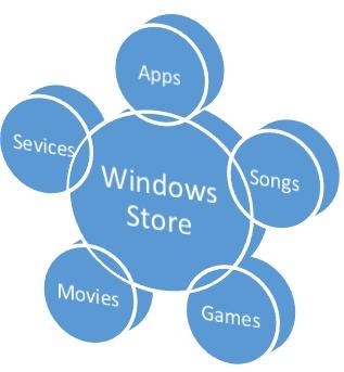
The Windows 10 Store is where applications are submitted, so that a user can find your application.
In Windows 8, the Store was limited to application only and Microsoft provides many stores i.e. Xbox Music Store, Xbox Game Store etc.
In Windows 8, all these were different stores but in Windows 10, it is called Windows Store. It is designed in a way where users can find a full range of apps, games, songs, movies, software and services in one place for all Windows 10 devices.
Monetization
Monetization means selling your app across desktop, mobile, tablets and other devices. There are various ways that you can sell your applications and services on Windows Store to earn some money.
You can select any of the following methods −
The simplest way is to submit your app on store with paid download options.
The Trails option, where users can try your application before buying it with limited functionality.
Add advertisements to your apps with Microsoft Advertising.
Microsoft Advertising
When you add Ads to your application and a user clicks on that particular Ad, then the advertiser will pay you the money. Microsoft Advertising allows developers to receive Ads from Microsoft Advertising Network.
The Microsoft Advertising SDK for Universal Windows apps is included in the libraries installed by Visual Studio 2015.
You can also install it from visualstudiogallery
Now, you can easily integrate video and banner Ads into your apps.
Let us have a look at a simple example in XAML, to add a banner Ad in your application using AdControl.
Create a new Universal Windows blank app project with the name UWPBannerAd.
In the Solution Explorer, right click on References
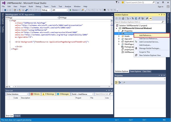
Select Add References, which will open the Reference Manager dialog.
From the left pane, select Extensions under Universal Windows option and check the Microsoft Advertising SDK for XAML.
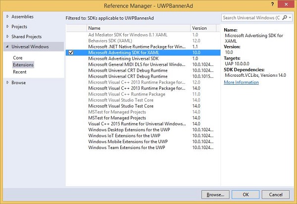
Click OK to Continue.
Given below is the XAML code in which AdControl is added with some properties.
<Page
   x:Class = "UWPBannerAd.MainPage"
   xmlns = "http://schemas.microsoft.com/winfx/2006/xaml/presentation"
   xmlns:x = "http://schemas.microsoft.com/winfx/2006/xaml"
   xmlns:local = "using:UWPBannerAd"
   xmlns:d = "http://schemas.microsoft.com/expression/blend/2008"
   xmlns:mc = "http://schemas.openxmlformats.org/markup-compatibility/2006"
   xmlns:UI = "using:Microsoft.Advertising.WinRT.UI"
   mc:Ignorable = "d">

   <Grid Background = "{ThemeResource ApplicationPageBackgroundThemeBrush}">
      <StackPanel HorizontalAlignment = "Center">
         <UI:AdControl ApplicationId = "d25517cb-12d4-4699-8bdc-52040c712cab"
            AdUnitId = "10043121" HorizontalAlignment = "Left" Height = "580"
            VerticalAlignment = "Top" Width = "800"/>
      </StackPanel>
   </Grid>

</Page>
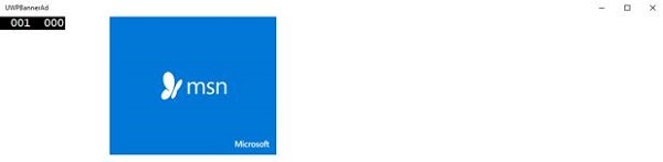
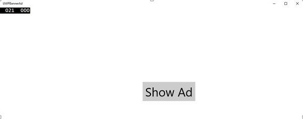
When the above code is compiled and executed on a local machine, you will see the following window with MSN banner on it. When you click this banner, it will open the MSN site.
You can also add a video banner in your application. Let us consider another example in which when the Show ad button is clicked, it will play the video advertisement of Xbox One.
Given below is the XAML code in which we demonstrate how a button is added with some properties and events.
<Page
   x:Class = "UWPBannerAd.MainPage"
   xmlns = "http://schemas.microsoft.com/winfx/2006/xaml/presentation"
   xmlns:x = "http://schemas.microsoft.com/winfx/2006/xaml"
   xmlns:local = "using:UWPBannerAd"
   xmlns:d = "http://schemas.microsoft.com/expression/blend/2008"
   xmlns:mc = "http://schemas.openxmlformats.org/markup-compatibility/2006"
   xmlns:UI = "using:Microsoft.Advertising.WinRT.UI"
   mc:Ignorable = "d">

   <Grid Background = "{ThemeResource ApplicationPageBackgroundThemeBrush}">
      <StackPanel HorizontalAlignment = "Center">
         <Button x:Name = "showAd" Content = "Show Ad" HorizontalAlignment = "Left"
            Margin = "138,296,0,0" VerticalAlignment = "Top" FontSize = "48"
            Click = "showAd_Click"/>
      </StackPanel>
   </Grid>

</Page>
Given below is the click event implementation in C#.
using Microsoft.Advertising.WinRT.UI;
using Windows.UI.Xaml;
using Windows.UI.Xaml.Controls;

// The Blank Page item template is documented at
   http://go.microsoft.com/fwlink/?LinkId=402352&clcid=0x409

namespace UWPBannerAd {

   /// <summary>
      /// An empty page that can be used on its own or navigated to within a Frame.
   /// </summary>

   public sealed partial class MainPage : Page {
      InterstitialAd videoAd = new InterstitialAd();

      public MainPage() {
         this.InitializeComponent();
      }

      private void showAd_Click(object sender, RoutedEventArgs e) {
         var MyAppId = "d25517cb-12d4-4699-8bdc-52040c712cab";
         var MyAdUnitId = "11388823";
         videoAd.AdReady += videoAd_AdReady;
         videoAd.RequestAd(AdType.Video, MyAppId, MyAdUnitId);
      }

      void videoAd_AdReady(object sender, object e){
         if ((InterstitialAdState.Ready) == (videoAd.State)) {
            videoAd.Show();
         }
      }

   }

}
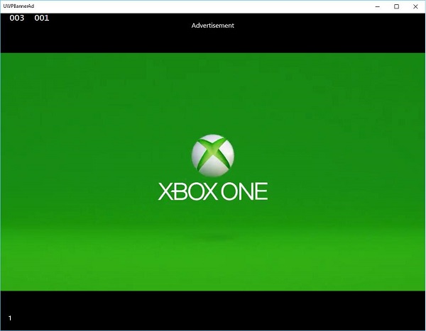
When the above code is compiled and executed on a local machine, you will see the following window, which contains a Show Ad button.
Now, when you click on the Show Ad button, it will play the video on your app.
Windows 10 Development - XAML Controls
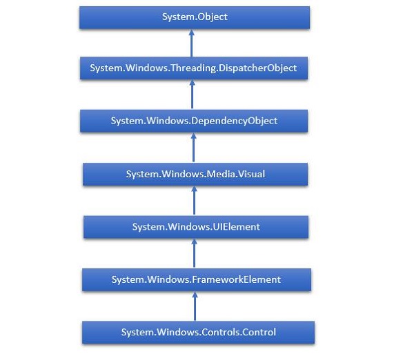
XAML Stands for Extensible Application Markup Language. It is a User Interface framework and it offers an extensive library of controls that support UI development for Windows. Some of them have a visual representation such as a Button, Textbox and TextBlock etc; while other controls are used as the containers for other controls or content, such as images etc. All the XAML controls are inherited from “System.Windows.Controls.Control”.
XAML Emerging Story
XAML is used in many important Microsoft platforms such as the Windows Presentation Foundation (WPF), the Silverlight and now, Windows apps. Now, Microsoft Office 2016 is also a family of UWP apps. XAML is a rich Platform, which provides very cool features and controls that can be used in UWP applications.
The complete inheritance hierarchy of controls is shown below.
Layout Controls
Layout of Controls is very important and critical for application usability. It is used to arrange a group of GUI elements in your application. There are certain important things to consider while selecting the layout panels −
- Positions of the child elements.
- Sizes of the child elements.
- Layering of overlapping child elements on top of each other.
A list of Layout Controls is given below −
| S.No. | Controls & Description |
|---|---|
| 1 | StackPanel StackPanel is a simple and useful layout panel in XAML. In stack panel, child elements can be arranged in a single line either horizontally or vertically based on orientation property. |
| 2 | WrapPanel In WrapPanel, child elements are positioned in sequential order from left to right or from top to bottom based on the orientation property. The only difference between StackPanel and WrapPanel is that it does not stack all the child elements into a single line but it wraps the remaining elements to another line if there is no space left. |
| 3 | DockPanel DockPanel defines an area to arrange child elements relative to each other, either horizontally or vertically. With DockPanel you can easily dock child elements to top, bottom, right, left and center with Dock property. With LastChildFill property, the last child element fill the remaining space regardless of any other dock value when set for that element. |
| 4 | Canvas Canvas is the basic layout panel in which child elements can be positioned explicitly using coordinates that are relative to any side such as left, right, top and bottom. Typically Canvas is used for 2D graphic elements (such as Ellipse, Rectangle etc.) but not for UI elements because specifying absolute coordinates give trouble while resizing, localizing or scaling in an XAML application. |
| 5 | Grid Grid provides a flexible area, which consists of rows and columns. In Grid, child elements can be arranged in a tabular form. Elements can be added to any specific row and column by using Grid.Row and Grid.Column properties. |
| 6 | SplitView SplitView represents a container with two views; one view for the main content and another view that is typically used for navigation commands. |
| 7 | RelativePanel RelativePanel defines an area within which you can position and align child objects in relation to each other or the parent panel. |
| 8 | ViewBox ViewBox defines a content decorator that can stretch and scale a single child to fill the available space. |
| 9 | FlipView FlipView represents an item’s control that displays one item at a time, and enables "flip" behavior for traversing its collection of items. |
| 10 | GridView GridView is a control that presents a collection of items in rows and columns and can be scrolled horizontally. |
UI Controls
Here is a list of UI Controls, which are visible to the end users.
| S.No. | UI Controls & Description |
|---|---|
| 1 | Button A control that responds to user input |
| 2 | Calendar Represents a control that enables a user to select a date by using a visual calendar display. |
| 3 | CheckBox A control that a user can select or clear. |
| 4 | ComboBox A drop-down list of items, a user can select from. |
| 5 | ContextMenu Gets or sets the context menu element that should appear whenever the context menu is requested through user interface (UI) from within this element. |
| 6 | DataGrid Represents a control that displays data in a customizable grid. |
| 7 | DatePicker A control that lets a user select a date. |
| 8 | Dialogs An application may also display additional windows to do the user to gather or display important information. |
| 9 | Flyout Represents a control that displays lightweight UI that is either information, or requires user interaction. Unlike a dialog, a Flyout can be light dismissed by clicking or tapping outside of it, pressing the device’s back button, or pressing the ‘Esc’ key. |
| 10 | Image A control that presents an image. |
| 11 | ListBox A control that presents an inline list of items that the user can select from. |
| 12 | Menus Represents a Windows menu control that enables you to hierarchically organize the elements associated with commands and event handlers. |
| 13 | MenuFlyout Represents a flyout that displays a menu of commands. |
| 14 | PasswordBox A control for entering passwords. |
| 15 | Popup Displays content on top of the existing content, within the bounds of the application window. |
| 16 | ProgressBar A control that indicates the progress by displaying a bar. |
| 17 | ProgressRing A control that indicates the indeterminate progress by displaying a ring. |
| 18 | RadioButton A control that allows a user to select a single option from a group of options. |
| 19 | RichEditBox A control that lets a user edit rich text documents with content like formatted text, hyperlinks, and images. |
| 20 | ScrollViewer A container control that lets the user pan and zoom its content. |
| 21 | SearchBox A control that lets a user enter search queries. |
| 22 | Slider A control that lets the user select from a range of values by moving a Thumb control along a track. |
| 23 | TextBlock A control that displays the text. |
| 24 | TimePicker A control that lets a user set a time value. |
| 25 | ToggleButton A button that can be toggled between 2 states. |
| 26 | ToolTip A pop-up window that displays information for an element. |
| 27 | Window The root window which provides minimize/maximize option, Title bar, border and close button. |
Given below is an example, which contains different types of controls in a SplitView. In XAML file, different controls are created with some properties and events.
<Page
x:Class = "UWPControlsDemo.MainPage"
xmlns = "http://schemas.microsoft.com/winfx/2006/xaml/presentation"
xmlns:x = "http://schemas.microsoft.com/winfx/2006/xaml"
xmlns:local = "using:UWPControlsDemo"
xmlns:d = "http://schemas.microsoft.com/expression/blend/2008"
xmlns:mc = "http://schemas.openxmlformats.org/markup-compatibility/2006"
mc:Ignorable = "d">
<Grid Background = "{ThemeResource ApplicationPageBackgroundThemeBrush}">
<StackPanel Margin = "20">
<StackPanel Orientation = "Horizontal">
<ToggleButton x:Name = "HamburgerButton" FontFamily = "Segoe MDL2 Assets"
Content = "" Checked = "HandleCheck" Unchecked = "HandleUnchecked"
HorizontalAlignment = "Center"/>
<AppBarButton Icon = "Like" />
<AppBarButton Icon = "Dislike" />
<AppBarSeparator/>
<AppBarButton Icon = "Accept" />
<AppBarButton Icon = "Add" />
</StackPanel>
<SplitView x:Name = "splitView" DisplayMode = "Inline"
OpenPaneLength = "296">
<SplitView.Pane>
<StackPanel>
<TextBlock Text = "SplitView Pane" FontSize = "36"
VerticalAlignment = "Center" HorizontalAlignment = "Center"
Margin = "10"/>
<Button Content = "Options" Margin = "10">
<Button.Flyout>
<MenuFlyout>
<MenuFlyoutItem Text = "Reset"/>
<MenuFlyoutSeparator/>
<MenuFlyoutItem Text = "Repeat"/>
<MenuFlyoutItem Text = "Shuffle"/>
</MenuFlyout>
</Button.Flyout>
</Button>
</StackPanel>
</SplitView.Pane>
<StackPanel>
<TextBlock Text = "SplitView Content" FontSize = "36"
VerticalAlignment = "Center" HorizontalAlignment = "Center"
Margin = "10"/>
<Border BorderThickness = "3" BorderBrush = "Red" Margin = "5">
<StackPanel Orientation = "Horizontal">
<TextBlock Text = "Hyperlink example" Margin = "5"/>
<HyperlinkButton Content = "www.microsoft.com"
NavigateUri = "http://www.microsoft.com"/>
</StackPanel>
</Border>
<RelativePanel BorderBrush = "Red" BorderThickness = "2"
CornerRadius = "10" Padding = "12" Margin = "5">
<TextBlock x:Name = "txt" Text = "Relative Panel example"
RelativePanel.AlignLeftWithPanel = "True"
Margin = "5,0,0,0"/>
<TextBox x:Name = "textBox1" RelativePanel.RightOf = "btn"
Margin = "5,0,0,0"/>
<Button x:Name = "btn" Content = "Name"
RelativePanel.RightOf = "txt" Margin = "5,0,0,0"/>
</RelativePanel>
<FlipView Height = "400" Margin = "10" Width = "400">
<Image Source = "Images/DSC_0104.JPG"/>
<Image Source = "Images/DSC_0080.JPG"/>
<Image Source = "Images/DSC_0076.JPG"/>
<Image Source = "Images/thGTF7BWGW.jpg"/>
</FlipView>
</StackPanel>
</SplitView>
</StackPanel>
</Grid>
</Page>
Given below is the Events implementation in C#.
using Windows.UI.Xaml;
using Windows.UI.Xaml.Controls;
using Windows.UI.Xaml.Media;

// The Blank Page item template is documented at
   http://go.microsoft.com/fwlink/?LinkId=402352&clcid=0x409

namespace UWPControlsDemo {

   /// <summary>
      /// An empty page that can be used on its own or navigated to within a Frame.
   /// </summary>

   public sealed partial class MainPage : Page {

      public MainPage() {
         this.InitializeComponent();
      }

      private void HandleCheck(object sender, RoutedEventArgs e) {
         splitView.IsPaneOpen = true;
      }

      private void HandleUnchecked(object sender, RoutedEventArgs e) {
         splitView.IsPaneOpen = false;
      }

   }

}
When the above code is compiled and executed, you will see the following window −
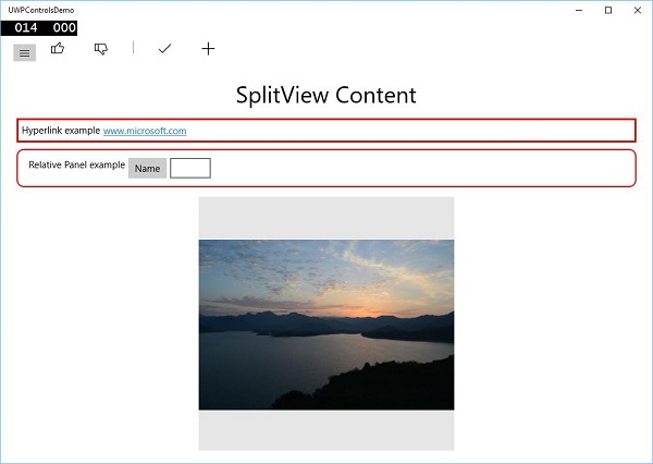
When you click on the hamburger button on the top left side, it will open/close the SplitView pane.
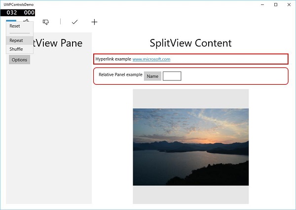
In the SplitView Pane, you can see the Flyout, MenuFlyout and FlipView controls.
In the SplitView Content, you can see the Hyperlink, Relative Panel, ViewBox and other buttons and textbox controls.
Windows 10 Development - Data Binding
Data binding is a mechanism in XAML application, which provides a simple and easy way for Windows Runtime apps using partial classes to display and interact with data. The management of data is entirely separated from the way data is displayed in this mechanism.
Data binding allows the flow of data between UI elements and data object on user interface. When a binding is established and the data or your business model changes, then it reflects the updates automatically to the UI elements and vice versa. It is also possible to bind, not to a standard data source, but rather to another element on the page. Data binding can be −
- One-way data binding
- Two-way data binding
- Element Binding
One-way Data Binding
In one-way binding, the data is bound from its source, (the object that holds the data) to its target (the object that displays the data).
Let us have a look at a simple example of one way data binding. Given below is the XAML code in which four text blocks are created with some properties.
<Page
   x:Class = "OneWayDataBinding.MainPage"
   xmlns = "http://schemas.microsoft.com/winfx/2006/xaml/presentation"
   xmlns:x = "http://schemas.microsoft.com/winfx/2006/xaml"
   xmlns:local = "using:OneWayDataBinding"
   xmlns:d = "http://schemas.microsoft.com/expression/blend/2008"
   xmlns:mc = "http://schemas.openxmlformats.org/markup-compatibility/2006"
   mc:Ignorable = "d">

   <Grid Background = "{ThemeResource ApplicationPageBackgroundThemeBrush}">
      <StackPanel Name = "Display">
         <StackPanel Orientation = "Horizontal" Margin = "50, 50, 0, 0">
            <TextBlock Text = "Name: " Margin = "10" Width = "100"/>
            <TextBlock Margin = "10" Width = "100" Text = "{Binding Name}"/>
         </StackPanel>

         <StackPanel Orientation = "Horizontal" Margin = "50,0,50,0">
            <TextBlock Text = "Title: " Margin = "10" Width = "100"/>
            <TextBlock Margin = "10" Width = "200" Text = "{Binding Title}" />
         </StackPanel>

      </StackPanel>
   </Grid>

</Page>
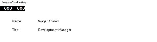
The Text properties of two text blocks are set to “Name” and “Title” statically, while the other two Text properties of the text blocks are bind to “Name” and “Title” which are class variables of Employee class as shown below.
using Windows.UI.Xaml.Controls;

// The Blank Page item template is documented at
   http://go.microsoft.com/fwlink/?LinkId=402352&clcid=0x409

namespace OneWayDataBinding {

   /// <summary>
      /// An empty page that can be used on its own or navigated to within a Frame.
   /// </summary>

   public sealed partial class MainPage : Page {
      public MainPage(){
         this.InitializeComponent();
         DataContext = Employee.GetEmployee();
      }
   }

   public class Employee {
      public string Name { get; set; }
      public string Title { get; set; }

      public static Employee GetEmployee() {
         var emp = new Employee() {
            Name = "Waqar Ahmed",
            Title = "Development Manager"
         };

         return emp;
      }

   }
}
In the Employee class, we have variables Name and Title and one static method in which the employee object is initialized and will return that employee object. Therefore, we are binding to the property, Name and Title, but we have not yet selected the object to which the property belongs. The easy way is to assign an object to DataContext, whose properties we are binding in the MainPage Constructor.
When you run this application, you can immediately see in your MainWindow that you have successfully bound to the Name and Title of that Employee object.
Two-way Data Binding
In Two-Way Binding, the user is able to modify the data through the user interface and have that data updated in the source. For example, if the source changes while the user is looking at the view, you want the view to be updated.
Let us have a look at the below given example in which two labels, two text boxes and one button are created with some properties and events.
<Page
   x:Class = "TwoWayDataBinding.MainPage"
   xmlns = "http://schemas.microsoft.com/winfx/2006/xaml/presentation"
   xmlns:x = "http://schemas.microsoft.com/winfx/2006/xaml"
   xmlns:local = "using:TwoWayDataBinding"
   xmlns:d = "http://schemas.microsoft.com/expression/blend/2008"
   xmlns:mc = "http://schemas.openxmlformats.org/markup-compatibility/2006"
   mc:Ignorable = "d">

   <Grid Background = "{ThemeResource ApplicationPageBackgroundThemeBrush}">

      <Grid.RowDefinitions>
         <RowDefinition Height = "Auto" />
         <RowDefinition Height = "Auto" />
         <RowDefinition Height = "*" />
      </Grid.RowDefinitions>

      <Grid.ColumnDefinitions>
         <ColumnDefinition Width = "Auto" />
         <ColumnDefinition Width = "200" />
      </Grid.ColumnDefinitions>

      <TextBlock Name = "nameLabel" Margin = "200,20,0,0">Name:</TextBlock>

      <TextBox Name = "nameText" Grid.Column = "1" Margin = "10,20,0,0"
         Text = "{Binding Name, Mode = TwoWay}"/>

      <TextBlock Name = "ageLabel" Margin = "200,20,0,0"
         Grid.Row = "1">Age:</TextBlock>

      <TextBox Name = "ageText" Grid.Column = "1" Grid.Row = "1" Margin = "10,20,0,0"
         Text = "{Binding Age, Mode = TwoWay}"/>

      <StackPanel Grid.Row = "2" Grid.ColumnSpan = "2">
         <Button Content = "Display" Click = "Button_Click"
            Margin = "200,20,0,0"/>
         <TextBlock x:Name = "txtblock" Margin = "200,20,0,0"/>
      </StackPanel>

   </Grid>

</Page>
We can observe the following −
The Text properties of both the text boxes bind to the "Name" and "Age" which are class variables of Person class as shown below.
In Person class, we have just two variables − Name and Age, and its object is initialized in the MainWindow class.
In XAML code, we are binding to the property − Name and Age, but we have not selected the object to which the property belongs.
The easier way is to assign an object to the DataContext, whose properties we are binding in the C# code as shown below in the MainWindowconstructor.
using Windows.UI.Xaml;
using Windows.UI.Xaml.Controls;

// The Blank Page item template is documented at
   http://go.microsoft.com/fwlink/?LinkId=402352&clcid=0x409

namespace TwoWayDataBinding {

   /// <summary>
      /// An empty page that can be used on its own or navigated to within a Frame.
   /// </summary>

   public sealed partial class MainPage : Page {
      Person person = new Person { Name = "Salman", Age = 26 };

      public MainPage() {
         this.InitializeComponent();
         this.DataContext = person;
      }

      private void Button_Click(object sender, RoutedEventArgs e) {
         string message = person.Name + " is " + person.Age + " years old";
         txtblock.Text = message;
      }

   }

   public class Person {
      private string nameValue;

      public string Name {
         get { return nameValue; }
         set { nameValue = value; }
      }

      private double ageValue;

      public double Age {
         get { return ageValue; }

         set {
            if (value != ageValue) {
               ageValue = value;
            }
         }
      }

   }

}
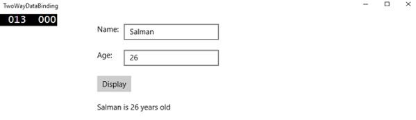
When the above code is compiled and executed, you will see the following window. Click the Display button.
Let us change the Name and Age and click the Display button again.
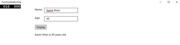
You can see that in click button ‘Display’, the text of the textboxes are not used to show the data on TextBlock but the class variables are used.
I recommend you to execute the above code with both cases for better understanding.
Element Binding
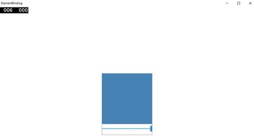
It is also possible to bind, not to a standard data source, but rather to another element on the page. Let us create an application called ElementBinding in which a Slider and a Rectangle are created and with the slider, the rectangle width and height are bound. Given below is the code in XAML.
<Page
   x:Class = "ElementBinding.MainPage"
   xmlns = "http://schemas.microsoft.com/winfx/2006/xaml/presentation"
   xmlns:x = "http://schemas.microsoft.com/winfx/2006/xaml"
   xmlns:local = "using:ElementBinding"
   xmlns:d = "http://schemas.microsoft.com/expression/blend/2008"
   xmlns:mc = "http://schemas.openxmlformats.org/markup-compatibility/2006"
   mc:Ignorable = "d">

   <Grid Background = "{ThemeResource ApplicationPageBackgroundThemeBrush}">
      <StackPanel VerticalAlignment = "Center" HorizontalAlignment = "Center">

         <Rectangle Height = "100" Width = "100" Fill = "SteelBlue"
            RenderTransformOrigin = "0.5,0.5" Margin = "50">

            <Rectangle.RenderTransform>
               <CompositeTransform ScaleX = "{Binding Value, ElementName = MySlider}"
                  ScaleY = "{Binding Value, ElementName = MySlider}"/>
            </Rectangle.RenderTransform>

         </Rectangle>

         <Slider Minimum = ".5" Maximum = "2.0" StepFrequency = ".1"
            x:Name = "MySlider" />

      </StackPanel>
   </Grid>

</Page>
When the above code is compiled and executed, you will see the following window.
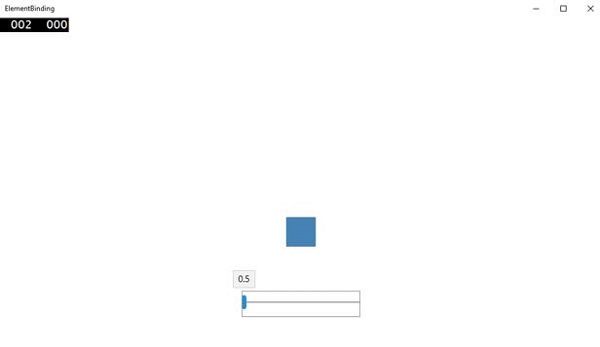
With a slider, you can change the size of the rectangle as shown below.
Windows 10 Dev - XAML Performance
Performance of applications such as how quickly your application appears at the startup or navigates to show the next content etc. is very important.
The performance of an application can be impacted by many things, including the ability of XAML rendering engine to parse all the XAML code you have in your application. XAML is a very powerful tool for creating UI, but it can be more robust by using the new techniques, which are now available in Windows 10 applications.
For example, in your applications, there are certain things, which you want to show when the page is loaded and then do not need it later. It is also possible that at the startup you do not need all the UI elements to be loaded.
In Windows 10 apps, some new features are added in XAML, which improved the XAML performance.
The performance of any Universal Windows application can be improved by the following techniques;
- Progressive Rendering
- Deferred Loading
Progressive Rendering
In Windows 10, two new and very cool features are introduced in XAML. They are −
x:Bind
It is a new syntax introduced in XAML used for binding, which works almost the same way as the Binding syntax does. x:Bind has two key differences; it provides compile-time syntax validation and better performance.
X:Phase
It provides the ability to prioritize the rendering of XAML controls within a data template. Each UI element may have only one phase specified. If so, that will apply to all the bindings on the element. If a phase is not specified, phase 0 is assumed.
In Universal Windows Platform (UWP) applications, these two new features provide performance improvements. It can be also used in existing Windows 8.x applications that migrate to Windows 10.
Given below is an example in which the employee objects are bound with GridView by using x:Bind key word.
<Page
   x:Class = "XAMLPhase.MainPage"
   xmlns = "http://schemas.microsoft.com/winfx/2006/xaml/presentation"
   xmlns:x = "http://schemas.microsoft.com/winfx/2006/xaml"
   xmlns:local = "using:XAMLPhase"
   xmlns:d = "http://schemas.microsoft.com/expression/blend/2008"
   xmlns:mc = "http://schemas.openxmlformats.org/markup-compatibility/2006"
   mc:Ignorable = "d">

   <Grid Background = "{ThemeResource ApplicationPageBackgroundThemeBrush}">
      <GridView Name = "Presidents" ItemsSource = "{Binding}" Height = "300"
         Width = "400" Margin = "50">

         <GridView.ItemTemplate>
            <DataTemplate x:DataType = "local:Employee">

               <StackPanel Orientation = "Horizontal" Margin = "2">
                  <TextBlock Text = "{x:Bind Name}" Width = "95" Margin = "2" />
                  <TextBlock Text = "{x:Bind Title}" Width = "95" Margin = "2"
                     x:Phase = "1"/>
               </StackPanel>

            </DataTemplate>
         </GridView.ItemTemplate>

      </GridView>

   </Grid>

</Page>
In the above XAML code, x:Phase = "1" is defined with Title. Therefore, in the first phase, Name will be rendered and then Title will be rendered.
Given below is the Employee class implementation in C#.
using System.Collections.ObjectModel;
using System.ComponentModel;
using System.Runtime.CompilerServices;
using Windows.UI.Xaml.Controls;

// The Blank Page item template is documented at
   http://go.microsoft.com/fwlink/?LinkId=402352&clcid=0x409

namespace XAMLPhase {

   /// <summary>
      /// An empty page that can be used on its own or navigated to within a Frame.
   /// </summary>

   public sealed partial class MainPage : Page {
      public MainPage() {
         this.InitializeComponent();
         DataContext = Employee.GetEmployees();
      }
   }

   public class Employee : INotifyPropertyChanged {
      private string name;

      public string Name {
         get { return name; }

         set {
            name = value;
            RaiseProperChanged();
         }
      }

      private string title;

      public string Title {
         get { return title; }

         set {
            title = value;
            RaiseProperChanged();
         }
      }

      public static Employee GetEmployee() {

         var emp = new Employee() {
            Name = "Waqas",
            Title = "Software Engineer"
         };

         return emp;
      }

      public event PropertyChangedEventHandler PropertyChanged;

      private void RaiseProperChanged(
         [CallerMemberName] string caller = "") {

         if (PropertyChanged != null) {
            PropertyChanged(this, new PropertyChangedEventArgs(caller));
         }

      }

      public static ObservableCollection<Employee> GetEmployees() {
         var employees = new ObservableCollection<Employee>();

         employees.Add(new Employee() { Name = "Ali", Title = "Developer" });
         employees.Add(new Employee() { Name = "Ahmed", Title = "Programmer" });
         employees.Add(new Employee() { Name = "Amjad", Title = "Desiner" });
         employees.Add(new Employee() { Name = "Waqas", Title = "Programmer" });
         employees.Add(new Employee() { Name = "Bilal", Title = "Engineer" });
         employees.Add(new Employee() { Name = "Waqar", Title = "Manager" });

         return employees;
      }

   }

}
When the above given code is executed, you will see the following window.
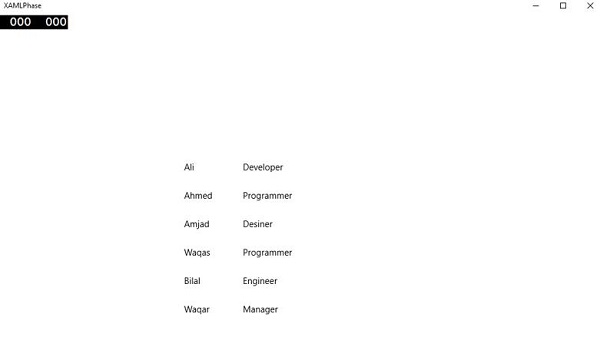
The X:Phase with x:Bind is used to render the ListView and GridView items incrementally and improve the panning experience.
Deferred Loading
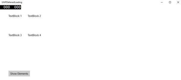
Deferred loading is a technique, which can be used to minimize the startup loading time by reducing the number of XAML UI elements at the startup of an application. If your application contains 30 UI elements and the user does not need all these elements at the startup, all those elements, which are not required can save some loading time by deferring.
x:DeferLoadStrategy = "Lazy" delays the creation of an element and its children, which decreases startup time but it slightly increases memory usage.
The deferred element can be realized/created by Calling FindName with the name that was defined on the element.
Once a deferred element is created, several things will happen −
The Loaded event on the element will be raised.
Any bindings on the element will be evaluated.
If the application is registered to receive property change notifications on the property containing the deferred element(s), the notification will be raised.
Given below is an example in which x:DeferLoadStrategy = "Lazy" is used for grid which contains four text blocks and will not be loaded at the startup of your application, until you load it.
<Page
   x:Class = "UWPDeferredLoading.MainPage"
   xmlns = "http://schemas.microsoft.com/winfx/2006/xaml/presentation"
   xmlns:x = "http://schemas.microsoft.com/winfx/2006/xaml"
   xmlns:local = "using:UWPDeferredLoading"
   xmlns:d = "http://schemas.microsoft.com/expression/blend/2008"
   xmlns:mc = "http://schemas.openxmlformats.org/markup-compatibility/2006"
   mc:Ignorable = "d">

   <Grid Background = "{ThemeResource ApplicationPageBackgroundThemeBrush}">
      <Grid x:Name = "DeferredGrid" x:DeferLoadStrategy = "Lazy" Margin = "50">
         <Grid.RowDefinitions>
            <RowDefinition Height = "Auto" />
            <RowDefinition Height = "Auto" />
         </Grid.RowDefinitions>

         <Grid.ColumnDefinitions>
            <ColumnDefinition Width = "Auto" />
            <ColumnDefinition Width = "Auto" />
         </Grid.ColumnDefinitions>

         <TextBlock Height = "100" Width = "100" Text = "TextBlock 1" Margin = "0,0,4,4" />

         <TextBlock Height = "100" Width = "100" Text = "TextBlock 2"
            Grid.Column = "1" Margin = "4,0,0,4" />

         <TextBlock Height = "100" Width = "100" Text = "TextBlock 3"
            Grid.Row = "1" Margin = "0,4,4,0" />

         <TextBlock Height = "100" Width = "100" Text = "TextBlock 4"
            Grid.Row = "1" Grid.Column = "1" Margin = "4,4,0,0" />
      </Grid>

      <Button x:Name = "RealizeElements" Content = "Show Elements"
         Click = "RealizeElements_Click" Margin = "50"/>

   </Grid>

</Page>
The following program is the click event implementation, in which grid is loaded on application main page.
using Windows.UI.Xaml;
using Windows.UI.Xaml.Controls;

// The Blank Page item template is documented at
   http://go.microsoft.com/fwlink/?LinkId=402352&clcid=0x409

namespace UWPDeferredLoading {

   /// <summary>
      /// An empty page that can be used on its own or navigated to within a Frame.
   /// </summary>

   public sealed partial class MainPage : Page {
      public MainPage() {
         this.InitializeComponent();
      }

      private void RealizeElements_Click(object sender, RoutedEventArgs e) {
         this.FindName("DeferredGrid"); // This will realize the deferred grid
      }

   }

}
When the above code in complied and executed, you will only see a button. The Textblocks are not loaded at the startup.
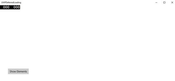
Now when you click the Show Elements button, it will load the text blocks, which will improve the startup performance of your application.
Windows 10 Development - Adaptive Design
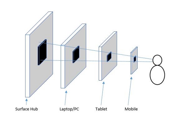
In Windows 10, Universal Windows Platform (UWP) applications will now run on a number of device families such as −
Desktop device family − Tablets, laptops, PCs
Mobile device family − Windows Phones, phablets
IoT device family − Compact devices such as wearables or household appliances
Team device family − Surface hub
Each device family has its own screen and window size. So how to design an app that provides a great user experience on several devices with dramatically different screen sizes and different input methods?
Designing your application for multiple device families requires some additional consideration, planning, and design. Windows 10 UWP provides a set of built-in features and universal building blocks that make it much easier to design for multiple devices and automatically scale across the different screen and window sizes, supported by the platform controls.
New Built-in Features
Following are the new features that the developers can use while creating a UWP application. These features are automatic and free.
Effective Pixels and Platform Scaling
When your UWP application runs on any device supported by Windows 10, then −
The system uses an algorithm to normalize the way controls, fonts, and other UI elements are displayed on the screen of a device on which it is currently running.
Scaling algorithm, controls the viewing distance and screen density (pixels per inch) to optimize for supposed size (rather than physical size).
The scaling algorithm ensures that a 36 px font on Surface Hub 10 feet away is just as readable to the user as a 36 px font on 5'' phone that is a few inches away.
Universal Input and Smart Interactions
Universal Windows Platform has built-in smart interactions input systems, which understand input for all the devices. For example, when you design a click interaction in your application, then you do not need to know whether the click comes from an actual mouse click or the tap of a finger. The system will do it automatically for you.
Universal Building Blocks
There are some valuable building blocks, which make it easier to design the applications for multiple device families in Universal Windows Platform (UWP).
Universal Controls
UWP provides a set of Universal Controls that are guaranteed to work well on all Windows 10 devices.
This ‘Universal controls’ list contains common controls like radio button, combobox and text box etc.
It also contains some sophisticated controls like grid view and list view that can generate a list of items from a stream of data and a template.
Universal Styles
UWP app automatically gets a default set of styles that gives you these features −
A set of styles that automatically give your app a light or dark theme.
Default animations for interactions.
Automatic support for high-contrast modes.
Automatic support for other languages. Our default styles automatically select the correct font for every language that the Windows supports. You can even use multiple languages in the same app and they will be displayed properly.
Windows 10 Development - Adaptive UI
A Universal Windows Platform (UWP) application can run on many different devices and each device has its own form of input, screen resolutions, DPI density, and other unique characteristics.
In Windows 10, with the help of new universal controls, layout panels, and tooling you can adapt your UI easily to the devices your application may run on. For example, when your UWP application is running either on a desktop computer, a mobile device or on a tablet, you can tailor the UI to take advantage of different screen resolution, screen sizes and DPI density.
In Windows 10, you can easily target your UI to multiple devices with the following features −
You can enhance your UI for different screen resolutions and screen sizes by using universal controls and layout panels.
Common input handling allows you to receive input through a touch pad, a pen, a mouse, a keyboard, or a controller such as a Microsoft Xbox controller.
With the help of Tools, you can design your application UI that can adapt to different screen resolutions.
Adaptive scaling adjusts to the resolution and DPI differences across devices.
In Windows 10, you can easily arrange, resize and position applications in any way you want. It also gives some sort of flexibility to the user to use your application the way they want. In Windows 10, there are various ways to implement responsive techniques in your UWP application, so it looks great no matter what is the screen or window size.
VisualStateManager
In Windows 10, the VisualStateManager class has two new mechanisms with the help of which you can implement a responsive design in your UWP applications. The new VisualState.StateTriggers allows the developer to check certain conditions like the window height or window width and then the VisualState.Setters APIs define visual states in response to those certain conditions.
Let us have a look at the example given below in which some controls are added in stack panel.
<Page
x:Class = "UWPAdaptiveUI.MainPage"
xmlns = "http://schemas.microsoft.com/winfx/2006/xaml/presentation"
xmlns:x = "http://schemas.microsoft.com/winfx/2006/xaml"
xmlns:local = "using:UWPAdaptiveUI"
xmlns:d = "http://schemas.microsoft.com/expression/blend/2008"
xmlns:mc = "http://schemas.openxmlformats.org/markup-compatibility/2006"
mc:Ignorable = "d">
<Grid Background = "{ThemeResource ApplicationPageBackgroundThemeBrush}">
<VisualStateManager.VisualStateGroups>
<VisualStateGroup>
<VisualState>
<VisualState.StateTriggers>
<!-- VisualState to be triggered when window
width is >=720 effective pixels. -->
<AdaptiveTrigger MinWindowWidth = "720" />
</VisualState.StateTriggers>
<VisualState.Setters>
<Setter Target = "myPanel.Orientation" Value = "Horizontal" />
</VisualState.Setters>
</VisualState>
</VisualStateGroup>
</VisualStateManager.VisualStateGroups>
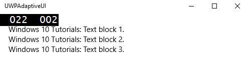
<StackPanel x:Name = "myPanel" Orientation = "Vertical">
<TextBlock Text = "Windows 10 Tutorials: Text block 1. "
Style = "{ThemeResource BodyTextBlockStyle}"/>
<TextBlock Text = "Windows 10 Tutorials: Text block 2. "
Style = "{ThemeResource BodyTextBlockStyle}"/>
<TextBlock Text = "Windows 10 Tutorials: Text block 3. "
Style = "{ThemeResource BodyTextBlockStyle}"/>
</StackPanel>
</Grid>
</Page>
Now VisualStateManager, will adjust the orientation of stack panel based on the window’s width. If width is >= 720, then the orientation will become Horizontal otherwise it will remain vertical. When the above code is compiled and executed, you will see the following window, which contains three text blocks in vertical order.
Let us resize the width of the above window and you will see the following window −
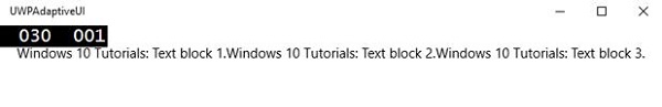
Now you can see that the text blocks are in horizontal order.
RelativePanel
RelativePanel can be used to lay out the UI elements by expressing spatial relationships between the elements. Let us take an example in which some rectangles are created in the relative panel.
<Page
   x:Class = "UWPAdaptiveUI.MainPage"
   xmlns = "http://schemas.microsoft.com/winfx/2006/xaml/presentation"
   xmlns:x = "http://schemas.microsoft.com/winfx/2006/xaml"
   xmlns:local = "using:UWPAdaptiveUI"
   xmlns:d = "http://schemas.microsoft.com/expression/blend/2008"
   xmlns:mc = "http://schemas.openxmlformats.org/markup-compatibility/2006"
   mc:Ignorable = "d">

   <Grid Background = "{ThemeResource ApplicationPageBackgroundThemeBrush}">

      <VisualStateManager.VisualStateGroups>

         <VisualStateGroup>

            <VisualState>

               <VisualState.StateTriggers>
                  <AdaptiveTrigger MinWindowWidth = "720" />
               </VisualState.StateTriggers>

               <VisualState.Setters>
                  <Setter Target = "GreenRect.(RelativePanel.RightOf)"
                     Value = "BlueRect" />
                  <Setter Target = "GreenRect.(RelativePanel.AlignRightWithPanel)"
                     Value = "True" />
               </VisualState.Setters>

            </VisualState>

         </VisualStateGroup>

      </VisualStateManager.VisualStateGroups>

      <RelativePanel BorderBrush = "Gray" BorderThickness = "10">
         <Rectangle x:Name = "RedRect" Fill = "Red" MinHeight = "100"
            MinWidth = "100"/>

         <Rectangle x:Name = "BlueRect" Fill = "Blue" MinHeight = "100"
            MinWidth = "100" RelativePanel.RightOf = "RedRect" />

         <!-- Width is not set on the green and yellow rectangles.
            It's determined by the RelativePanel properties. -->

         <Rectangle x:Name = "GreenRect" Fill = "Green" MinHeight = "100"
            RelativePanel.Below = "BlueRect" RelativePanel.AlignLeftWith = "RedRect"
            RelativePanel.AlignRightWith = "BlueRect"/>

         <Rectangle Fill = "Yellow" MinHeight = "100" RelativePanel.Below = "GreenRect"
            RelativePanel.AlignLeftWith = "BlueRect"
            RelativePanel.AlignRightWithPanel = "True"/>

      </RelativePanel>

   </Grid>

</Page>
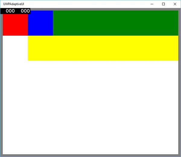
When the above code is compiled and executed, you will see the following window.
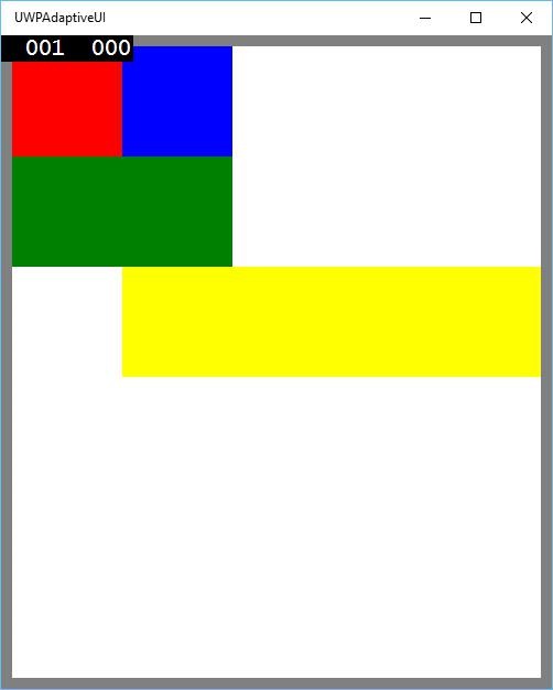
When you resize the above window, you will see that the green rectangle is now adjusted in the top row to the left of blue rectangle as shown below.
Windows 10 Development - Adaptive Code
In this chapter, we will be demonstrating the adoption of your application to different devices supported by Windows 10. We have already learnt about adopting your UI and all the tricks, techniques and controls used in UWP applications.
Now, we will learn about adopting your code, because
Application codes are not the same across all the devices.
APIs used, particularly for Xbox, will not be available for mobile devices. The same thing is true for HoloLens etc.
Adaptive code can light up your application conditionally and execute code only when running on a specific device family and/or on a particular version of the platform/extension APIs.
Writing Code
In Windows 10, you can implement the UWP applications in Visual Studio by using either C++, C#, Visual Basic or JavaScript.
With C# and Visual Basic you can use XAML for UI designing.
With C++ you can either use DirectX instead of using XAML.
For JavaScript, you can use HTML for your presentation layer, which is a cross platform Web standards.
The Windows Core APIs run in the same way for all the devices, which contain most of the functionality you need for your code and UI. However, for the code and the UI tailored for particular device families, you need to use the adaptive code and adaptive UI.
Calling an API that is NOT implemented by the target device family −
The UI adapts to different screens easily, but different device families not only have different screen sizes, it has a lot more than that.
For example, the mobile phones have some hardware buttons such as Back and Camera, which might not be available on other devices such as PC.
By default, the core APIs contain most of the functionality, which works for all the devices, but the device specific functionality can be used by referencing the Extension SDKs in your UWP applications just like external assemblies.
To add any particular extension SDK, needed in your application, follow the below given steps −
Right click on the References.
Select “Add References..”. The following dialog will open.
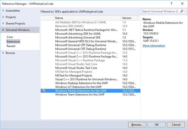
Adding an extension is as simple as adding a project reference.
Now you can add any extension SDK from the list, which contains Desktop Extension, IoT Extension, and Mobile Extension etc.
Desktop and Mobile extensions are the two most common platform Extension SDKs. The Mobile extension, for example, enables the APIs necessary to use the hardware camera button.
You can check the device capabilities by using the Windows.Foundation.Metadata.ApiInformation class method, which returns a Boolean output if the type is supported on the current device. For example, you can enable your Windows app to use the Camera button with code like this −
bool isHardwareButtonsAPIPresent =
   Windows.Foundation.Metadata.ApiInformation.
   IsTypePresent("Windows.Phone.UI.Inpu t.HardwareButtons");

if (isHardwareButtonsAPIPresent) {
   Windows.Phone.UI.Input.HardwareButtons.CameraPressed += HardwareButtons_CameraPressed;
}
The phone-camera button code will execute only if the Mobile Extension SDK is enabled on the device. Similarly, you can also check for any particular event, method or property in the current API version by using IsEventPresent, IsMethodPresent, IsPropertyPresent, instead of IsTypePresent as shown below.
bool isHardwareButtons_CameraPressedAPIPresent =
   Windows.Foundation.Metadata.ApiInformation.IsEventPresent
   ("Windows.Phone.UI.Input.HardwareButtons", "CameraPressed");
Win32 APIs in the UWP
A Universal Widows Platform (UWP) application or Windows Runtime Component, which are written in C++/CX, can access Win32 APIs, which are also a part of UWP now. All of the Windows 10 device families can implement Win32 APIs by linking your application with Windowsapp.lib.
Windowsapp.lib is an "umbrella" lib that provides the exports for the UWP APIs. Linking to Windowsapp.lib will add to your app dependencies on dlls that are present on all Windows 10 device families.
Let us have a look into a simple example in which the application targets both the desktop and the phone. Therefore, when the application runs on the desktop, it will not show the status bar, but when the same application runs on the phone, it will display the status bar.
Given below is the XAML code in which different controls are added.
<Page
   x:Class = "UWPAdoptiveCode.MainPage"
   xmlns = "http://schemas.microsoft.com/winfx/2006/xaml/presentation"
   xmlns:x = "http://schemas.microsoft.com/winfx/2006/xaml"
   xmlns:local = "using:UWPAdoptiveCode"
   xmlns:d = "http://schemas.microsoft.com/expression/blend/2008"
   xmlns:mc = "http://schemas.openxmlformats.org/markup-compatibility/2006"
   mc:Ignorable = "d">

   <Page.Background>
      <SolidColorBrush Color = "Green"/>
   </Page.Background>

   <Page.BottomAppBar>
      <CommandBar x:Name = "commandBar" >
         <AppBarButton Icon = "Accept" Label = "appbarbutton"/>
         <AppBarButton Icon = "Cancel" Label = "appbarbutton"/>
      </CommandBar>
   </Page.BottomAppBar>

   <Grid Background = "AliceBlue">

      <VisualStateManager.VisualStateGroups>

         <VisualStateGroup>

            <VisualState>
               <VisualState.StateTriggers>
                  <local:DeviceFamilyTrigger DeviceFamily = "Desktop" />
               </VisualState.StateTriggers>

               <VisualState.Setters>
                  <Setter Target = "StatusBarControls.Visibility"
                     Value = "Collapsed"/>
               </VisualState.Setters>

            </VisualState>

         </VisualStateGroup>

      </VisualStateManager.VisualStateGroups>

      <StackPanel HorizontalAlignment = "Left" Margin = "75,164,0,0"
         VerticalAlignment = "Top" >

         <RadioButton x:Name = "ShowAppBarRadioButton" Content = "Show AppBar"
            HorizontalAlignment = "Stretch" VerticalAlignment = "Stretch"
            IsChecked = "True" Checked = "RadioButton_Checked"/>

         <RadioButton x:Name = "ShowOpaqueAppBarRadioButton"
            Content = "Show Transparent AppBar" HorizontalAlignment = "Stretch"
            VerticalAlignment = "Stretch" Checked = "RadioButton_Checked"/>

         <RadioButton x:Name = "HideAppBarRadioButton" Content = "Hide AppBar"
            HorizontalAlignment = "Stretch" VerticalAlignment = "Stretch"
            Checked = "RadioButton_Checked"/>

      </StackPanel>

      <StackPanel x:Name = "StatusBarControls" Orientation = "Vertical"
         Margin = "75,350,0,0" Visibility = "Visible">

         <CheckBox x:Name = "StatusBarBackgroundCheckBox"
            Content = "Set StatusBar Background"
            Checked = "StatusBarBackgroundCheckBox_Checked"
            Unchecked = "StatusBarBackgroundCheckBox_Unchecked"/>

         <CheckBox x:Name = "StatusBarHiddenCheckBox"
            Content = "Set StatusBar Hidden" Checked = "StatusBarHiddenCheckBox_Checked"
            Unchecked = "StatusBarHiddenCheckBox_Unchecked"/>

      </StackPanel>

   </Grid>

</Page>
Given below is the C# implementation for different events.
using Windows.UI;
using Windows.UI.Xaml;
using Windows.UI.Xaml.Controls;

// The Blank Page item template is documented at
   http://go.microsoft.com/fwlink/?LinkId=402352&clcid=0x409

namespace UWPAdoptiveCode {
   /// <summary>
      /// An empty page that can be used on its own or navigated to within a Frame.
   /// </summary>

   public sealed partial class MainPage : Page {

      private Color? DefaultTitleBarButtonsBGColor;
      private Color? DefaultTitleBarBGColor;

      public MainPage() {
         this.InitializeComponent();

         //Windows.UI.ViewManagement.ApplicationView.GetForCurrentView().
            VisibleBoundsCh anged += MainPage_VisibleBoundsChanged;

         var viewTitleBar = Windows.UI.ViewManagement.ApplicationView.
            GetForCurrentView().TitleBar;

         DefaultTitleBarBGColor = viewTitleBar.BackgroundColor;
         DefaultTitleBarButtonsBGColor = viewTitleBar.ButtonBackgroundColor;
      }

      private void RadioButton_Checked(object sender, RoutedEventArgs e) {

         // Bottom AppBar shows on Desktop and Mobile
         if (ShowAppBarRadioButton != null) {

            if (ShowAppBarRadioButton.IsChecked.HasValue &&
               (ShowAppBarRadioButton.IsChecked.Value == true)) {
                 commandBar.Visibility = Windows.UI.Xaml.Visibility.Visible;
                 commandBar.Opacity = 1;
            } else {
               commandBar.Visibility = Windows.UI.Xaml.Visibility.Collapsed;
            }
         }

         if (ShowOpaqueAppBarRadioButton != null) {

            if (ShowOpaqueAppBarRadioButton.IsChecked.HasValue &&
               (ShowOpaqueAppBarRadioButton.IsChecked.Value == true)){
                  commandBar.Visibility = Windows.UI.Xaml.Visibility.Visible;
                  commandBar.Background.Opacity = 0;
            } else{
               commandBar.Background.Opacity = 1;
            }
         }

      }

      private void StatusBarHiddenCheckBox_Checked(object sender, RoutedEventArgs e){

         // StatusBar is Mobile only
         if (Windows.Foundation.Metadata.ApiInformation.
            IsTypePresent("Windows.UI.ViewManag ement.StatusBar")){
               var ignore = Windows.UI.ViewManagement.StatusBar.GetForCurrentView().HideAsync();
         }
      }

      private void StatusBarHiddenCheckBox_Unchecked(object sender, RoutedEventArgs e){

         // StatusBar is Mobile only
         if (Windows.Foundation.Metadata.ApiInformation.
            IsTypePresent("Windows.UI.ViewManag ement.StatusBar")){
               var ignore = Windows.UI.ViewManagement.StatusBar.GetForCurrentView().ShowAsync();
         }
      }

      private void StatusBarBackgroundCheckBox_Checked(object sender, RoutedEventArgs e){

         // StatusBar is Mobile only
         if (Windows.Foundation.Metadata.ApiInformation.
            IsTypePresent("Windows.UI.ViewManag ement.StatusBar")){

               Windows.UI.ViewManagement.StatusBar.GetForCurrentView().
                  BackgroundColor = Windows.UI.Colors.Blue;

               Windows.UI.ViewManagement.StatusBar.GetForCurrentView().
                   BackgroundOpacity = 1;
         }
      }

      private void StatusBarBackgroundCheckBox_Unchecked(object sender, RoutedEventArgs e){

         // StatusBar is Mobile only
         if (Windows.Foundation.Metadata.ApiInformation.
            IsTypePresent("Windows.UI.ViewManag ement.StatusBar")){
               Windows.UI.ViewManagement.StatusBar.GetForCurrentView().
                  BackgroundOpacity = 0;
         }
      }

   }

   public class DeviceFamilyTrigger : StateTriggerBase{

      //private variables
      private string _deviceFamily;

      //Public property
      public string DeviceFamily {

         get {
            return _deviceFamily;
         }
         set{
            _deviceFamily = value;
            var qualifiers = Windows.ApplicationModel.Resources.Core.ResourceContext.
               GetForCurrentView().Qua lifierValues;

            if (qualifiers.ContainsKey("DeviceFamily"))
               SetActive(qualifiers["DeviceFamily"] == _deviceFamily);
            else
               SetActive(false);
         }
      }
   }
}
When the above given code is compiled and executed on a Mobile, you will see the following window.
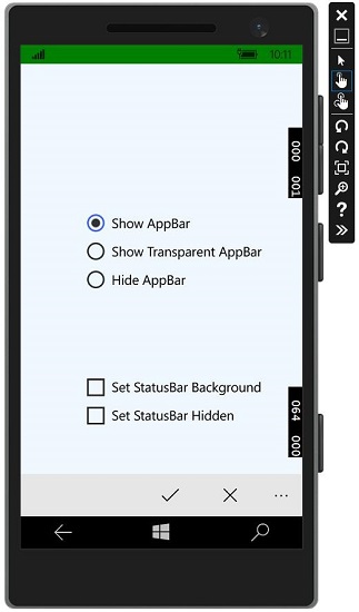
You can change the background color of the status bar with the checkbox as shown in the image.
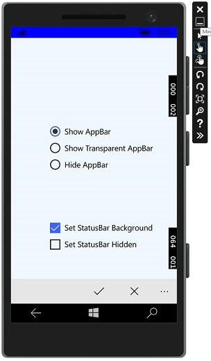
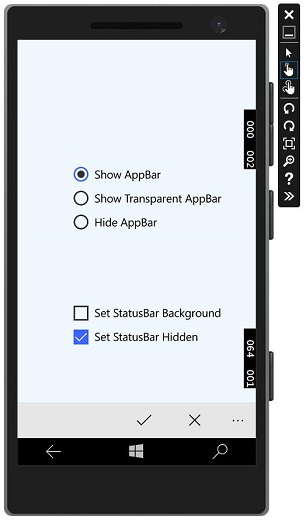
You can also hide the status bar.
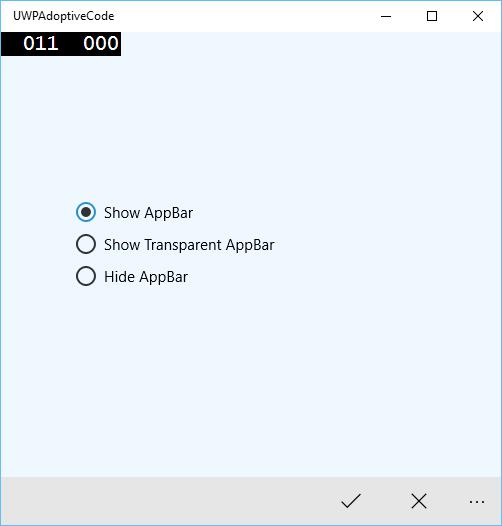
Now, when you run the same application on a desktop device, you will see the following window in which the status bar and the checkboxes specific to the status bar are not visible.
Windows10 Development - File Management
In any application, one of the most important thing is the data. If you are .net developer, you might know about the isolated storage and the same concept follows through the Universal Windows Platform (UWP) applications.
File Locations
These are the areas where your application can access the data. The application contains some area, which is private to that particular application and is inaccessible to the others, but there are many other areas, where you can store and save your data inside a file.
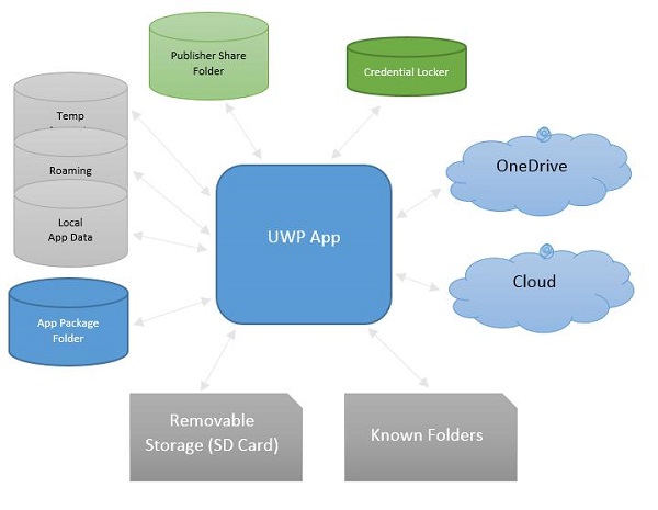
Given below are the brief descriptions of each folder.
| S.No. | Folder & Description |
|---|---|
| 1 | App package folder Package manager installs all the app’s related files into the App package folder, and app can only read data from this folder. |
| 2 | Local folder Applications store local data into a local folder. It can store data up to the limit on the storage device. |
| 3 | Roaming folder Setting and properties related to application is stored in roaming folder. Other devices can also access data from this folder. It has limited size up to 100KB per application. |
| 4 | Temp Folder Use of temporary storage and there is no guarantee that it will still be available when your application runs again. |
| 5 | Publisher Share Shared storage for all the apps from the same publisher. It is declared in app manifest. |
| 6 | Credential Locker Used for secure storage of password credential objects. |
| 7 | OneDrive OneDrive is free online storage that comes with your Microsoft account. |
| 8 | Cloud Store data on the cloud. |
| 9 | Known folders These folders already known folders such as My Pictures, Videos, and Music. |
| 10 | Removable storage USB storage device or external hard drive etc. |
File Handling APIs
In Windows 8, new APIs were introduced for file handling. These APIs are located in the Windows.Storage and Windows.Storage.Streams namespaces. You can use these APIs instead of the System.IO.IsolatedStorage namespace. By using these APIs, it will be easier to port your Windows Phone app to the Windows Store, and you can easily upgrade your applications to future versions of the Windows.
To access local, roaming or temp folders, you need to call these APIs −
StorageFolder localFolder = ApplicationData.Current.LocalFolder;
StorageFolder roamingFolder = ApplicationData.Current.RoamingFolder;
StorageFolder tempFolder = ApplicationData.Current.TemporaryFolder;
To create a new file in a local folder use the following code −
StorageFolder localFolder = ApplicationData.Current.LocalFolder;
StorageFile textFile = await localFolder.CreateFileAsync(filename,
   CreationCollisionOption.ReplaceExisting);
Here is the code to open the newly created file and write some content in that file.
using (IRandomAccessStream textStream = await textFile.OpenAsync(FileAccessMode.ReadWrite)) {

   using (DataWriter textWriter = new DataWriter(textStream)){
      textWriter.WriteString(contents);
      await textWriter.StoreAsync();
   }

}
You can open the same file again, from the local folder as shown in the code given below.
using (IRandomAccessStream textStream = await textFile.OpenReadAsync()) {

   using (DataReader textReader = new DataReader(textStream)){
      uint textLength = (uint)textStream.Size;
      await textReader.LoadAsync(textLength);
      contents = textReader.ReadString(textLength);
   }

}
To understand how the reading and writing of the data works, let us have a look at a simple example. Given below is the XAML code in which different controls are added.
<Page
   x:Class = "UWPFileHandling.MainPage"
   xmlns = "http://schemas.microsoft.com/winfx/2006/xaml/presentation"
   xmlns:x = "http://schemas.microsoft.com/winfx/2006/xaml"
   xmlns:local = "using:UWPFileHandling"
   xmlns:d = "http://schemas.microsoft.com/expression/blend/2008"
   xmlns:mc = "http://schemas.openxmlformats.org/markup-compatibility/2006"
   mc:Ignorable = "d">

   <Grid Background = "{ThemeResource ApplicationPageBackgroundThemeBrush}">

      <Button x:Name = "readFile" Content = "Read Data From File"
         HorizontalAlignment = "Left" Margin = "62,518,0,0"
         VerticalAlignment = "Top" Height = "37" Width = "174"
         Click = "readFile_Click"/>

      <TextBox x:FieldModifier = "public" x:Name = "textBox"
         HorizontalAlignment = "Left" Margin = "58,145,0,0" TextWrapping = "Wrap"
         VerticalAlignment = "Top" Height = "276" Width = "245"/>.

      <Button x:Name = "writeFile" Content = "Write Data to File"
         HorizontalAlignment = "Left" Margin = "64,459,0,0"
         VerticalAlignment = "Top" Click = "writeFile_Click"/>

      <TextBlock x:Name = "textBlock" HorizontalAlignment = "Left"
         Margin = "386,149,0,0" TextWrapping = "Wrap"
         VerticalAlignment = "Top" Height = "266" Width = "250"
         Foreground = "#FF6231CD"/>

   </Grid>

</Page>
Given below is the C# implementation for different events and also the implementation of the FileHelper class for reading and writing data to the text file.
using System;
using System.IO;
using System.Threading.Tasks;

using Windows.Storage;
using Windows.Storage.Streams;
using Windows.UI.Xaml;
using Windows.UI.Xaml.Controls;

// The Blank Page item template is documented at
   http://go.microsoft.com/fwlink/?LinkId=402352&clcid=0x409

namespace UWPFileHandling {

   /// <summary>
      /// An empty page that can be used on its own or navigated to within a Frame.
   /// </summary>

   public partial class MainPage : Page {
      const string TEXT_FILE_NAME = "SampleTextFile.txt";

      public MainPage(){
         this.InitializeComponent();
      }

      private async void readFile_Click(object sender, RoutedEventArgs e) {
         string str = await FileHelper.ReadTextFile(TEXT_FILE_NAME);
         textBlock.Text = str;
      }

      private async void writeFile_Click(object sender, RoutedEventArgs e) {
         string textFilePath = await FileHelper.WriteTextFile(TEXT_FILE_NAME, textBox.Text);
      }

   }

   public static class FileHelper {

      // Write a text file to the app's local folder.

      public static async Task<string>
         WriteTextFile(string filename, string contents) {

         StorageFolder localFolder = ApplicationData.Current.LocalFolder;
         StorageFile textFile = await localFolder.CreateFileAsync(filename,
            CreationCollisionOption.ReplaceExisting);

         using (IRandomAccessStream textStream = await
            textFile.OpenAsync(FileAccessMode.ReadWrite)){

               using (DataWriter textWriter = new DataWriter(textStream)){
                  textWriter.WriteString(contents);
                  await textWriter.StoreAsync();
               }
         }

         return textFile.Path;
      }

      // Read the contents of a text file from the app's local folder.

      public static async Task<string> ReadTextFile(string filename) {
         string contents;
         StorageFolder localFolder = ApplicationData.Current.LocalFolder;
         StorageFile textFile = await localFolder.GetFileAsync(filename);

         using (IRandomAccessStream textStream = await textFile.OpenReadAsync()){

            using (DataReader textReader = new DataReader(textStream)){
               uint textLength = (uint)textStream.Size;
               await textReader.LoadAsync(textLength);
               contents = textReader.ReadString(textLength);
            }

         }

         return contents;
      }
   }
}
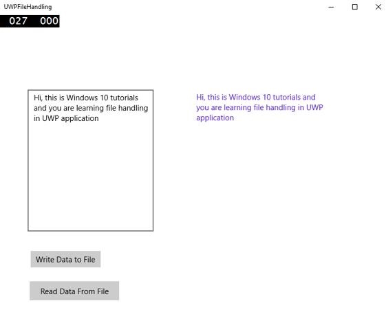
When the above code is compiled and executed, you will see the following window.
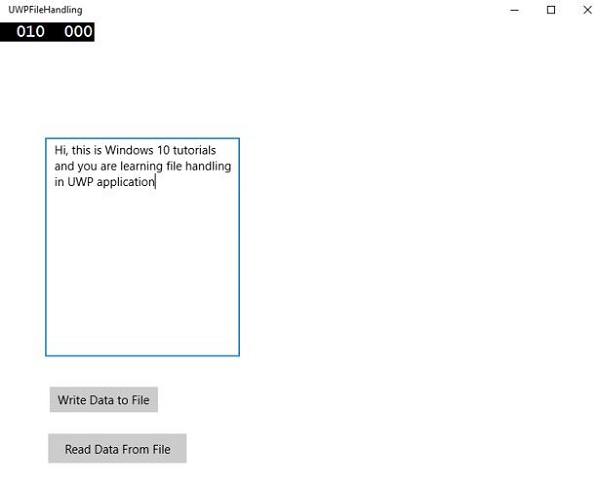
Now, you write something in the textbox and click “Write Data to File” button. The program will write the data into the text file in a local folder. If you click on “Read Data from File” button, the program will read the data from the same text file, which is located in the local folder and will display it on the text block.
Windows 10 Development - SQLite Database
In many applications, there are certain types of data, which have some sort of relationship to each other. These types of data, which are difficult to store in a file, can be stored in a database.
If you are familiar with the types of databases, such as SQL server or Oracle databases in any application, then it is very easy to understand SQLite database.
What is SQLite?
SQLite is a software library that implements a self-contained, server less, zero-configuration, transactional SQL database engine.
Important features are −
SQLite is the most widely deployed database engine in the world.
The source code for SQLite is Open source.
It has had a large impact on game and mobile application development, due to its portability and small footprint.
Advantages of SQLite
The following are the advantages of SQLite −
- It is a very lightweight database.
- It is platform independent and works on all platforms.
- It has a small memory footprint.
- It is reliable.
- No need for any setup and installation.
- It has no dependencies.
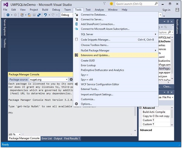
To use SQLite in your Universal Windows Platform (UWP) applications, you need to follow the steps given below.
Create a new Universal Windows blank app with the name UWPSQLiteDemo.
Go to the Tools menu and select Extensions and Updates. The following dialog will open.
- After selecting Extensions and Updates, the following window will open.
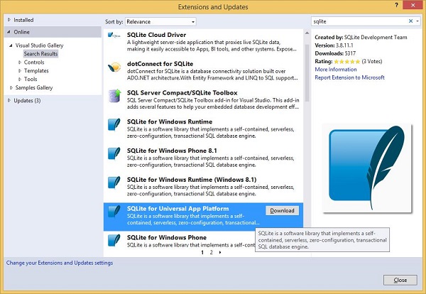
Now select the Online option and search for SQLite, from the left pane.
Download and Install SQLite for Universal App Platform.
Now, go to the Tools menu again and select NuGet Package Manager > Package Manager Console menu option as shown below.
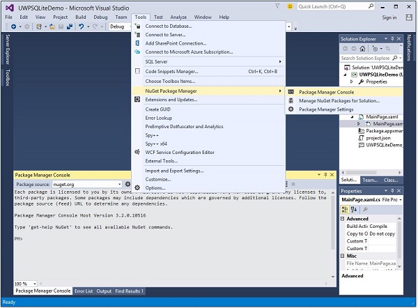
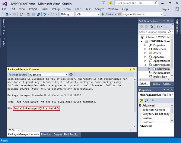
Write the following command in the Package Manager Console and press enter to execute this command −
Install-Package SQLite.Net-PCL
Now right click on References in the solution explorer and select Add References.
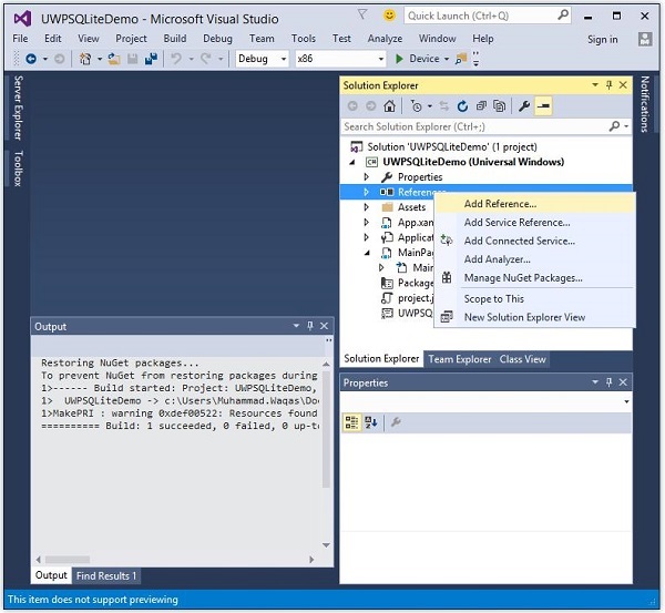
- The following dialog will open.
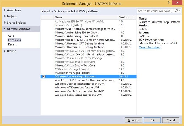
Select Extensions from the left pane under Universal Windows, check SQLite for Universal App Platform in the middle pane, and click Ok.
Now you are ready to go and use SQLite in your UWP applications.
You can create a database by using the following code.
string path = Path.Combine(Windows.Storage.ApplicationData.
   Current.LocalFolder.Path, "db.sqlite");

SQLite.Net.SQLiteConnection conn = new SQLite.Net.SQLiteConnection(new
   SQLite.Net.Platform.WinRT.SQLitePlatformWinRT(), path);
To create a table you need to call CreateTable method with table name object.
conn.CreateTable<Customer>();
You can insert the data into your table by using the following code.
conn.Insert(new Customer(){
   Name = textBox.Text,
   Age = textBox1.Text
});
Given below is the code to retrieve data from the table.
var query = conn.Table<Customer>();
string id = "";
string name = "";
string age = "";

foreach (var message in query) {
   id = id + " " + message.Id;
   name = name + " " + message.Name;
   age = age + " " + message.Age;
}
Let us understand how to create a database, a table and how to insert and retrieve the data from the database with the help of a simple example. We will be adding Name and age and then we will retrieve the same data from the table. Given below is the XAML code in which different controls are added.
<Page
   x:Class = "UWPSQLiteDemo.MainPage"
   xmlns = "http://schemas.microsoft.com/winfx/2006/xaml/presentation"
   xmlns:x = "http://schemas.microsoft.com/winfx/2006/xaml"
   xmlns:local = "using:UWPSQLiteDemo"
   xmlns:d = "http://schemas.microsoft.com/expression/blend/2008"
   xmlns:mc = "http://schemas.openxmlformats.org/markup-compatibility/2006"
   mc:Ignorable = "d">

   <Grid Background = "{ThemeResource ApplicationPageBackgroundThemeBrush}" >
      <Button x:Name = "Retrieve" Content = "Retrieve" HorizontalAlignment = "Left"
         VerticalAlignment = "Top" Margin = "384,406,0,0"
         Click = "Retrieve_Click"/>

      <Button x:Name = "Add" Content = "Add" HorizontalAlignment = "Left"
         VerticalAlignment = "Top" Margin = "291,406,0,0" Click = "Add_Click"/>

      <TextBlock x:Name = "textBlock" HorizontalAlignment = "Left"
         TextWrapping = "Wrap" Text = "Name" VerticalAlignment = "Top"
         Margin = "233,280,0,0" Width = "52"/>

      <TextBox x:Name = "textBox" HorizontalAlignment = "Left" TextWrapping = "Wrap"
         VerticalAlignment = "Top" Margin = "289,274,0,0" Width = "370"/>

      <TextBlock x:Name = "textBlock1" HorizontalAlignment = "Left"
         TextWrapping = "Wrap" Text = "Age" VerticalAlignment = "Top"
         Margin = "233,342,0,0" Width = "52"/>

      <TextBox x:Name = "textBox1" HorizontalAlignment = "Left" TextWrapping = "Wrap"
         VerticalAlignment = "Top" Margin = "289,336,0,0" Width = "191"/>

      <TextBlock x:Name = "textBlock2" HorizontalAlignment = "Left"
         Margin = "290,468,0,0" TextWrapping = "Wrap"
         VerticalAlignment = "Top" Width = "324" Height = "131"/>

   </Grid>

</Page>
Given below is the C# implementation for events and SQLite database.
using SQLite.Net.Attributes;

using System;
using System.Collections.Generic;
using System.IO;
using System.Linq;
using System.Runtime.InteropServices.WindowsRuntime;

using Windows.Foundation;
using Windows.Foundation.Collections;

using Windows.UI.Xaml;
using Windows.UI.Xaml.Controls;
using Windows.UI.Xaml.Controls.Primitives;
using Windows.UI.Xaml.Data;
using Windows.UI.Xaml.Input;
using Windows.UI.Xaml.Media;
using Windows.UI.Xaml.Navigation;

// The Blank Page item template is documented at
   http://go.microsoft.com/fwlink/?LinkId=402352&clcid=0x409

namespace UWPSQLiteDemo {

   /// <summary>
      /// An empty page that can be used on its own or navigated to within a Frame.
   /// </summary>

   public sealed partial class MainPage : Page {
      string path;
      SQLite.Net.SQLiteConnection conn;

      public MainPage(){
         this.InitializeComponent();
         path = Path.Combine(Windows.Storage.ApplicationData.Current.LocalFolder.Path,
            "db.sqlite");
         conn = new SQLite.Net.SQLiteConnection(new
            SQLite.Net.Platform.WinRT.SQLitePlatformWinRT(), path);
         conn.CreateTable<Customer>();
      }

      private void Retrieve_Click(object sender, RoutedEventArgs e) {
         var query = conn.Table<Customer>();
         string id = "";
         string name = "";
         string age = "";

         foreach (var message in query) {
            id = id + " " + message.Id;
            name = name + " " + message.Name;
            age = age + " " + message.Age;
         }

         textBlock2.Text = "ID: " + id + "\nName: " + name + "\nAge: " + age;
      }

      private void Add_Click(object sender, RoutedEventArgs e){

         var s = conn.Insert(new Customer(){
            Name = textBox.Text,
            Age = textBox1.Text
         });

      }
   }

   public class Customer {
      [PrimaryKey, AutoIncrement]
      public int Id { get; set; }
      public string Name { get; set; }
      public string Age { get; set; }
   }

}
When the above code is compiled and executed, you will see the following window.
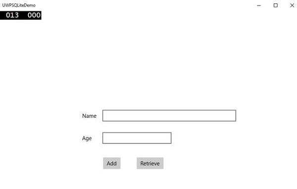
Enter the Name and Age and click the Add button.
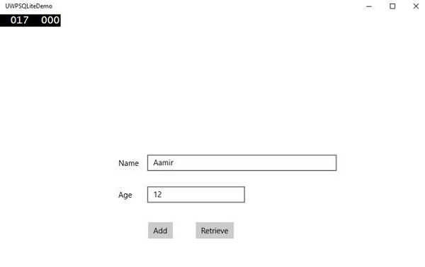
Now click on the Retrieve button. You will see the following data on the Text Block.
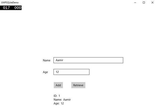
The ID field is a Primary Key and Auto Increment field, which is specified in the Customer class.
[PrimaryKey, AutoIncrement]
public int Id { get; set; }
Windows10 Dev - App Communication
App to app communication means that your application can speak to or communicate with another application that is installed on the same device. This is not a new feature in Universal Windows Platform (UWP) application and was also available in Windows 8.1.
In Windows 10, some new and improved ways are introduced to easily communicate between applications on the same device. Communication between two apps can be in the following ways −
- One application launching another app with some data.
- Apps are simply exchanging data without launching anything.
The main advantage of app to app communication is that you can break applications into smaller chunks, which can be maintained, updated and consumed easily.
Getting Your App Ready
If you Follow the steps given below, other applications can launch your application.
Add a protocol declaration in application package manifest.
Double click on the Package.appxmanifest file, which is available in the Solution Explorer as shown below.
Go to the Declaration tab and write the Name of the protocol as shown below.
The next step is to add the activation code, so the app can respond appropriately when launched by the other application.
To respond to protocol activations, we need to override the OnActivated method of the activation class. So, add the following code in App.xaml.cs file.
protected override void OnActivated(IActivatedEventArgs args) {

   ProtocolActivatedEventArgs protocolArgs = args as ProtocolActivatedEventArgs;

   if (args != null){

      Frame rootFrame = Window.Current.Content as Frame;

      // Do not repeat app initialization when the Window already has content,
      // just ensure that the window is active

      if (rootFrame == null){

         // Create a Frame to act as the navigation context and navigate to the first page
         rootFrame = new Frame();

         // Set the default language
         rootFrame.Language = Windows.Globalization.ApplicationLanguages.Languages[0];
         rootFrame.NavigationFailed += OnNavigationFailed;

         // Place the frame in the current Window
         Window.Current.Content = rootFrame;
      }

      if (rootFrame.Content == null){

         // When the navigation stack isn't restored, navigate to the
         // first page, configuring the new page by passing required
         // information as a navigation parameter

         rootFrame.Navigate(typeof(MainPage), null);
      }

      // Ensure the current window is active
      Window.Current.Activate();

   }
}
To launch the application, you can simply use the Launcher.LaunchUriAsync method, which will launch the application with protocol specified in this method.
await Windows.System.Launcher.LaunchUriAsync(new Uri("win10demo:?SomeData=123"));
Let us understand this with a simple example in which we have two UWP applications with ProtocolHandlerDemo and FirstProtocolHandler.
In this example, the ProtocolHandlerDemo application contains one button and by clicking on the button, it will open the FirstProtocolHandler application.
XAML code in the ProtocolHandlerDemo application, which contains one button is given below.
<Page
   x:Class = "ProtocolHandlerDemo.MainPage"
   xmlns = "http://schemas.microsoft.com/winfx/2006/xaml/presentation"
   xmlns:x = "http://schemas.microsoft.com/winfx/2006/xaml"
   xmlns:local = "using:ProtocolHandlerDemo"
   xmlns:d = "http://schemas.microsoft.com/expression/blend/2008"
   xmlns:mc = "http://schemas.openxmlformats.org/markup-compatibility/2006"
   mc:Ignorable = "d">

   <Grid Background = "{ThemeResource ApplicationPageBackgroundThemeBrush}">
      <Button x:Name = "LaunchButton" Content = " Launch First Protocol App"
         FontSize = "24" HorizontalAlignment = "Center"
         Click = "LaunchButton_Click"/>
   </Grid>

</Page>
Given below is the C# code, in which the button click event is implemented.
using System;
using Windows.UI.Xaml;
using Windows.UI.Xaml.Controls;

// The Blank Page item template is documented at
   http://go.microsoft.com/fwlink/?LinkId=402352&clcid=0x409

namespace ProtocolHandlerDemo {

   /// <summary>
      /// An empty page that can be used on its own or navigated to within a Frame.
   /// </summary>

   public sealed partial class MainPage : Page {

      public MainPage(){
         this.InitializeComponent();
      }

      private async void LaunchButton_Click(object sender, RoutedEventArgs e) {
         await Windows.System.Launcher.LaunchUriAsync(new
            Uri("win10demo:?SomeData=123"));
      }

   }
}
Now let us have a look into the FirstProtocolHandler application table. Given below is the XAML code in which a textblock is created with some properties.
<Page
   x:Class = "FirstProtocolHandler.MainPage"
   xmlns = "http://schemas.microsoft.com/winfx/2006/xaml/presentation"
   xmlns:x = "http://schemas.microsoft.com/winfx/2006/xaml"
   xmlns:local = "using:FirstProtocolHandler"
   xmlns:d = "http://schemas.microsoft.com/expression/blend/2008"
   xmlns:mc = "http://schemas.openxmlformats.org/markup-compatibility/2006"
   mc:Ignorable = "d">

   <Grid Background = "{ThemeResource ApplicationPageBackgroundThemeBrush}">
      <TextBlock Text = "You have successfully launch First Protocol Application"
         TextWrapping = "Wrap" Style = "{StaticResource SubtitleTextBlockStyle}"
         Margin = "30,39,0,0" VerticalAlignment = "Top" HorizontalAlignment = "Left"
         Height = "100" Width = "325"/>
   </Grid>

</Page>
The C# implementation of the App.xaml.cs file in which OnActicated is overriden is shown below. Add the following code inside App class in the App.xaml.cs file.
protected override void OnActivated(IActivatedEventArgs args) {
   ProtocolActivatedEventArgs protocolArgs = args as ProtocolActivatedEventArgs;

   if (args != null) {
      Frame rootFrame = Window.Current.Content as Frame;

      // Do not repeat app initialization when the Window already has content,
      // just ensure that the window is active

      if (rootFrame == null) {

         // Create a Frame to act as the navigation context and navigate to
            the first page
         rootFrame = new Frame();

         // Set the default language
         rootFrame.Language = Windows.Globalization.ApplicationLanguages.Languages[0];
         rootFrame.NavigationFailed += OnNavigationFailed;

         // Place the frame in the current Window
         Window.Current.Content = rootFrame;
      }

      if (rootFrame.Content == null) {

         // When the navigation stack isn't restored navigate to the
         // first page, configuring the new page by passing required
         // information as a navigation parameter

         rootFrame.Navigate(typeof(MainPage), null);
      }

      // Ensure the current window is active
      Window.Current.Activate();
   }
}
When you compile and execute the ProtocolHandlerDemo application on an emulator, you will see the following window.
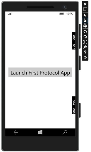
Now, when you click on the button, it will open the FirstProtocolHandler application as shown below.
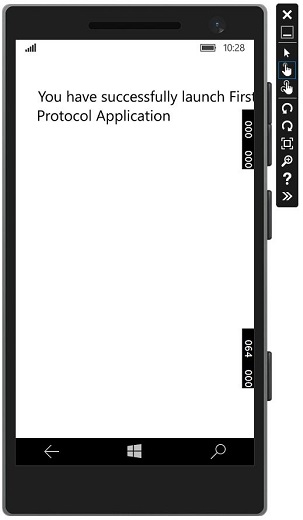
Windows 10 Development - Localization
Windows is used worldwide, in a variety of different markets and for the target audiences that vary in culture, region, or language. Localization is the translation of application resources into localized versions for the specific cultures that the application supports.
When you develop any application in only one language, it means you are just limiting your business and customers. If you want to increase your customer base, which will also increase your business, then your application must be available and reachable globally. Cost-effective localization of your product is one of the best and most economical ways to reach more customers.
In Windows 10, localizable applications is very easy to create with resx file, which is the simplest solution for localization.
Let us understand this with the help of a simple example by following all the below mentioned steps.
Translating UI Resources
You can put string resources for your UI into resource (resw) files instead of putting them directly in code or markup, and then you can reference those strings from your code or markup. Follow the steps given below to add strings to the resource files.
Create a new Universal Windows Platform (UWP) application.
In the Solution Explorer, right-click the project and select Add > New Folder.
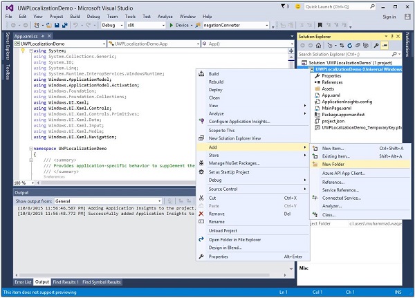
Change the name of the new folder to "Strings".
Right-click the Strings folder and add a new folder with the name "en-US". These are naming conventions specific to a language and country/region name, and it can be found on National Language Support (NLS) API Reference msdn.microsoft.com page.
Right-click on the en-US folder and select Add > New Item….
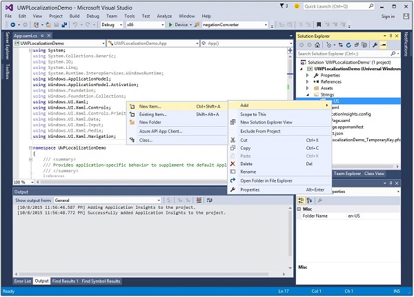
- The following dialog will open.
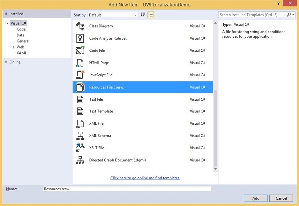
Select "Resources File (.resw)" and Click the Add button.
Now let us go to the XAML file and add a Hub control with some properties as shown below.
<Page
   x:Class = "UWPLocalizationDemo.MainPage"
   xmlns = "http://schemas.microsoft.com/winfx/2006/xaml/presentation"
   xmlns:x = "http://schemas.microsoft.com/winfx/2006/xaml"
   xmlns:local = "using:UWPLocalizationDemo"
   xmlns:d = "http://schemas.microsoft.com/expression/blend/2008"
   xmlns:mc = "http://schemas.openxmlformats.org/markup-compatibility/2006"
   mc:Ignorable = "d">

   <Grid Background = "{ThemeResource ApplicationPageBackgroundThemeBrush}">
      <Hub x:Name = "textBlock" x:Uid = "HubControl" Background = "Black"
         Foreground = "White" Header = "Localization Demo"/>
   </Grid>

</Page>
x:Uid = "HubControl" are the identifiers that are used for localization
Now, when the above code is compiled and executed, you will see the following window.
All the information related to the Hub such as the Header, the Foreground and the background color are set in the XAML.
Now add some of the information in Resource.resw file in the Strings/en-US folder as shown below.
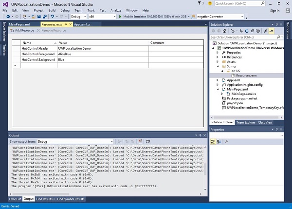
You need to associate every control that needs localized text with the .resw file. You can do this by using the x:Uid attribute on your XAML elements like this −
x:Uid = "HubControl" is used in resw file to assign a string for the header, foreground and background color.
Now, when you compile and execute your application on an emulator, you will see the following window. You can see that the header, foreground and background color values are picked from the Resources.resw file.
You can add other Resource.resw files for other languages such as French, German, and Japanese etc. manually, as we did for English-US, but Microsoft also provides a Multilingual App Toolkit with the help of which, you can easily translate your Resource.resw in to other languages.
Go to the Tools > Extensions and Update menu and search the Multilingual app toolkit.
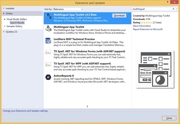
Download and install this toolkit. Once installation is finished, restart Visual Studio and open the same project.
Now enable this toolkit from the Tools > Multilingual App Toolkit menu option.
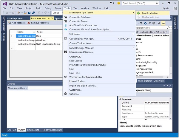
Now you can add translation for other languages.
Right Click on the project in the Solution Explorer and select Multilingual App Toolkit > Add Translation Languages option from the menu.
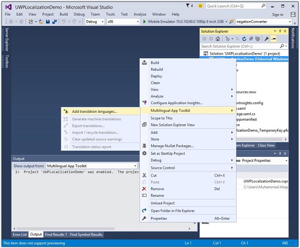
The following Translation Languages dialog will open. You can select any language you want, to localize your application for those cultures.
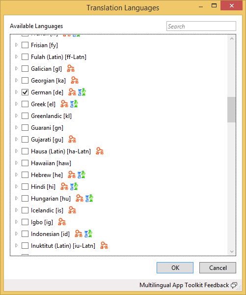
Let us select German language and click the OK button.
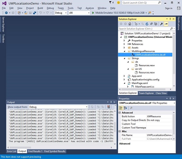
You can also see that the Resources.resw file is created inside the folder Strings\de.
Now, you will see that another MultiLingualResources is added inside the *.xlf file. Double click on this file, which will open the Multilingual editor to check and verify the translated strings and make some changes if needed.
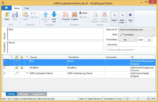
Make the changes and verify whether the Background color has changed to brown and the Header text is properly translated to German.
As in the above example, the background color of Hub has changed from blue color to brown and the foreground color has remained same.
Now open the Resources.resw, which is inside the Strings\de folder.
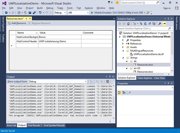
You can see that only two strings are mentioned here, because we have not changed the foreground color on the multilingual editor.
To check the localized version of your application, change the culture of your machine. To change the culture of your machine follow the steps given.
- Let us go to the PC settings and select Time & Language.
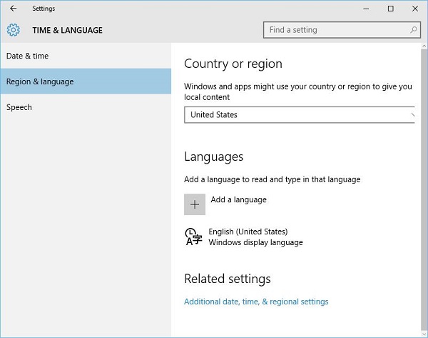
From the left pane, select Regions & language and click on the Add a language.
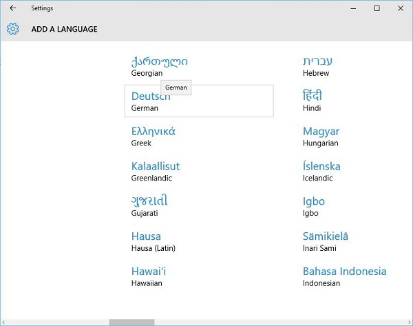
Select Deutsch German language as shown above which will open another dialog.
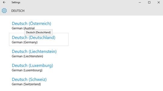
Now select the German (Germany) and close this dialog box.
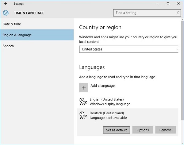
- Make Deutsch as the default language.
- Now execute your application, it will display the following window.
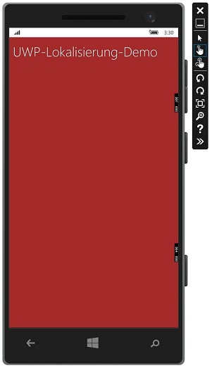
- Now you can see the output of your application in German language.
Windows 10 Development - Lifecycle
Historically, Windows has environment, where users can run multiple applications simultaneously. User can switch between different applications easily. This model does not work well for phone or tablet devices where the usage is typically single-application focused.
One of the most significant challenges facing Windows 8 Store application programmers will be managing and understanding the application lifecycle. If you have been building Windows phone applications, then much of this would be familiar.
Under Windows 8, the operating system manages the lifetime of an application, and while the user can terminate an application, typically the user opens new applications without consciously terminating running applications.
The Universal Windows Platform (UWP) for Windows 10 addresses these issues, offering some cool stuff to the desktop users so that multiple applications can run with a multiple windowed experience.
Windows applications can exist in three states at the basic level as shown below.
Running
Suspended
Terminate
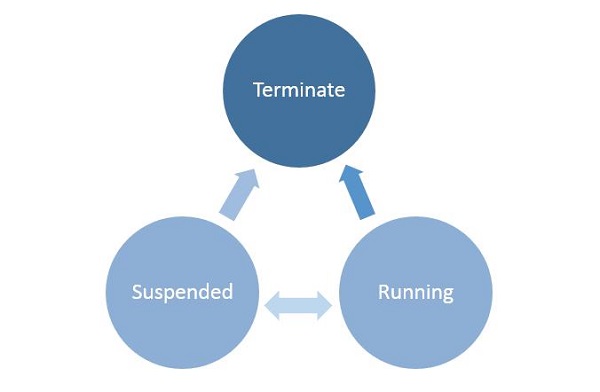
When a user launches/activates any application, then it goes in the running state.
Applications can be suspended if a user does not use it and it is no longer in the foreground.
From the Suspended state, applications can either resume that application or terminate the OS in order to reclaim system resources.
Process State Transition
It is important to understand the process state transitions in a running application. When the user first launches the application, the splash screen is shown and then the application starts running.
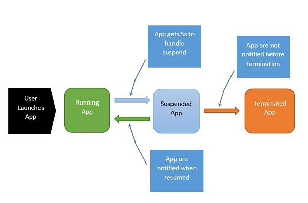
The process can be explained as follows −
When the application is suspending, your app gets five seconds to handle that suspended event.
When the application is suspended, absolutely no code runs and no resources are allocated.
When it resumes, the app is notified that it has resumed. If you are coming from a suspended state, you need to take no action.
Under memory pressure, it is possible for your application to be terminated.
Remember that you will not be notified at that point, and so any saving you do, you have to do when you enter into the suspended application state.
When the application transits back and forth between Running and Suspended states, fire suspending and resuming events respectively.
Sometimes, you need to save data. Then you have to call asynchronous methods as shown below.
Application.Current.Suspending += new SuspendingEventHandler(App_Suspending);

async void App_Suspending(Object sender, Windows.ApplicationModel.SuspendingEventArgs e){
   // Create a simple setting
   localSettings.Values["FirstName"] = fName.Text;
   localSettings.Values["LastName"] = lName.Text;
   localSettings.Values["Email"] = email.Text;
}
Application.Current.Resuming += new EventHandler<Object>(App_Resuming);

private void App_Resuming(Object sender, Object e){
   fName.Text = localSettings.Values["FirstName"];
   lName.Text = localSettings.Values["LastName"];
   email.Text = localSettings.Values["Email"];
}
Let us study an example in which controls are added as shown in the below given XAML file.
<Page
   x:Class = "UWPLifeCycleDemo.MainPage"
   xmlns = "http://schemas.microsoft.com/winfx/2006/xaml/presentation"
   xmlns:x = "http://schemas.microsoft.com/winfx/2006/xaml"
   xmlns:local = "using:UWPLifeCycleDemo"
   xmlns:d = "http://schemas.microsoft.com/expression/blend/2008"
   xmlns:mc = "http://schemas.openxmlformats.org/markup-compatibility/2006"
   mc:Ignorable = "d">

   <Grid Background = "{ThemeResource ApplicationPageBackgroundThemeBrush}">
      <Hub Header = "Details" />

      <StackPanel VerticalAlignment = "Top" HorizontalAlignment = "Left"
         Margin = "12,64,0,0">

         <TextBox Header = "First Name" Text = "{Binding FirstName,
            Mode = TwoWay, UpdateSourceTrigger = PropertyChanged}"
            Width = "200" />

         <TextBox Header = "Last Name" Text = "{Binding LastName, Mode = TwoWay,
            UpdateSourceTrigger = PropertyChanged}" Width = "200" />

         <TextBox Header = "Email" Text = "{Binding Email, Mode = TwoWay,
            UpdateSourceTrigger = PropertyChanged}" Width = "200" />

         <Button Margin = "0,12">Submit</Button>

      </StackPanel>

   </Grid>

</Page>
Given below is the C# code in which the Suspend and Resume events are implemented. The current data will be stored in the suspend event in local settings and then the data will be retrieved in the resume event from local settings as shown below.
using System;
using System.ComponentModel;
using System.Runtime.CompilerServices;

using Windows.UI.Xaml;
using Windows.UI.Xaml.Controls;

namespace UWPLifeCycleDemo {

   /// <summary>
      /// An empty page that can be used on its own or navigated to within a Frame.
   /// </summary>

   public sealed partial class MainPage : Page{
      var localSettings = Windows.Storage.ApplicationData.Current.LocalSettings;

      public MainPage() {
         this.InitializeComponent();
         Application.Current.Suspending += new SuspendingEventHandler(App_Suspending);
         Application.Current.Resuming += new EventHandler<Object>(App_Resuming);
      }

      async void App_Suspending(Object sender, Windows.ApplicationModel.SuspendingEventArgs e){

         // Create a simple setting
         localSettings.Values["FirstName"] = fName.Text;
         localSettings.Values["LastName"] = lName.Text;
         localSettings.Values["Email"] = email.Text;
      }

      private void App_Resuming(Object sender, Object e){
         fName.Text = localSettings.Values["FirstName"];
         lName.Text = localSettings.Values["LastName"];
         email.Text = localSettings.Values["Email"];
      }

   }

   public abstract class BindableBase : INotifyPropertyChanged {
      private string _FirstName = default(string);

      public string FirstName {
         get { return _FirstName; }
         set { Set(ref _FirstName, value); }
      }

      private string _LastName = default(string);

      public string LastName {
         get { return _LastName; }
         set { Set(ref _LastName, value); }
      }

      private string _Email = default(string);

      public string Email {
         get { return _Email; }
         set { Set(ref _Email, value); }
      }

      public event PropertyChangedEventHandler PropertyChanged;

      public void RaisePropertyChanged([CallerMemberName]string propertyName = null) {
         PropertyChanged?.Invoke(this, new PropertyChangedEventArgs(propertyName));
      }

      public void Set<T>(ref T storage, T value,
         [CallerMemberName()]string propertyName = null){

         if (!object.Equals(storage, value)){
            storage = value;
            RaisePropertyChanged(propertyName);
         }
      }
   }
}
When the above code is compiled and executed, you will see the following window. Now write the desired information.
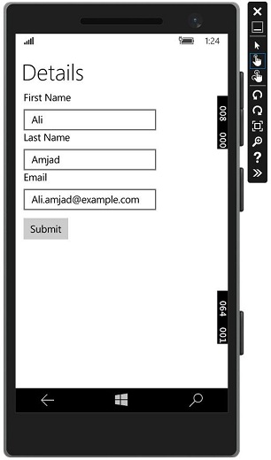
Let us go to the Lifecycle Events dropdown menu and select suspended. Now your application will be suspended and the desired information will be stored in local settings. See the screenshot given below.
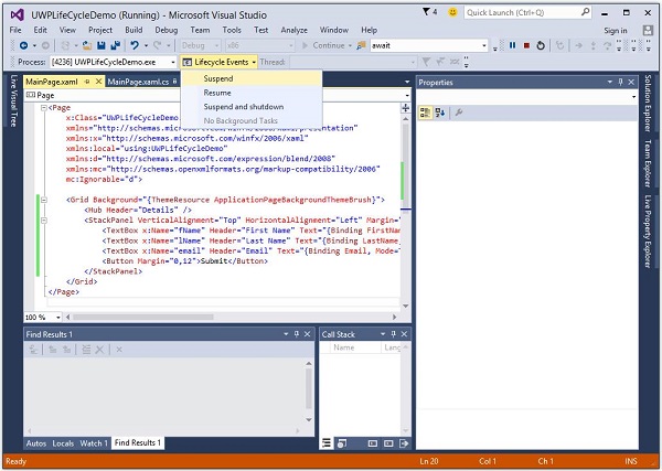
Now, when you want to resume your application, select the option Resume from the Lifecycle Events menu.
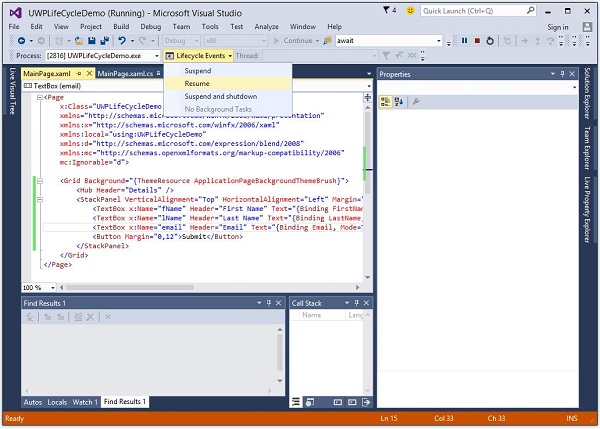
Now you will see that the stored information is retrieved from local settings and the application is resumed at the same state from which it was suspended.

Windows10 Dev - Background Execution
The Universal Windows Platform (UWP) introduces new mechanisms, which allow the applications to perform some functionality while the application is not running in the foreground. UWP also increases the ability of the applications to extend their execution time in the background for Background Tasks and Triggers. Background execution is the real complementary tail to the application lifecycle.
Important features of Background Tasks are −
A background task is triggered by a system or time event and can be constrained by one or more conditions.
When a background task is triggered, its associated handler runs and performs the work of the background task.
A background task can run even when the app that registered the background task is suspended.
They are part of the standard application platform and essentially provide an app with the ability to register for a system event (trigger). When that event occurs, they run a predefined block of code in the background. System triggers include events such as changes in network connectivity or the system time zone.
Background Execution is not guaranteed, so it is not suitable for critical functions and features.
The OS has a limitation as to how many background tasks can run at the same time. So even when trigger is fired and conditions are met, the task can still not run.
Create and Register Background Task
Create a background task class and register it to run when your app is not in the foreground. You can run code in the background by writing classes that implement the IBackgroundTask interface. The following sample code shows a very basic starting point for a background task class.
public sealed class MyBackgroundTask : IBackgroundTask {
   public void Run(IBackgroundTaskInstance taskInstance){
      // write code
   }
}
You can request access for background task as follows.
var access = await BackgroundExecutionManager.RequestAccessAsync();

switch (access) {

   case BackgroundAccessStatus.Unspecified:
      break;
   case BackgroundAccessStatus.AllowedMayUseActiveRealTimeConnectivity:
      break;
   case BackgroundAccessStatus.AllowedWithAlwaysOnRealTimeConnectivity:
      break;
   case BackgroundAccessStatus.Denied:
      break;
   default:
      break;
}
To build and register the background task, use the following code.
var task = new BackgroundTaskBuilder {
   Name = "My Task",
   TaskEntryPoint = typeof(BackgroundStuff.MyBackgroundTask).ToString()
};

var trigger = new ApplicationTrigger();
task.SetTrigger(trigger);
task.Register();

await trigger.RequestAsync();
Let us understand a simple example of background task by following all the below given steps.
Create a new blank UWP project ‘UWPBackgroundDemo’ and add one button in the XAML file.
<Page
   x:Class = "UWPBackgroundDemo.MainPage"
   xmlns = "http://schemas.microsoft.com/winfx/2006/xaml/presentation"
   xmlns:x = "http://schemas.microsoft.com/winfx/2006/xaml"
   xmlns:local = "using:UWPBackgroundDemo"
   xmlns:d = "http://schemas.microsoft.com/expression/blend/2008"
   xmlns:mc = "http://schemas.openxmlformats.org/markup-compatibility/2006"
   mc:Ignorable = "d">

   <Grid Background = "{ThemeResource ApplicationPageBackgroundThemeBrush}">
      <Button x:Name = "button" Content = "Button"
         HorizontalAlignment = "Left" Margin = "159,288,0,0"
         VerticalAlignment = "Top" Click = "button_Click"/>
   </Grid>

</Page>
Given below is the button click event implementation in which the background task is registered.
using System;

using Windows.ApplicationModel.Background;
using Windows.UI.Xaml;
using Windows.UI.Xaml.Controls;

// The Blank Page item template is documented at
   http://go.microsoft.com/fwlink/?LinkId=402352&clcid=0x409

namespace UWPBackgroundDemo {

   /// <summary>
      /// An empty page that can be used on its own or navigated to within a Frame.
   /// </summary>

   public sealed partial class MainPage : Page {

      public MainPage() {
         this.InitializeComponent();
      }

      private async void button_Click(object sender, RoutedEventArgs e) {
         var access = await BackgroundExecutionManager.RequestAccessAsync();

         switch (access){
            case BackgroundAccessStatus.Unspecified:
               break;
            case BackgroundAccessStatus.AllowedMayUseActiveRealTimeConnectivity:
               break;
            case BackgroundAccessStatus.AllowedWithAlwaysOnRealTimeConnectivity:
               break;
            case BackgroundAccessStatus.Denied:
               break;
            default:
               break;
         }

         var task = new BackgroundTaskBuilder {
            Name = "My Task",
            TaskEntryPoint = typeof(BackgroundStuff.MyBackgroundTask).ToString()
         };

         var trigger = new ApplicationTrigger();
         task.SetTrigger(trigger);

         var condition = new SystemCondition(SystemConditionType.InternetAvailable);
         task.Register();

         await trigger.RequestAsync();
      }
   }
}
Now create another project, but this time select Windows Runtime Component (Universal Windows) from the menu and give the name Background stuff to this project.
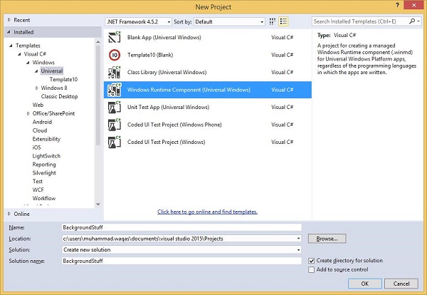
Given below is the C# code. which contains MyBackgroundTask class implantation and it will run the background task.
using Windows.ApplicationModel.Background;
using Windows.UI.Notifications;

namespace BackgroundStuff {
   public sealed class MyBackgroundTask : IBackgroundTask {

      public void Run(IBackgroundTaskInstance taskInstance) {
         SendToast("Hi this is background Task");
      }

      public static void SendToast(string message) {
         var template = ToastTemplateType.ToastText01;
         var xml = ToastNotificationManager.GetTemplateContent(template);
         var elements = xml.GetElementsByTagName("Test");
         var text = xml.CreateTextNode(message);

         elements[0].AppendChild(text);
         var toast = new ToastNotification(xml);
         ToastNotificationManager.CreateToastNotifier().Show(toast);
      }
   }
}
To make this project accessible in the UWPBackgroundDemo project, right click on References > Add References in Solution Explorer and add BackgroundStuff project.
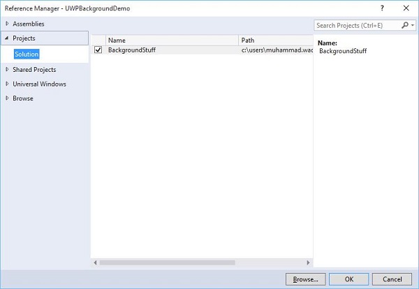
Now, let us go to the Package.appxmanifest file of UWPBackgroundDemo project and add the following information in Declarations tab.
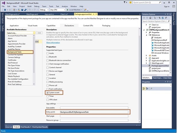
First build the Background stuff project, then build and execute the UWPBackgroundDemo project.
When the above code is compiled and executed, you will see the following window.
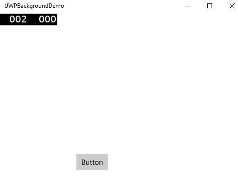
When you click the button, it will run the background task and will show a notification at the right end of your window.
Windows 10 Development - Services
In this chapter, we will be learning about how UWP apps can help or provide services to another Universal Windows Platform (UWP) applications. Actually, this chapter is an extension of the chapter Background execution and is a special case of it.
In Windows 10, an app service is a way or mechanism for an app to provide services to other apps.
An app service works in the form of a background task.
Foreground apps can call an app service in another app to perform tasks in the background.
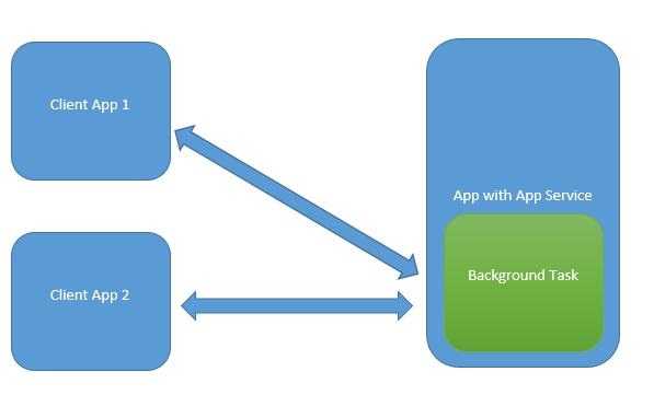
App services are like web services but app services are used on Windows 10 device.
Universal Windows Platform (UWP) applications can interact with another UWP application in various ways −
- URI association using LaunchUriAsync
- File association using LaunchFileAsync
- Launch for results using LaunchUriForResultsAsync
- App services
The first three ways are used when both the applications are foreground, but the App services are used in background task and in that case client application must be in foreground and available to use App service.
App services are very beneficial in applications where non-visual services are provided e.g. a bar code scanner in which a foreground app will take the image and send those bytes to the app services to identify the bar code.
To understand all these concepts, let us create a new UWP project with the name AppServiceProvider in Microsoft Visual Studio 2015.
Now in the Package.appmenifest file, add the following information.
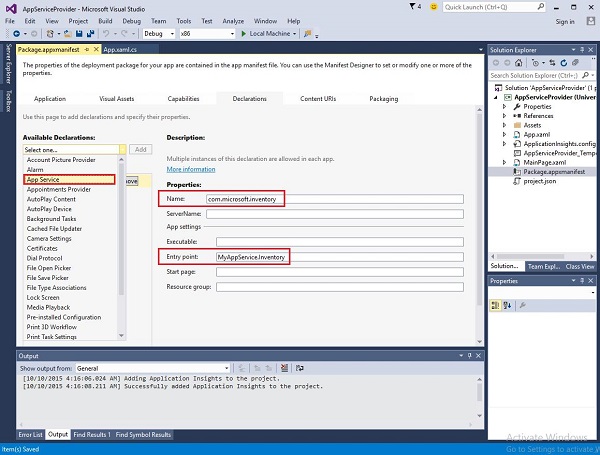
To create an app service, which can be invoked by foreground applications, let us add a new Windows Runtime Component project to the solution with MyAppService name, because app services are implemented as a background task.
Add a reference to the MyAppService project in the AppServiceProvider project.
Now delete the class1.cs file from MyAppService project and add a new class with the inventory name, which will implement the IBackgrounTask interface.
The IBackgrounTask interface has only one method “Run” which needs to be implemented for background Task.
public sealed class Inventory : IBackgroundTask {
   public void Run(IBackgroundTaskInstance taskInstance) {

   }
}
When the background task is created, Run() method is called and when Run method completes, then background tasks are terminated. To stay upto a background task, to serve requests, the code takes a deferral.
The app services code is in OnRequestedReceived(). In this example, an index for an inventory item passes to the service, to retrieve the name and the price of the specified inventory item.
private async void OnRequestReceived(AppServiceConnection sender,
   AppServiceRequestReceivedEventArgs args) {
      // Get a deferral because we use an awaitable API below to respond to the message
}
Given below is the complete implementation of Inventory class in C#.
using System;
using System.Collections.Generic;
using System.Linq;
using System.Text;
using System.Threading.Tasks;

using Windows.ApplicationModel.AppService;
using Windows.ApplicationModel.Background;
using Windows.Foundation.Collections;

namespace MyAppService{
   public sealed class Inventory : IBackgroundTask {

      private BackgroundTaskDeferral backgroundTaskDeferral;
      private AppServiceConnection appServiceconnection;

      private String[] inventoryItems = new string[] { "Robot vacuum", "Chair" };
      private double[] inventoryPrices = new double[] { 129.99, 88.99 };

      public void Run(IBackgroundTaskInstance taskInstance) {
         this.backgroundTaskDeferral = taskInstance.GetDeferral();
         taskInstance.Canceled += OnTaskCanceled;
         var details = taskInstance.TriggerDetails as AppServiceTriggerDetails;

         appServiceconnection = details.AppServiceConnection;
         appServiceconnection.RequestReceived += OnRequestReceived;
      }

      private async void OnRequestReceived(AppServiceConnection sender,
         AppServiceRequestReceivedEventArgs args) {

            var messageDeferral = args.GetDeferral();
            ValueSet message = args.Request.Message;
            ValueSet returnData = new ValueSet();

            string command = message["Command"] as string;
            int? inventoryIndex = message["ID"] as int?;
            if (inventoryIndex.HasValue &&

            inventoryIndex.Value >= 0 &&
            inventoryIndex.Value < inventoryItems.GetLength(0)) {

               switch (command) {

                  case "Price": {
                     returnData.Add("Result", inventoryPrices[inventoryIndex.Value]);
                     returnData.Add("Status", "OK");
                     break;
                  }

                  case "Item": {
                     returnData.Add("Result", inventoryItems[inventoryIndex.Value]);
                     returnData.Add("Status", "OK");
                     break;
                  }

                  default: {
                     returnData.Add("Status", "Fail: unknown command");
                     break;
                  }
               } else {
                  returnData.Add("Status", "Fail: Index out of range");
               }
            }
            await args.Request.SendResponseAsync(returnData);
            messageDeferral.Complete();
      }

      private void OnTaskCanceled(IBackgroundTaskInstance sender,
         BackgroundTaskCancellationReason reason){
            if (this.backgroundTaskDeferral != null) {
               // Complete the service deferral.
               this.backgroundTaskDeferral.Complete();
            }
      }
   }
}
Let us create a client app by adding a new blank UWP project ClientApp and add one button, one text box and two textblocks as shown below in the XAML file.
<Page
   x:Class = "ClientApp.MainPage"
   xmlns = "http://schemas.microsoft.com/winfx/2006/xaml/presentation"
   xmlns:x = "http://schemas.microsoft.com/winfx/2006/xaml"
   xmlns:local = "using:ClientApp"
   xmlns:d = "http://schemas.microsoft.com/expression/blend/2008"
   xmlns:mc = "http://schemas.openxmlformats.org/markup-compatibility/2006"
   mc:Ignorable = "d">

   <Grid Background = "{ThemeResource ApplicationPageBackgroundThemeBrush}">
      <TextBlock HorizontalAlignment = "Left" Text = "Enter Item No."
         Margin = "52,40,0,0" TextWrapping = "Wrap"
         VerticalAlignment = "Top" Height = "32" Width = "268"/>

      <Button x:Name = "button" Content = "Get Info" HorizontalAlignment = "Left"
         Margin = "255,96,0,0" VerticalAlignment = "Top" Click = "button_Click"/>

      <TextBox x:Name = "textBox" HorizontalAlignment = "Left" Margin = "52,96,0,0"
         TextWrapping = "Wrap" VerticalAlignment = "Top" Width = "168"/>

      <TextBlock x:Name = "textBlock" HorizontalAlignment = "Left"
         Margin = "52,190,0,0" TextWrapping = "Wrap"
         VerticalAlignment = "Top" Height = "32" Width = "268"/>
   </Grid>

</Page>
Given below is the button-click event implementation in which App services are requested.
using System;

using Windows.ApplicationModel.AppService;
using Windows.Foundation.Collections;

using Windows.UI.Xaml;
using Windows.UI.Xaml.Controls;

// The Blank Page item template is documented at
   http://go.microsoft.com/fwlink/?LinkId=402352&clcid=0x409

namespace ClientApp {

   /// <summary>
      /// An empty page that can be used on its own or navigated to within a Frame.
   /// </summary>

   public sealed partial class MainPage : Page {

      private AppServiceConnection inventoryService;

      public MainPage() {
         this.InitializeComponent();
      }

      private async void button_Click(object sender, RoutedEventArgs e){

         // Add the connection.
         if (this.inventoryService == null) {

            this.inventoryService = new AppServiceConnection();
            this.inventoryService.AppServiceName = "com.microsoft.inventory";
            this.inventoryService.PackageFamilyName =
               "bb1a8478-8005-46869923-e525ceaa26fc_4sz2ag3dcq60a";

            var status = await this.inventoryService.OpenAsync();

            if (status != AppServiceConnectionStatus.Success) {
               button.Content = "Failed to connect";
               return;
            }
         }

         // Call the service.
         int idx = int.Parse(textBox.Text);
         var message = new ValueSet();

         message.Add("Command", "Item");
         message.Add("ID", idx);

         AppServiceResponse response = await
            this.inventoryService.SendMessageAsync(message);
         string result = "";

         if (response.Status == AppServiceResponseStatus.Success) {
            // Get the data  that the service sent  to us.
            if (response.Message["Status"] as string == "OK") {
               result = response.Message["Result"] as string;
            }
         }

         message.Clear();
         message.Add("Command", "Price");
         message.Add("ID", idx);

         response = await this.inventoryService.SendMessageAsync(message);

         if (response.Status == AppServiceResponseStatus.Success){
            // Get the data that the service sent to us.
            if (response.Message["Status"] as string == "OK") {
               result += " : Price = " + "$"+ response.Message["Result"] as string;
            }
         }

         textBlock.Text = result;
      }
   }
}
To run this application, you will need to set the ClientApp project to be the startup project in the Solution Explorer and then Deploy this solution from Build > Deploy Solution.
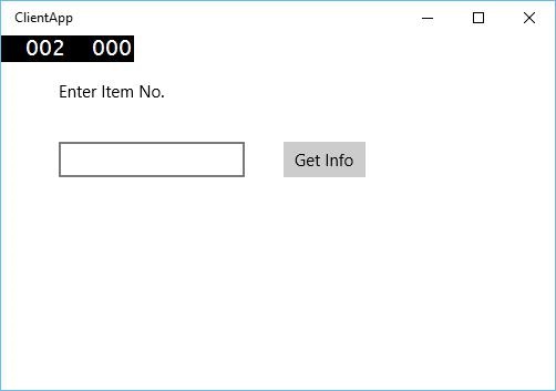
When the above code is compiled and executed, you will see the following window. In App services, we have just added information of two items. So, you can either enter 0 or 1 to get information of those items.
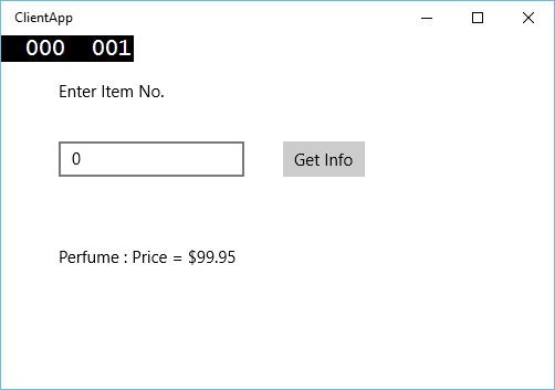
When you enter 0 and click the button, it will run the App service as the background task and will show the item information on the textblock.
Windows 10 Development - Web Platform
In Windows 10, it is very easy for the developers to create Universal Windows Platform (UWP) application and host their website on that application which can then be published to Windows Store for downloading.
Advantages
With this new feature in Windows 10, web developers can easily convert components of their web sites into Windows apps.
However, all those components will still be hosted remotely on their own web servers.
Additionally, they can also access universal APIs, which will allow the developers to access some cool stuff like the notifications, camera, calendar, Cortana, and more.
Microsoft hopes that this feature and ability will attract more developers to write apps for the Windows 10 platform, which includes.
- Desktops
- Smartphones
- Xbox
- Tablets
- HoloLens and other devices
Presently, there is only one problem with this feature and that is security. Obviously, Microsoft needs to address this as soon as possible.
Let us understand with the help of an example in which we will host a website and convert that website into a Windows app.
Follow the below given steps.
Create a new Universal Windows Project from File > New > Project.
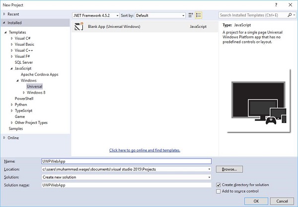
Select JavaScript > Windows > Universal option from the left pane of the New project and dialog.
From the middle pane, select Blank App (Universal Windows).
Write in the name field, UWPWebApp and click the OK button.
If you look at the Solution Explorer window, you will see some files and folders.
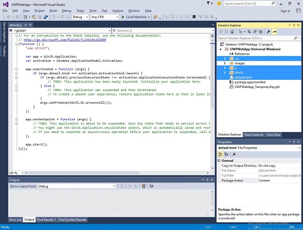
Delete the css, js, WinJS folders and the default.html file, because in this example, we are just hosting a website and we assume that all the contents are on the remote server. Therefore, we do not need most of the local files.
After deleting the above mentioned files and folders, now double click on the package.appxmanifest file and you will see the following window.
Now specify the website URL by replacing the default.html in the Start page field by the URL. For the purpose of demonstration, we will be using the URL https://www.google.com.pk/ website.

Now go to the Content URIs tab and define the rule and access permission for your web app.
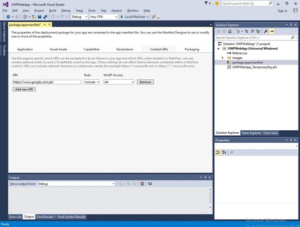
In the URI field, specify your website link and then select Include from the Rule dropdown and All from WinRT Access.
When you run this application, you will see the google start page on your app as shown below.
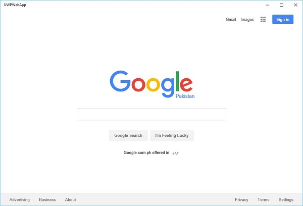
Windows10 Dev - Connected Experience
As we already know, in Windows 10 we can create an application which can be executed and run on multiple Windows 10 devices. Let us suppose that we have these different devices and we want to make it feel like that it is one application even though it is running on different devices.
In the Universal Windows Platform (UWP), you can run a single application on all Windows 10 devices, and you can give the user a feeling that it is one application. This is known as connecting experience.
Important features of connected experience −
Windows 10 is the first step to an era of more personal computing where your apps, services and content can move with you across devices, seamlessly and easily.
With connected experience, you can easily share your data and personal settings related to that application and it will be available on all devices.
In this chapter we will learn −
where these shared data or settings will be stored so that it can be available on your devices for that one application.
how the user is identified; that it is the same user which is using the same application on different devices.
Windows 10 takes a bold step forward. When you login to Windows 10 with either Microsoft account (MSA) or with your enterprise or (work) account, it is assumed that −
You have free access to OneDrive for MSA account, and you have access to Active Directory (AD) and Azure Active Directory (AAD), which is a cloud version with your enterprise account.
You have access to different applications and resources.
The Devices and applications are in roaming state and settings.
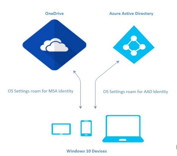
Roaming in Windows 10
When you logon to a PC, you set some preferences like lock screen or background color or personalize your different kinds of settings. If you have more than one computer or device, which are running on Windows 10, your preferences and settings on one device will be synchronized from cloud, when you login to other devices with the same account.
In Windows 10, when you have set or personalized your application settings, then these settings will roam with Roaming APIs available in UWP. When you run the same application again on other device, then it will first retrieve the settings and apply those settings to the application on that device.
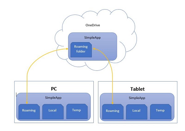
There is a limit of 100KB for uploading roaming data to the cloud. If this limit exceeds, then synchronization will stop and will just behave like a local folder.
The RoamingSettings APIs are exposed as dictionary in which an application can save data.
Windows.Storage.ApplicationDataContainer roamingSettings =
   Windows.Storage.ApplicationData.Current.RoamingSettings;

// Retrivve value from RoamingSettings
var colorName = roamingSettings.Values["PreferredBgColor"].ToString();

// Set values to RoamingSettings
roamingSettings.Values["PreferredBgColor"] = "Green";
When the data changes in RoamingSettings then it fires the DataChanged event, where you can refresh your settings.
Windows.Storage.ApplicationData.Current.DataChanged += RoamingDataChanged;

private void RoamingDataChanged(Windows.Storage.ApplicationData sender, object args) {
   // Something has changed in the roaming data or settings
}
Let us look at an example, in which we will set the background color of the application and these settings will roam with Roaming APIs available in UWP.
Given below is the XAML code in which different controls are added.
<Page
   x:Class = "RoamingSettingsDemo.Views.MainPage"
   xmlns = "http://schemas.microsoft.com/winfx/2006/xaml/presentation"
   xmlns:x = "http://schemas.microsoft.com/winfx/2006/xaml"
   xmlns:local = "using:RoamingSettingsDemo.Views"
   xmlns:d = "http://schemas.microsoft.com/expression/blend/2008"
   xmlns:mc = "http://schemas.openxmlformats.org/markup-compatibility/2006"
   mc:Ignorable = "d">

   <Grid x:Name = "MainGrid" Background = "{ThemeResource ApplicationPageBackgroundThemeBrush}">
      <Grid.RowDefinitions>
         <RowDefinition Height = "80" />
         <RowDefinition />
      </Grid.RowDefinitions>

      <StackPanel Orientation = "Horizontal" VerticalAlignment = "Top" Margin = "12,12,0,0">
         <TextBlock Style = "{StaticResource HeaderTextBlockStyle}"
            FontSize = "24" Text = "Connected Experience Demo" />
      </StackPanel>

      <Grid Grid.Row = "1" Margin = "0,80,0,0">
         <StackPanel Margin = "62,0,0,0">
            <TextBlock x:Name = "textBlock" HorizontalAlignment = "Left"
               TextWrapping = "Wrap" Text = "Choose your background color:"
               VerticalAlignment = "Top"/>

            <RadioButton x:Name = "BrownRadioButton" Content = "Brown"
               Checked = "radioButton_Checked" />

            <RadioButton x:Name = "GrayRadioButton" Content = "Gray"
               Checked = "radioButton_Checked"/>
         </StackPanel>
      </Grid>

   </Grid>

</Page>
C# implementation for RoamingSettings and different events is given below.
using System;
using System.Collections.Generic;
using System.IO;
using System.Linq;
using System.Runtime.InteropServices.WindowsRuntime;

using Windows.Foundation;
using Windows.Foundation.Collections;

using Windows.UI;
using Windows.UI.Xaml;
using Windows.UI.Xaml.Controls;
using Windows.UI.Xaml.Controls.Primitives;
using Windows.UI.Xaml.Data;
using Windows.UI.Xaml.Input;
using Windows.UI.Xaml.Media;
using Windows.UI.Xaml.Navigation;

// The RoamingSettingsDemo Page item template is documented at
   http://go.microsoft.com/fwlink/?LinkId=234238

namespace RoamingSettingsDemo.Views {

   /// <summary>
      /// An empty page that can be used on its own or navigated to within a Frame.
   /// </summary>

   public sealed partial class MainPage : Page {

      public MainPage() {
         this.InitializeComponent();
      }

      protected override void OnNavigatedTo(NavigationEventArgs e) {
         SetBackgroundFromSettings();
         Windows.Storage.ApplicationData.Current.DataChanged += RoamingDataChanged;
      }

      protected override void OnNavigatedFrom(NavigationEventArgs e) {
         Windows.Storage.ApplicationData.Current.DataChanged -= RoamingDataChanged;
      }

      private void RoamingDataChanged(Windows.Storage.ApplicationData sender, object args) {

         // Something has changed in the roaming data or settings
         var ignore = Dispatcher.RunAsync(Windows.UI.Core.CoreDispatcherPriority.Normal,
            () ⇒ SetBackgroundFromSettings());
      }

      private void SetBackgroundFromSettings() {

         // Get the roaming settings
         Windows.Storage.ApplicationDataContainer roamingSettings =
            Windows.Storage.ApplicationData.Current.RoamingSettings;

         if (roamingSettings.Values.ContainsKey("PreferBrownBgColor")) {
            var colorName = roamingSettings.Values["PreferBrownBgColor"].ToString();

            if (colorName == "Gray") {
               MainGrid.Background = new SolidColorBrush(Colors.Gray);
               GrayRadioButton.IsChecked = true;
            } else if (colorName == "Brown") {
               MainGrid.Background = new SolidColorBrush(Colors.Brown);
               BrownRadioButton.IsChecked = true;
            }
         }

      }

      private void radioButton_Checked(object sender, RoutedEventArgs e){
         if (GrayRadioButton.IsChecked.HasValue &&
            (GrayRadioButton.IsChecked.Value == true)) {
               Windows.Storage.ApplicationData.Current.RoamingSettings.
                  Values["PreferBrownBgCo lor"] = "Gray";
         } else {
            Windows.Storage.ApplicationData.Current.RoamingSettings.
               Values["PreferBrownBgCo lor"] = "Brown";
         }

         SetBackgroundFromSettings();
      }

   }
}
When the above code is compiled and executed, you will see the following window.
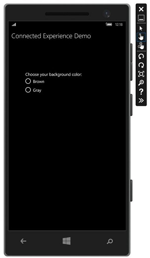
Let us choose gray color as the background color and close this app.
Now, when you run this app on this device or any other device, you will see that the background color has changed to gray. This shows that the app has successfully retrieved the information of background color change in RoamingSettings.
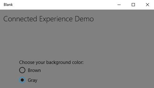
Windows 10 Development - Navigation
In Universal Windows Platform (UWP) applications, navigation is a flexible model of navigation structures, navigation elements, and system level features. It enables a variety of intuitive user experiences for moving between apps, pages, and content.
There are some situations and scenarios where all of the content and functionality can easily fit into a single page and there is no need for the developers to create multiple pages. However, in majority of the applications, multiple pages are used for interaction between different content and functionality.
When an app has more than one page, then it is very important for the developers to provide the right navigation experience.
Page Models
Typically, in Universal Windows Platform (UWP) applications, single page navigation model is used.
Important features are −
A single page navigation model maintains all the context of your application and additional content and data into a central frame.
You can divide the content of your application into multiple pages. However, when moving from one page to another, your application loads the pages into a main page form.
Neither the main page of your application is unloaded nor the code and data is unloaded, it makes it easier to manage state, and provide smoother transition animations between pages.
Multi-page navigation is also used for navigating between different pages or screens without worrying about the application context. In multi-page navigation, each page has its own set of functions, user interface and data etc.
Multi-pages navigation is typically used in web pages within the website.
Navigation Structure
In multi-page navigation, each page has its own set of functions, user interface and data etc. For example, a photo application may have one page for capturing photos, then when the user wants to edit the photo, it navigates to another page and to maintain the image library, it has another page.
The navigation structure of your application is defined by how these pages are organized.
Following are the ways to structure navigation in your application −
Hierarchy
In this type of navigation structuring,
Pages are organized into a tree like structure.
Each child page has only one parent, but a parent can have one or more child pages.
To reach a child page, you have to travel through the parent.
Peer
In this type of navigation −
- Pages exist side by side.
- You can go from one page to another in any order.
In most of the multi-pages applications, both structures are used simultaneously. Some of the pages are organized as peers and some of them are organized into hierarchies.
Let us take an example that contains three pages.
Create a blank UWP application with the name UWPNavigation.
Add two more blank pages by right clicking on the project in Solution Explorer and select Add > New Item option from the menu, which will open the following dialog window.
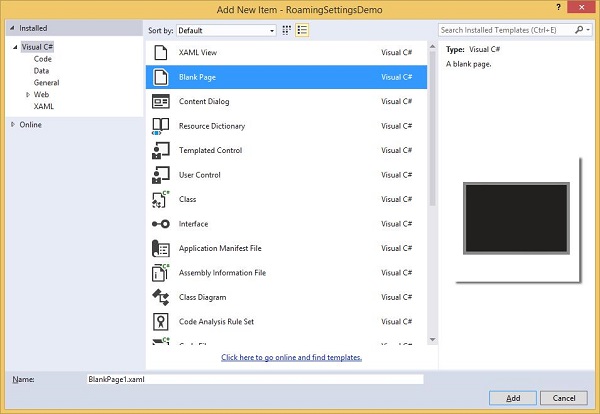
Select the Blank page from the middle pane and click the Add button.
Now add one more page by following the above given steps.
You will see three pages in the Solution Explorer − MainPage, BlankPage1, and BlankPage2.
Given below is the XAML code for MainPage in which two buttons are added.
<Page
   x:Class = "UWPNavigation.MainPage"
   xmlns = "http://schemas.microsoft.com/winfx/2006/xaml/presentation"
   xmlns:x = "http://schemas.microsoft.com/winfx/2006/xaml"
   xmlns:local = "using:UWPNavigation"
   xmlns:d = "http://schemas.microsoft.com/expression/blend/2008"
   xmlns:mc = "http://schemas.openxmlformats.org/markup-compatibility/2006"
   mc:Ignorable = "d">

   <Grid Background = "{ThemeResource ApplicationPageBackgroundThemeBrush}">
      <Hub Header = "Hi, this Main Page"/>
      <Button Content = "Go to Page 1" Margin = "64,131,0,477" Click = "Button_Click"/>
      <Button Content = "Go to Page 2" Margin = "64,210,0,398" Click = "Button_Click_1"/>
   </Grid>

</Page>
Given below is the C# code for two buttons on MainPage, which will navigate to the other two pages.
using Windows.UI.Xaml;
using Windows.UI.Xaml.Controls;

// The Blank Page item template is documented at
   http://go.microsoft.com/fwlink/?LinkId=402352&clcid=0x409

namespace UWPNavigation {

   /// <summary>
      /// An empty page that can be used on its own or navigated to within a Frame.
   /// </summary>

   public sealed partial class MainPage : Page {
      public MainPage() {
         this.InitializeComponent();
      }

      private void Button_Click(object sender, RoutedEventArgs e){
         this.Frame.Navigate(typeof(BlankPage1));
      }

      private void Button_Click_1(object sender, RoutedEventArgs e) {
         this.Frame.Navigate(typeof(BlankPage2));
      }

   }
}
The XAML code for blank page 1 is shown below.
<Page
   x:Class = "UWPNavigation.BlankPage1"
   xmlns = "http://schemas.microsoft.com/winfx/2006/xaml/presentation"
   xmlns:x = "http://schemas.microsoft.com/winfx/2006/xaml"
   xmlns:local = "using:UWPNavigation"
   xmlns:d = "http://schemas.microsoft.com/expression/blend/2008"
   xmlns:mc = "http://schemas.openxmlformats.org/markup-compatibility/2006"
   mc:Ignorable = "d">

   <Grid Background = "{ThemeResource ApplicationPageBackgroundThemeBrush}">
      <Hub Header = "Hi, this is page 1"/>
      <Button Content = "Go to Main Page" Margin = "64,94,0,514" Click = "Button_Click"/>
   </Grid>

</Page>
C# code for button - click event on blank page 1, which will navigate to main page is shown below.
using System;
using Windows.UI.Xaml;
using Windows.UI.Xaml.Controls;

// The Blank Page item template is documented at
   http://go.microsoft.com/fwlink/?LinkId=234238

namespace UWPNavigation {

   /// <summary>
      /// An empty page that can be used on its own or navigated to within a Frame.
   /// </summary>

   public sealed partial class BlankPage1 : Page {

      public BlankPage1() {
         this.InitializeComponent();
      }

      private void Button_Click(object sender, RoutedEventArgs e) {
         this.Frame.Navigate(typeof(MainPage));
      }

   }
}
Given below is the XAML code for blank page 2.
<Page
   x:Class = "UWPNavigation.BlankPage2"
   xmlns = "http://schemas.microsoft.com/winfx/2006/xaml/presentation"
   xmlns:x = "http://schemas.microsoft.com/winfx/2006/xaml"
   xmlns:local = "using:UWPNavigation"
   xmlns:d = "http://schemas.microsoft.com/expression/blend/2008"
   xmlns:mc = "http://schemas.openxmlformats.org/markup-compatibility/2006"
   mc:Ignorable = "d">

   <Grid Background = "{ThemeResource ApplicationPageBackgroundThemeBrush}">
      <Hub Header = "Hi, this is page 2"/>
      <Button Content = "Go to Main Page" Margin = "64,94,0,514" Click = "Button_Click"/>
   </Grid>

</Page>
Given below is the C# code for button click event on blank page 2, which will navigate to the main page.
using Windows.UI.Xaml;
using Windows.UI.Xaml.Controls;

// The Blank Page item template is documented at
   http://go.microsoft.com/fwlink/?LinkId=234238

namespace UWPNavigation {

   /// <summary>
      /// An empty page that can be used on its own or navigated to within a Frame.
   /// </summary>

   public sealed partial class BlankPage2 : Page {

      public BlankPage2(){
         this.InitializeComponent();
      }

      private void Button_Click(object sender, RoutedEventArgs e) {
         this.Frame.Navigate(typeof(MainPage));
      }

   }
}
When the above code is compiled and executed, you will see the following window.
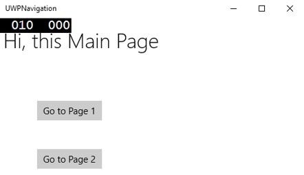
When you click on any button, it will navigate you to the respective page. Let us click on Go to Page 1 and the following page will be displayed.
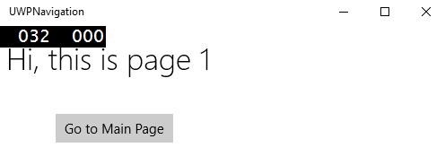
When you click on the button 'Go to Main Page', it will navigate back to the main page.
Windows 10 Development - Networking
Nowadays, you will see many applications, which have somehow integrated with web services or other devices on a network. Fetching online weather content, latest news, chatting or peer-to-peer games are some examples which use network services. These apps are built using a wide variety of networking APIs. In Windows 10, the networking APIs are improved in terms of their speed and memory performances as well as the capabilities and flexibility they provide to the developers.
Capabilities
In order to network, you must add appropriate capability elements to your app manifest. If no network capability is specified in your app's manifest, your app will have no networking capability, and any attempt to connect to the network will fail.
The following are the most-used networking capabilities.
| S.No. | Capability & Description |
|---|---|
| 1 | internetClient Provides outbound access to the Internet and networks in public places, like airports and coffee shop. Most apps that require Internet access should use this capability. |
| 2 | internetClientServer Gives the app inbound and outbound network access from the Internet and networks in public places like airports and coffee shops. |
| 3 | privateNetworkClientServer Gives the app inbound and outbound network access at the users’ trusted places, like home and work. |
To define one or more capabilities in your app manifest file, look at the image given below.
The Universal Windows Platform (UWP) contains a large set of networking APIs by targeting the following −
- Querying the connectivity status of the device and connecting to the peer devices.
- Communicating with REST web services and
- Downloading large media files in the background
Networking Technologies
In Universal Windows Platform (UWP), the following networking technologies are available for the developers, which can be used in many different situations.
Sockets
Sockets are used when you want to communicate with another device with your own protocol.
You can use both, Windows.Networking.Sockets and Winsock to communicate with other devices as a Universal Windows Platform (UWP) app developer.
Windows.Networking.Sockets has the advantage of being a modern API, designed for use by UWP developers.
If you are using cross-platform networking libraries or other existing Winsock code, then use Winsock APIs.
The following code shows how to create a socket listener.
try {

//Create a StreamSocketListener to start listening for TCP connections.
   Windows.Networking.Sockets.StreamSocketListener socketListener = new
      Windows.Networking.Sockets.StreamSocketListener();

//Hook up an event handler to call when connections are received.
   socketListener.ConnectionReceived += SocketListener_ConnectionReceived;

//Start listening for incoming TCP connections on the specified port.
   You can specify any port that's not currently in use.

   await socketListener.BindServiceNameAsync("1337");
} catch (Exception e) {
   //Handle exception.
}
The following code shows the implementation of the SocketListener_ConnectionReceived event handler.
private async void SocketListener_ConnectionReceived(
   Windows.Networking.Sockets.StreamSocketListen er sender,
   Windows.Networking.Sockets.StreamSocketListenerConnectionReceivedEventArgs args){

   //Read line from the remote client.
   Stream inStream = args.Socket.InputStream.AsStreamForRead();
   StreamReader reader = new StreamReader(inStream);
   string request = await reader.ReadLineAsync();

   //Send the line back to the remote client.
   Stream outStream = args.Socket.OutputStream.AsStreamForWrite();
   StreamWriter writer = new StreamWriter(outStream);

   await writer.WriteLineAsync(request);
   await writer.FlushAsync();
}
WebSocket
The WebSockets protocol provides a fast and secure two-way communication between a client and a server over the web. Universal Windows Platform (UWP) developers can use the MessageWebSocket and StreamWebSocket classes to connect with servers that support the Websocket protocol.
Important features are −
Under the WebSocket Protocol, data is transferred immediately over a full-duplex single socket connection.
It allows messages to be sent and received from both endpoints in real time.
WebSockets are ideal for use in real-time gaming where instant social network notifications and up-to-date displays of information (game statistics) need to be secure and use fast data transfer.
The following code shows how to send and receive messages on a secure connection.
MessageWebSocket webSock = new MessageWebSocket();

//In this case we will be sending/receiving a string so we need to
   set the MessageType to Utf8.
webSock.Control.MessageType = SocketMessageType.Utf8;

//Add the MessageReceived event handler.
webSock.MessageReceived += WebSock_MessageReceived;

//Add the Closed event handler.
webSock.Closed += WebSock_Closed;

Uri serverUri = new Uri("wss://echo.websocket.org");

try {
   //Connect to the server.
   await webSock.ConnectAsync(serverUri);

   //Send a message to the server.
   await WebSock_SendMessage(webSock, "Hello, world!");
} catch (Exception ex) {
   //Add code here to handle any exceptions
}
The following code shows the event implementation, which will receive a string from a connected WebSocket.
//The MessageReceived event handler.
private void WebSock_MessageReceived(MessageWebSocket sender,
   MessageWebSocketMessageReceivedEventArgs args){

   DataReader messageReader = args.GetDataReader();
   messageReader.UnicodeEncoding = UnicodeEncoding.Utf8;
   string messageString = messageReader.ReadString(
      messageReader.UnconsumedBufferLength);
   //Add code here to do something with the string that is received.
}
HttpClient
HttpClient and Windows.Web.Http namespace APIs, provide ability to the developer to send and receive information using the HTTP 2.0 and HTTP 1.1 protocols.
It can be used to −
- communicate with a web service or a web server.
- Upload or download a number of small files.
- Stream the content over the network.
The following code shows how to send a GET request using Windows.Web.Http.HttpClient and Windows.Web.Http.HttpResponseMessage.
//Create an HTTP client object
Windows.Web.Http.HttpClient httpClient = new Windows.Web.Http.HttpClient();

//Add a user-agent header to the GET request.
var headers = httpClient.DefaultRequestHeaders;

//The safe way to add a header value is to use the TryParseAdd method
   and verify the return value is true,

//especially if the header value is coming from user input.
string header = "ie";

if (!headers.UserAgent.TryParseAdd(header)) {
   throw new Exception("Invalid header value: " + header);
}

header = "Mozilla/5.0 (compatible; MSIE 10.0; Windows NT 6.2; WOW64; Trident/6.0)";

if (!headers.UserAgent.TryParseAdd(header)) {
   throw new Exception("Invalid header value: " + header);
}

Uri requestUri = new Uri("http://www.contoso.com");

//Send the GET request asynchronously and retrieve the response as a string.
Windows.Web.Http.HttpResponseMessage httpResponse = new
   Windows.Web.Http.HttpResponseMessage();
string httpResponseBody = "";

try {
   //Send the GET request
   httpResponse = await httpClient.GetAsync(requestUri);
   httpResponse.EnsureSuccessStatusCode();
   httpResponseBody = await httpResponse.Content.ReadAsStringAsync();
} catch (Exception ex) {
   httpResponseBody = "Error: " + ex.HResult.ToString("X") + " Message: " + ex.Message;
}
Windows 10 Development - Cloud Services
As a developer, you may require data other than that available on your desktop. Cloud services can help you to access that data. This chapter gives a better understanding of the cloud services, which you may require.
Microsoft has provided a cloud-computing platform and the infrastructure, which is known as Microsoft Azure, where you can build, deploy and manage all the applications and services.
Azure was first released on 1 February 2010, as Windows Azure. Later it was renamed to Microsoft Azure on 25 March 2014.
It provides both, PaaS and IaaS services and supports many different programming languages, tools and frameworks, including both Microsoft-specific and third party software and systems.
Microsoft has upgraded the cloud services with Windows 10. The Microsoft account integration was introduced in Windows 8, though OneDrive has been around since 2007. For Windows 10, both services have been updated with increased integration and new functionality, which are attracting more users.
Microsoft Account
You can use Microsoft’s Azure cloud offerings with your Microsoft account. Of course, it is not free but you can use a free 30 days trial.
When you first set up a machine with Windows 10 and login with Microsoft account, you can use the same account for Microsoft Azure subscription. To sign up for Microsoft Azure click here https://azure.microsoft.com/.
Once you subscribe for Microsoft Azure, go to the Azure Portal https://portal.azure.com/. You will see the following page.
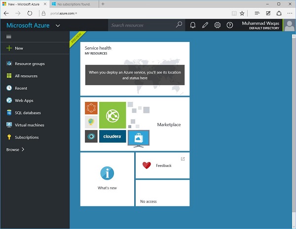
You can store in the databases, use Virtual machines etc. You can also build and host the back end of your mobile app.
Let us try this with an example by following the below mention steps.
Click on the New option in the left pane.
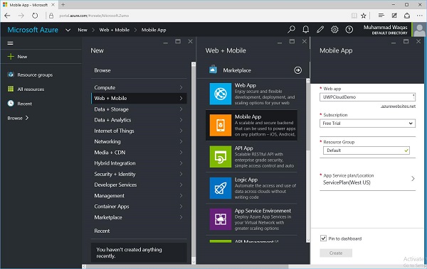
Select Web + Mobile > Mobile App and give a name to your Web app.
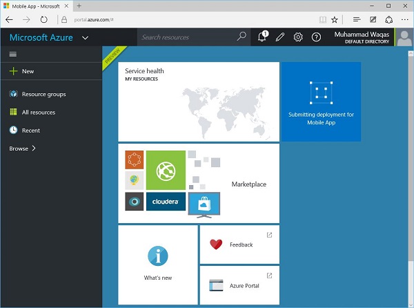
It will take some time for submitting and deploying your app. Once this process is completed, you will see the following page. Here, you can select the different kinds of mobile apps such Windows(C#), iOS Android, etc.
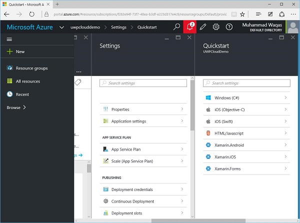
Since, we are talking about Windows 10, select Windows (C#), which will open the following page.
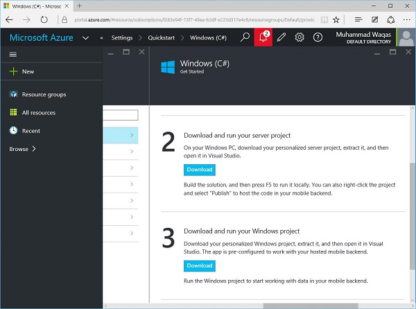
Here, you can see the two download options. These are sample projects, you can simply download and build in Visual Studio and then you can easily publish to Microsoft Azure.
Let us download the first one, which is a server project. It is a zip file.
When downloading is complete, unzip this and open in Visual Studio.
Now, build this application. If some errors are listed then build it again.
Run the application. You will see the following webpage, which is now on localhost.
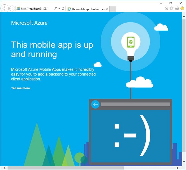
Now to host this application on the cloud, right click on the Project option in Solution Explore as shown below.
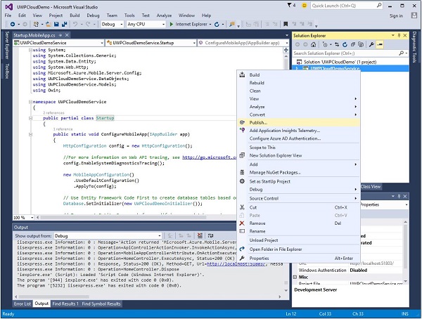
Select Publish option from the menu. You will see the following dialog.
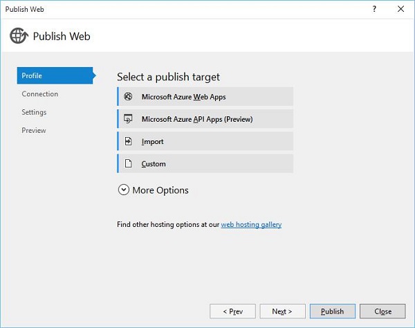
Select the first option − Microsoft Azure Web Apps. The following dialog box will open.
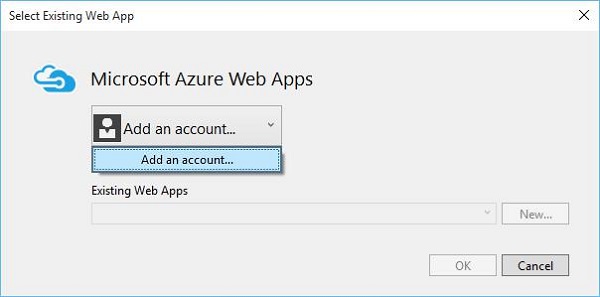
Now click on the Add an account option from the menu to add Microsoft Azure account.
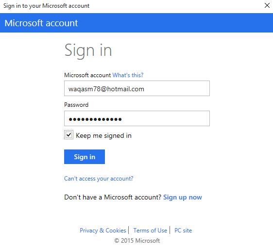
Specify your credentials and click Sign in. The following dialog window will open.
After signing in, select your application from the menu Existing Web Apps and click Ok.
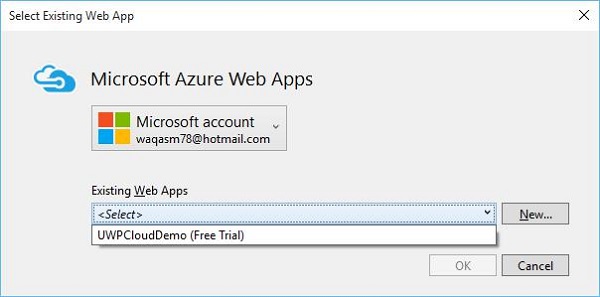
The dialog shown below displays some information related to your application such as name, server name, URL, etc.
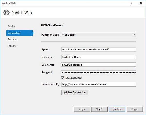
Now, click on the Validate Connection button. After validation, click the Publish button and you will see that your application is now hosted on Microsoft Azure.
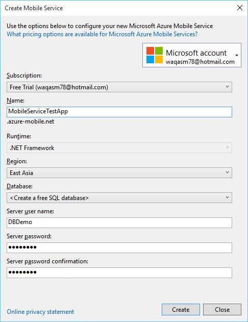
Windows 10 Development - Live Tiles
In this chapter, we will talk about the interaction with a user through tiles. It is the iconic part of Windows 10. Tiles are displayed on the Start Screen as well as on the Start Menu. In other words, it is an application icon asset, which appears in a variety of forms throughout the Windows 10 operating system. They are the calling cards for your Universal Windows Platform (UWP) app.
Tile Anatomy
There are three states of tile.
Basic State − Basic components of a Start tile consist of a back plate, an icon, and an app title.
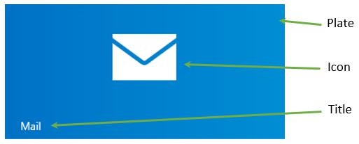
Semi-Live state − It is the same as the basic tile with the only difference that the badge, which is a number, can display the numbers from 0-99.
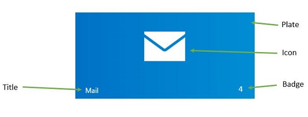
Live State − This tile contains all the elements of semi-live state tile and also shows additional content plate where you can put anything you want such as photos, text etc.
Updating Tiles
There are four ways to update the tiles.
Scheduled − You can set the template and time with ScheduledTileNotification.
Periodic − When information is retrieved from a URI and you can specify the time to pull the information after that period of time, such as 30min, 1 hr., 6 hrs. etc.
Local − Local one can be updated from your application; either from the foreground or the background app.
Push − It is updated from the server by pushing the information from the server.
To create a tile, follow the given code.
var tileXml =
   TileUpdateManager.GetTemplateContent(TileTemplateType.TileSquare150x150Text01);

var tileAttributes = tileXml.GetElementsByTagName("text");
tileAttributes[0].AppendChild(tileXml.CreateTextNode("Hello"));

var tileNotification = new TileNotification(tileXml);
TileUpdateManager.CreateTileUpdaterForApplication().Update(tileNotification);
Update badge is pretty simple because it is just a number and you can set the value of badge as shown below.
var type = BadgeTemplateType.BadgeNumber;
var xml = BadgeUpdateManager.GetTemplateContent(type);

var elements = xml.GetElementsByTagName("badge");
var element = elements[0] as Windows.Data.Xml.Dom.XmlElement;
element.SetAttribute("value", "7");

var updator = BadgeUpdateManager.CreateBadgeUpdaterForApplication();
var notification = new BadgeNotification(xml);
updator.Update(notification);
Let us create a new UWP project in Visual Studio.
You will see the different png files under the Assets folder in Solution Explorer.
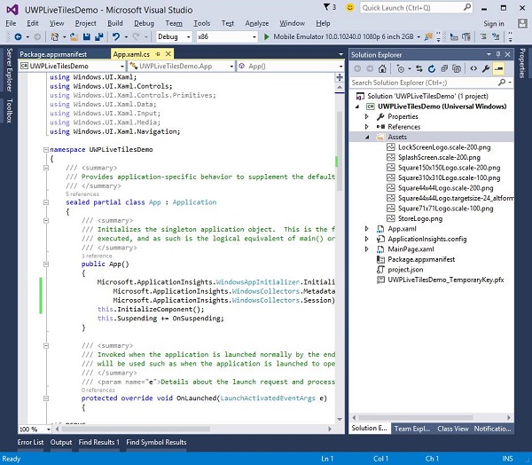
Let us define a default tile and its image in the package manifest.
Double-click on the package.appxmanifest. This opens the manifest editor window.
Select Visual Assets tab.
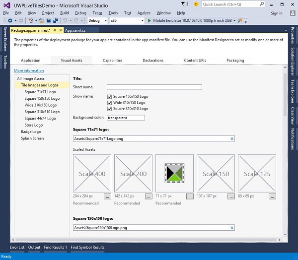
You can select the images and icons for your application tile with any of the specified dimensions. Under the Tile Images and Logos, default images are provided for all logos such as
- Square 71x71 Logo
- Square 150x150 Logo
- Square 310x310 Logo
- Store Logo
When you execute your application and then go to your start screen, you will see the tile for your application.
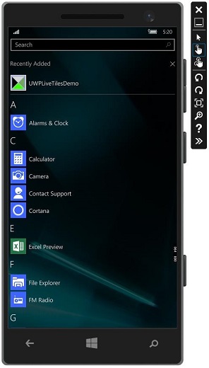
Windows 10 Development - Sharing Contract
In this chapter, we will learn how to share data between applications. Users often come across information that they are excited to share with someone or use it in another application. Nowadays, users want to use technology to connect and share with other people.
A user may want to share −
- A link with their social network
- Copy a picture into a report
- Upload a file to cloud storage
Applications today, need to ensure that the data they use is also available for users to share and exchange. Share is a lightweight feature, which is easy to add to your UWP application. There are several ways for the apps to exchange data with other apps.
In UWP applications, the share feature can be supported in the following ways;
First, application can be a source app that provides content that the user wants to share.
Second, the app can be a target app that the user selects as the destination for shared content.
An app can also be both a source app and a target app.
Sharing Content
Sharing content from an application, which is a source app is very simple. To perform any sharing operation, you will need the DataPackage class object. This object contains the data, which the user wants to share.
The following types of content can be included in DataPackage object −
- Plain text
- Uniform Resource Identifiers (URIs)
- HTML
- Formatted text
- Bitmaps
- Files
- Developer-defined data
While sharing data, you can include one or more of the above-mentioned formats. To support sharing in your application, you first need to get the instance of the DataTransferManager class.
It will then register an event handler that is called whenever a DataRequested event occurs.
DataTransferManager dataTransferManager = DataTransferManager.GetForCurrentView();
dataTransferManager.DataRequested += new TypedEventHandler<DataTransferManager,
   DataRequestedEventArgs>(this.ShareTextHandler);
When your app receives a DataRequest object, then your application is ready to add the content that the user wants to share.
private void ShareTextHandler(DataTransferManager sender, DataRequestedEventArgs e){
   DataRequest request = e.Request;

   // The Title is mandatory
   request.Data.Properties.Title = "Share Text Example";
   request.Data.Properties.Description = "A demonstration that shows how to share text.";
   request.Data.SetText("Hello World!");
}
Any content that your application shares, must contain two properties −
- A Title property, which is mandatory and must be set.
- The content itself.
Receiving Shared Content
If you want that your application can receive shared content then the first thing you need to do is to declare that it supports the Share Contract. After declaration, the system will let your application be available to receive content.
To add support of the Share Contract −
Double click on the package.appmanifest file.
Go to the Declarations tab. Choose Share Target from the Available Declarations list, and click on the Add button.
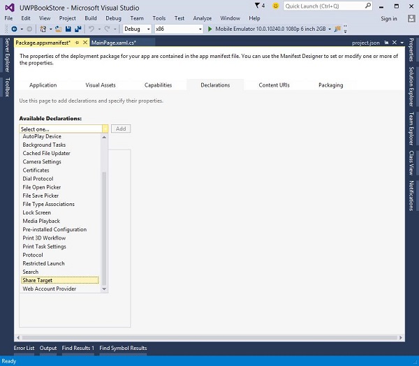
If you want your application to receive any kind of file as shared content, then you can specify the file types and data formats.
To specify the Data Formats that you support go to the Data Formats section, of the Declarations page and click Add New.
Type the name of the data format you support. For example, "Text".
To specify the file type that you support, in the Supported File Types section of the Declarations page, click Add New.
Type the file name extension that you want to support, e.g, .pdf
If you want to support All file types, check the SupportsAnyFileType box.
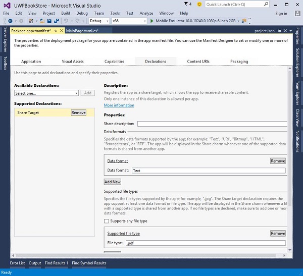
When a user selects your application as target application for sharing data then OnShareTargetActivated event is fired.
Your app needs to handle this event to process the data, which the user wants to share.
protected override async void OnShareTargetActivated(ShareTargetActivatedEventArgs args) {
   // Code to handle activation goes here.
}
All the data that the user wants to share with any application is contained in a ShareOperation object. You can also check the format of the data it contains.
Given below is the code snippet that handles shared content in plain text format.
ShareOperation shareOperation = args.ShareOperation;

if (shareOperation.Data.Contains(StandardDataFormats.Text)) {
   string text = await shareOperation.Data.GetTextAsync();

   // To output the text from this example, you need a TextBlock control
   // with a name of "sharedContent".
   sharedContent.Text = "Text: " + text;
}
Let us have look at a simple example by creating a new UWP project, which will share a weblink.
Given below is the XAML code in which a button is created with some properties.
<Page
   x:Class = "UWPSharingDemo.MainPage"
   xmlns = "http://schemas.microsoft.com/winfx/2006/xaml/presentation"
   xmlns:x = "http://schemas.microsoft.com/winfx/2006/xaml"
   xmlns:local = "using:UWPSharingDemo"
   xmlns:d = "http://schemas.microsoft.com/expression/blend/2008"
   xmlns:mc = "http://schemas.openxmlformats.org/markup-compatibility/2006"
   mc:Ignorable = "d">

   <Grid Background = "{ThemeResource ApplicationPageBackgroundThemeBrush}">

      <StackPanel Orientation = "Vertical">
         <TextBlock Text = "Share Web Link" Style = "{StaticResource
            HeaderTextBlockStyle}" Margin = "30"></TextBlock>

         <Button Content = "Invoke share contract" Margin = "10"
            Name = "InvokeShareContractButton" Click = "InvokeShareContractButton_Click"
            ></Button>
      </StackPanel>

   </Grid>

</Page>
C# code in which button-click event is implemented and a URI-sharing code is given below.
using System;

using Windows.ApplicationModel.DataTransfer;
using Windows.UI.Xaml;
using Windows.UI.Xaml.Controls;

// The Blank Page item template is documented at
   http://go.microsoft.com/fwlink/?LinkId=402352&clcid=0x409

namespace UWPSharingDemo {

   /// <summary>
      /// An empty page that can be used on its own or navigated to within a Frame.
   /// </summary>

   public sealed partial class MainPage : Page {

      DataTransferManager dataTransferManager;

      public MainPage() {
         this.InitializeComponent();
         dataTransferManager = DataTransferManager.GetForCurrentView();
         dataTransferManager.DataRequested += dataTransferManager_DataRequested;
      }

      void dataTransferManager_DataRequested(DataTransferManager sender,
         DataRequestedEventArgs args) {
            Uri sharedWebLink = new Uri("https://msdn.microsoft.com");

            if (sharedWebLink != null) {
               DataPackage dataPackage = args.Request.Data;
               dataPackage.Properties.Title = "Sharing MSDN link";

               dataPackage.Properties.Description = "The Microsoft Developer Network (MSDN)
                  is designed to help developers write applications using Microsoft
                  products and technologies.";

               dataPackage.SetWebLink(sharedWebLink);
            }
      }

      private void InvokeShareContractButton_Click(object sender, RoutedEventArgs e) {
         DataTransferManager.ShowShareUI();
      }

   }
}
When the above code is compiled and executed, you will see the following page on the emulator.
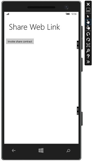
When the button is clicked, it will give the options to share on which application.
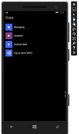
Click on messaging and the following window will be displayed from where you can send the link to anyone.
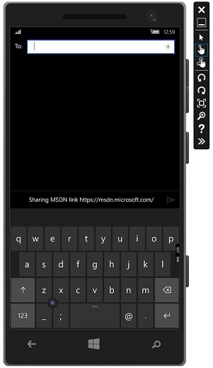
Windows 10 Dev - Porting to Windows
In this chapter, we will learn how to port your existing app Windows 8.1 application to the Universal Windows Platform (UWP). You can create a single Windows 10 app package that your customers can install onto all types of devices.
After porting your application to the Windows 10 UWP, your app will benefit from −
- Exciting new hardware
- Great monetization opportunities
- A modern API set,
- Adaptive UI controls,
- Adaptive Design and Code
- A range of input modalities such as mouse, keyboard, touch, and speech.
Porting a Windows 8.x Project to a UWP Project
There are two options to port your existing Windows 8.x application to Universal Windows Platform (UWP).
Option 1 − One is to create a new Windows 10 project in Visual Studio and copy your files into it.
Option 2 − The other option is to edit a copy of your existing project files, including the app package manifest.
Below given are the main steps while using the first option.
Launch Microsoft Visual Studio 2015 and create a new Blank Application (Windows Universal) project with the name UWPBookStore.
Your new project builds an app package (an appx file) that will run on all device families.
In your Universal 8.1 app project, identify all the source code files and visual asset files that you want to reuse. Shown below is a sample application, which has three projects. One is used for Windows, the second one is for mobile and the third one is the shared project for Windows and mobile.
After running this application on phone, you will see the following window.
After running the window application, you will see the following application.
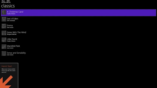
- Now, open the newly created UWP project application
From the Shared Project, copy the folder Assets\CoverImages containing the book cover image (.png) files. Also copy the ViewModel folder and the MainPage.xaml and replace the file in the destination.
From the Windows project, copy BookstoreStyles.xaml. All the resource keys in this file will resolve in a Windows 10 app. Some of those in the equivalent WindowsPhone file will not.
In the Solution Explorer, make sure Show All Files is toggled ON.
Select the files that you copied, right-click them, and click Include In Project as shown below.
This will automatically include their containing folders. You can then toggle Show All Files ‘OFF’ if you like.
Now your project structure will look like this in Solution Explorer.
Edit the source code and markup files that you just copied and change any references to the Bookstore1_81 namespace to UWPBookStore namespace.
The easiest way is to replace the name space with Replace In Files feature. No code changes are needed in the view model.
Now, when the above code is executed, you can run it on a local machine as well as on a mobile as shown below.
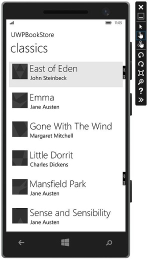
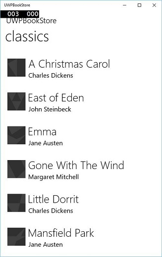
Now, the second option is to edit a copy of your existing project files, including the app package manifest. The project file and the package.appmanifest file need some modifications when porting from Windows/phone 8.x to Windows 10.
Microsoft has provided UWP project upgrade utility, which is very helpful while porting your existing application. The utility can be downloaded from github.com.
We recommend you to follow the above examples step by step for better understanding.