- Tcl Tutorial
- Tcl - Home
- Tcl - Overview
- Tcl - Environment Setup
- Tcl - Special Variables
- Tcl - Basic Syntax
- Tcl - Commands
- Tcl - Data Types
- Tcl - Variables
- Tcl - Operators
- Tcl - Decisions
- Tcl - Loops
- Tcl - Arrays
- Tcl - Strings
- Tcl - Lists
- Tcl - Dictionary
- Tcl - Procedures
- Tcl - Packages
- Tcl - Namespaces
- Tcl - File I/O
- Tcl - Error Handling
- Tcl - Built-in Functions
- Tcl - Regular Expressions
- Tk Tutorial
- Tk - Overview
- Tk - Environment
- Tk - Special Variables
- Tk - Widgets Overview
- Tk - Basic Widgets
- Tk - Layout Widgets
- Tk - Selection Widgets
- Tk - Canvas Widgets
- Tk - Mega Widgets
- Tk - Fonts
- Tk - Images
- Tk - Events
- Tk - Windows Manager
- Tk - Geometry Manager
- Tcl/Tk Useful Resources
- Tcl/Tk - Quick Guide
- Tcl/Tk - Useful Resources
- Tcl/Tk - Discussion
Tk - Widgets Overview
The basic component of a Tk-based application is called a widget. A component is also sometimes called a window, since, in Tk, "window" and "widget" are often used interchangeably. Tk is a package that provides a rich set of graphical components for creating graphical applications with Tcl.
Tk provides a range of widgets ranging from basic GUI widgets like buttons and menus to data display widgets. The widgets are very configurable as they have default configurations making them easy to use.
Tk applications follow a widget hierarchy where any number of widgets may be placed within another widget, and those widgets within another widget. The main widget in a Tk program is referred to as the root widget and can be created by making a new instance of the TkRoot class.
Creating a Widget
The syntax for creating a widget is given below.
type variableName arguments options
The type here refers to the widget type like button, label, and so on. Arguments can be optional and required based on individual syntax of each widget. The options range from size to formatting of each component.
Widget Naming Convention
Widget uses a structure similar to naming packages. In Tk, the root window is named with a period (.) and an element in window, for example button is named .myButton1. The variable name should start with a lowercase letter, digit, or punctuation mark (except a period). After the first character, other characters may be uppercase or lowercase letters, numbers, or punctuation marks (except periods). It is recommended to use a lowercase letter to start the label.
Color Naming Convention
The colors can be declared using name like red, green, and so on. It can also use hexadecimal representing with #. The number of hexadecimal digits can be 3, 6, 9, or 12.
Dimension Convention
The default unit is pixels and it is used when we specify no dimension. The other dimensions are i for inches, m for millimeters, c for centimeters and p for points.
Common Options
There are so many common options available to all widgets and they are listed below in the following table −
| Sr.No. | Syntax & Description |
|---|---|
| 1 | -background color Used to set background color for widget. |
| 2 | -borderwidth width Used to draw with border in 3D effects. |
| 3 | -font fontDescriptor Used to set font for widget. |
| 4 | -foreground color Used to set foreground color for widget. |
| 5 | -height number Used to set height for widget. |
| 6 | -highlightbackground color Used to set the color rectangle to draw around a widget when the widget does not have input focus. |
| 7 | -highlightcolor color Used to set the color rectangle to draw around a widget when the widget has input focus. |
| 8 | -padx number Sets the padx for the widget. |
| 9 | -pady number Sets the pady for the widget. |
| 10 | -relief condition Sets the 3D relief for this widget. The condition may be raised, sunken, flat, ridge, solid, or groove. |
| 11 | -text text Sets the text for the widget. |
| 12 | -textvariable varName Variable associated with the widget. When the text of widget changes, the variable is set with text of widget. |
| 13 | -width number Sets the width for widget. |
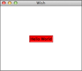
A simple example for options is shown below.
#!/usr/bin/wish

grid [label .myLabel -background red -text "Hello World" -relief ridge -borderwidth 3]
   -padx 100 -pady 100
When we run the above program, we will get the following output.
The list of available widgets are categorized below −
Basic widgets
| Sr.No. | Widget & Description |
|---|---|
| 1 | Label Widget for displaying single line of text. |
| 2 | Button Widget that is clickable and triggers an action. |
| 3 | Entry Widget used to accept a single line of text as input. |
| 4 | Message Widget for displaying multiple lines of text. |
| 5 | Text Widget for displaying and optionally edit multiple lines of text. |
| 6 | Toplevel Window with all borders and decorations provided by the Window manager. |
Layout Widgets
| Sr.No. | Widget & Description |
|---|---|
| 1 | Frame Container widget to hold other widgets. |
| 2 | Place Widget to hold other widgets in specific place with coordinates of its origin and an exact size. |
| 3 | Pack Simple widget to organize widgets in blocks before placing them in the parent widget. |
| 4 | Grid Widget to nest widgets packing in different directions. |
Selection Widgets
| Sr.No. | Widget & Description |
|---|---|
| 1 | Radiobutton Widget that has a set of on/off buttons and labels, one of which may be selected. |
| 2 | Checkbutton Widget that has a set of on/off buttons and labels, many of which may be selected.. |
| 3 | Menu Widget that acts as holder for menu items. |
| 4 | Listbox Widget that displays a list of cells, one or more of which may be selected. |
Mega Widgets
| Sr.No. | Widget & Description |
|---|---|
| 1 | Dialog Widget for displaying dialog boxes. |
| 2 | Spinbox Widget that allows users to choose numbers. |
| 3 | Combobox Widget that combines an entry with a list of choices available to the use. |
| 4 | Notebook Tabbed widget that helps to switch between one of several pages, using an index tab. |
| 5 | Progressbar Widget to provide visual feedback to the progress of a long operation like file upload. |
| 6 | Treeview Widget to display and allow browsing through a hierarchy of items more in form of tree. |
| 7 | Scrollbar Scrolling widgets without a text or canvas widgets. |
| 8 | Scale Scale widget to choose a numeric value through sliders. |
Other Widgets
| Sr.No. | Widget & Description |
|---|---|
| 1 | Canvas Drawing widget for displaying graphics and images.. |
We will cover each of these widgets in the upcoming chapters.