- Seaborn Tutorial
- Seaborn - Home
- Seaborn - Introduction
- Seaborn - Environment Setup
- Importing Datasets and Libraries
- Seaborn - Figure Aesthetic
- Seaborn- Color Palette
- Seaborn - Histogram
- Seaborn - Kernel Density Estimates
- Visualizing Pairwise Relationship
- Seaborn - Plotting Categorical Data
- Distribution of Observations
- Seaborn - Statistical Estimation
- Seaborn - Plotting Wide Form Data
- Multi Panel Categorical Plots
- Seaborn - Linear Relationships
- Seaborn - Facet Grid
- Seaborn - Pair Grid
- Function Reference
- Seaborn - Function Reference
- Seaborn Useful Resources
- Seaborn - Quick Guide
- Seaborn - Useful Resources
- Seaborn - Discussion
Seaborn - Plotting Categorical Data
In our previous chapters we learnt about scatter plots, hexbin plots and kde plots which are used to analyze the continuous variables under study. These plots are not suitable when the variable under study is categorical.
When one or both the variables under study are categorical, we use plots like striplot(), swarmplot(), etc,. Seaborn provides interface to do so.
Categorical Scatter Plots
In this section, we will learn about categorical scatter plots.
stripplot()
stripplot() is used when one of the variable under study is categorical. It represents the data in sorted order along any one of the axis.
Example
import pandas as pd
import seaborn as sb
from matplotlib import pyplot as plt
df = sb.load_dataset('iris')
sb.stripplot(x = "species", y = "petal_length", data = df)
plt.show()
Output
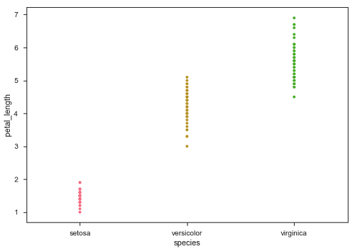
In the above plot, we can clearly see the difference of petal_length in each species. But, the major problem with the above scatter plot is that the points on the scatter plot are overlapped. We use the ‘Jitter’ parameter to handle this kind of scenario.
Jitter adds some random noise to the data. This parameter will adjust the positions along the categorical axis.
Example
import pandas as pd
import seaborn as sb
from matplotlib import pyplot as plt
df = sb.load_dataset('iris')
sb.stripplot(x = "species", y = "petal_length", data = df, jitter = Ture)
plt.show()
Output
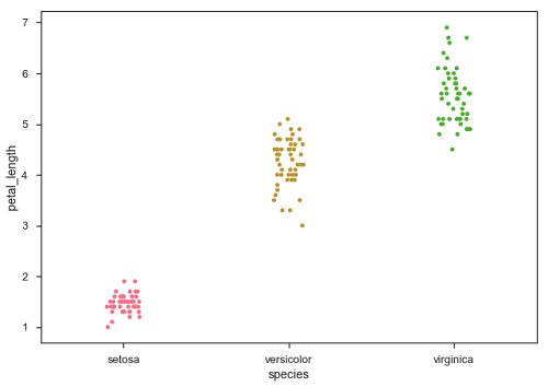
Now, the distribution of points can be seen easily.
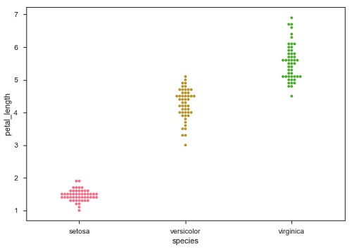
Swarmplot()
Another option which can be used as an alternate to ‘Jitter’ is function swarmplot(). This function positions each point of scatter plot on the categorical axis and thereby avoids overlapping points −
Example
import pandas as pd
import seaborn as sb
from matplotlib import pyplot as plt
df = sb.load_dataset('iris')
sb.swarmplot(x = "species", y = "petal_length", data = df)
plt.show()
Output