- Seaborn Tutorial
- Seaborn - Home
- Seaborn - Introduction
- Seaborn - Environment Setup
- Importing Datasets and Libraries
- Seaborn - Figure Aesthetic
- Seaborn- Color Palette
- Seaborn - Histogram
- Seaborn - Kernel Density Estimates
- Visualizing Pairwise Relationship
- Seaborn - Plotting Categorical Data
- Distribution of Observations
- Seaborn - Statistical Estimation
- Seaborn - Plotting Wide Form Data
- Multi Panel Categorical Plots
- Seaborn - Linear Relationships
- Seaborn - Facet Grid
- Seaborn - Pair Grid
- Function Reference
- Seaborn - Function Reference
- Seaborn Useful Resources
- Seaborn - Quick Guide
- Seaborn - Useful Resources
- Seaborn - Discussion
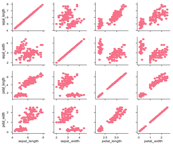
Seaborn - Pair Grid
PairGrid allows us to draw a grid of subplots using the same plot type to visualize data.
Unlike FacetGrid, it uses different pair of variable for each subplot. It forms a matrix of sub-plots. It is also sometimes called as “scatterplot matrix”.
The usage of pairgrid is similar to facetgrid. First initialise the grid and then pass the plotting function.
Example
import pandas as pd
import seaborn as sb
from matplotlib import pyplot as plt
df = sb.load_dataset('iris')
g = sb.PairGrid(df)
g.map(plt.scatter);
plt.show()
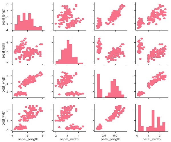
It is also possible to plot a different function on the diagonal to show the univariate distribution of the variable in each column.
Example
import pandas as pd
import seaborn as sb
from matplotlib import pyplot as plt
df = sb.load_dataset('iris')
g = sb.PairGrid(df)
g.map_diag(plt.hist)
g.map_offdiag(plt.scatter);
plt.show()
Output
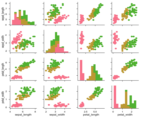
We can customize the color of these plots using another categorical variable. For example, the iris dataset has four measurements for each of three different species of iris flowers so you can see how they differ.
Example
import pandas as pd
import seaborn as sb
from matplotlib import pyplot as plt
df = sb.load_dataset('iris')
g = sb.PairGrid(df)
g.map_diag(plt.hist)
g.map_offdiag(plt.scatter);
plt.show()
Output
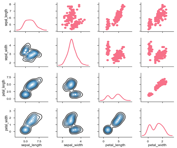
We can use a different function in the upper and lower triangles to see different aspects of the relationship.
Example
import pandas as pd
import seaborn as sb
from matplotlib import pyplot as plt
df = sb.load_dataset('iris')
g = sb.PairGrid(df)
g.map_upper(plt.scatter)
g.map_lower(sb.kdeplot, cmap = "Blues_d")
g.map_diag(sb.kdeplot, lw = 3, legend = False);
plt.show()
Output