- SAP Webi Tutorial
- SAP Webi - Home
- SAP Webi - Overview
- SAP Webi - BI Launchpad
- SAP Webi - BI Preferences
- SAP Webi - Application Modes
- SAP Webi - Creating Documents
- Editing & Opening Documents
- Web Intelligence Sending Documents
- SAP Webi - Managing Reports
- SAP Webi - Using Queries
- SAP Webi - Queries Using Universe
- SAP Webi - Queries Using Bex
- Queries Using Analysis View
- SAP Webi - Query Filters
- SAP Webi - Query Filter Types
- SAP Webi - Ranking Data
- SAP Webi - Working With Reports
- SAP Webi - Breaks
- SAP Webi - Sorts
- SAP Webi - Charts
- SAP Webi - Conditional Formatting
- SAP Webi - Filtering Report Data
- SAP Webi - Input Controls
- SAP Webi - Formulas and Variables
- SAP Webi - Drill Options in Reports
- SAP Webi - Sharing Reports
- SAP Webi - Merge Dimension
- SAP Webi Useful Resources
- SAP Webi - Questions Answers
- SAP Webi - Quick Guide
- SAP Webi - Useful Resources
- SAP Webi - Discussion
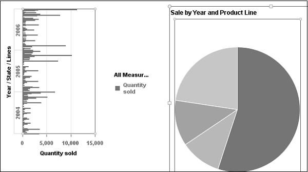
SAP Webi - Charts
In a Webi document, you can include one or more charts. You can insert charts in an existing document or in a new document.
When a Webi document containing chart is exported into an Excel or PDF format, the chart is converted into an image.
Chart Types
You can convert the tables in a Webi report into different chart types. There are different Chart types available in Webi.
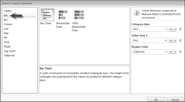
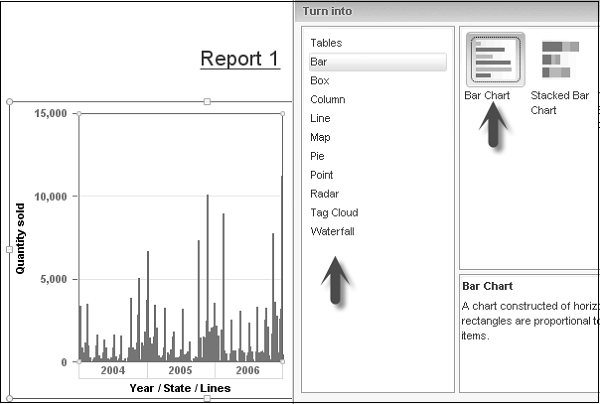
Bar Charts
Bar charts are used to compare similar groups of data and they display data in rectangular form horizontally. Following are the different types of Bar Chart −
- Bar Chart
- Stacked Bar Chart
- 100% Stacked Bar Chart
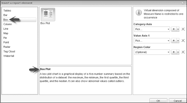
Box Plot Charts
As mentioned in description of box charts, it is a graphical display of a five number summary based on distribution of a dataset: the maximum, the minimum, the first quartile, the third quartile, and the median. It can also show abnormal values called outliers.
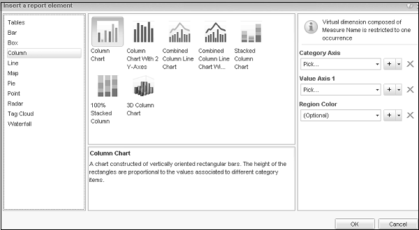
Column Charts
Column charts are constructed of vertically-oriented rectangular bars. The height of the rectangles are proportional to the values associated with different category items.
Following are the different types of Column charts −
- Column Chart
- Column Chart with 2 Y-axes
- Combined column Line Chart
- Stacked Column Chart
- 100% Stacked Column Chart
- 3D Column Chart
Line Charts
An XY chart that displays lines connecting plots. Value axis plot positions are expressed by analysis category items. The second value axis plot positions represent the associated values.
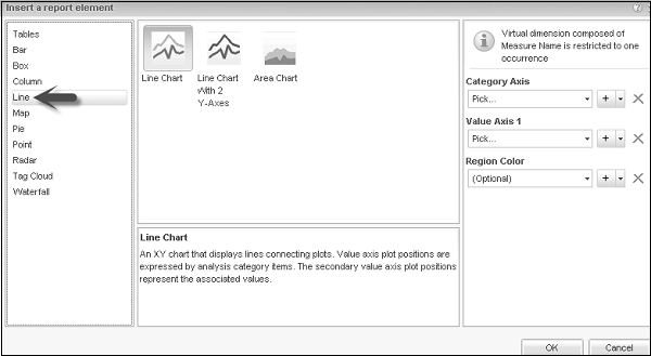
Following are the different types of Line Chart −
- Line Chart
- Line Chart with 2 Y Axes
- Area Chart
Map Charts
This chart displays values within nested rectangles that can be colored. The levels of nesting correspond to the levels of hierarchy breakdown. The size of rectangles and their color both express a set of values.
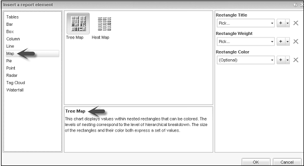
Following are the different types of Map Charts −
- Tree Map
- Heat Map
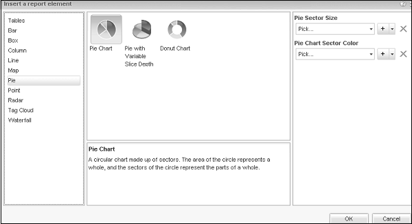
Pie Charts
A circular chart made up of sectors. The area of circle represents a whole, and the sectors of circle represent the parts of a whole.
Different types of Pie Charts −
- Pie Chart
- Pie Chart with Variable Slice Depth
- Donut Chart
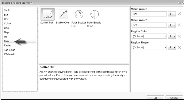
Point Charts
Point chart is an XY chart displaying plots. Plots are positioned with coordinates represented by a pair of values.
Following are the different type of Point Charts −
- Scatter Plot
- Bubble Chart
- Polar Scatter Chart
- Polar Bubble Chart
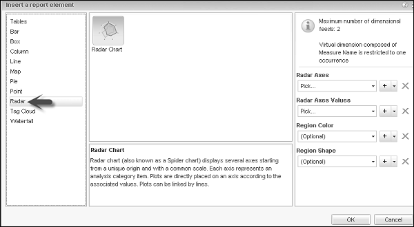
Radar Chart
It is also known as Spider chart and displays several axes starting from unique origin with a common scale.
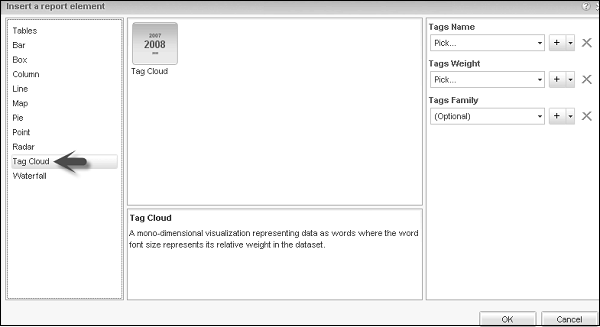
Tag Cloud
A mono dimensional visualization representing data as words where the word font size represents its relative weight in dataset.
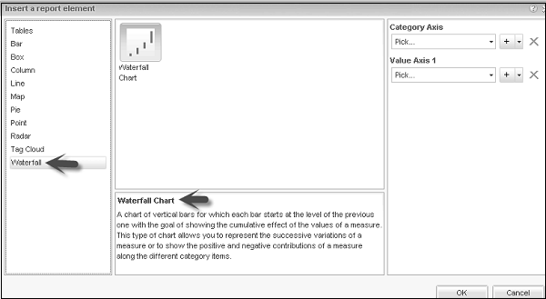
Waterfall
It is used to show the cumulative effect of values of a measure and each bar starts with the level of previous one.
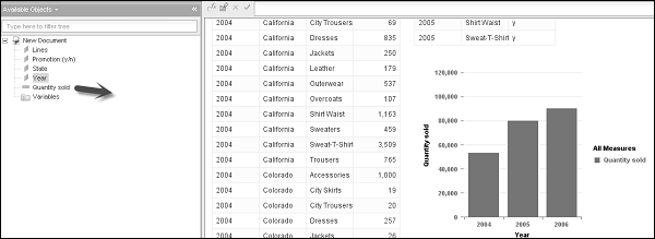
Add a Chart to Report
You should be in Design mode to add a chart. There are different ways to add a chart to a Webi Report.
Method 1
Go to Report Element → Chart → Select a Chart and click on the report area where you want to insert a chart.
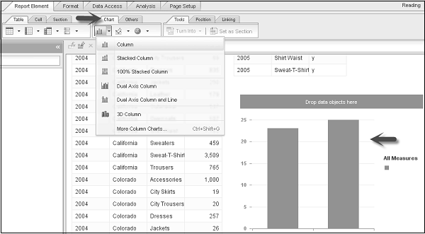
Chart is greyed when there is no data assigned to it. To assign data, you can drag the object from the list of available objects to chart axes.
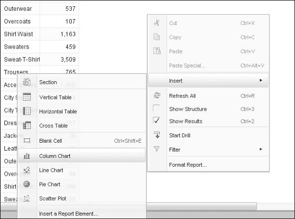
Method 2
Right-click → Insert → Select the Chart type as shown in the following screenshot. Click the report to add a blank chart and then assign data by dragging objects from the list of available objects.
Method 3
Another method is by converting a table into chart. You can do this by selecting a table in a Webi report. Right-click on a column → Turn Into → Select a Chart.
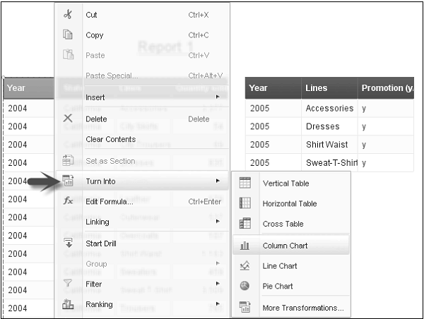
The table will be converted into a column chart.
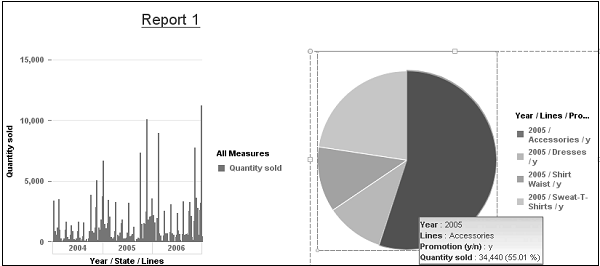
Copy Chart
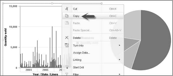
You can also copy a chart from a Webi report to the same report or to an application. To copy a chart, you have to first select the chart.
To copy a Chart, right-click on the chart and select copy.
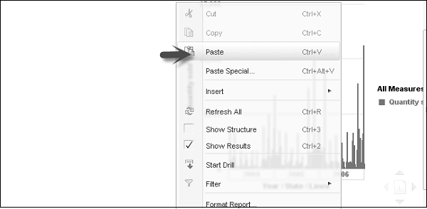
Now to paste this chart in the same report, select an area in the report. Right-click and Paste.
To copy this chart to an application, you can drag the chart directly to an open application or this can be done by copying the chart to the clipboard and pasting it in the application.
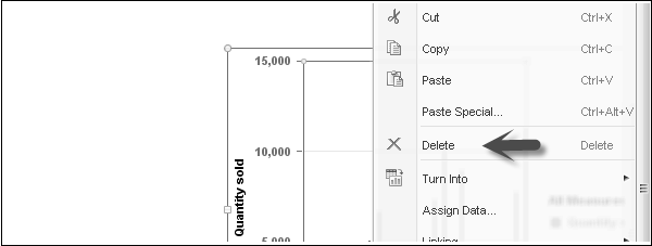
Delete a Chart
To delete a chart, you can select a chart. Right-click → press Delete or select delete option.
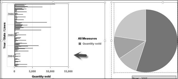
Changing a Chart Type
Select the table or Chart → Right-click → Turn into → More Transformations.
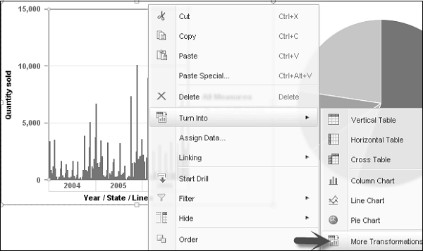
Once you click on More Transformation, it will open a window with different Chart options. You can select any chart type and the chart will be changed in the report.
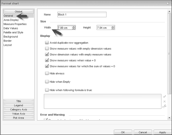
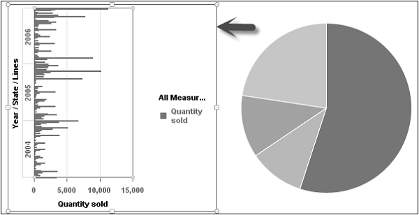
Resize Charts
You can also resize the chart by using the mouse option. Right-click the chart and select format chart option. It will open a new window. Go to General tab → Width and Height option → Select the chart parameters. Click ‘Apply’ and then ‘Ok’.
Formatting a Chart
To format a chart → Select the chart → Right-click → Format Chart.
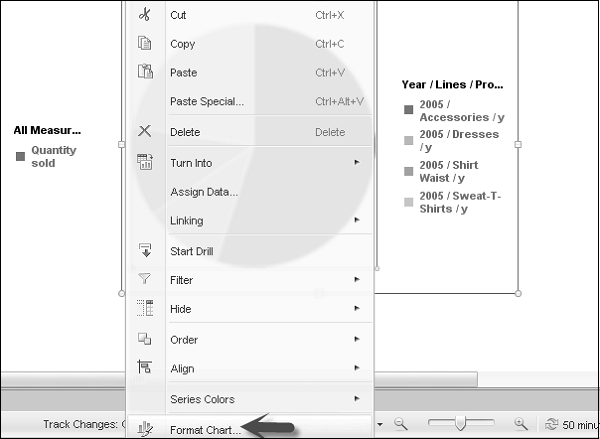
Following are the various chart properties you can choose from −
- Area Display
- Data Value
- Background
- Border
- Layout, etc.
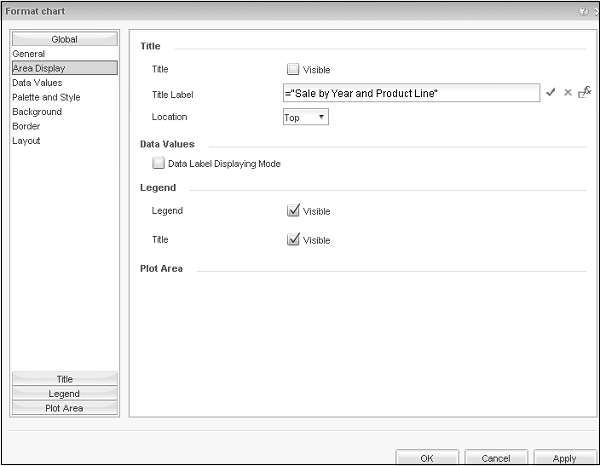
Once you make Title label visible, it will be displayed at the top of Chart.