- SAP BO Analysis Tutorial
- SAP BO Analysis - Home
- SAP BO Analysis - Overview
- SAP BO Analysis - User Interface
- Create a Workspace
- SAP BO Analysis - Analyses
- SAP BO Analysis - Crosstabs
- SAP BO Analysis - Charts
- Chart Types & Styles
- Sub Analysis
- SAP BO Analysis - Using Filters
- SAP BO Analysis - Sorting
- Conditional Formatting
- SAP BO Analysis - Calculations
- SAP BO Analysis - Aggregations
- SAP BO Analysis - Hierarchies
- SAP BO Analysis - Sheets
- Sharing Workspaces
- SAP BO Analysis - Export Options
- Connecting to SAP BW
- SAP BO Analysis Useful Resources
- SAP BO Analysis - Quick Guide
- SAP BO Analysis - Useful Resources
- SAP BO Analysis - Discussion
SAP BO Analysis - Quick Guide
SAP BO Analysis - Overview
Analysis edition for OLAP is a BI reporting tool using which you can connect to OLAP data sources. It helps business managers in decision making, and to analyze business data. You create a new workspace, then add charts and crosstab objects and OLAP data sources to get the data into these objects.
In Analysis edition for OLAP, you can connect to multiple data providers simultaneously. For example, you can have a workspace where data comes from SAP BW cube and also from Microsoft Analysis Cube.
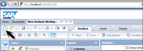
This tool can be accessed via BI Launchpad in a web browser using the following link −
http://localhost:8080/BOE/BI
In the above link, localhost represents the Name of BI server. When you have BI server on the same system on which you are trying to access BI Launchpad, you can use the local host in the URL, otherwise you have to mention the name of BI server to open BI Launchpad.
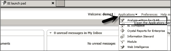
To open the application, navigate to Applications dropdown at the top of the screen. You can see Analysis Edition for OLAP tool in the dropdown list.
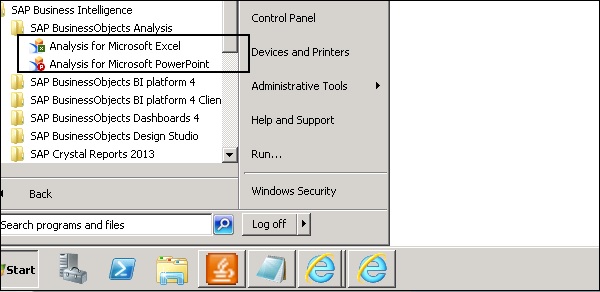
You should have tool installed on SAP BusinessObjects server and a connection from the local system to BI platform. You can also access SAP BO Analysis for Microsoft Office, which integrates Analysis with Microsoft Excel and PowerPoint.
All the connections and Analysis workspaces are managed in Central Management Console (CMC). You can distribute Analysis workspace to large number of users over the web.
What is an OLAP Data Source?
A relational data source contains data in one format and to meet the business requirements, you need to create a multidimensional product. OLAP data represents the hierarchical aggregations of the individual transactions. Aggregated data can be analyzed much faster than relational data.
OLAP data source also allows hierarchy of data where you can drill to different data levels. OLAP data model is also called a data cube.
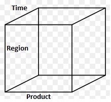
Using a data cube, you can analyze the data in different ways to meet different business requirements. In the above cube, you can analyze −
How are products selling at different times of year? (Product by Time)
How are products selling in each region? (Product by Region)
How are products selling in each region at different times? (Product by Region and Time)
SAP BO Analysis - User Interface
When a new workspace is opened, you can see different icons and panels in the user interface. Analysis Edition for OALP tool can be opened via BI Launchpad.
When a new workspace is created, you have to select the data source. It shows you a list of all OLAP connections to different database. Once you select the connection, you will be prompted to select an OLAP model.
Following panels are available under the user interface −
- Task Panel
- Layout Panel
- Metadata Explorer
- Analysis Window
- Crosstab
- Chart
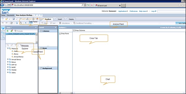
At the top, you have the task panel where you can perform different operations - Creating a new workspace, Open option, Save Option. You can even change an OLAP connection or remove a connection in the workspace.
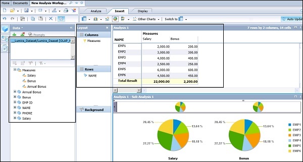
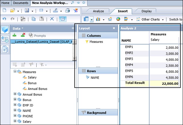
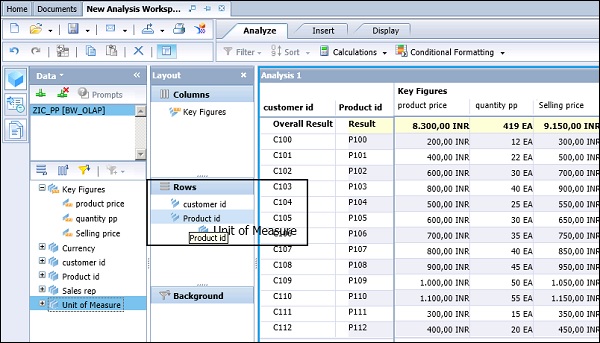
On the left side you have a metadata explorer, where all the objects from OALP data source is displayed. You can see different measure and dimension values.
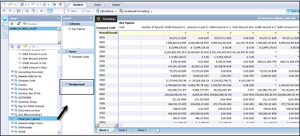
In the middle pane, you have the Layout option, which defines the layout of Crosstab. You have to drag different measures and dimensions to the corresponding columns and rows. You can use the Background option to filter the data in background based on Dimension values.
In the right pane, you have Analysis Panel, Crosstab, and Chart. Crosstab and Charts are based on the values selected in the Layout panel.
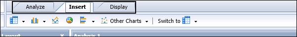
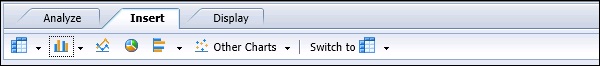
In the Analysis panel, you have 3 tabs −
Analyze ─ Under the Analyze tab, you have an option to apply Filter and Sort.
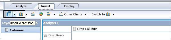
Insert ─ Under the Insert tab, you can add Crosstabs and insert different type of charts.
Display ─ Under the Display tab, you can manipulate data under crosstab. You can swap axis, create sub-analysis, define nulls and zeros, etc.
SAP BO Analysis - Create a Workspace
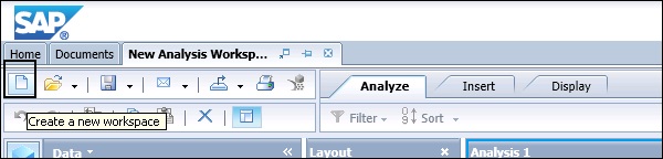
To create a new workspace, you have to click the New button - Create a new workspace.
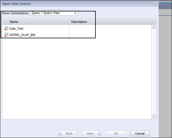
When you click the New button, you will be prompted to select a data source. You can select from the dropdown list to view all the connections or the connections pointing to Cube/InfoProvider or to Query/Query View to connect to BW OLAP source.
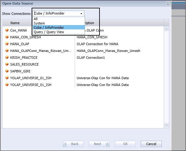
When you select “All” from the dropdown list, you can see −
- OLAP Connections
- Cube/InfoProvider
- Query/QueryView
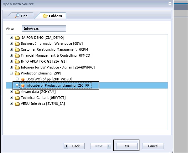
Click the Next button and you will see a list of all the Modeling Views/InfoCubes in the source system that are pointed using this OLAP connection.
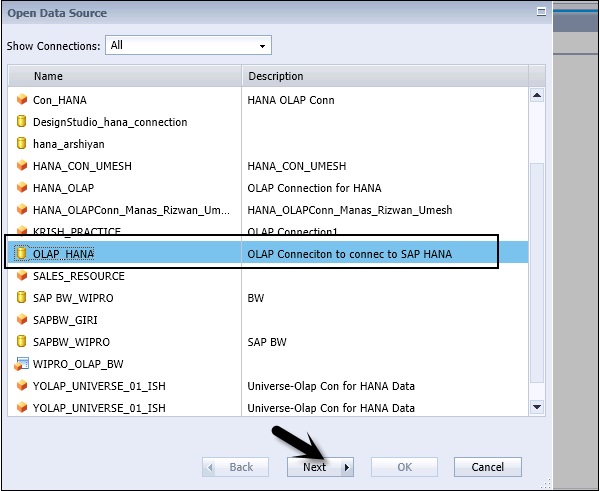
Navigate to Folders tab at the top. You can also perform a search with the name of InfoCube/Modeling View in the source system.
Select InfoCube from the source system and click the OK button.
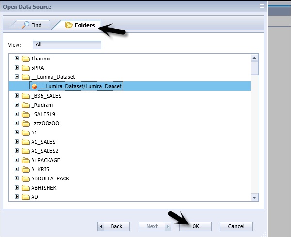
When you click the OK button, all the measures and dimension values will be added to metadata explorer under the new workspace. You can see the name of InfoCube/Modeling View under Data tab in the Task panel.
You can drag different measures and dimension values to the Layout panel to create a Crosstab and Chart in the Analysis pane.
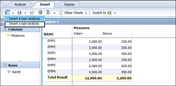
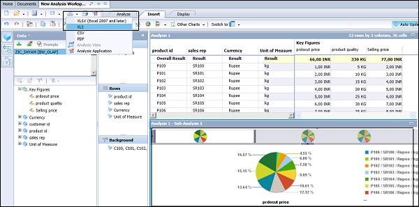
Adding Chart to WS
To add a chart to workspace, you have to navigate to the Insert tab at the top. You have different chart options under Insert. When you have multiple analysis on the sheet, each chart points to a specific analysis in the workspace.
Adding Chart
In the analysis window, you have to select the component that you want the chart to be linked to → Navigate to Insert tab and select the Chart from the available charts.
This will add the chart as a sub-analysis, linked to the component that you selected. The added chart is placed below or to the right of the existing components on the sheet.
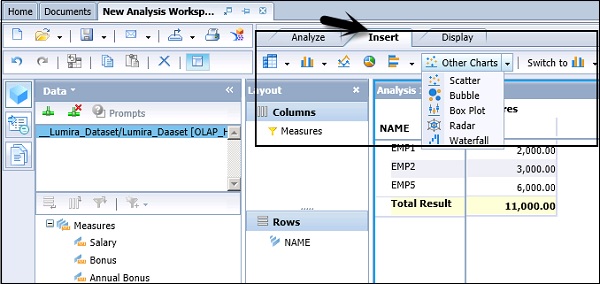
Following chart types are available under the Insert tab in the tool −
- Column Chart Family
- Multiline Chart
- Multi Pie Chart
- Bar Chart
- Other Chart
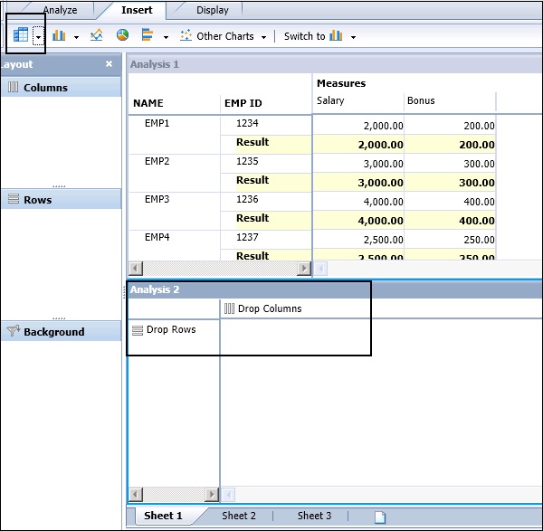
Adding Crosstab to WS
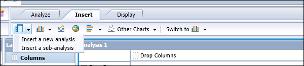
In Analysis Edition for OLAP, you can add a crosstab as Analysis or Sub-analysis. To add a crosstab as sub-analysis, navigate to the “Insert” tab at the top of the screen.
This adds a crosstab as a sub-analysis, linked to the component that you selected. The crosstab is added to the right or below an existing component.
When you add it as sub-analysis, it is based on the existing object in the workspace. When you add it as a new analysis, it adds a blank crosstab below or right of an existing object.
How to Copy an Existing Crosstab or Chart?
It is also possible to copy an existing crosstab or chart. To copy an object, you have to select the object by clicking the Analysis panel. Later, click the Copy button at the top.
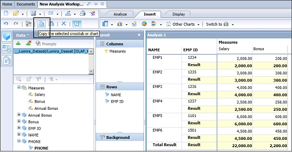
When the object is copied, you can paste this to a new sheet. To paste the object, you can use the paste button at the top of the screen. You can also copy the object on the right or below an existing object.
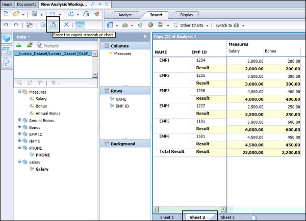
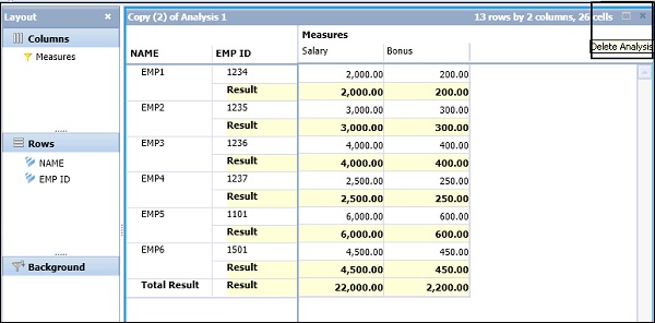
If you want to delete the component, you can click the cross button on the top right corner of the object.
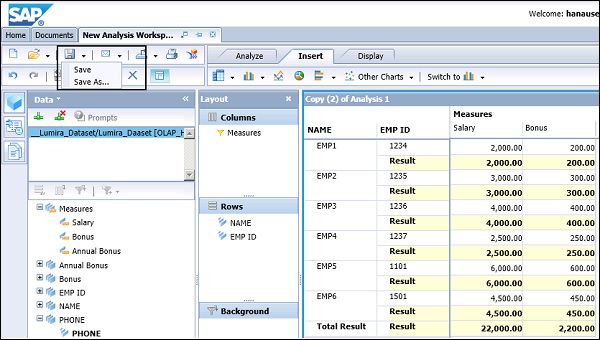
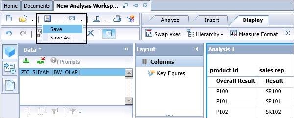
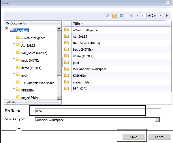
Saving a Workspace
You can also save the workspace to BI platform repository. You can choose to save your changes to the existing workspace, or to save the modified workspace as a new workspace in the repository.
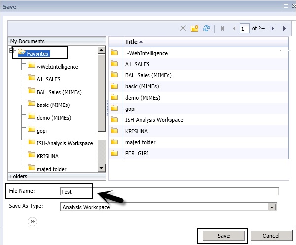
In the next window, you have to select the folder where you want to save the Workspace. Enter the name of the Workspace and click the Save button.
Note − In Analysis Edition for OLAP, if a workspace is idle for several minutes, a copy of the workspace is automatically saved to your Favorites folder before the session is terminated.
When the session is returned before it is terminated, the auto-save cycle is reset, and the workspace is auto-saved again the next time your workspace becomes idle for several minutes.
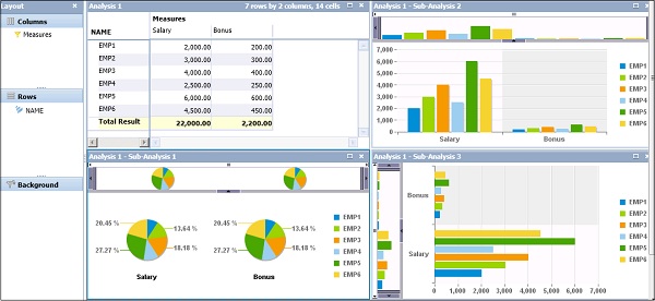
SAP BO Analysis - Analyses
In Analysis Edition for OLAP, you can connect to a data source and further analyze the data using features in the tool. You can add a crosstab and charts as well as drag the objects from the data source to analyze the data.
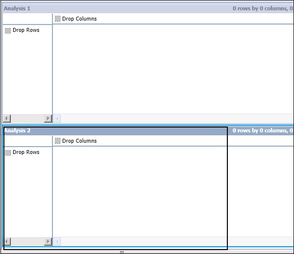
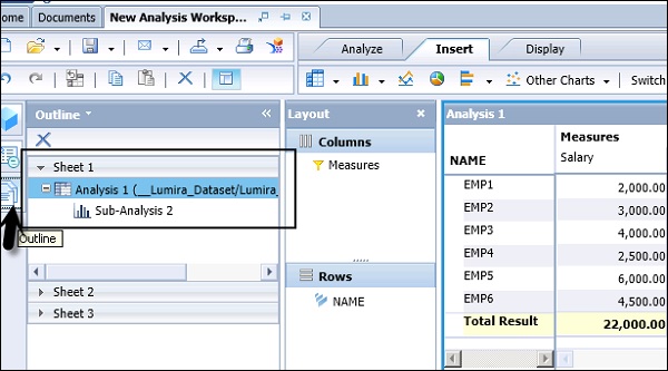
Each analysis workspace contains multiple sheets; it is independent from each other. Analysis stores the structure of data and chart, and the crosstab is used to display the data in the workspace. An Analysis can be displayed using different types of components - Charts or Crosstabs.
When an analysis contains a crosstab and chart they are considered as linked with each other. When the data in crosstab is updated, it also updates the data in the chart automatically.
Defining a New Analysis
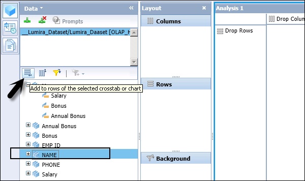
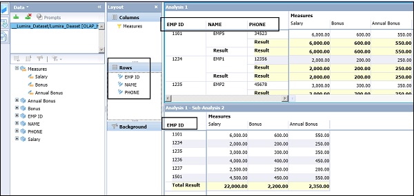
You can add a new analysis by adding a hierarchy or any level of hierarchy. To create a new analysis, drag the hierarchy from the data panel to the layout panel.
If you want to add the selected hierarchy to the crosstab's rows, you can drag it to the "Rows" area.
If you want to add the selected hierarchy to the crosstab's columns, drag it to the "Columns" area.
If you want to add the hierarchy to the crosstab's background filter, drag it to the "Background" filter area.
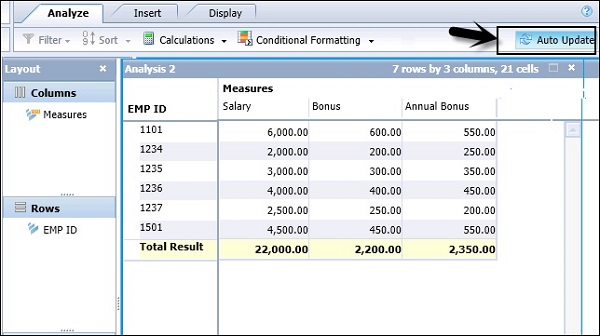
On the top right corner of the analysis, you have an auto update option. When automatic update is on, it updates the crosstab and chart components with each hierarchy to the Layout panel, causing short delays.
You can also turn off automatic update by clicking the Auto Update button.
Few Points to be Considered About Analysis
You can’t add members from the same hierarchy to two axes.
When you are using SAP BW as the data source, you can’t use hierarchies of the same dimension in the same analysis.
When a data source is selected in a new workspace, an analysis is automatically created. You can add an analysis to the workspace in the following ways −
When you add a crosstab to the sheet, by default, adding a new crosstab creates a new analysis. The new analysis is connected to the data source that is currently selected on the Data panel.
Add a new data source to the workspace, and then add a crosstab to the sheet. The new analysis is connected to the new data source.
Add another crosstab or chart component to the sheet as a sub-analysis. The subanalysis is linked to the original analysis, but you can unlink the new component from the original analysis, creating a separate analysis.
Adding Analysis to a Worksheet
To add an analysis, click the Insert button in the tool bar and then click Insert Crosstab button to add an analysis to the current sheet. When you add a new analysis, it is connected to the currently selected data source and displayed in the outline panel.
Note − It is also possible to add the crosstab as a sub-analysis, by clicking the arrow beside the Insert Crosstab button.
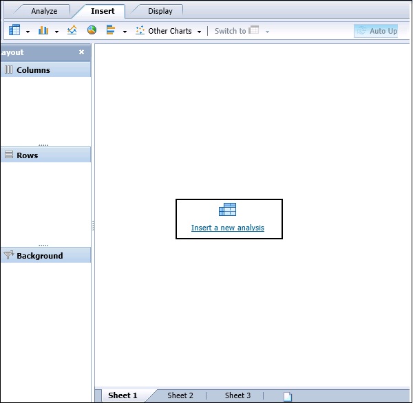
When there is no analysis in the workspace, you get an option to insert one in the outline panel. Once you click on insert a new analysis button, a new analysis is added.
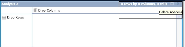
To delete an Analysis, you have to click the delete button on the top right corner of the screen.
SAP BO Analysis - Crosstabs
In Analysis edition for OLAP, data is analyzed in the form of a crosstab. A Crosstab is a grid table similar to the spreadsheet. You have 3 axes for a Crosstab −
Row Axis − This shows dimensions or hierarchical values in OLAP data source.
Column Axis − This shows column data.
Background Filter − This is used to apply filters on the background value.
Adding a Crosstab
You can add a crosstab by dragging it from the available chart type or you can add a crosstab by clicking the crosstab button in the tool bar.
This adds the component to the right of an existing window or below the existing component. To show the data in the crosstab, you have to add a data source.
In a workspace, an empty crosstab is placed. To add the data, you add dimensions and hierarchies from the metadata explorer to the crosstab.
When you place one measure on the crosstab, the data is shown in the crosstab and you can then proceed to perform the analysis by adding different features available in the tool.
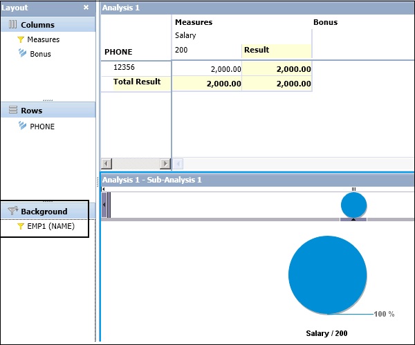
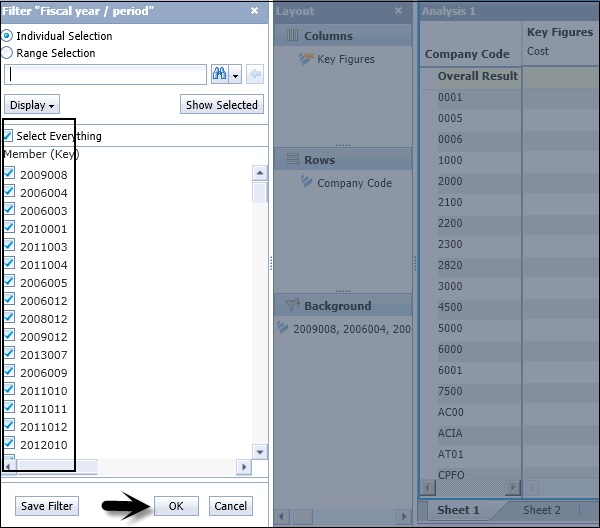
When you drag any of the dimension or hierarchy to the Background Filter, you will be prompted to select the filter values.
You can enter the Individual selection or range selection, and selective values are reflected in Crosstab.
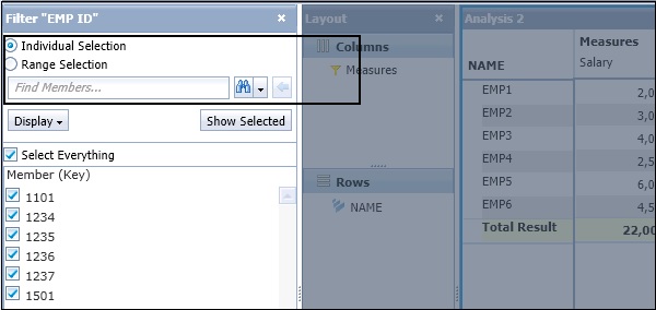
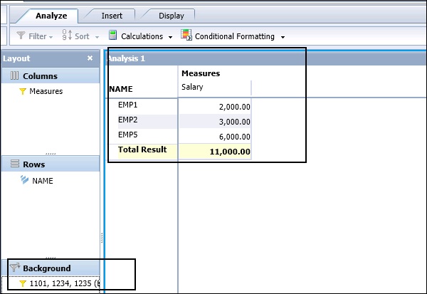
When the filters are applied, the values in the crosstab changes as per the background filter condition. In this example, we have selected the background filter based on Employee #, and values are presented in the crosstab.
SAP BO Analysis - Charts
To show the trend in your data, you can add charts to make the analysis more interactive. Charts are used for graphical representation of data. You can emphasize on the business performance indicators of your data.
- Stacked Bar
- 3D Column Charts
- Multiline Charts
- Scatter Charts
- Bubble Charts
- Radar Charts
- Stacked Bar Charts
Crosstabs and charts are linked in the form of analysis and sub-analysis. First a crosstab is added in the form of a new analysis in the workspace and the chart is added as a subanalysis to the main analysis. When the data is changed, both the analysis and subanalysis gets changed with data.
To add a chart to your analysis, navigate to the Insert tab at the top of the screen and select the required chart type in the workspace.
Adding Data to a Chart
When you select a chart, it is added to the right or below the existing component. It is also possible to add multiple charts in a single analysis that can focus on multiple areas.
Example
You use a crosstab for main analysis and chart for the sub-analysis to focus on certain points.
Note − It is also possible to unlink or disconnect a chart sub-analysis from its current analysis, converting it to a new, separate analysis.
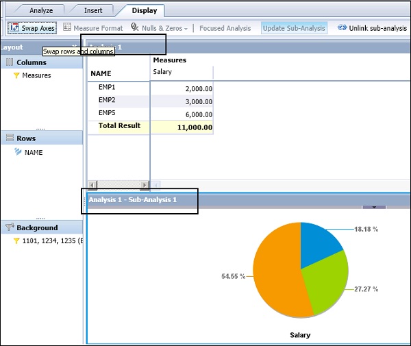
It is also possible to change the chart type and customize the charts as per requirement. Chart appearance can be changed and you can also swap the chart axes to improve the chart presentation.
To swap the axes, you have to navigate to Display tab → Swap Axes.
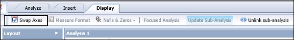
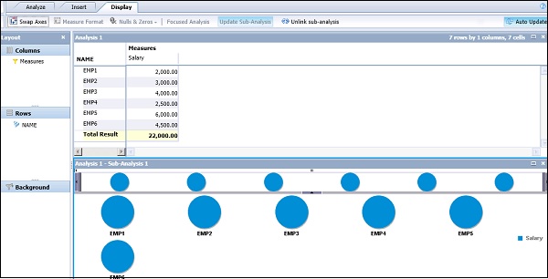
Chart Family
You can see a family of charts under each chart category. To see all the charts available under the Chart category, click the dropdown arrow button.
Under Column Charts, following chart types are available −
Under Bar charts, following chart types are available −
Under Other Charts, following chart types are available −
How to Change the Chart Type?
You can also change the chart type in your analysis. If you have selected a pie chart and you want to change it to a Bar or a Column chart, navigate to Insert button → Switch To.
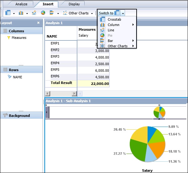
Chart Properties
You can also define the display properties of the chart. To define the name and description of the chart, navigate to Chart Properties in the Task Panel.
In the Chart Properties window, you have the following options −
- Chart Type
- Chart Name
- Last Refreshed At
- Description
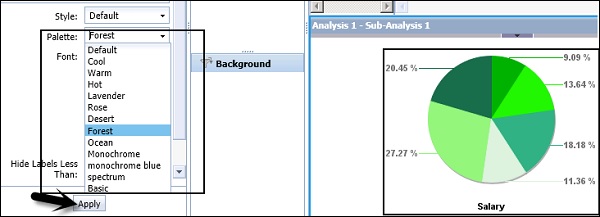
- Style
- Pallete
- Font
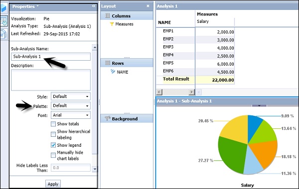
You can also change the palette color of the chart and the character fonts used in the chart. Select Palette and click Apply. The changes will be reflected in the chart area.
SAP BO Analysis - Chart Types & Styles
In Analysis Edition for OLAP, you have the following chart types −
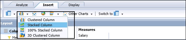
Column Charts
Following charts are available under Column charts −
- Clustered Column
- Stacked Column
- 100% Stacked Column
- 3D Clustered Column
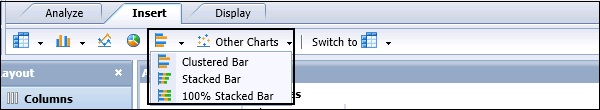
Bar Charts
Following charts are available under Bar charts −
- Clustered Bar
- Stacked Bar
- 100% Stacked Bar
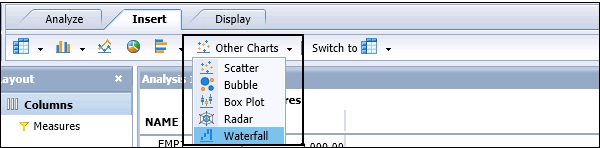
Other Charts
Following charts are available under other charts −
- Scatter
- Bubble
- Box Plot
- Radar
- Waterfall
Some other types of charts include Pie Charts and Line Charts.
Displaying Totals
You can also show totals in the chart. Go to Chart Properties → Select “Show Totals” checkbox and click Apply.
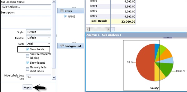
You can also select different chart properties −
- Show Hierarchical Labeling
- Show Legend
- Show Totals
- Manual Hide Chart Labels
- Show Actual Values
Using show actual values, you can print the actual values on the chart instead of percentage value.
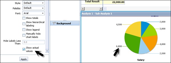
Chart Styles
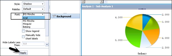
You can select different predefined chart styles to display. To change the chart style, navigate to Properties → Style.
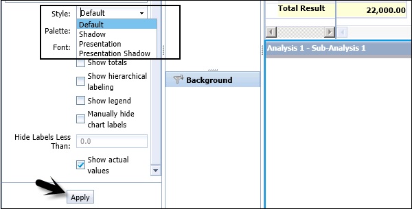
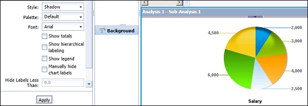
You can also select different font styles for your chart. By default, Font type is Arial. You can change it by selecting different font types from the dropdown list.
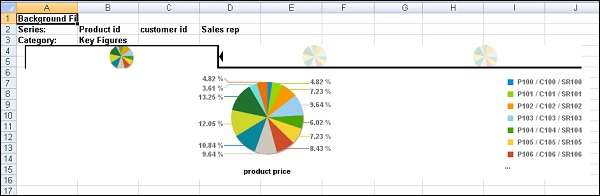
Sub Analysis
In a workspace, data is analyzed using a crosstab in a workspace. Crosstab is added as main analysis and you can also add sub-analysis in the form of a graph or a crosstab. Subanalysis is always linked to the main analysis.
For example, when a crosstab is added as main analysis you can add a chart or graph as sub analysis. This sub-analysis represents the same data as main analysis.
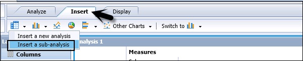
To create a sub-analysis, you have to click the Insert button in the toolbar and select Insert a sub-analysis.
Sub-analysis is used to focus on a certain set of data in analysis. To focus on a subset, you have to select an analysis and click the Outline button on the tool bar.
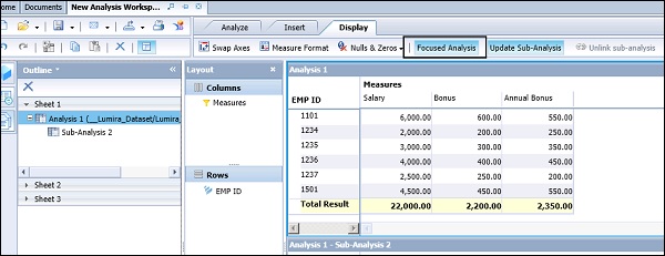
You can see the Analysis and Sub-analysis in the workspace. Select the Analysis and click the Display button on the top right side of the screen. You can see an option of Focused Analysis as shown in the following screenshot.
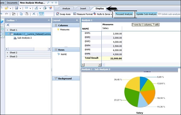
Linked sub-analyses now display only the selected data in the main analysis. In the main analysis, select the range of members that you want to display in the sub-analysis.
You can click and drag to select a range, or use SHIFT + CLICK to select a range.
Pause and Unlink
Pausing a Sub-analysis
In an analysis, it is also possible to pause a sub-analysis update. Select an Analysis in the Outline Panel on the left side of the screen → Select Display → Click Update Sub-Analysis.
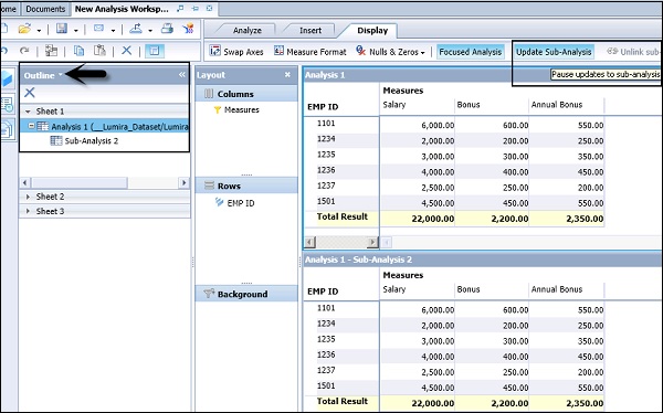
Now once you pause updating sub-analysis, you add dimensions/hierarchies to the main analysis. It will not update sub-analysis as shown in the following screenshot.
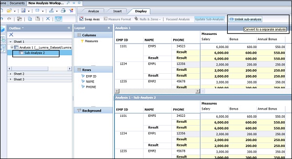
Unlinking a Sub-Analysis
In a workspace in Analysis Edition for OLAP, when you add a crosstab or chart sub-analysis to a sheet that contains an analysis, the new component is linked to the main analysis. Changes that you make to the main analysis (usually a crosstab) are reflected in all subanalyses.
You can unlink the sub-analysis and the sub-analysis is converted to a separate analysis that contains only the focused analysis. To unlink a sub-analysis, select the sub-analysis in the Outline panel → Display tab → Unlink Sub-Analysis.
SAP BO Analysis - Using Filters
Filters are used to see the data which is relevant only to your analysis. You can apply filters in the crosstab and in charts too. Filters can be applied manually by selecting the member from the list or you can define a filter condition.
Different filter types are available in a workspace. You can filter the analysis based on the measure values or it can be applied to certain dimensions/hierarchies.
Note − Filter based on measures are applied only to SAP BW data source and the data should be unformatted.
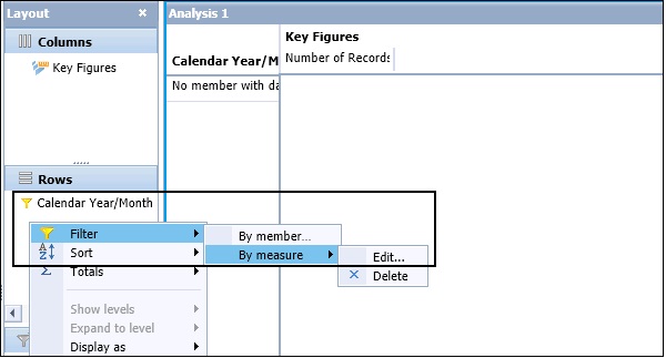
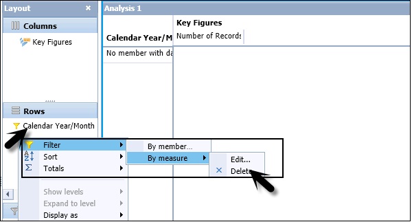
In the Layout panel, right-click on the hierarchy that you want to filter. Navigate to Filter option → Select By Measure option.
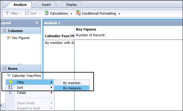
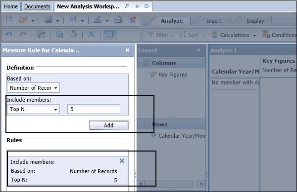
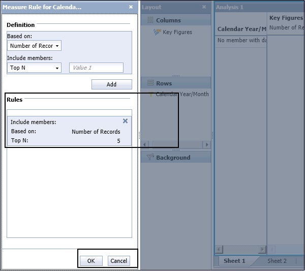
In the “Setting” area on the filter, select the target level for the filter. In Definition area, select a measure based on the list. In Filter Properties, you can see the list of measure values in the dropdown list.
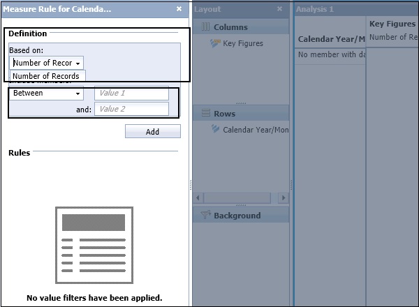
Next, define a filter type by entering a condition and an operand value. Different filter types are available in Filter condition. If you want to select Top 5 values, you can select from the dropdown list. Search Top N and enter the Operand value 5 and click on Add.
Click the OK button at the bottom to apply filter.
How to Edit an Existing Filter?
To edit an existing filter, navigate to Layout panel → Select hierarchy and right-click → Filter → By Measure → Edit.
The existing filter rules are displayed in the Filter panel. Add and delete the rules to define your modified filter. You cannot directly edit an existing rule to change a rule, delete it, and then add the modified rule → Click OK to apply the modified filter to the hierarchy.
How to Delete Filters in an Analysis?
You can manually remove a filter or it can be automatically removed. Whenever you replace hierarchies on the row or column axes, filters are automatically removed from the analysis.
To delete a filter manually, in Layout panel right-click hierarchy → Filter → By Measure → Delete.
Filter Types
You can apply different types of filters in an Analysis.
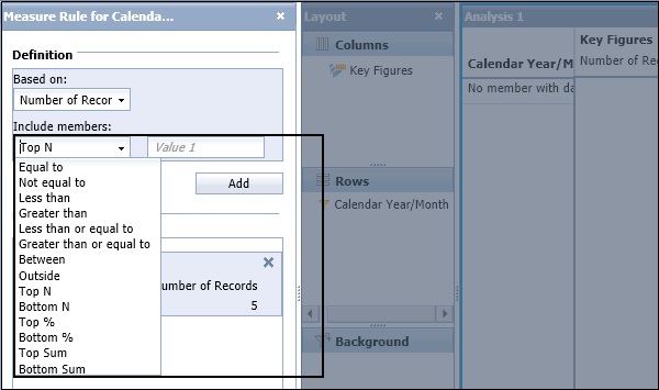
| Top N | Displays the top N members for the selected level, per parent.(Available for SAP BW flat lists, but not for SAP BW hierarchies.) |
| Top % | Displays the top contributors to N percent of the parent for the selected level.(Available for SAP BW flat lists, but not for the SAP BW hierarchies.) |
| Top Sum N | Displays the top members whose cumulative sum is greater than or equal to N. (Available for SAO BW flat lists, but not for SAP BW hierarchies.) |
| Bottom N | Displays the bottom N members for the selected level, per parent. (Available for SAP BW flat lists, but not for SAP BW hierarchies.) |
| Bottom % | Displays the bottom contributors to N percent of the parent for the selected level. (Available for SAP BW flat lists, but not for SAP BW hierarchies.) |
| Bottom Sum N | Displays the bottom members whose cumulative sum is greater than or equal to N. (Available for SAP BW flat lists, but not for SAP BW hierarchies.) |
| Greater than |
|
| Outside |
|
| Between |
|
Background Filters
In an Analysis, you can also narrow the search by applying filters in hierarchy on the crosstab and these filters are called Background filters.
Let us say you have data related to three hierarchies in your InfoCube - Product, Market, and Year. Now you want to see the data related to year 2015 for all products so you can add Year hierarchy to Background filter. This will show other two hierarchies on the Crosstab axis.
In Background filters, you can add a single member or multiple members. Background filters are also known as Slice.
Once you add a hierarchy, double-click the hierarchy or dimension in the Background filter area and this will open the "Filter" panel.
In the Filter panel, you can select one or more members → Click OK.
SAP BO Analysis - Sorting
In a workspace, it is possible to sort the data in an ascending and descending order. When you arrange the data in an ascending sort, you have data with smaller values at the top. A descending sort arranges data with larger value at the top. By default, in an analysis, data is sorted in a descending order.
How to Apply Sort in a Crosstab?
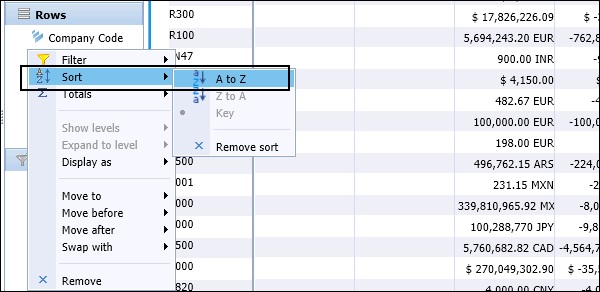
In a Crosstab analysis, select the row or column that you want to sort. On the toolbar, choose Analyze tab at the top. To apply sort, click the arrow next to Sort. You can also right-click on any key figure or hierarchy in Row/Column tab and select Sort option → A to Z or Z to A.
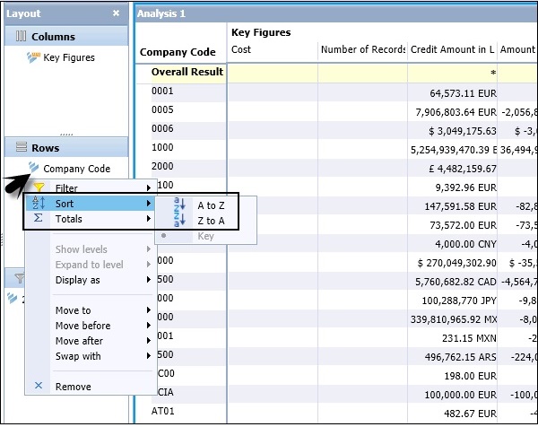
When we apply a sort on Company code in Z to A sort order, the values will be changed in the main analysis.
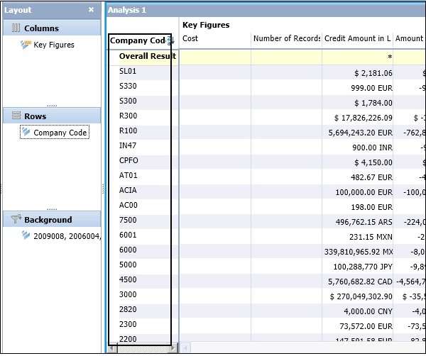
This has a sorted value in alphanumeric sort order.
How to Reverse a Sort Order?
You can also reverse the sort order from ascending to descending and vice versa. To reverse the sort, select the other sorting order.
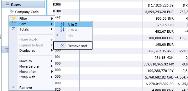
How to Remove a Sort Filter?
It is possible to remove a sort in an analysis manually or automatically. To remove a sort manually, you can right-click the member header -> Select Sort, and then click Remove sort, or right-click the Sort icon beside the sorted member's name and click Remove sort.
A sort is automatically removed when one of the following action is performed −
When you select swapping hierarchies, removing a hierarchy, or adding a hierarchy results in sorts and filters being removed.
When you use nesting hierarchies, this removes the value sorts; however, member name sorts remain and filters are not affected.
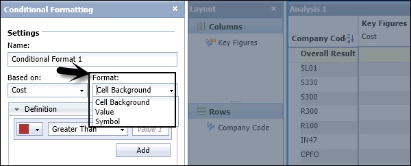
SAP BO Analysis - Conditional Formatting
Using conditional formatting in an analysis, you can highlight important data and results, and also point out the data range that is unexpected. You can add different colors to the cells in analysis that represents different values.
You can select from the following styles of formatting −
Defining the background cell color − This allows you to set the background color of the cell with values in analysis.
Value color − You can define the color of the values when it is changed.
Defining the symbols − You can also add symbols to different cells of an analysis.
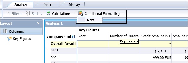
To create a new Conditional Formatting rule, you have to navigate to Analyze tab → Conditional Formatting → New.
Rule Priority
When you have multiple conditional formatting rules applied on a cell in an analysis, the rule with the higher priority controls how the cell is displayed.
When you apply two conditional formatting rules applied to the same cells, and both conditional formats contain rules with equal priority, then the conditional format that was added first takes precedence.
To apply Conditional Formatting, navigate to Analyze tab → Conditional Formatting → New. On the Conditional Formatting panel, you have to define the name for the conditional format.
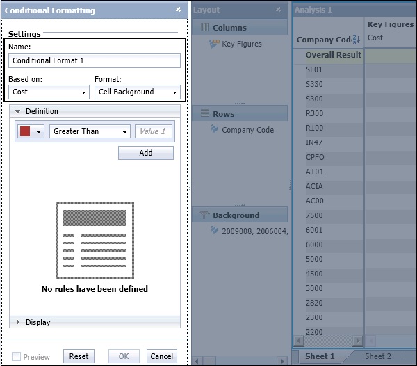
In the next step, you have to define Based on Field value by selecting a measure value. The conditions are evaluated using the measure you select in Based on Field.
Next, define Format field from the dropdown.
In the Definition tab, you have to define the priority of the formatting rule. Select the Operator value, and enter the value in the operand. Click the Add button to apply the rule.
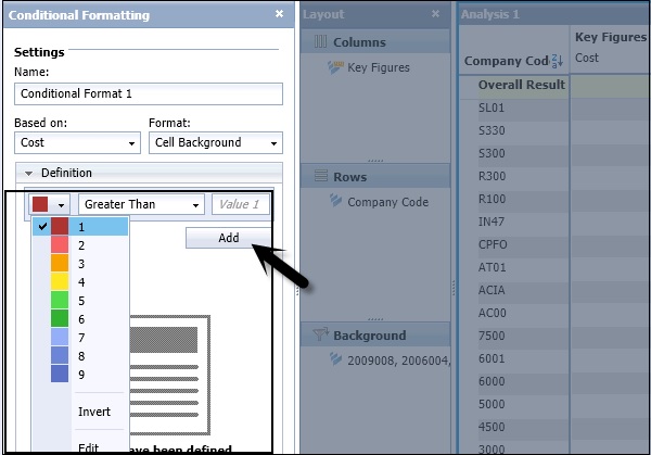
When you click the Add button, the rule will be added to the list of Conditional formatting rules. You have an option to preview the data or you can reset the conditional formatting rule.
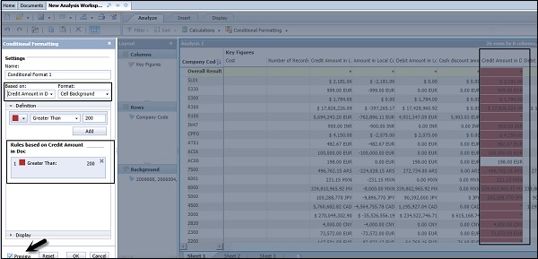
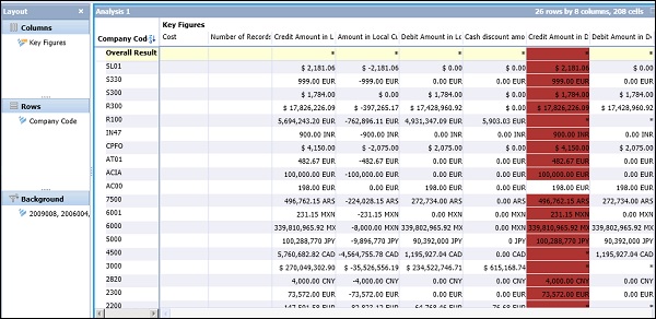
You can see the data in the analysis panel as per the Conditional formatting rule. To apply the rule, click the OK button.
You can also add multiple conditional formatting rules in the same analysis. To add more than one rule, navigate to Analyze tab → Conditional Formatting → New.
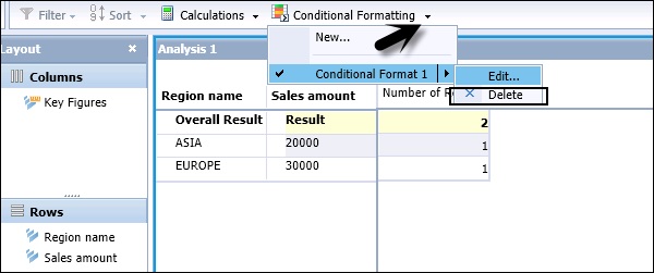
To edit a conditional formatting rule, select arrow next to Conditional Formatting → Edit.
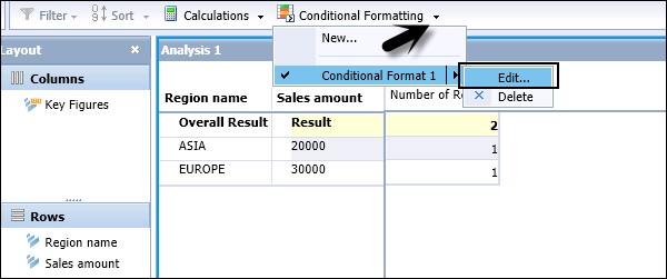
You can use the same option to delete the Conditional Formatting rule, navigate to Analyze → Conditional Formatting → Delete.
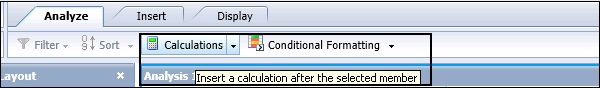
SAP BO Analysis - Calculations
In a workspace, you can add calculation to enhance the analysis and perform custom calculations in the analysis. When you add a calculation to analysis, it is used as another key figure on which you can apply Conditional Formatting and Filters.
There are different calculation types that can be used in an analysis −
Simple Calculations
These calculations involve simple arithmetic operations - subtraction, division, percentage calculations, etc. These simple calculations can be created from the Calculation toolbar.
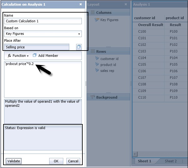
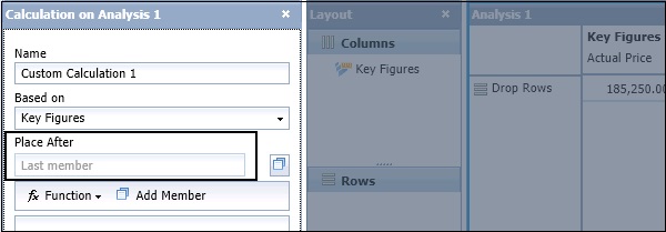
To add a simple Calculation, click the Calculation button in the Toolbar. This will open the Calculation panel in the task bar on the right side.
In the Calculation Panel, you have to enter the name of calculation, Based on, Place After option. In calculation, you have to enter the member on which you want to perform calculation by clicking Add Member, and from Function you can select different arithmetic functions and any operand value to complete the calculation.
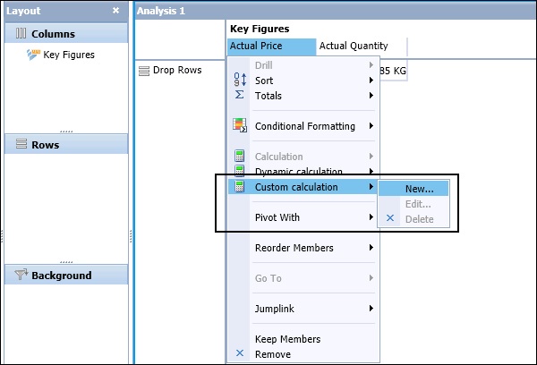
Custom Calculations
Custom calculations are calculations that you define by creating formulas in the Calculation panel. Custom calculations can be as simple as an addition of two members, or can be a complex combination of functions and members.
Dynamic Calculations
Dynamic calculations are a special type of calculation that recalculates when the data changes in its associated members.
Create a Calculation Via Calculation Panel
When you click the Validate button, the status of expression is updated in the Calculation. To add the calculation to analysis, click the OK button.
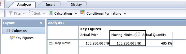
To create a dynamic calculation, you have to select a key figure in the Crosstab and click the Calculation dropdown → Dynamic Calculation.
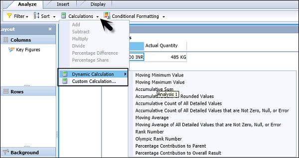
You have to select one of the dynamic calculations from the list. The calculation is added as a new column or row member to the right of or beneath the selected measure. A default name is applied.
Following Dynamic Calculations are available −
| Dynamic Calculations | Description |
|---|---|
| Moving Minimum Value | Returns the current minimum value, within a hierarchy level, compared to the previous values. |
| Moving Maximum Value | Returns the current maximum value, within a hierarchy level, compared to the previous values. |
| Accumulative Sum | Returns the accumulative sum, within a hierarchy level, of all the previous values. This is based on the server-formatted value. |
| Accumulative Sum of Rounded Values | Returns the accumulative sum, within a hierarchy level, of all the previous values. This is based on the displayed values. |
| Accumulative Count of All Detailed Values | Returns the accumulative count, within a hierarchy, of all previous values. |
| Accumulative Count of All Detailed Values that are Not Zero, Null, or Error | Returns the accumulative count, within a hierarchy, of all the previous values that are not 0, null, or error values. |
| Moving Average | Returns the moving average, within a hierarchy, of the previous values. |
| Moving Average of All Detailed Values that are Not Zero, Null, or Error | Returns the moving average, within a hierarchy, of the previous values that are not 0, null, or error values. |
| Rank Number | Returns the rank order for each value, with the largest value having a rank of 1. Items with the same value will have the same rank. |
Note − You can’t use dynamic calculations as operand in other calculations and filters can’t be applied on custom calculations.
SAP BO Analysis ─ Calculation With Sorts
In an Analysis, when you create a new calculation it is added after a particular member. When you select a member in Crosstab, right-click to navigate to Calculation button and create a new calculation. The Place After field is automatically populated.
If you don’t select any member in the Crosstab and perform a Calculation, the Place After field is empty. The calculation is added to analysis and when a sort is applied, it is also sorted with the key figures.
SAP BO Analysis - Aggregations
You can perform totals in the crosstab rows and columns. When an aggregation is applied, default aggregation is Sum. You can also change default aggregation as per requirement. In a workspace, in Analysis Edition for OLAP, following aggregations are supported −
- Default
- Minimum
- Maximum
- Sum
- Count
- Average
- Median
To display totals and subtotals, select a Crosstab in an Analysis and navigate to Display tab → Select Totals or you can also select a column in THE Crosstab on which you want to apply an aggregation.
You can also change the aggregation type by selecting Calculate Total As option.
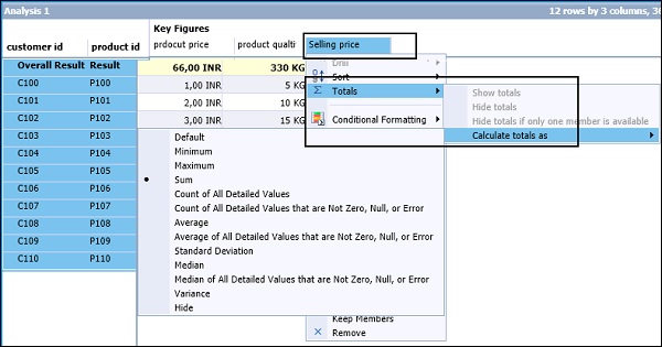
To set up the position of Totals, select the Crosstab and click the Totals tab under Display. You have an option to select the position of totals in your analysis.
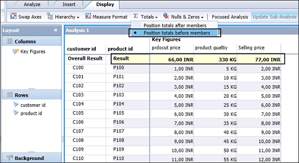
You can also position the totals after members from the dropdown list.
SAP BO Analysis - Hierarchies
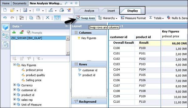
Hierarchies can be used to represent parent-child relationship in an analysis. It is also possible to swap hierarchies to reorient data in the Crosstab as well as swap all axes in an analysis and sub-analysis.
To swap two hierarchies, you have to select a hierarchy and drag it towards other hierarchy that you want to swipe with. When the hierarchy name appears on the other hierarchy, you can release the mouse button.
Swapping All Rows With All Columns
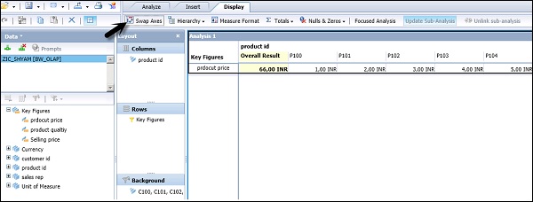
You can also swap between hierarchies in an analysis. Select an analysis or sub analysis and navigate to the Display tab → Swap Axes.
Sort and Filters During Swap Axes
When you swap axes, all the filters and sorts are preserved.
Using Pivot Hierarchies
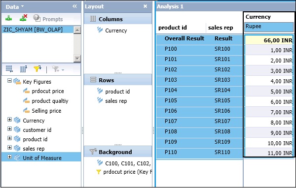
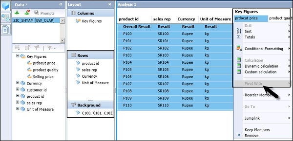
You can use Pivot hierarchy to explore the data in different aspects. On the Crosstab, right-click the member → point to Pivot With.
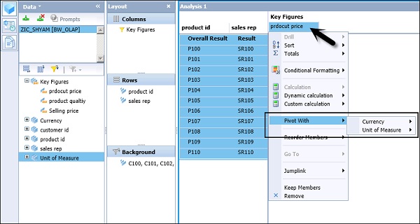
You have to select hierarchy that you want to pivot with. If you select Currency here, it will add Currency to the Crosstab.
When all the hierarchies are added to the Crosstab, Pivot With option is disabled.
SAP BO Analysis - Sheets
In a workspace, there can be multiple sheets. Sheets are used to group the data in a workspace. In a new Analysis, three sheets are included and you can add/remove sheets to suit the analysis.
In a workspace, each sheet has its own set of analyses and components, which are not shared and which cannot be linked across sheets. Analyses and components on one sheet can therefore have the same names as analyses and components on other sheets.
How to Add a Sheet?
In a workspace, you can add as many sheets as you want and delete as many sheets as you want. It should have at least one sheet in analysis.
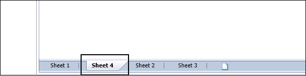
To add a sheet, right-click on a sheet tab.
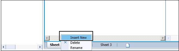
This adds the new sheet to the right of the sheet you selected and the new sheet becomes the active sheet.
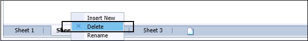
How to Delete a Sheet?
To delete a sheet, you have to right-click any sheet tab and click delete.
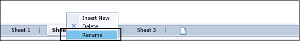
How to Rename a Sheet?
You can also rename a sheet in an analysis as per the requirement. To rename the sheet, you have to right-click the sheet name and click Rename.
The maximum length of a caption is 60 characters.
SAP BO Analysis - Sharing Workspaces
When a workspace is created, you can save or share it over the web with other end users. When you have sufficient rights of Administrator, you can publish workspaces to BI repository.
To save the workspace in a public folder, navigate to the toolbar and click the arrow button and select Save As.
In the folder tree, expand the Public Folders folder and browse to the folder where you want to save your workspace. Enter the file name and click the Save button.
Sending a Workspace to Another User Via Email
You can also send a workspace to another BI platform user or in an email attachment. Saved workspace is shared with BI platform users through email in an attachment or in a link.
How to send a workspace to BI platform user?
To send a workspace, click the Send to button on the Toolbar.
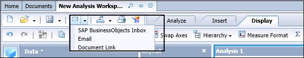
To send a workspace via email, click the Email and enter the recipient list. Select a target name for the workspace. You can also select the Shortcut option to send the workspace as a hyperlink, or select the Copy option to send the workspace as a file.
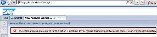
To send workspace to BI platform users, you have to define the settings in BI Launchpad.
When you receive an error message - "The destination plugin required for this action is disabled. If you require this functionality, please contact your system administrator", you need to configure BI Platform Adaptive Job Server for email destination.
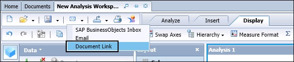
How to get URL for workspace?
To get the URL, click the arrow button next to the Send to button → Select Document Link.
http://BODS:8080/BOE/OpenDocument/opendoc/openDocument.jsp?sIDType=CUID&iD ocID=ASeqXMP0neREq8IWoTMkDwY
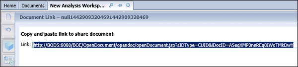
This URL can be copied to Crystal report, Web Intelligence document, or other office document.
SAP BO Analysis - Export Options
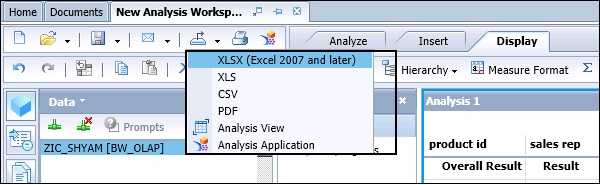
In Analysis Edition for OLAP, sometimes it is required to export the data to different file formats. You can export your analysis to an Excel file, CSV file, PDF, or to an analysis view, or an application.
To export an analysis, click on the Export To option −
You can also use the Printing option where you can print a sheet or the entire data. To take a Print, click the Print option in the tool bar.
When you click the Print option, you will be promoted to select Sheet or Data and paper settings for printing. You can also define the header and footer settings and Landscape/Portrait.
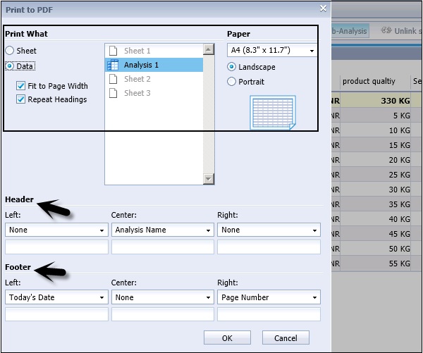
While selecting the Print option, you can choose to print raw data instead of the crosstab or chart representations of your data. When you choose the data printing option, all the filtered data in an analysis is printed and not just the data visible on the screen. During the printing function, cell formatting is retained.
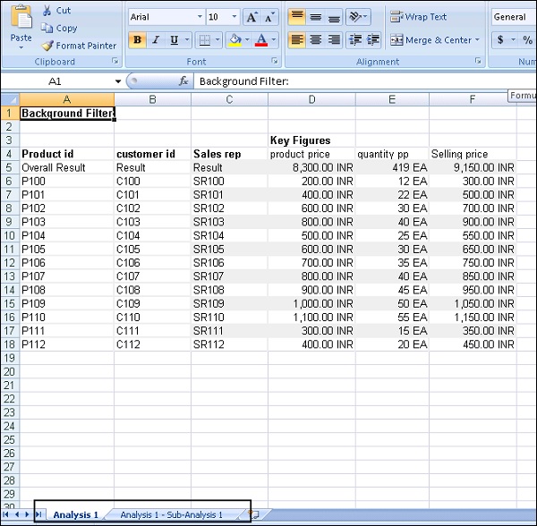
Exporting Data to an Excel
You can also export an Analysis into an Excel file, which can be viewed by the users or save it in an .xls file. To view the data immediately, you should have MS Excel installed on your machine.
If you have a chart in your analysis, it is exported as a static image in xls file.
You have an option to export a particular Analysis or Sub-analysis to Excel file. Click the OK button to proceed.
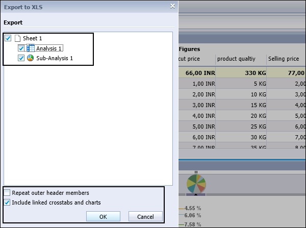
When you click the OK button, you will be prompted to open the xls or to save the file. Both Analysis and Sub-analysis will be added to the xls file.
You can also export the analysis in a CSV file format.
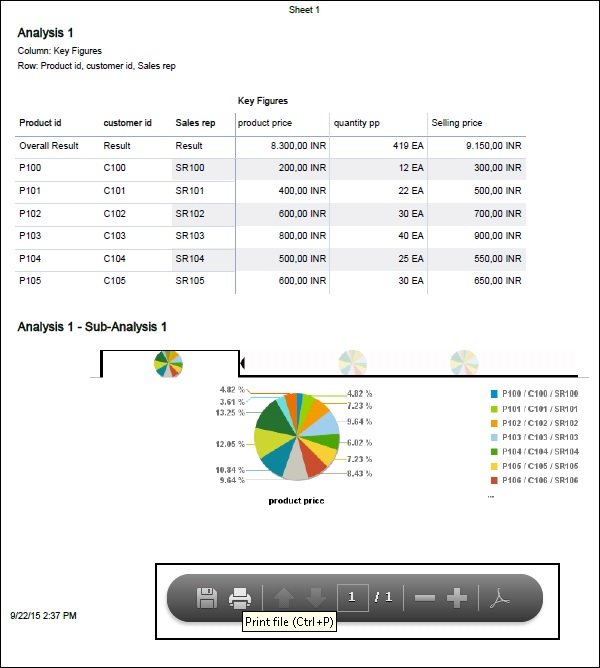
Exporting an Analysis to PDF
It is also possible to export an analysis in the PDF format and you can use the PDF viewer to view both the main analysis and sub-analysis. You can then send the PDF file to colleagues, or print hard copies of the data from the PDF viewer.
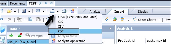
You also have the Zoom in/Zoom out option in the PDF viewer. You can save the PDF locally or take a printout from the PDF viewer in the toolbar.
SAP BO Analysis - Connecting to SAP BW
In Analysis Edition for OLAP, you can connect to SAP BW data source and take advantages of attributes and variables.
When you connect to BEx query, there are variables defined. You will then be prompted to select the value of variable. An Analysis in OLAP tool supports various variable types −
- Key Date Variables
- Hierarchy Variables
- Characteristics Variables
- Formula Variables
- Currency Variables
Connecting to SAP BW
When you select a new Workspace in the tool, you will be prompted to select a data source.
In Open Data Source option, you can select different OLAP data types or a BEx query. You can also connect to HANA Modeling views.
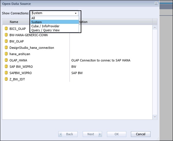
You can connect to Cube/InfoProvider directly or can select Query/Query View to connect to SAP BEx query. When you select Cube, it shows InfoCube in BW and also in HANA database modeling views. When you select Query from the dropdown, you can see a list of BEx query.
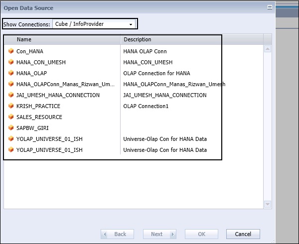
When you select all from the dropdown list, you can see all OLAP connections pointing to different InfoProviders, BEx query, or direct InfoCubes. When you select an OLAP connection, you can see a list of all InfoCubes in SAP BW/HANA system as per connection properties.
Select any InfoProvider by navigating to the Folder tab and click the OK button.
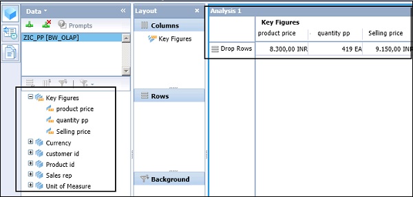
You can see list of all the key figures and characteristics added to the metadata explorer in the workspace. This is how you can connect to SAP BW data source to perform an Analysis.