- SAP Analytics Cloud Tutorial
- SAP Analytics Cloud - Home
- SAP Analytics Cloud - Introduction
- SAP Analytics Cloud - Registration (Trial)
- SAP Analytics Cloud - System Requirements
- SAP Analytics Cloud - User Interface
- SAP Analytics Cloud - Export Options
- SAP Analytics Cloud - Creating First Story
- SAP Analytics Cloud - Exploring Data (Charts)
- SAP Analytics Cloud - Using Filters
- SAP Analytics Cloud - Styling Template
- SAP Analytics Cloud - Using Sharing Option
- SAP Analytics Cloud - Bookmarks
- SAP Analytics Cloud - Role Configuration
- Customizing Home Screen
- SAP Analytics Cloud - Designer
- SAP Analytics Cloud - Application
- SAP Analytics Cloud - User Roles
- SAP Analytics Cloud - Assigning Roles
- SAP Analytics Cloud - Creating Teams
- SAP Analytics Cloud - Admin for Support
- SAP Analytics Cloud - Adding Comments
- SAP Analytics Cloud - Digital Boardroom
- SAP Analytics Cloud - Support
- SAP Analytics Cloud Resources
- SAP Analytics Cloud - Quick Guide
- SAP Analytics Cloud - Useful Resources
- SAP Analytics Cloud - Discussion
SAP Analytics Cloud - Using Filters
The Canvas provides a variety of tools that let you control how the charts on your page behave and are displayed. This allows you to show specific data and provide user with options to select values to display metrics. Like other tools, you can also apply chart filters in SAP Analytics Cloud on complete story, or to charts as well.
Add a Chart Filter
Filters let you focus on a specific set of data. You can apply filters to an entire story, a single page, or a specific chart on a page.
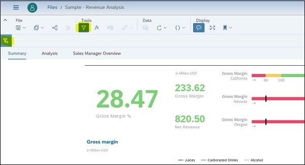
You can select Story Filter from the Tools section of the tool bar. And a filter bar appears under the toolbar.
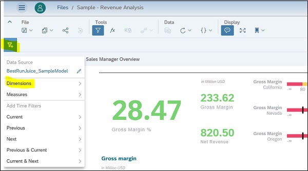
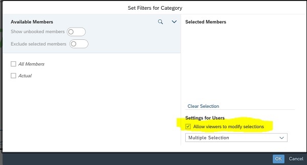
In the next step, you have to click on Filter sign and select the Dimension value from drop down list to add to filter. A dialog will appear allowing you to set a filter on selected dimension.
It shows you all the options that can be selected for that dimension under Filter options.
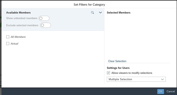
You also have an option to allow viewers to change/modify the filter selection. You can select check box - “Allow Viewers to modify selections” to enable this.
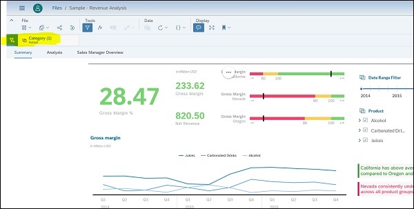
When you make the filter selection and click on OK button, your chart values are changed automatically, and selected filter will be shown in Tool bar.