- Ruby Basics
- Ruby - Home
- Ruby - Overview
- Ruby - Environment Setup
- Ruby - Syntax
- Ruby - Classes and Objects
- Ruby - Variables
- Ruby - Operators
- Ruby - Comments
- Ruby - IF...ELSE
- Ruby - Loops
- Ruby - Methods
- Ruby - Blocks
- Ruby - Modules
- Ruby - Strings
- Ruby - Arrays
- Ruby - Hashes
- Ruby - Date & Time
- Ruby - Ranges
- Ruby - Iterators
- Ruby - File I/O
- Ruby - Exceptions
- Ruby Advanced
- Ruby - Object Oriented
- Ruby - Regular Expressions
- Ruby - Database Access
- Ruby - Web Applications
- Ruby - Sending Email
- Ruby - Socket Programming
- Ruby - Ruby/XML, XSLT
- Ruby - Web Services
- Ruby - Tk Guide
- Ruby - Ruby/LDAP Tutorial
- Ruby - Multithreading
- Ruby - Built-in Functions
- Ruby - Predefined Variables
- Ruby - Predefined Constants
- Ruby - Associated Tools
- Ruby Useful Resources
- Ruby - Quick Guide
- Ruby - Useful Resources
- Ruby - Discussion
- Ruby - Ruby on Rails Tutorial
Ruby/Tk - Scrollbar Widget
Description
A Scrollbar helps the user to see all parts of another widget, whose content is typically much larger than what can be shown in the available screen space.
A scrollbar displays two arrows, one at each end of the scrollbar, and a slider in the middle portion of the scrollbar. The position and size of the slider indicate which portion of the document is visible in the associated window.
Syntax
Here is a simple syntax to create this widget −
TkScrollbar.new {
   .....Standard Options....
   .....Widget-specific Options....
}
Standard Options
- activebackground
- highlightbackground
- orient
- takefocus
- background
- highlightcolor
- relief
- troughcolor
- borderwidth
- highlightthickness
- repeatdelay
- cursor
- jump
- repeatinterval
These options have been described in the previous chapter.
Widget Specific Options
| Sr.No. | Options & Description |
|---|---|
| 1 | activerelief => String Specifies the relief to use when displaying the element that is active, if any. Elements other than the active element are always displayed with a raised relief. |
| 2 | command => String Specifies a callback to invoke to change the view in the widget associated with the scrollbar. When a user requests a view change by manipulating the scrollbar, the callback is invoked. |
| 3 | elementborderwidth => Integer Specifies the width of borders drawn around the internal elements of the scrollbar. |
| 4 | width => Integer Specifies the desired narrow dimension of the scrollbar window, not including 3-D border, if any. For vertical scrollbars this will be the width and for horizontal scrollbars this will be the height. |
Elements of Scrollbar
A scrollbar displays five elements, which are referred in the methods for the scrollbar −
arrow1 − The top or left arrow in the scrollbar.
trough1 − The region between the slider and arrow1.
slider − The rectangle that indicates what is visible in the associated widget.
trough2 − The region between the slider and arrow2.
arrow2 − The bottom or right arrow in the scrollbar.
Manipulating Scrollbar
The following useful methods to manipulate the content of a scrollbar −
activate(?element?) − Marks the element indicated by element as active, which causes it to be displayed as specified by the activebackground and activerelief options. The only element values understood by this command are arrow1, slider, or arrow2.
delta(deltaX, deltaY) − Returns a real number indicating the fractional change in the scrollbar setting that corresponds to a given change in slider position.
fraction(x, y) − Returns a real number between 0 and 1 indicating where the point given by x and y lies in the trough area of the scrollbar. The value 0 corresponds to the top or left of the trough, the value 1 corresponds to the bottom or right, 0.5 corresponds to the middle, and so on.
get − Returns the scrollbar settings in the form of a list whose elements are the arguments to the most recent set method.
identify(x, y) − Returns the name of the element under the point given by x and y (such as arrow1), or an empty string if the point does not lie in any element of the scrollbar. X and y must be pixel coordinates relative to the scrollbar widget.
set(first, last) − This command is invoked by the scrollbar's associated widget to tell the scrollbar about the current view in the widget. The command takes two arguments, each of which is a real fraction between 0 and 1. The fractions describe the range of the document that is visible in the associated widget.
Event Bindings
Ruby/Tk automatically creates class bindings for scrollbars that gives them the following default behavior. If the behavior is different for vertical and horizontal scrollbars, the horizontal behavior is described in parentheses −
Pressing button 1 over arrow1 causes the view in the associated widget to shift up (left) by one unit so that the document appears to move down (right) one unit. If the button is held down, the action auto-repeats.
Pressing button 1 over trough1 causes the view in the associated widget to shift up (left) by one screenful so that the document appears to move down (right) one screenful. If the button is held down, the action auto-repeats.
Pressing button 1 over the slider and dragging causes the view to drag with the slider. If the jump option is true, then the view doesn't drag along with the slider; it changes only when the mouse button is released.
Pressing button 1 over trough2 causes the view in the associated widget to shift down (right) by one screenful so that the document appears to move up (left) one screenful. If the button is held down, the action auto-repeats.
Pressing button 1 over arrow2 causes the view in the associated widget to shift down (right) by one unit so that the document appears to move up (left) one unit. If the button is held down, the action auto-repeats.
If button 2 is pressed over the trough or the slider, it sets the view to correspond to the mouse position; dragging the mouse with button 2 down causes the view to drag with the mouse. If button 2 is pressed over one of the arrows, it causes the same behavior as pressing button 1.
If button 1 is pressed with the Control key down, then if the mouse is over arrow1 or trough1 the view changes to the very top (left) of the document; if the mouse is over arrow2 or trough2 the view changes to the very bottom (right) of the document; if the mouse is anywhere else then the button press has no effect.
In vertical scrollbars the Up and Down keys have the same behavior as mouse clicks over arrow1 and arrow2, respectively. In horizontal scrollbars these keys have no effect.
In vertical scrollbars Control-Up and Control-Down have the same behavior as mouse clicks over trough1 and trough2, respectively. In horizontal scrollbars these keys have no effect.
In horizontal scrollbars the Up and Down keys have the same behavior as mouse clicks over arrow1 and arrow2, respectively. In vertical scrollbars these keys have no effect.
In horizontal scrollbars Control-Up and Control-Down have the same behavior as mouse clicks over trough1 and trough2, respectively. In vertical scrollbars these keys have no effect.
The Prior and Next keys have the same behavior as mouse clicks over trough1 and trough2, respectively.
The Home key adjusts the view to the top (left edge) of the document.
The End key adjusts the view to the bottom (right edge) of the document.
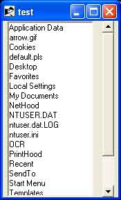
Examples
require "tk"

list = scroll = nil

list = TkListbox.new {
   yscroll proc{|idx|
      scroll.set *idx
   }
   width 20
   height 16
   setgrid 1
   pack('side' => 'left', 'fill' => 'y', 'expand' => 1)
}
scroll = TkScrollbar.new {
   command proc{|idx|
      list.yview *idx
   }
  pack('side' => 'left', 'fill' => 'y', 'expand' => 1)
}

for f in Dir.glob("*")
   list.insert 'end', f
end

Tk.mainloop
This will produce the following result −