- Ruby Basics
- Ruby - Home
- Ruby - Overview
- Ruby - Environment Setup
- Ruby - Syntax
- Ruby - Classes and Objects
- Ruby - Variables
- Ruby - Operators
- Ruby - Comments
- Ruby - IF...ELSE
- Ruby - Loops
- Ruby - Methods
- Ruby - Blocks
- Ruby - Modules
- Ruby - Strings
- Ruby - Arrays
- Ruby - Hashes
- Ruby - Date & Time
- Ruby - Ranges
- Ruby - Iterators
- Ruby - File I/O
- Ruby - Exceptions
- Ruby Advanced
- Ruby - Object Oriented
- Ruby - Regular Expressions
- Ruby - Database Access
- Ruby - Web Applications
- Ruby - Sending Email
- Ruby - Socket Programming
- Ruby - Ruby/XML, XSLT
- Ruby - Web Services
- Ruby - Tk Guide
- Ruby - Ruby/LDAP Tutorial
- Ruby - Multithreading
- Ruby - Built-in Functions
- Ruby - Predefined Variables
- Ruby - Predefined Constants
- Ruby - Associated Tools
- Ruby Useful Resources
- Ruby - Quick Guide
- Ruby - Useful Resources
- Ruby - Discussion
- Ruby - Ruby on Rails Tutorial
Ruby/TK - Canvas Widget
Description
A Canvas widget implements structured graphics. A canvas displays any number of items, which may be things like rectangles, circles, lines, and text.
Items may be manipulated (e.g., moved or re-colored) and callbacks may be associated with items in much the same way that the bind method allows callbacks to be bound to widgets.
Syntax
Here is a simple syntax to create this widget −
TkCanvas.new {
   .....Standard Options....
   .....Widget-specific Options....
}
Standard Options
- background
- borderwidth
- cursor
- highlightbackground
- highlightcolor
- highlightthickness
- relief
- selectbackground
- selectborderwidth
- selectforeground
- state
- takefocus
- tile
- xscrollcommand
- yscrollcommand
These options have been described in the previous chapter.
Widget Specific Options
| Sr.No. | Options & Description |
|---|---|
| 1 | closeenough =>Integer Specifies a floating-point value indicating how close the mouse cursor must be to an item before it is considered to be inside the item. Defaults to 1.0. |
| 2 | confine =>Boolean Specifies a boolean value that indicates whether or not it should be allowable to set the canvas's view outside the region defined by the scrollregion argument. Defaults to true, which means that the view will be constrained within the scroll region. |
| 3 | height =>Integer Specifies a desired window height that the canvas widget should request from its geometry manager. |
| 4 | scrollregion =>Coordinates Specifies a list with four coordinates describing the left, top, right, and bottom coordinates of a rectangular region. This region is used for scrolling purposes and is considered to be the boundary of the information in the canvas. |
| 5 | state =>String Modifies the default state of the canvas where state may be set to one of: normal, disabled, or hidden. Individual canvas objects all have their own state option, which overrides the default state. |
| 6 | width =>Integer Specifies a desired window width that the canvas widget should request from its geometry manager. |
| 7 | xscrollincrement =>Integer Specifies an increment for horizontal scrolling, in any of the usual forms permitted for screen distances. If the value of this option is greater than zero, the horizontal view in the window will be constrained so that the canvas x coordinate at the left edge of the window is always an even multiple of xscrollincrement; furthermore, the units for scrolling will also be xscrollincrement. |
| 8 | yscrollincrement =>Integer Specifies an increment for vertical scrolling, in any of the usual forms permitted for screen distances. If the value of this option is greater than zero, the vertical view in the window will be constrained so that the canvas y coordinate at the top edge of the window is always an even multiple of yscrollincrement; furthermore, the units for scrolling will also be yscrollincrement. |
Indices
Indices are used for methods such as inserting text, deleting a range of characters, and setting the insertion cursor position. An index may be specified in any of a number of ways, and different types of items may support different forms for specifying indices.
Text items support the following forms for an index −
number − A decimal number giving the position of the desired character within the text item. 0 refers to the first character, 1 to the next character, and so on.
end − Refers to the character or coordinate just after the last one in the item (same as the number of characters or coordinates in the item).
insert − Refers to the character just before which the insertion cursor is drawn in this item. Not valid for lines and polygons.
Creating Items
When you create a new canvas widget, it will essentially be a large rectangle with nothing on it; truly a blank canvas in other words. To do anything useful with it, you'll need to add items to it.
There are a wide variety of different types of items you can add. Following methods will be used to create different items inside a canvas −
Arc Items
Items of type arc appear on the display as arc-shaped regions. An arc is a section of an oval delimited by two angles. Arcs are created with methods of the following form −
The TkcArc.new(canvas, x1, y1, x2, y2, ?option, value, option, value, ...?) method will be used to create an arc.
The arguments x1, y1, x2, and y2 give the coordinates of two diagonally opposite corners of a rectangular region enclosing the oval that defines the arc. Here is the description of other options −
extent => degrees − Specifies the size of the angular range occupied by the arc. If it is greater than 360 or less than -360, then degrees modulo 360 is used as the extent.
fill => color − Fills the region of the arc with color.
outline => color − Color specifies a color to use for drawing the arc's outline.
start => degrees − Specifies the beginning of the angular range occupied by the arc.
style => type − Specifies how to draw the arc. If type is pieslice (the default) then the arc's region is defined by a section of the oval's perimeter plus two line segments, one between the center of the oval and each end of the perimeter section. If type is chord then the arc's region is defined by a section of the oval's perimeter plus a single line segment connecting the two end points of the perimeter section. If type is arc then the arc's region consists of a section of the perimeter alone.
tags => tagList − Specifies a set of tags to apply to the item. TagList consists of a list of tag names, which replace any existing tags for the item. TagList may be an empty list.
width => outlineWidth − Specifies the width of the outline to be drawn around the arc's region.
Bitmap Items
Items of type bitmap appear on the display as images with two colors, foreground and background. Bitmaps are created with methods of the following form −
The TkcBitmap.new(canvas, x, y, ?option, value, option, value, ...?) method will be used to create a bitmap.
The arguments x and y specify the coordinates of a point used to position the bitmap on the display. Here is the description of other options −
anchor => anchorPos − AnchorPos tells how to position the bitmap relative to the positioning point for the item. For example, if anchorPos is center then the bitmap is centered on the point; if anchorPos is n then the bitmap will be drawn so that its top center point is at the positioning point. This option defaults to center.
background => color − Specifies a color to use for each of the bitmap pixels whose value is 0.
bitmap => bitmap − Specifies the bitmap to display in the item.
foreground => color − Specifies a color to use for each of the bitmap pixels whose value is 1.
tags => tagList − Specifies a set of tags to apply to the item. TagList consists of a list of tag names, which replace any existing tags for the item. TagList may be an empty list.
Image Items
Items of type image are used to display images on a canvas. Images are created with methods of the following form: :
The TkcImage.new(canvas,x, y, ?option, value, option, value, ...?) method will be used to create an image.
The arguments x and y specify the coordinates of a point used to position the image on the display. Here is the description of other options −
anchor => anchorPos − AnchorPos tells how to position the bitmap relative to the positioning point for the item. For example, if anchorPos is center then the bitmap is centered on the point; if anchorPos is n then the bitmap will be drawn so that its top center point is at the positioning point. This option defaults to center.
image => name − Specifies the name of the image to display in the item. This image must have been created previously with the image create command.
tags => tagList − Specifies a set of tags to apply to the item. TagList consists of a list of tag names, which replace any existing tags for the item. TagList may be an empty list.
Line Items
Items of type line appear on the display as one or more connected line segments or curves. Lines are created with methods of the following form −
The TkcLine.new(canvas, x1, y1..., xn, yn, ?option, value, ...?) method will be used to create a line.
The arguments x1 through yn give the coordinates for a series of two or more points that describe a series of connected line segments. Here is the description of other options −
arrow => where − Indicates whether or not arrowheads are to be drawn at one or both ends of the line. Where must have one of the values none (for no arrowheads), first (for an arrowhead at the first point of the line), last (for an arrowhead at the last point of the line), or both (for arrowheads at both ends). This option defaults to none.
arrowshape => shape − This option indicates how to draw arrowheads. If this option isn't specified then Tk picks a reasonable shape.
dash => pattern − Specifies a pattern to draw the line.
capstyle => style − Specifies the ways in which caps are to be drawn at the endpoints of the line. Possible values are butt, projecting, or round.
fill => color − Color specifies a color to use for drawing the line.
joinstyle => style − Specifies the ways in which joints are to be drawn at the vertices of the line. Possible values are bevel, miter, or round.
smooth => boolean − It indicates whether or not the line should be drawn as a curve.
splinesteps => number − Specifies the degree of smoothness desired for curves: each spline will be approximated with number line segments. This option is ignored unless the smooth option is true.
stipple => bitmap − Indicates that the line should be filled in a stipple pattern; bitmap specifies the stipple pattern to use.
tags => tagList − Specifies a set of tags to apply to the item. TagList consists of a list of tag names, which replace any existing tags for the item. TagList may be an empty list.
width => lineWidth − Specifies the width of the line.
Rectangle Items
Items of type rectangle appear as rectangular regions on the display. Each rectangle may have an outline, a fill, or both. Rectangles are created with methods of the following form −
The TkcRectangle.new(canvas, x1, y1, x2, y2, ?option, value,...?) method will be used to create a Rectangle.
The arguments x1, y1, x2, and y2 give the coordinates of two diagonally opposite corners of the rectangle. Here is the description of other options −
fill => color − Fills the area of the rectangle with color.
outline => color − Draws an outline around the edge of the rectangle in color.
stipple => bitmap − Indicates that the rectangle should be filled in a stipple pattern; bitmap specifies the stipple pattern to use.
tags => tagList − Specifies a set of tags to apply to the item. TagList consists of a list of tag names, which replace any existing tags for the item. TagList may be an empty list.
width => outlineWidth − Specifies the width of the outline to be drawn around the rectangle.
Event Bindings
Canvas has the default bindings to allow scrolling if necessary: <Up>, <Down>, <Left> and <Right> (and their <Control-*> counter parts). Further <Prior>, <Next>, <Home> and <End>. These bindings allow you to navigate the same way as in other widgets that can scroll.
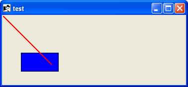
Example 1
require "tk"

canvas = TkCanvas.new
TkcRectangle.new(canvas, '1c', '2c', '3c', '3c', 'outline' => 'black', 'fill' => 'blue')
TkcLine.new(canvas, 0, 0, 100, 100, 'width' => '2', 'fill' => 'red')
canvas.pack

Tk.mainloop
This will produce the following result −
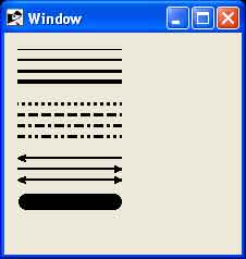
Example 2
require 'tk'

root = TkRoot.new
root.title = "Window"

canvas = TkCanvas.new(root) do
   place('height' => 170, 'width' => 100, 'x' => 10, 'y' => 10)
end

TkcLine.new(canvas, 0, 5, 100, 5)
TkcLine.new(canvas, 0, 15, 100, 15, 'width' => 2)
TkcLine.new(canvas, 0, 25, 100, 25, 'width' => 3)
TkcLine.new(canvas, 0, 35, 100, 35, 'width' => 4)
TkcLine.new(canvas, 0, 55, 100, 55, 'width' => 3, 'dash' => ".")
TkcLine.new(canvas, 0, 65, 100, 65, 'width' => 3, 'dash' => "-")
TkcLine.new(canvas, 0, 75, 100, 75, 'width' => 3, 'dash' => "-.")
TkcLine.new(canvas, 0, 85, 100, 85, 'width' => 3, 'dash' => "-..")
TkcLine.new(canvas, 0, 105, 100, 105, 'width' => 2, 'arrow' => "first")
TkcLine.new(canvas, 0, 115, 100, 115, 'width' => 2, 'arrow' => "last")
TkcLine.new(canvas, 0, 125, 100, 125, 'width' => 2, 'arrow' => "both")
TkcLine.new(canvas, 10, 145, 90, 145, 'width' => 15, 'capstyle' => "round")
Tk.mainloop
This will produce the following result −
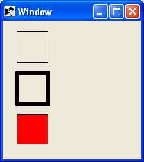
Example 3
require 'tk'

root = TkRoot.new
root.title = "Window"

canvas = TkCanvas.new(root) do
   place('height' => 170, 'width' => 100, 'x' => 10, 'y' => 10)
end

TkcRectangle.new(canvas, 10,  5,    55,  50, 'width' => 1)
TkcRectangle.new(canvas, 10,  65,  55, 110, 'width' => 5)
TkcRectangle.new(canvas, 10,  125, 55, 170, 'width' => 1, 'fill'  => "red")

Tk.mainloop
This will produce the following result −
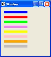
Example 4
require 'tk'

root = TkRoot.new
root.title = "Window"

canvas = TkCanvas.new(root) do
   place('height' => 170, 'width' => 100, 'x' => 10, 'y' => 10)
end

TkcLine.new(canvas, 0,  10, 100,  10, 'width' => 10, 'fill' => "blue")
TkcLine.new(canvas, 0,  30, 100,  30, 'width' => 10, 'fill' => "red")
TkcLine.new(canvas, 0,  50, 100,  50, 'width' => 10, 'fill' => "green")
TkcLine.new(canvas, 0,  70, 100,  70, 'width' => 10, 'fill' => "violet")
TkcLine.new(canvas, 0,  90, 100,  90, 'width' => 10, 'fill' => "yellow")
TkcLine.new(canvas, 0, 110, 100, 110, 'width' => 10, 'fill' => "pink")
TkcLine.new(canvas, 0, 130, 100, 130, 'width' => 10, 'fill' => "orange")
TkcLine.new(canvas, 0, 150, 100, 150, 'width' => 10, 'fill' => "grey")
Tk.mainloop
This will produce the following result −