- Python Basics
- Python - Home
- Python - Overview
- Python - History
- Python - Features
- Python vs C++
- Python - Hello World Program
- Python - Application Areas
- Python - Interpreter
- Python - Environment Setup
- Python - Virtual Environment
- Python - Basic Syntax
- Python - Variables
- Python - Data Types
- Python - Type Casting
- Python - Unicode System
- Python - Literals
- Python - Operators
- Python - Arithmetic Operators
- Python - Comparison Operators
- Python - Assignment Operators
- Python - Logical Operators
- Python - Bitwise Operators
- Python - Membership Operators
- Python - Identity Operators
- Python - Operator Precedence
- Python - Comments
- Python - User Input
- Python - Numbers
- Python - Booleans
- Python Control Statements
- Python - Control Flow
- Python - Decision Making
- Python - If Statement
- Python - If else
- Python - Nested If
- Python - Match-Case Statement
- Python - Loops
- Python - for Loops
- Python - for-else Loops
- Python - While Loops
- Python - break Statement
- Python - continue Statement
- Python - pass Statement
- Python - Nested Loops
- Python Functions & Modules
- Python - Functions
- Python - Default Arguments
- Python - Keyword Arguments
- Python - Keyword-Only Arguments
- Python - Positional Arguments
- Python - Positional-Only Arguments
- Python - Arbitrary Arguments
- Python - Variables Scope
- Python - Function Annotations
- Python - Modules
- Python - Built in Functions
- Python Strings
- Python - Strings
- Python - Slicing Strings
- Python - Modify Strings
- Python - String Concatenation
- Python - String Formatting
- Python - Escape Characters
- Python - String Methods
- Python - String Exercises
- Python Lists
- Python - Lists
- Python - Access List Items
- Python - Change List Items
- Python - Add List Items
- Python - Remove List Items
- Python - Loop Lists
- Python - List Comprehension
- Python - Sort Lists
- Python - Copy Lists
- Python - Join Lists
- Python - List Methods
- Python - List Exercises
- Python Tuples
- Python - Tuples
- Python - Access Tuple Items
- Python - Update Tuples
- Python - Unpack Tuples
- Python - Loop Tuples
- Python - Join Tuples
- Python - Tuple Methods
- Python - Tuple Exercises
- Python Sets
- Python - Sets
- Python - Access Set Items
- Python - Add Set Items
- Python - Remove Set Items
- Python - Loop Sets
- Python - Join Sets
- Python - Copy Sets
- Python - Set Operators
- Python - Set Methods
- Python - Set Exercises
- Python Dictionaries
- Python - Dictionaries
- Python - Access Dictionary Items
- Python - Change Dictionary Items
- Python - Add Dictionary Items
- Python - Remove Dictionary Items
- Python - Dictionary View Objects
- Python - Loop Dictionaries
- Python - Copy Dictionaries
- Python - Nested Dictionaries
- Python - Dictionary Methods
- Python - Dictionary Exercises
- Python Arrays
- Python - Arrays
- Python - Access Array Items
- Python - Add Array Items
- Python - Remove Array Items
- Python - Loop Arrays
- Python - Copy Arrays
- Python - Reverse Arrays
- Python - Sort Arrays
- Python - Join Arrays
- Python - Array Methods
- Python - Array Exercises
- Python File Handling
- Python - File Handling
- Python - Write to File
- Python - Read Files
- Python - Renaming and Deleting Files
- Python - Directories
- Python - File Methods
- Python - OS File/Directory Methods
- Object Oriented Programming
- Python - OOPs Concepts
- Python - Object & Classes
- Python - Class Attributes
- Python - Class Methods
- Python - Static Methods
- Python - Constructors
- Python - Access Modifiers
- Python - Inheritance
- Python - Polymorphism
- Python - Method Overriding
- Python - Method Overloading
- Python - Dynamic Binding
- Python - Dynamic Typing
- Python - Abstraction
- Python - Encapsulation
- Python - Interfaces
- Python - Packages
- Python - Inner Classes
- Python - Anonymous Class and Objects
- Python - Singleton Class
- Python - Wrapper Classes
- Python - Enums
- Python - Reflection
- Python Errors & Exceptions
- Python - Syntax Errors
- Python - Exceptions
- Python - try-except Block
- Python - try-finally Block
- Python - Raising Exceptions
- Python - Exception Chaining
- Python - Nested try Block
- Python - User-defined Exception
- Python - Logging
- Python - Assertions
- Python - Built-in Exceptions
- Python Multithreading
- Python - Multithreading
- Python - Thread Life Cycle
- Python - Creating a Thread
- Python - Starting a Thread
- Python - Joining Threads
- Python - Naming Thread
- Python - Thread Scheduling
- Python - Thread Pools
- Python - Main Thread
- Python - Thread Priority
- Python - Daemon Threads
- Python - Synchronizing Threads
- Python Synchronization
- Python - Inter-thread Communication
- Python - Thread Deadlock
- Python - Interrupting a Thread
- Python Networking
- Python - Networking
- Python - Socket Programming
- Python - URL Processing
- Python - Generics
- Python Libraries
- NumPy Tutorial
- Pandas Tutorial
- SciPy Tutorial
- Matplotlib Tutorial
- Django Tutorial
- OpenCV Tutorial
- Python Miscellenous
- Python - Date & Time
- Python - Maths
- Python - Iterators
- Python - Generators
- Python - Closures
- Python - Decorators
- Python - Recursion
- Python - Reg Expressions
- Python - PIP
- Python - Database Access
- Python - Weak References
- Python - Serialization
- Python - Templating
- Python - Output Formatting
- Python - Performance Measurement
- Python - Data Compression
- Python - CGI Programming
- Python - XML Processing
- Python - GUI Programming
- Python - Command-Line Arguments
- Python - Docstrings
- Python - JSON
- Python - Sending Email
- Python - Further Extensions
- Python - Tools/Utilities
- Python - GUIs
- Python Useful Resources
- Python Compiler
- NumPy Compiler
- Matplotlib Compiler
- SciPy Compiler
- Python - Programming Examples
- Python - Quick Guide
- Python - Useful Resources
- Python - Discussion
Tkinter Menubutton
A menubutton is the part of a drop-down menu that stays on the screen all the time. Every menubutton is associated with a Menu widget that can display the choices for that menubutton when the user clicks on it.
Syntax
Here is the simple syntax to create this widget −
w = Menubutton ( master, option, ... )
Parameters
master − This represents the parent window.
options − Here is the list of most commonly used options for this widget. These options can be used as key-value pairs separated by commas.
| Sr.No. | Options & Description |
|---|---|
| 1 | activebackground The background color when the mouse is over the menubutton. |
| 2 | activeforeground The foreground color when the mouse is over the menubutton. |
| 3 | anchor This options controls where the text is positioned if the widget has more space than the text needs. The default is anchor=CENTER, which centers the text. |
| 4 | bg The normal background color displayed behind the label and indicator. |
| 5 | bitmap To display a bitmap on the menubutton, set this option to a bitmap name. |
| 6 | bd The size of the border around the indicator. Default is 2 pixels. |
| 7 | cursor The cursor that appears when the mouse is over this menubutton. |
| 8 | direction Set direction=LEFT to display the menu to the left of the button; use direction=RIGHT to display the menu to the right of the button; or use direction='above' to place the menu above the button. |
| 9 | disabledforeground The foreground color shown on this menubutton when it is disabled. |
| 10 | fg The foreground color when the mouse is not over the menubutton. |
| 11 | height The height of the menubutton in lines of text (not pixels!). The default is to fit the menubutton's size to its contents. |
| 12 | highlightcolor Color shown in the focus highlight when the widget has the focus. |
| 13 | image To display an image on this menubutton, |
| 14 | justify This option controls where the text is located when the text doesn't fill the menubutton: use justify=LEFT to left-justify the text (this is the default); use justify=CENTER to center it, or justify=RIGHT to right-justify. |
| 15 | menu To associate the menubutton with a set of choices, set this option to the Menu object containing those choices. That menu object must have been created by passing the associated menubutton to the constructor as its first argument. |
| 16 | padx How much space to leave to the left and right of the text of the menubutton. Default is 1. |
| 17 | pady How much space to leave above and below the text of the menubutton. Default is 1. |
| 18 | relief Selects three-dimensional border shading effects. The default is RAISED. |
| 19 | state Normally, menubuttons respond to the mouse. Set state=DISABLED to gray out the menubutton and make it unresponsive. |
| 20 | text To display text on the menubutton, set this option to the string containing the desired text. Newlines ("\n") within the string will cause line breaks. |
| 21 | textvariable You can associate a control variable of class StringVar with this menubutton. Setting that control variable will change the displayed text. |
| 22 | underline Normally, no underline appears under the text on the menubutton. To underline one of the characters, set this option to the index of that character. |
| 23 | width The width of the widget in characters. The default is 20. |
| 24 | wraplength Normally, lines are not wrapped. You can set this option to a number of characters and all lines will be broken into pieces no longer than that number. |
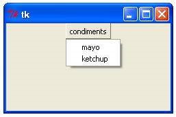
Example
Try the following example yourself −
from tkinter import *
import tkinter
top = Tk()
mb= Menubutton ( top, text="condiments", relief=RAISED )
mb.grid()
mb.menu = Menu ( mb, tearoff = 0 )
mb["menu"] = mb.menu

mayoVar = IntVar()
ketchVar = IntVar()
mb.menu.add_checkbutton (label="mayo", variable=mayoVar)
mb.menu.add_checkbutton (label="ketchup", variable=ketchVar)
mb.pack()
top.mainloop()
When the above code is executed, it produces the following output −