- Python Basics
- Python - Home
- Python - Overview
- Python - History
- Python - Features
- Python vs C++
- Python - Hello World Program
- Python - Application Areas
- Python - Interpreter
- Python - Environment Setup
- Python - Virtual Environment
- Python - Basic Syntax
- Python - Variables
- Python - Data Types
- Python - Type Casting
- Python - Unicode System
- Python - Literals
- Python - Operators
- Python - Arithmetic Operators
- Python - Comparison Operators
- Python - Assignment Operators
- Python - Logical Operators
- Python - Bitwise Operators
- Python - Membership Operators
- Python - Identity Operators
- Python - Operator Precedence
- Python - Comments
- Python - User Input
- Python - Numbers
- Python - Booleans
- Python Control Statements
- Python - Control Flow
- Python - Decision Making
- Python - If Statement
- Python - If else
- Python - Nested If
- Python - Match-Case Statement
- Python - Loops
- Python - for Loops
- Python - for-else Loops
- Python - While Loops
- Python - break Statement
- Python - continue Statement
- Python - pass Statement
- Python - Nested Loops
- Python Functions & Modules
- Python - Functions
- Python - Default Arguments
- Python - Keyword Arguments
- Python - Keyword-Only Arguments
- Python - Positional Arguments
- Python - Positional-Only Arguments
- Python - Arbitrary Arguments
- Python - Variables Scope
- Python - Function Annotations
- Python - Modules
- Python - Built in Functions
- Python Strings
- Python - Strings
- Python - Slicing Strings
- Python - Modify Strings
- Python - String Concatenation
- Python - String Formatting
- Python - Escape Characters
- Python - String Methods
- Python - String Exercises
- Python Lists
- Python - Lists
- Python - Access List Items
- Python - Change List Items
- Python - Add List Items
- Python - Remove List Items
- Python - Loop Lists
- Python - List Comprehension
- Python - Sort Lists
- Python - Copy Lists
- Python - Join Lists
- Python - List Methods
- Python - List Exercises
- Python Tuples
- Python - Tuples
- Python - Access Tuple Items
- Python - Update Tuples
- Python - Unpack Tuples
- Python - Loop Tuples
- Python - Join Tuples
- Python - Tuple Methods
- Python - Tuple Exercises
- Python Sets
- Python - Sets
- Python - Access Set Items
- Python - Add Set Items
- Python - Remove Set Items
- Python - Loop Sets
- Python - Join Sets
- Python - Copy Sets
- Python - Set Operators
- Python - Set Methods
- Python - Set Exercises
- Python Dictionaries
- Python - Dictionaries
- Python - Access Dictionary Items
- Python - Change Dictionary Items
- Python - Add Dictionary Items
- Python - Remove Dictionary Items
- Python - Dictionary View Objects
- Python - Loop Dictionaries
- Python - Copy Dictionaries
- Python - Nested Dictionaries
- Python - Dictionary Methods
- Python - Dictionary Exercises
- Python Arrays
- Python - Arrays
- Python - Access Array Items
- Python - Add Array Items
- Python - Remove Array Items
- Python - Loop Arrays
- Python - Copy Arrays
- Python - Reverse Arrays
- Python - Sort Arrays
- Python - Join Arrays
- Python - Array Methods
- Python - Array Exercises
- Python File Handling
- Python - File Handling
- Python - Write to File
- Python - Read Files
- Python - Renaming and Deleting Files
- Python - Directories
- Python - File Methods
- Python - OS File/Directory Methods
- Object Oriented Programming
- Python - OOPs Concepts
- Python - Object & Classes
- Python - Class Attributes
- Python - Class Methods
- Python - Static Methods
- Python - Constructors
- Python - Access Modifiers
- Python - Inheritance
- Python - Polymorphism
- Python - Method Overriding
- Python - Method Overloading
- Python - Dynamic Binding
- Python - Dynamic Typing
- Python - Abstraction
- Python - Encapsulation
- Python - Interfaces
- Python - Packages
- Python - Inner Classes
- Python - Anonymous Class and Objects
- Python - Singleton Class
- Python - Wrapper Classes
- Python - Enums
- Python - Reflection
- Python Errors & Exceptions
- Python - Syntax Errors
- Python - Exceptions
- Python - try-except Block
- Python - try-finally Block
- Python - Raising Exceptions
- Python - Exception Chaining
- Python - Nested try Block
- Python - User-defined Exception
- Python - Logging
- Python - Assertions
- Python - Built-in Exceptions
- Python Multithreading
- Python - Multithreading
- Python - Thread Life Cycle
- Python - Creating a Thread
- Python - Starting a Thread
- Python - Joining Threads
- Python - Naming Thread
- Python - Thread Scheduling
- Python - Thread Pools
- Python - Main Thread
- Python - Thread Priority
- Python - Daemon Threads
- Python - Synchronizing Threads
- Python Synchronization
- Python - Inter-thread Communication
- Python - Thread Deadlock
- Python - Interrupting a Thread
- Python Networking
- Python - Networking
- Python - Socket Programming
- Python - URL Processing
- Python - Generics
- Python Libraries
- NumPy Tutorial
- Pandas Tutorial
- SciPy Tutorial
- Matplotlib Tutorial
- Django Tutorial
- OpenCV Tutorial
- Python Miscellenous
- Python - Date & Time
- Python - Maths
- Python - Iterators
- Python - Generators
- Python - Closures
- Python - Decorators
- Python - Recursion
- Python - Reg Expressions
- Python - PIP
- Python - Database Access
- Python - Weak References
- Python - Serialization
- Python - Templating
- Python - Output Formatting
- Python - Performance Measurement
- Python - Data Compression
- Python - CGI Programming
- Python - XML Processing
- Python - GUI Programming
- Python - Command-Line Arguments
- Python - Docstrings
- Python - JSON
- Python - Sending Email
- Python - Further Extensions
- Python - Tools/Utilities
- Python - GUIs
- Python Useful Resources
- Python Compiler
- NumPy Compiler
- Matplotlib Compiler
- SciPy Compiler
- Python - Programming Examples
- Python - Quick Guide
- Python - Useful Resources
- Python - Discussion
Tkinter Label
This widget implements a display box where you can place text or images. The text displayed by this widget can be updated at any time you want.
It is also possible to underline part of the text (like to identify a keyboard shortcut) and span the text across multiple lines.
Syntax
Here is the simple syntax to create this widget −
w = Label ( master, option, ... )
Parameters
master − This represents the parent window.
options − Here is the list of most commonly used options for this widget. These options can be used as key-value pairs separated by commas.
| Sr.No. | Options & Description |
|---|---|
| 1 | Anchor This options controls where the text is positioned if the widget has more space than the text needs. The default is anchor=CENTER, which centers the text in the available space. |
| 2 | Bg The normal background color displayed behind the label and indicator. |
| 3 | Bitmap Set this option equal to a bitmap or image object and the label will display that graphic. |
| 4 | Bd The size of the border around the indicator. Default is 2 pixels. |
| 5 | Cursor If you set this option to a cursor name (arrow, dot etc.), the mouse cursor will change to that pattern when it is over the checkbutton. |
| 6 | Font If you are displaying text in this label (with the text or textvariable option, the font option specifies in what font that text will be displayed. |
| 7 | Fg If you are displaying text or a bitmap in this label, this option specifies the color of the text. If you are displaying a bitmap, this is the color that will appear at the position of the 1-bits in the bitmap. |
| 8 | height The vertical dimension of the new frame. |
| 9 | image To display a static image in the label widget, set this option to an image object. |
| 10 | justify Specifies how multiple lines of text will be aligned with respect to each other: LEFT for flush left, CENTER for centered (the default), or RIGHT for right-justified. |
| 11 | padx Extra space added to the left and right of the text within the widget. Default is 1. |
| 12 | pady Extra space added above and below the text within the widget. Default is 1. |
| 13 | relief Specifies the appearance of a decorative border around the label. The default is FLAT; for other values. |
| 14 | text To display one or more lines of text in a label widget, set this option to a string containing the text. Internal newlines ("\n") will force a line break. |
| 15 | textvariable To slave the text displayed in a label widget to a control variable of class StringVar, set this option to that variable. |
| 16 | underline You can display an underline (_) below the nth letter of the text, counting from 0, by setting this option to n. The default is underline=- 1, which means no underlining. |
| 17 | width Width of the label in characters (not pixels!). If this option is not set, the label will be sized to fit its contents. |
| 18 | wraplength You can limit the number of characters in each line by setting this option to the desired number. The default value, 0, means that lines will be broken only at newlines. |
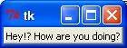
Example
Try the following example yoursel −
from tkinter import *
root = Tk()
var = StringVar()
label = Label( root, textvariable=var, relief=RAISED )
var.set("Hey!? How are you doing?")
label.pack()
root.mainloop()
When the above code is executed, it produces the following result −