- NativeScript Tutorial
- NativeScript - Home
- NativeScript - Introduction
- NativeScript - Installation
- NativeScript - Architecture
- NativeScript - Angular Application
- NativeScript - Templates
- NativeScript - Widgets
- NativeScript - Layout Containers
- NativeScript - Navigation
- NativeScript - Events Handling
- NativeScript - Data Binding
- NativeScript - Modules
- NativeScript - Plugins
- NativeScript - Native APIs Using JavaScript
- NativeScript - Creating an Application in Android
- NativeScript - Creating an Application in iOS
- NativeScript - Testing
- NativeScript Useful Resources
- NativeScript - Quick Guide
- NativeScript - Useful Resources
- NativeScript - Discussion
NativeScript - Widgets
NativeScript provides a large set of user interface components and are called as ‘widgets’. Each widget does a special task and comes with a set of methods. Let’s understand NativeScript widgets in detail in this section.
Button
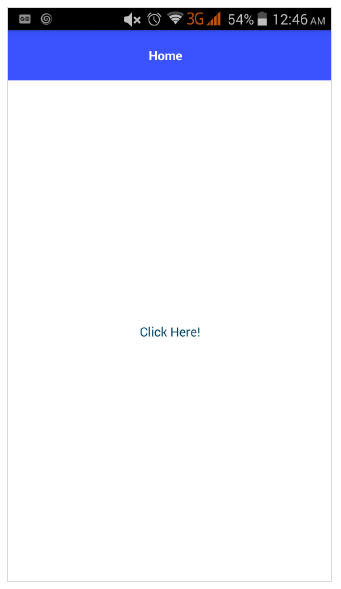
Button is a component to execute tap event action. When a user taps the button it performs the corresponding actions. It is defined below −
<Button text="Click here!" tap="onTap"></Button>
Let us add the button in our BlankNgApp as below −
Step 1
Open the src\app\home\home.component.html. This is the UI design page of our home component.
Step 2
Add a button inside the GirdLayout component. The complete code is as follows −
<ActionBar>
   <Label text="Home"></Label>
</ActionBar>
<GridLayout>
   <button text="Click Here!"></button>
</GridLayout>
Output
Below is the output of the button −
Step 3
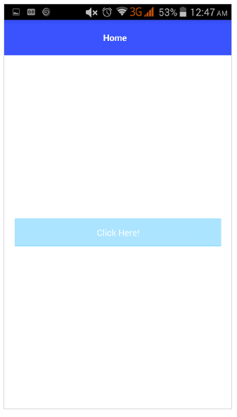
We can style the button using CSS as specified below −
<ActionBar>
   <Label text="Home"></Label>
</ActionBar>
<GridLayout>
   <button text="Click Here!" class="-primary"></button>
</GridLayout>
Here, −primary class is used to represent the primary button.
Output
Below is the output of ButtonPrimary −
Step 4
NativeScript provides formatted option to provide custom icons in the button. The sample code is as follows −
<GridLayout>
<Button class="-primary">
<FormattedString>
<Span text="" class="fa"></Span>
<Span text=" Button.-primary with icon"></Span>
</FormattedString>
</Button>
</GridLayout>
.fa {
font-family: "FontAwesome", "fontawesome-webfont";
}
Here,
 specifies the location of the icon in the font, FontAwesome. Download the latest Font Awesome font and place the fontawesome-webfont.ttf in src\fonts folder.
Output
Below is the output of ButtonPrimary −
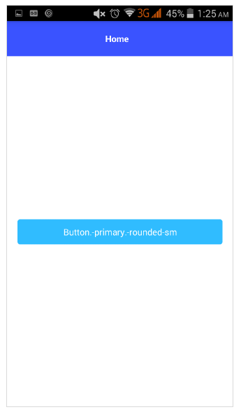
Step 5
Rounded button can be created using the below syntax −
<Button text="Button.-primary.-rounded-sm" class="-primary -rounded-sm"></Button>
Output
Below is the output of ButtonPrimary −
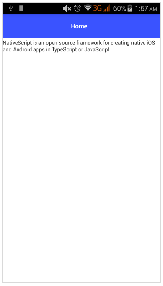
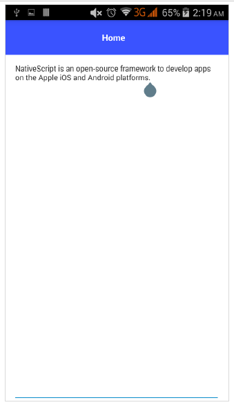
Label
Label component is used to display static text. Change the home page as below −
<GridLayout>
   <Label text="NativeScript is an open source framework for creating native iOS and Android apps in TypeScript or JavaScript." textWrap="true">
   </Label>
</GridLayout>
Here, textWrap wraps the content of the label, if the label extends beyond the screen width.
Output
Below is the output of Label −
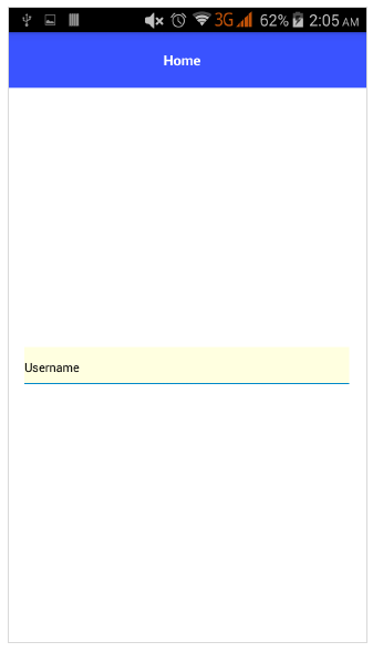
TextField
TextField component is used to get information from user. Let us change our home page as specified below −
<GridLayout>
   <TextField hint="Username"
      color="lightblue"
      backgroundColor="lightyellow"
      height="75px">
   </TextField>
</GridLayout>
Here,
color represent text color
backgroundColor represent background of the text box
height represent the height of the text box
Output
Below is the output of Text Field −
TextView
TextView Component is used to get multi-line text content from the user. Let us change our home page as specified below −
<GridLayout>
   <TextView loaded="onTextViewLoaded" hint="Enter text" returnKeyType="done" autocorrect="false" maxLength="100">
   </TextView>
</GridLayout>
Here, maxLength represent maximum length accepted by TextView.
Output
Below is the output of TextView −
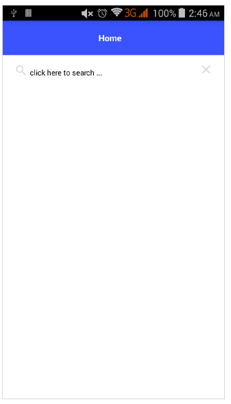
SearchBar
This component is used for search any queries or submit any request. It is defined below −
<StackLayout>
   <SearchBar id="bar" hint="click here to search ..."></SearchBar>
<StackLayout>
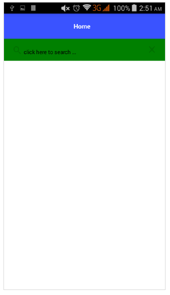
We can apply styles −
<StackLayout>
   <SearchBar id="bar" hint="click here to search ..." color="green" backgroundColor="green"></SearchBar>
</StackLayout>
Below is the output of SearchBarStyle −
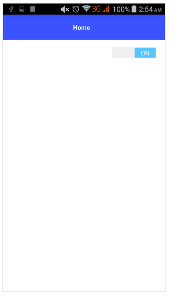
Switch
Switch is based on toggle to choose between options. Default state is false. It is defined below −
<StackLayout>
   <Switch checked="false" loaded="onSwitchLoaded"></Switch>
</StackLayout>
The output for the above program is shown below −
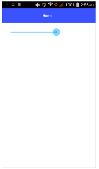
Slider
Slider is a sliding component to pick a numeric range. It is defined below −
<Slider value="30" minValue="0" maxValue="50" loaded="onSliderLoaded"></Slider>
The output for the above program is given below −
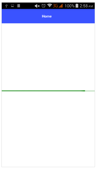
Progress
Progress widget indicates progress in an operation. Current progress is represented as bar. It is defined below −
<StackLayout verticalAlign="center" height="50">
   <Progress value="90" maxValue="100" backgroundColor="red" color="green" row="0"></Progress>
</StackLayout>
Below is the output of Progress widget −
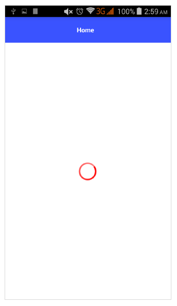
ActivityIndicator
ActivityIndicator shows a task in a progress. It is defined below −
<StackLayout verticalAlign="center" height="50">
   <ActivityIndicator busy="true" color="red" width="50"
   height="50"></ActivityIndicator>
</StackLayout>
Below is the output for ActivityIndicator −
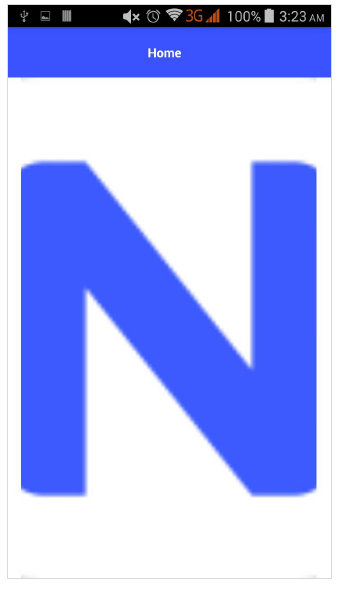
Image
Image widget is used to display an image. It can be loaded using ‘ImageSource’ url. It is defined below −
<StackLayout class="m-15" backgroundColor="lightgray">
   <Image src="~/images/logo.png" stretch="aspectFill"></Image>
</StackLayout>
The output for Image Widget is as shown below −
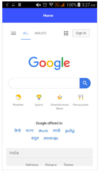
WebView
WebView shows web pages. Web pages can be loaded using URL. It is defined below −
<WebView row="1" loaded="onWebViewLoaded" id="myWebView" src="http://www.google.com"></WebView>
The output for the above code is as shown below −
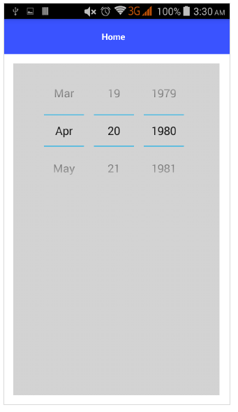
DatePicker
DatePicker component is used to pick date. It is defined below −
<StackLayout class="m-15" backgroundColor="lightgray">
   <DatePicker year="1980" month="4" day="20" verticalAlignment="center"></DatePicker>
</StackLayout>
The output of DatePicker component is as shown below −
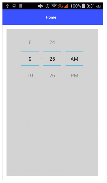
TimePicker
TimePicker component is used to pick the time. It is defined below −
<StackLayout class="m-15" backgroundColor="lightgray">
<TimePicker hour="9"
   minute="25"
   maxHour="23"
   maxMinute="59"
   minuteInterval="5">
</TimePicker>
</StackLayout>
Below is the output of TimePicker component −