- NativeScript Tutorial
- NativeScript - Home
- NativeScript - Introduction
- NativeScript - Installation
- NativeScript - Architecture
- NativeScript - Angular Application
- NativeScript - Templates
- NativeScript - Widgets
- NativeScript - Layout Containers
- NativeScript - Navigation
- NativeScript - Events Handling
- NativeScript - Data Binding
- NativeScript - Modules
- NativeScript - Plugins
- NativeScript - Native APIs Using JavaScript
- NativeScript - Creating an Application in Android
- NativeScript - Creating an Application in iOS
- NativeScript - Testing
- NativeScript Useful Resources
- NativeScript - Quick Guide
- NativeScript - Useful Resources
- NativeScript - Discussion
NativeScript - Layout Containers
NativeScript provides collection of container component for the sole purpose of laying out UI widget component. Layout containers act as the parent component and can have one or more child components. All child components of a layout container can be arranged based on the technique provided by its parent layout container.
NativeScript supports six layouts containers and they are as follows −
Absolute layout container
Dock layout container
Grid layout container
Stack layout container
Wrap layout container
FlexBox layout container
Let us learn all the layout container concepts in detail in this chapter.
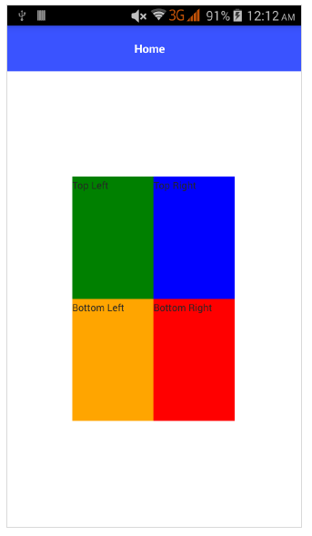
Absolute Layout
AbsoluteLayout container is the simplest layout container in NativeScript. AbsoluteLayout does not enforce any constraint on its children and will place its children inside it using 2-dimensional coordinate system with top-left corner as origin.
AbsoluteLayout uses four properties of its children to position them and they are as follows −
top − Defines the placement of the child from origin moving downwards in y direction.
left − Defines the placement of the child from origin moving sidewards in x direction.
width − Defines the width of the child.
height − Defines the height of the child.
Let us add AbsoluteLayout container in the home page of our application as below −
<ActionBar>
   <Label text="Home"></Label>
</ActionBar>

<AbsoluteLayout width="200" height="300" backgroundColor="blue">
   <Label text="Top Left" left="0" top="0" width="100" height="150" backgroundColor="green">
   </Label>
   <Label text="Top Right" left="100" top="0" width="100" height="150" backgroundColor="blue"></Label>
   <Label text="Bottom Left" left="0" top="150" width="100" height="150" backgroundColor="orange">
   </Label>
   <Label text="Bottom Right" left="100" top="150" width="100" height="150" backgroundColor="red"></Label>
</AbsoluteLayout>
Output
The output of the AbsoluteLayout is as given below −
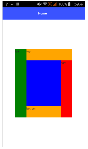
DockLayout
Docklayout container component enables its children to dock inside it. Each side of the container (top, bottom, left, right) can dock a child component. DockLayout container uses the dock property of its children to correctly dock them.
The possible values of the dock property is as follows −
top − Layout container dock the child component at the top corner.
bottom − Layout container dock the child component at the bottom corner.
left − Layout container dock the child component at the left corner.
right − Layout container dock the child component at the right corner.
By default, DockLayout container docks its last child component. It can override by setting its stretchLastChild property to zero.
Let us add DockLayout container in the home page of our application as below −
<ActionBar>
   <Label text="Home"></Label>
</ActionBar>
<DockLayout width="250" height="300" backgroundColor="blue" stretchLastChild="false">
   <Label text="left" dock="left" width="50" backgroundColor="green"></Label>
   <Label text="top" dock="top" height="50" backgroundColor="orange"></Label>
   <Label text="right" dock="right" width="50" backgroundColor="red"></Label<
   <Label text="bottom" dock="bottom" height="50"
   backgroundColor="orange"></Label>
</DockLayout>
Output
Below is the output for DockLayout −
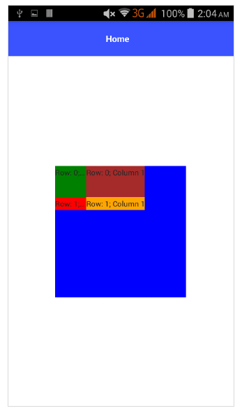
GridLayout
GridLayout container component is one of the complex layout container and arranges child elements in tabular format with rows and columns. By default, it has one row and one column. It has the following properties −
columns − Used to represent the default width of each column separated by ,. The possible values are number, * and auto keyword.
Where,
number indicates an absolute column width.
indicates the width of a column relative to other columns. It can be preceded by number to indicate how many times the column width should be relative to other column. For example, 2* indicate the width the column should be 2 times the width of the smallest column.
auto indicates the width of the column as wide as its widest child.
For example, *,2* means two columns and second will be twice the size of first column.
rows − Used to represent the default height of each row separated by ,. Value representation is similar to columns.
GridLayout uses the below specified properties of its children to layout them −
row − Row number
rowSpan − total number of rows that child content spans within a layout.
colSpan − total number of columns that child content spans within a layout.
Let us add GridLayout container in the home page of our application as below −
<ActionBar>
   <Label text="Home"></Label>
</ActionBar>
<GridLayout columns="50, auto, *" rows="50, auto, *" width="210" height="210"
   backgroundColor="blue">
   <Label text="Row: 0; Column 0" row="0" col="0" backgroundColor="green"></Label>
   <Label text="Row: 0; Column 1" row="0" col="1" colSpan="1" backgroundColor="brown"></Label>
   <Label text="Row: 1; Column 0" row="1" col="0" rowSpan="1" backgroundColor="red"></Label>
   <Label text="Row: 1; Column 1" row="1" col="1" backgroundColor="orange"></Label>
</GridLayout>
Output
Below is the output for GridLayout −
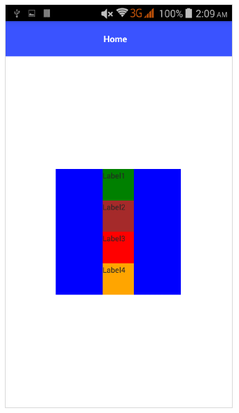
StackLayout
StackLayout organizes its children in a one-dimensional line either horizontally or vertically. It can be sized based on the space in the layout using layout options. It has orientation property that can be used to specify direction, horizontal or vertical.
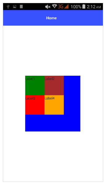
Let us add StackLayout container in the home page of our application as below −
<ActionBar>
   <Label text="Home"></Label>
</ActionBar>
<StackLayout orientation="vertical" width="200" height="200" backgroundColor="blue">
   <Label text="Label1" width="50" height="50" backgroundColor="green"></Label>
   <Label text="Label2" width="50" height="50" backgroundColor="brown"></Label>
   <Label text="Label3" width="50" height="50" backgroundColor="red"></Label>
   <Label text="Label4" width="50" height="50" backgroundColor="orange"></Label>
</StackLayout>
Output
The output for StackLayout is as shown below −
WrapLayout
WrapLayout is used to wrap contents on new rows or columns.
It has the following three properties −
orientation − display either horizontally or vertically.
itemWidth − layout width for each child.
itemHeight − layout height for each child.
Let us add WrapLayout container in the home page of our application as below −
<ActionBar>
   <Label text="Home"></Label>
</ActionBar> <WrapLayout orientation="horizontal" width="200" height="200" backgroundColor="blue">
   <Label text="Label1" width="70" height="70" backgroundColor="green"></Label>
   <Label text="Label2" width="70" height="70" backgroundColor="brown"></Label
   <Label text="Label3" width="70" height="70" backgroundColor="red"></Label>
   <Label text="Label4" width="70" height="70" backgroundColor="orange"></Label>
</WrapLayout>
Output
Flexbox Layout
FlexboxLayout container component is one of the advanced layout container. It provides option to render simple layout to very complex and sophisticated layouts. It is based on the CSS Flexbox.
FlexboxLayout component has lot of properties and they are as follows −
flexDirection
It represents the direction in which the child components are arranged. The possible values of flexDirection are as follows −
row − Child components are arranged side by side.
row-reverse − Child components are arranged side by side but in reverse direction.
column − Child components are arranged one below the another.
column-reverse − Child components are arranged one below the another but in reverse direction.
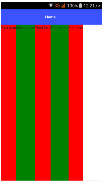
Let us add FlexLayout container in the home page of our application as below −
<ActionBar>
   <Label text="Home"></Label>
</ActionBar>
<FlexboxLayout flexDirection="row">
   <Label text="First Item" backgroundColor="red"></Label>
   <Label text="Second Item" backgroundColor="green"></Label>
   <Label text="Third Item" backgroundColor="red"></Label>
   <Label text="Fourth Item" backgroundColor="green"></Label>
   <Label text="Fifth Item" backgroundColor="red"></Label>
</FlexboxLayout>
Output
Below is the output of FlexLayout – Row −
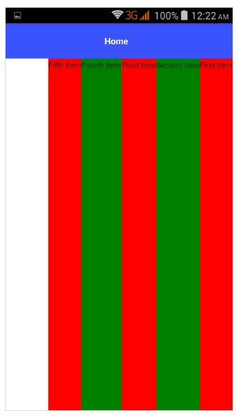
Now, let us change the flexDirection value from row to row-reverse and check how it affects the layout.
<ActionBar>
   <Label text="Home"></Label>
</ActionBar> <FlexboxLayout flexDirection="row-reverse">
   <Label text="First Item" backgroundColor="red"></Label>
   <Label text="Second Item" backgroundColor="green"></Label>
   <Label text="Third Item" backgroundColor="red"></Label>
   <Label text="Fourth Item" backgroundColor="green"></Label>
   <Label text="Fifth Item" backgroundColor="red"></Label>
</FlexboxLayout>
Output
Below is the output of Flex Layout - Row Reverse −
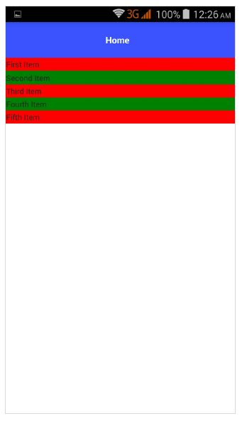
Let us change the flexDirection value from row-reverse to column and check how it affects the layout.
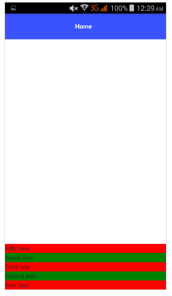
<ActionBar>
   <Label text="Home"></Label>
</ActionBar>
<FlexboxLayout flexDirection="column">
   <Label text="First Item" backgroundColor="red"></Label>
   <Label text="Second Item" backgroundColor="green"></Label>
   <Label text="Third Item" backgroundColor="red"></Label>
   <Label text="Fourth Item" backgroundColor="green"></Label>
   <Label text="Fifth Item" backgroundColor="red"></Label>
</FlexboxLayout>
Output
The output for FlexLayout – Column is given below −
Let us change the flexDirection value from column to column-reverse and check how it affects the layout.
<ActionBar>
   <Label text="Home"></Label>
</ActionBar>
<FlexboxLayout flexDirection="column-reverse">
   <Label text="First Item" backgroundColor="red"></Label>
   <Label text="Second Item" backgroundColor="green"></Label>
   <Label text="Third Item" backgroundColor="red"></Label>
   <Label text="Fourth Item" backgroundColor="green"></Label>
   <Label text="Fifth Item" backgroundColor="red"></Label>
</FlexboxLayout>
Output
Below is the output of FlexLayout – Column Reverse −
flexWrap
It represents whether the child components will be rendered in a single row/column or flow into multiple rows by wraping in the direction set by flexDirection.
The possible values are as follows −
wrap − Wraps the children components, if no space is available in the given direction (flexDirection).
wrap-reverse − Same as wrap except the component flow in opposite direction.
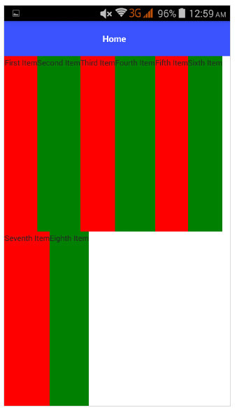
Let us add the flexWrap property and then set its value as wrap. Also add three more children as specified below −
<ActionBar>
   <Label text="Home"></Label>
&tl;/ActionBar>
<FlexboxLayout flexDirection="row" flexWrap="wrap">
   <Label text="First Item" backgroundColor="red"></Label>
   <Label text="Second Item" backgroundColor="green"></Label>
   <Label text="Third Item" backgroundColor="red"></Label>
   <Label text="Fourth Item" backgroundColor="green"></Label>
   <Label text="Fifth Item" backgroundColor="red"></Label>
   <Label text="Sixth Item" backgroundColor="green"></Label>
   <Label text="Seventh Item" backgroundColor="red"></Label>
   <Label text="Eighth Item" backgroundColor="green"></Label>
</FlexboxLayout>
Output
Below is the output for flexWrap −
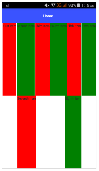
JustifyContent
It represents how child components are arranged with respect to each other and the overall structure. It has three properties as specified below −
flex-end − It packs the child component toward the end line.
space-between − It packs the child component by evenly distributing in line.
space-around − Similar to space-between except it packs the child component by evenly distributing in line as well as equal space around them.
Let us add justifyContent as well and check how it behaves −
<ActionBar>
   <Label text="Home"></Label>
</ActionBar>
<FlexboxLayout flexDirection="row" flexWrap="wrap" justifyContent="space-around">
   <Label text="First Item" backgroundColor="red"></Label>
   <Label text="Second Item" backgroundColor="green"></Label>
   <Label text="Third Item" backgroundColor="red"></Label>
   <Label text="Fourth Item" backgroundColor="green"></Label>
   <Label text="Fifth Item" backgroundColor="red"></Label>
   <Label text="Sixth Item" backgroundColor="green"></Label>
   <Label text="Seventh Item" backgroundColor="red"></Label>
   <Label text="Eighth Item" backgroundColor="green"></Label>
</FlexboxLayout>
Output
Below is the output of Flex Layout – JustifyContent −
FlexLayout container provides two more properties for its children to specify the order and ability to shrink. They are as follows −
order − It determines that order in which the children of the FlexLayout container will be rendered.
flexShrink − It determines the ability of the children to shrink to level 0.