- Kibana Tutorial
- Kibana - Home
- Kibana - Overview
- Kibana - Environment Setup
- Kibana - Introduction To Elk Stack
- Kibana - Loading Sample Data
- Kibana - Management
- Kibana - Discover
- Kibana - Aggregation And Metrics
- Kibana - Create Visualization
- Kibana - Working With Charts
- Kibana - Working With Graphs
- Kibana - Working With Heat Map
- Working With Coordinate Map
- Kibana - Working With Region Map
- Working With Guage And Goal
- Kibana - Working With Canvas
- Kibana - Create Dashboard
- Kibana - Timelion
- Kibana - Dev Tools
- Kibana - Monitoring
- Creating Reports Using Kibana
- Kibana Useful Resources
- Kibana - Quick Guide
- Kibana - Useful Resources
- Kibana - Discussion
Kibana - Working With Guage And Goal
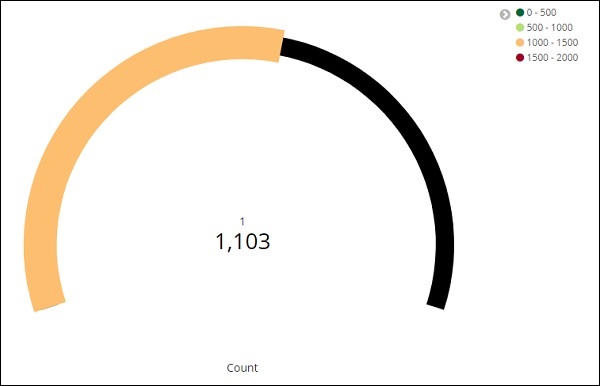
A gauge visualization tells how your metric considered on the data falls in the predefined range.
A goal visualization tells about your goal and how your metric on your data progresses towards the goal.
Working with Gauge
To start using Gauge, go to visualization and select Visualize tab from Kibana UI.
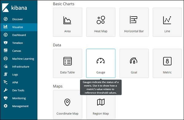
Click on Gauge and select the index you want to use.
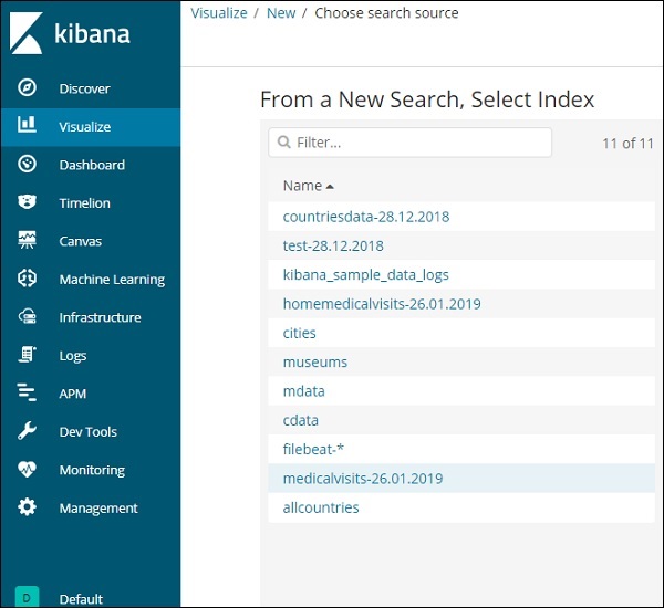
We are going to work on medicalvisits-26.01.2019 index.
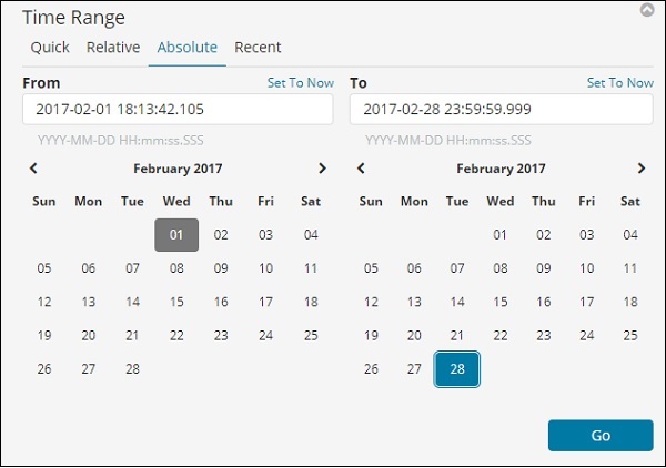
Select the time range of February 2017
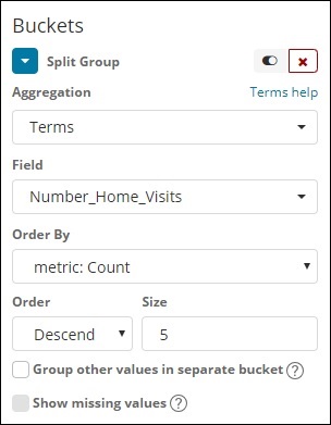
Now you can select the metric and bucket aggregation.
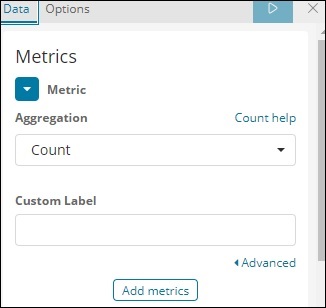
We have selected the metric aggregation as Count.
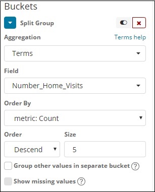
The bucket aggregation we have selected Terms and the field selected is Number_Home_Visits.
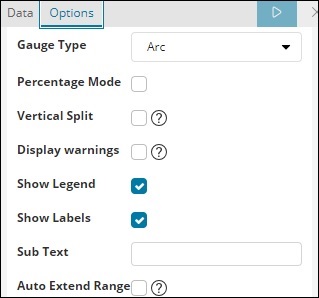
From Data options Tab, the options selected are shown below −
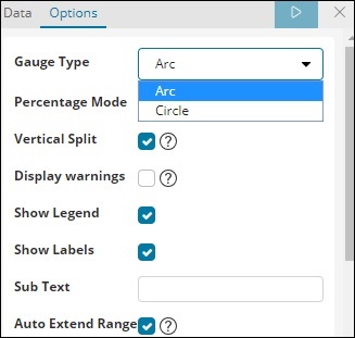
Gauge Type can be in the form of circle or arc. We have selected as arc and rest all others as the default values.
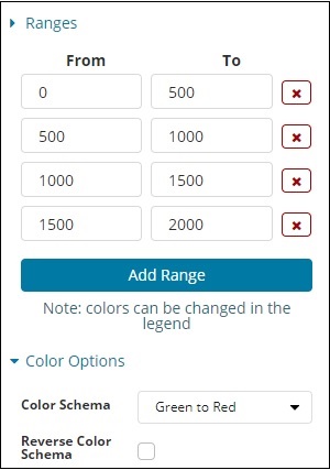
The predefined range we have added is shown here −
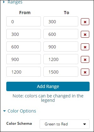
The colour selected is Green To Red.
Now, click on Analyze Button to see the visualization in the form of Gauge as shown below −
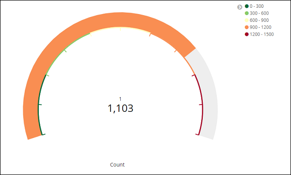
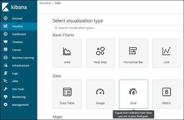
Working with Goal
Go to Visualize Tab and select Goal as shown below −
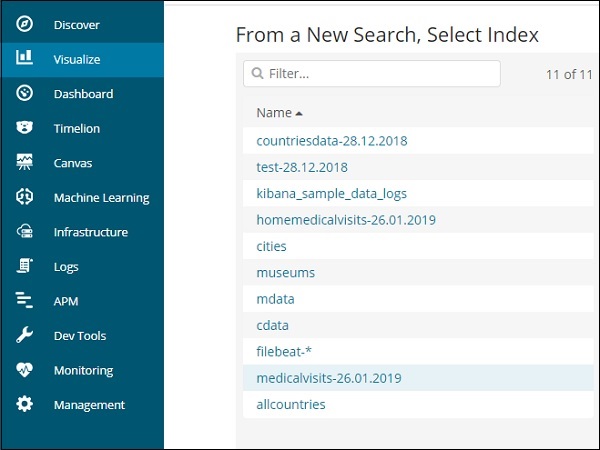
Select Goal and select the index.
Use medicalvisits-26.01.2019 as the index.
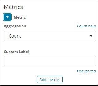
Select the metric aggregation and bucket aggregation.
Metric Aggregation
We have selected Count as the metric aggregation.
Bucket Aggregation
We have selected Terms as the bucket aggregation and field is Number_Home_Visits.
The options selected are as follows −
The Range selected is as follows −
Click on Analyze and you see the goal displayed as follows −