- Kibana Tutorial
- Kibana - Home
- Kibana - Overview
- Kibana - Environment Setup
- Kibana - Introduction To Elk Stack
- Kibana - Loading Sample Data
- Kibana - Management
- Kibana - Discover
- Kibana - Aggregation And Metrics
- Kibana - Create Visualization
- Kibana - Working With Charts
- Kibana - Working With Graphs
- Kibana - Working With Heat Map
- Working With Coordinate Map
- Kibana - Working With Region Map
- Working With Guage And Goal
- Kibana - Working With Canvas
- Kibana - Create Dashboard
- Kibana - Timelion
- Kibana - Dev Tools
- Kibana - Monitoring
- Creating Reports Using Kibana
- Kibana Useful Resources
- Kibana - Quick Guide
- Kibana - Useful Resources
- Kibana - Discussion
Kibana - Working With Graphs
In this chapter, we will discuss the two types of graphs used in visualization −
- Line Graph
- Area
Line Graph
To start with, let us create a visualization, choosing a line graph to display the data and use contriesdata as the index. We need to create the Y -axis and X-axis and the details for the same are shown below −
For Y-axis
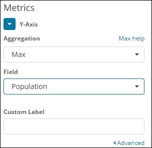
Observe that we have taken Max as the Aggregation. So here we are going to show data presentation in line graph. Now,we will plot graph that will show the max population country wise. The field we have taken is Population since we need maximum population country wise.
For X-axis
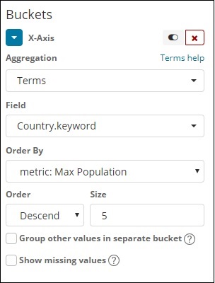
On x-axis we have taken Terms as Aggregation, Country.keyword as Field and metric:Max Population for Order By, and order size is 5. So it will plot the 5 top countries with max population. After applying the changes, you can see the line graph as shown below −
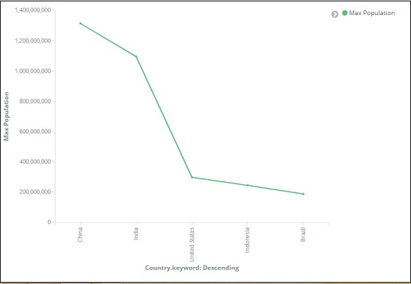
So we have Max population in China, followed by India, United States, Indonesia and Brazil as the top 5 countries in population.
Now, let us save this line graph so that we can use in dashboard later.
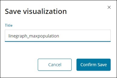
Click Confirm Save and you can save the visualization.
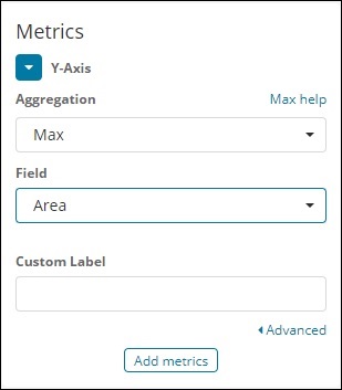
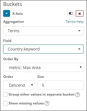
Area Graph
Go to visualization and choose area with index as countriesdata. We need to select the Y-axis and X-axis. We will plot area graph for max area for country wise.
So here the X- axis and Y-axis will be as shown below −
After you click the apply changes button, the output that we can see is as shown below −
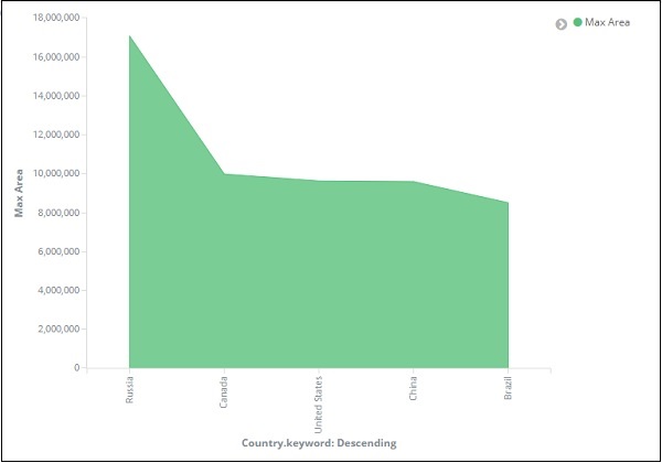
From the graph, we can observe that Russia has the highest area, followed by Canada, United States , China and Brazil. Save the visualization to use it later.