- Kibana Tutorial
- Kibana - Home
- Kibana - Overview
- Kibana - Environment Setup
- Kibana - Introduction To Elk Stack
- Kibana - Loading Sample Data
- Kibana - Management
- Kibana - Discover
- Kibana - Aggregation And Metrics
- Kibana - Create Visualization
- Kibana - Working With Charts
- Kibana - Working With Graphs
- Kibana - Working With Heat Map
- Working With Coordinate Map
- Kibana - Working With Region Map
- Working With Guage And Goal
- Kibana - Working With Canvas
- Kibana - Create Dashboard
- Kibana - Timelion
- Kibana - Dev Tools
- Kibana - Monitoring
- Creating Reports Using Kibana
- Kibana Useful Resources
- Kibana - Quick Guide
- Kibana - Useful Resources
- Kibana - Discussion
Kibana - Working With Charts
Let us explore and understand the most commonly used charts in visualization.
- Horizontal Bar Chart
- Vertical Bar Chart
- Pie Chart
The following are the steps to be followed to create above visualization. Let us start with Horizontal Bar.
Horizontal Bar Chart
Open Kibana and click Visualize tab on left side as shown below −
Click the + button to create a new visualization −
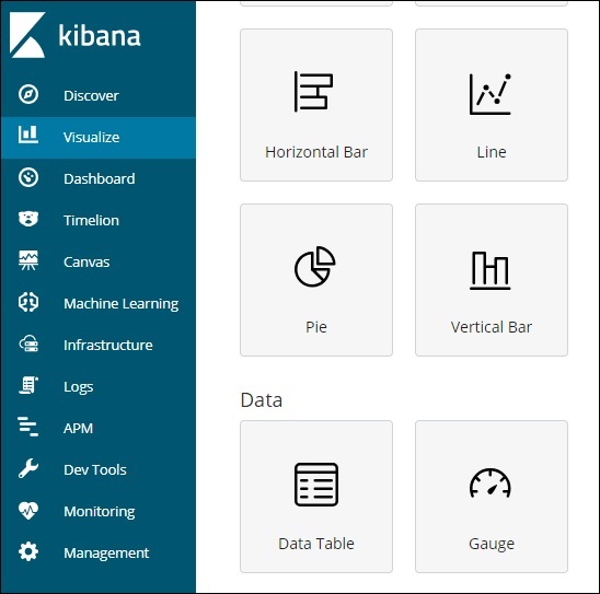
Click the Horizontal Bar listed above. You will have to make a selection of the index you want to visualize.
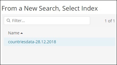
Select the countriesdata-28.12.2018 index as shown above. On selecting the index, it displays a screen as shown below −
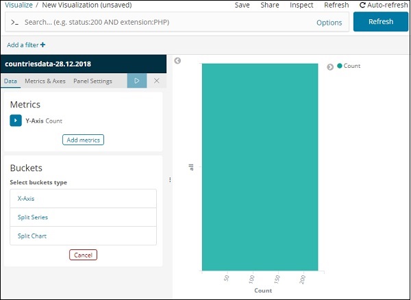
It shows a default count. Now, let us plot a horizontal graph where we can see the data of top 10 country wise populations.
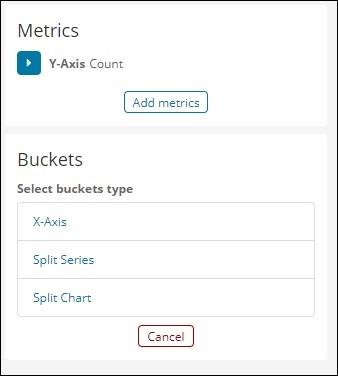
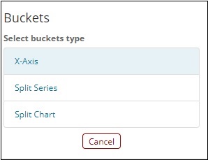
For this purpose, we need to select what we want on the Y and X axis. Hence, select the Bucket and Metric Aggregation −
Now, if you click on Y-Axis, it will display the screen as shown below −
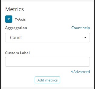
Now, select the Aggregation that you want from the options shown here −
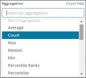
Note that here we will select the Max aggregation as we want to display data as per the max population available.
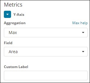
Next we have to select the field whose max value is required. In the index countriesdata-28.12.2018, we have only 2 numbers field – area and population.
Since we want the max population, we select the Population field as shown below −
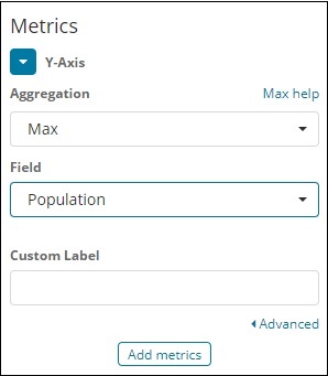
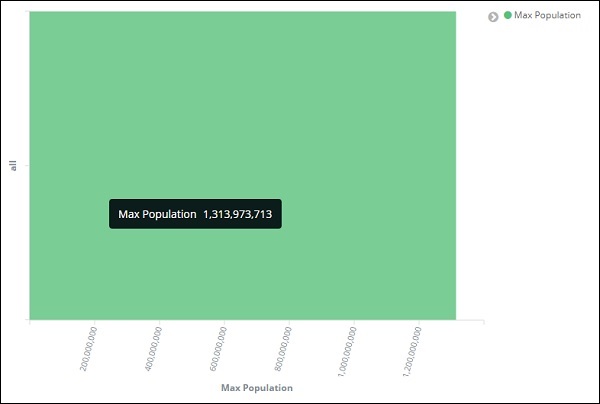
By this, we are done with the Y-axis. The output that we get for Y-axis is as shown below −
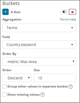
Now let us select the X-axis as shown below −
If you select X-Axis, you will get the following output −

Choose Aggregation as Terms.
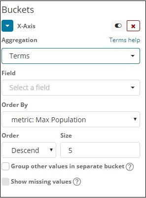
Choose the field from the dropdown. We want country wise population so select country field. Order by we have following options −
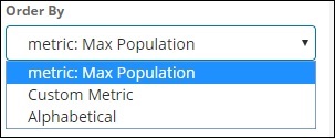
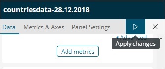
We are going to choose the order by as Max Population as want the country with highest population to be displayed first and so on. Once the data we want is added click on the apply changes button on top of the Metrics data as shown below −
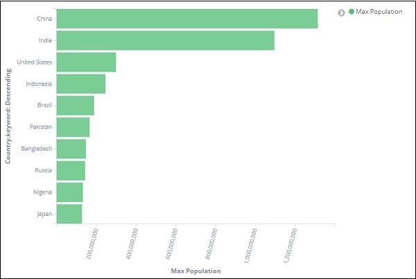
Once you click apply changes, we have the horizontal graph wherein we can see that China is the country with highest population, followed by India, United States etc.
Similarly, you can plot different graphs by choosing the field you want. Next, we will save this visualization as max_population to be used later for Dashboard creation.
In the next section, we will create vertical bar chart.
Vertical Bar Chart
Click the Visualize tab and create a new visualization using vertical bar and index as countriesdata-28.12.2018.
In this vertical bar visualization, we will create bar graph with countries wise area, i.e. countries will be displayed with highest area.
So let us select the Y and X axes as shown below −
Y-axis
X-axis
When we apply the changes here, we can see the output as shown below −
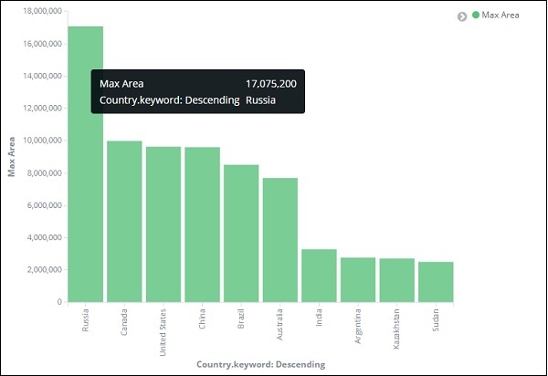
From the graph, we can see that Russia is having the highest area, followed by Canada and United States. Please note this data is picked from the index countriesdata, and its dummy data, so figures might not be correct with live data.
Let us save this visualization as countrywise_maxarea to be used with dashboard later.
Next, let us work on Pie chart.
Pie Chart
So first create a visualization and select the pie chart with index as countriesdata. We are going to display the count of regions available in the countriesdata in pie chart format.
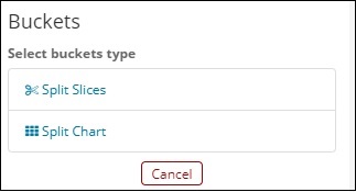
The left side has metrics which will give count. In Buckets, there are 2 options: Split slices and split chart. Now, we will use the option Split slices.
Now, if you select Split Slices, it will display the following options −
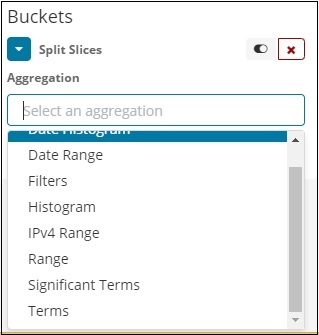
Select the Aggregation as Terms and it will display more options to be entered as follows −
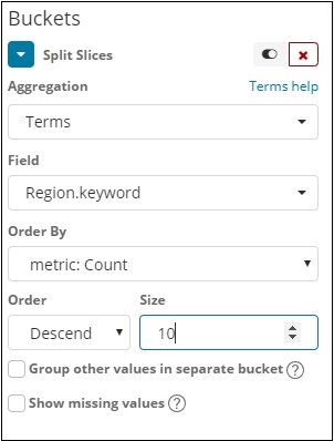
The Fields dropdown will have all the fields from the index chosen. We have selected Region field and Order By that we have selected as Count. We will order it Descending and the size will take as 10. So here we will be get the 10 regions count from the countries index.
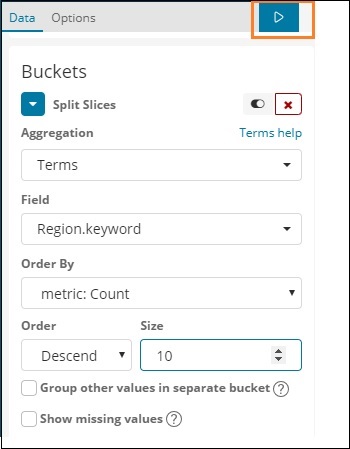
Now, click the play button as highlighted below and you should see the pie chart updated on the right side.
Pie chart display
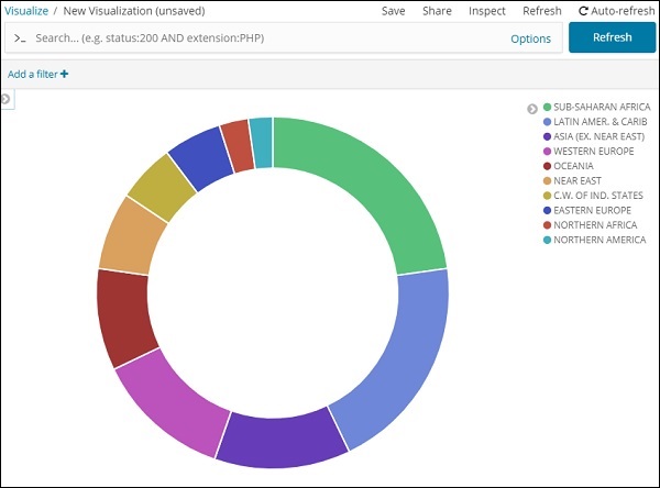
All the regions are listed at the right top corner with colours and the same colour is shown in the pie chart. If you mouse over the pie chart, it will give the count of the region and also the name of the region as shown below −
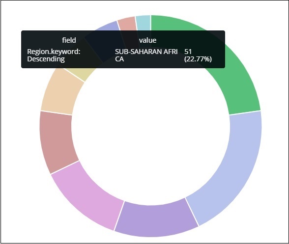
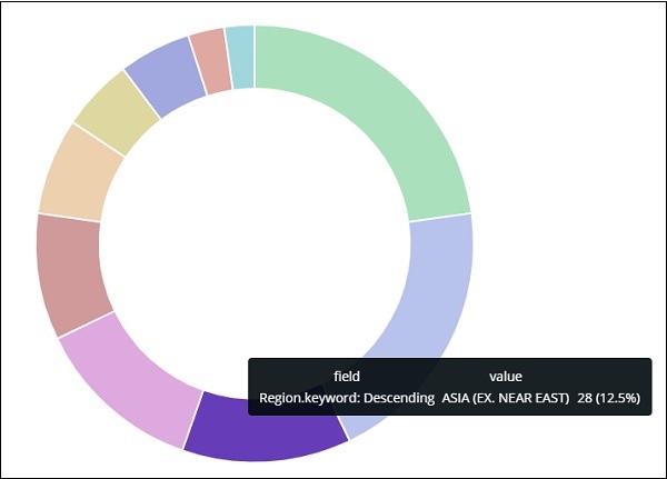
Thus, it tells us that 22.77% of region is occupied by Sub-Saharan Afri in the countries data we have uploaded.
From the pie chart, observe that the Asia region covers 12.5% and the count is 28.
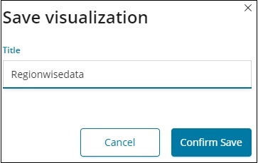
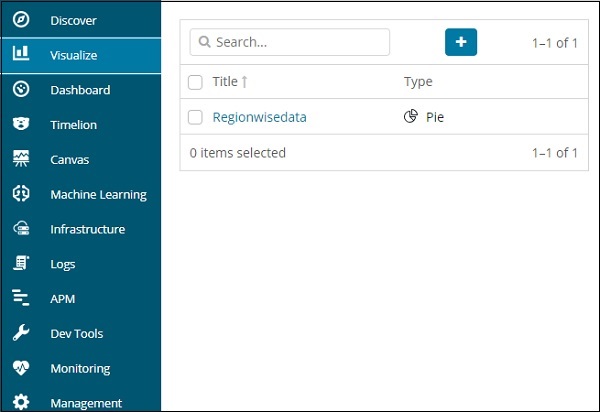
Now we can save the visualization by clicking the save button on top right corner as shown below −

Now, save the visualization so that it can be used later in dashboard.