- Kibana Tutorial
- Kibana - Home
- Kibana - Overview
- Kibana - Environment Setup
- Kibana - Introduction To Elk Stack
- Kibana - Loading Sample Data
- Kibana - Management
- Kibana - Discover
- Kibana - Aggregation And Metrics
- Kibana - Create Visualization
- Kibana - Working With Charts
- Kibana - Working With Graphs
- Kibana - Working With Heat Map
- Working With Coordinate Map
- Kibana - Working With Region Map
- Working With Guage And Goal
- Kibana - Working With Canvas
- Kibana - Create Dashboard
- Kibana - Timelion
- Kibana - Dev Tools
- Kibana - Monitoring
- Creating Reports Using Kibana
- Kibana Useful Resources
- Kibana - Quick Guide
- Kibana - Useful Resources
- Kibana - Discussion
Kibana - Create Visualization
We can visualize the data we have in the form of bar charts, line graphs, pie charts etc. In this chapter, we will understand how to create visualization.
Create Visualization
Go to Kibana Visualization as shown below −
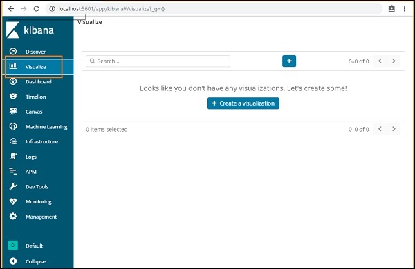
We do not have any visualization created, so it shows blank and there is a button to create one.
Click the button Create a visualization as shown in the screen above and it will take you to the screen as shown below −
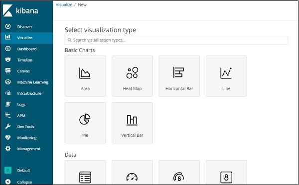
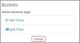
Here you can select the option which you need to visualize your data. We will understand each one of them in detail in the upcoming chapters. Right now will select pie chart to start with.
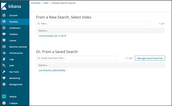
Once you select the visualization type, now you need to select the index on which you want to work on, and it will take you the screen as shown below −
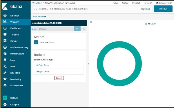
Now we have a default pie chart. We will use the countriesdata-28.12.2018 to get the count of regions available in the countries data in pie chart format.
Bucket and Metric Aggregation
The left side has metrics, which we will select as count. In Buckets, there are 2 options Split slices and split chart. We will use the option Split slices.
Now, select Split Slices and it will display following options −
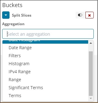
Now, select the Aggregation as Terms and it will display more options to be entered as follows −
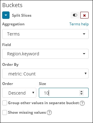
The Fields dropdown will have all the field from the index:countriesdata chosen. We have chosen the Region field and Order By. Note that we have chosen, the metric Count for Order By. We will order it Descending and the size we have taken as 10. It means here, we will get the top 10 regions count from the countries index.
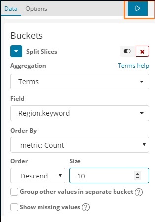
Now, click the analyse button as highlighted below and you should see the pie chart updated on right side.
Pie chart display
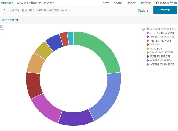
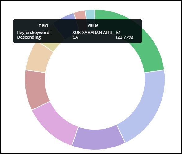
All the regions are listed at the right top corner with colours and the same colour is shown in the pie chart. If you mouse over the pie chart it will give the count of the region and also the name of the region as shown below −
So it tells us that 22.77% of region is occupied by Sub-Saharan Afri from the countries data we have uploaded.
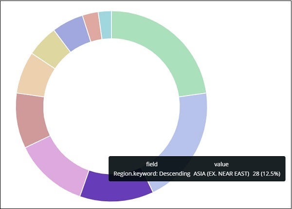
Asia region covers 12.5% and the count is 28.
Now we can save the visualization by clicking on the save button on top right corner as shown below −

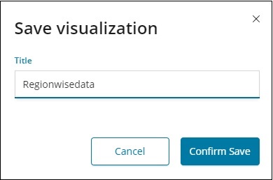
Now, save the visualization so that it can be used later.
We can also get the data as we want by using the search option as shown below −
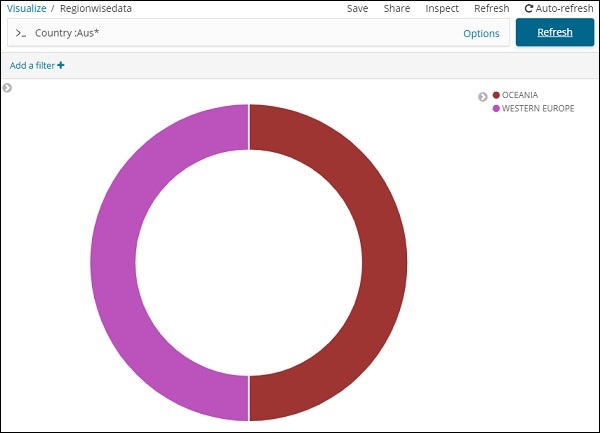
We have filtered data for countries starting with Aus*. We will understand more on pie-chart and other visualization in the upcoming chapters.