- iOS Tutorial
- iOS - Home
- iOS - Getting Started
- iOS - Environment Setup
- iOS - Objective-C Basics
- iOS - First iPhone Application
- iOS - Actions and Outlets
- iOS - Delegates
- iOS - UI Elements
- iOS - Accelerometer
- iOS - Universal Applications
- iOS - Camera Management
- iOS - Location Handling
- iOS - SQLite Database
- iOS - Sending Email
- iOS - Audio & Video
- iOS - File Handling
- iOS - Accessing Maps
- iOS - In-App Purchase
- iOS - iAd Integration
- iOS - GameKit
- iOS - Storyboards
- iOS - Auto Layouts
- iOS - Twitter & Facebook
- iOS - Memory Management
- iOS - Application Debugging
- iOS Useful Resources
- iOS - Quick Guide
- iOS - Useful Resources
- iOS - Discussion
iOS - Buttons
Use of Buttons
Buttons are used for handling user actions. It intercepts the touch events and sends message to the target object.
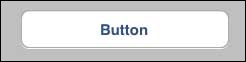
A Round Rect Button
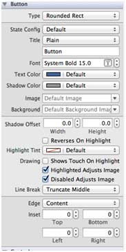
Button Properties in xib
You can change the button properties in xib in the attributes inspector in the utilities area (right side of the Window).
Buttons Types
- UIButtonTypeCustom
- UIButtonTypeRoundedRect
- UIButtonTypeDetailDisclosure
- UIButtonTypeInfoLight
- UIButtonTypeInfoDark
- UIButtonTypeContactAdd
Important Properties
- imageView
- titleLabel
Important Methods
+ (id)buttonWithType:(UIButtonType)buttonType
- (UIImage *)backgroundImageForState:(UIControlState)state
- (UIImage *)imageForState:(UIControlState)state
- (void)setTitle:(NSString *)title forState:(UIControlState)state
- (void)addTarget:(id)target action:(SEL)action forControlEvents: (UIControlEvents) controlEvents
Add a Custom Method addDifferentTypesOfButton
-(void)addDifferentTypesOfButton {
   // A rounded Rect button created by using class method
   UIButton *roundRectButton = [UIButton buttonWithType:
   UIButtonTypeRoundedRect];
   [roundRectButton setFrame:CGRectMake(60, 50, 200, 40)];

   // sets title for the button
   [roundRectButton setTitle:@"Rounded Rect Button" forState:
   UIControlStateNormal];
   [self.view addSubview:roundRectButton];

   UIButton *customButton = [UIButton buttonWithType: UIButtonTypeCustom];
   [customButton setBackgroundColor: [UIColor lightGrayColor]];
   [customButton setTitleColor:[UIColor blackColor] forState:
   UIControlStateHighlighted];

   //sets background image for normal state
   [customButton setBackgroundImage:[UIImage imageNamed:
   @"Button_Default.png"]
   forState:UIControlStateNormal];

   //sets background image for highlighted state
   [customButton setBackgroundImage:[UIImage imageNamed:
   @"Button_Highlighted.png"]
   forState:UIControlStateHighlighted];
   [customButton setFrame:CGRectMake(60, 100, 200, 40)];
   [customButton setTitle:@"Custom Button" forState:UIControlStateNormal];
   [self.view addSubview:customButton];

   UIButton *detailDisclosureButton = [UIButton buttonWithType:
   UIButtonTypeDetailDisclosure];
   [detailDisclosureButton setFrame:CGRectMake(60, 150, 200, 40)];
   [detailDisclosureButton setTitle:@"Detail disclosure" forState:
   UIControlStateNormal];
   [self.view addSubview:detailDisclosureButton];

   UIButton *contactButton = [UIButton buttonWithType:
   UIButtonTypeContactAdd];
   [contactButton setFrame:CGRectMake(60, 200, 200, 40)];
   [self.view addSubview:contactButton];

   UIButton *infoDarkButton = [UIButton buttonWithType:
   UIButtonTypeInfoDark];
   [infoDarkButton setFrame:CGRectMake(60, 250, 200, 40)];
   [self.view addSubview:infoDarkButton];

   UIButton *infoLightButton = [UIButton buttonWithType:
   UIButtonTypeInfoLight];
   [infoLightButton setFrame:CGRectMake(60, 300, 200, 40)];
   [self.view addSubview:infoLightButton];
}
Note −
We have to add two images named as "Button_Default.png" and "Button_Highlighted.png" to our project, which can be done by dragging the images to our navigator area where our project files are listed.
Update viewDidLoad in ViewController.m as follows −
(void)viewDidLoad {
   [super viewDidLoad];

   //The custom method to create our different types of button is called
	[self addDifferentTypesOfButton];
	//Do any additional setup after loading the view, typically from a nib
}
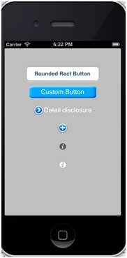
Output
When we run the application, we'll get the following output −
ios_ui_elements.htm
Advertisements