- GWT Highcharts Tutorial
- GWT Highcharts - Home
- GWT Highcharts - Overview
- Environment Setup
- Configuration Syntax
- GWT Highcharts - Line Charts
- GWT Highcharts - Area Charts
- GWT Highcharts - Bar Charts
- GWT Highcharts - Column Charts
- GWT Highcharts - Pie Charts
- GWT Highcharts - Scatter Chart
- GWT Highcharts - Dynamic Charts
- GWT Highcharts - Combinations
- GWT Highcharts - 3D Charts
- GWT Highcharts - Map Charts
- GWT Highcharts Useful Resources
- GWT Highcharts - Quick Guide
- GWT Highcharts - Useful Resources
- GWT Highcharts - Discussion
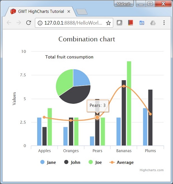
Chart with Column, Line and Pie
Following is an example of a Chart with Column, Line and Pie.
We have already seen the configuration used to draw a chart in Highcharts Configuration Syntax chapter.
An example of a combination chart having Column, Line and Pie is given below.
Configurations
Let us now see the additional configurations/steps taken.
series
Configure the chart type to be scatter based. series.type decides the series type for the chart. Here, the default value is "line".
chart.addSeries(chart.createSeries()
   .setType(Type.COLUMN)
);
Example
HelloWorld.java
package com.tutorialspoint.client;

import org.moxieapps.gwt.highcharts.client.Chart;
import org.moxieapps.gwt.highcharts.client.LabelItem;
import org.moxieapps.gwt.highcharts.client.Point;
import org.moxieapps.gwt.highcharts.client.Series;
import org.moxieapps.gwt.highcharts.client.Style;
import org.moxieapps.gwt.highcharts.client.ToolTip;
import org.moxieapps.gwt.highcharts.client.ToolTipData;
import org.moxieapps.gwt.highcharts.client.ToolTipFormatter;
import org.moxieapps.gwt.highcharts.client.labels.DataLabels;
import org.moxieapps.gwt.highcharts.client.plotOptions.PiePlotOptions;

import com.google.gwt.core.client.EntryPoint;
import com.google.gwt.user.client.ui.RootPanel;

public class HelloWorld implements EntryPoint {
   public void onModuleLoad() {
      final Chart chart = new Chart()
         .setChartTitleText("Combination chart")
         .setToolTip(new ToolTip()
            .setFormatter(new ToolTipFormatter() {
               @Override
               public String format(ToolTipData toolTipData) {
                  String s;
                  if (toolTipData.getPointName() != null) { // the pie chart
                     s = toolTipData.getPointName() + ": " +
                     toolTipData.getYAsLong() + " fruits";
                  } else {
                     s = toolTipData.getXAsString() + ": " +
                     toolTipData.getYAsLong();
                  }
                  return s;
               }
            })
         )
         .setLabelItems(new  LabelItem()
            .setHtml("Total fruit consumption")
            .setStyle(new Style()
               .setLeft("40px")
               .setTop("8px")
               .setColor("black")
            )
         );
      chart.getXAxis()
         .setCategories("Apples", "Oranges", "Pears", "Bananas", "Plums");

      chart.addSeries(chart.createSeries()
         .setName("Jane")
         .setType(Series.Type.COLUMN)
         .setPoints(new Number[]{3, 2, 1, 3, 4})
      );
      chart.addSeries(chart.createSeries()
         .setName("John")
         .setType(Series.Type.COLUMN)
         .setPoints(new Number[]{2, 3, 5, 7, 6})
      );
      chart.addSeries(chart.createSeries()
         .setName("Joe")
         .setType(Series.Type.COLUMN)
         .setPoints(new Number[]{4, 3, 3, 9, 0})
      );
      chart.addSeries(chart.createSeries()
         .setName("Average")
         .setType(Series.Type.SPLINE)
         .setPoints(new Number[]{3, 2.67, 3, 6.33, 3.33})
      );

      chart.addSeries(chart.createSeries()
         .setName("Total consumption")
         .setType(Series.Type.PIE)
         .setPoints(new Point[]{
            new Point("Jane", 13),
            new Point("John", 23),
            new Point("Joe", 19)
         })
         .setPlotOptions(new PiePlotOptions()
            .setCenter(100, 80)
            .setSize(100)
            .setShowInLegend(false)
            .setDataLabels(new DataLabels()
               .setEnabled(false)
            )
         ));
      RootPanel.get().add(chart);
   }
}
Result
Verify the result.
gwt_highcharts_combinations.htm
Advertisements