- GWT Highcharts Tutorial
- GWT Highcharts - Home
- GWT Highcharts - Overview
- Environment Setup
- Configuration Syntax
- GWT Highcharts - Line Charts
- GWT Highcharts - Area Charts
- GWT Highcharts - Bar Charts
- GWT Highcharts - Column Charts
- GWT Highcharts - Pie Charts
- GWT Highcharts - Scatter Chart
- GWT Highcharts - Dynamic Charts
- GWT Highcharts - Combinations
- GWT Highcharts - 3D Charts
- GWT Highcharts - Map Charts
- GWT Highcharts Useful Resources
- GWT Highcharts - Quick Guide
- GWT Highcharts - Useful Resources
- GWT Highcharts - Discussion
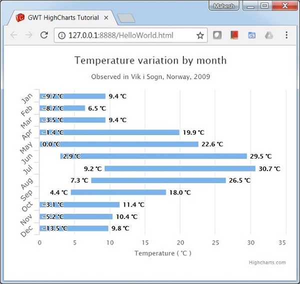
GWT Highcharts - Column Range
Following is an example of a Column Chart using ranges.
We have already seen the configuration used to draw a chart in Highcharts Configuration Syntax chapter.
An example of a Column Chart using ranges is given below.
Configurations
Let us now see additional configurations.
chart
Configure the chart type to be 'columnrange' based. chart.type decides the series type for the chart. Default value is "line".
chart.setType(Type.COLUMN_RANGE)
Example
HelloWorld.java
package com.tutorialspoint.client;

import org.moxieapps.gwt.highcharts.client.Chart;
import org.moxieapps.gwt.highcharts.client.Legend;
import org.moxieapps.gwt.highcharts.client.Series.Type;
import org.moxieapps.gwt.highcharts.client.Style;
import org.moxieapps.gwt.highcharts.client.ToolTip;

import org.moxieapps.gwt.highcharts.client.labels.DataLabels;
import org.moxieapps.gwt.highcharts.client.labels.DataLabelsData;
import org.moxieapps.gwt.highcharts.client.labels.DataLabelsFormatter;
import org.moxieapps.gwt.highcharts.client.labels.Labels.Align;
import org.moxieapps.gwt.highcharts.client.labels.XAxisLabels;
import org.moxieapps.gwt.highcharts.client.plotOptions.ColumnRangePlotOptions;

import com.google.gwt.core.client.EntryPoint;
import com.google.gwt.i18n.client.NumberFormat;
import com.google.gwt.user.client.ui.RootPanel;

public class HelloWorld implements EntryPoint {
   public void onModuleLoad() {
      final Chart chart = new Chart()
         .setType(Type.COLUMN_RANGE)
         .setChartTitleText("Temperature variation by month")
         .setChartSubtitleText("Observed in Vik i Sogn, Norway, 2009")
         .setInverted(true)
         .setLegend(new Legend()
            .setEnabled(false)
         )
         .setToolTip(new ToolTip()
            .setValueSuffix("°C")
         )
         .setColumnRangePlotOptions(new ColumnRangePlotOptions()
            .setDataLabels(new DataLabels()
               .setEnabled(true)
               .setY(0)
               .setFormatter(new DataLabelsFormatter() {
                  @Override
                  public String format(DataLabelsData dataLabelsData) {
                     return NumberFormat.getFormat("0.0").format(dataLabelsData.getYAsDouble()) + " °C";
                  }
               })
            )
         );

         chart.getXAxis()
            .setCategories("Jan", "Feb", "Mar", "Apr", "May", "Jun", "Jul", "Aug", "Sep", "Oct", "Nov", "Dec"
         )
         .setLabels(new XAxisLabels()
            .setRotation(-45)
            .setAlign(Align.RIGHT)
            .setStyle(new Style()
               .setFont("normal 13px Verdana, sans-serif")
            )
         );
         chart.getYAxis()
            .setMin(0)
            .setAxisTitleText("Temperature ( °C )");

         chart.addSeries(chart.createSeries()
            .setName("Temperatures")
            .setPoints(new Number[][]{
               {-9.7, 9.4},
               {-8.7, 6.5},
               {-3.5, 9.4},
               {-1.4, 19.9},
               {0.0, 22.6},
               {2.9, 29.5},
               {9.2, 30.7},
               {7.3, 26.5},
               {4.4, 18.0},
               {-3.1, 11.4},
               {-5.2, 10.4},
               {-13.5, 9.8}
            })
         );
      RootPanel.get().add(chart);
   }
}
Result
Verify the result.
gwt_highcharts_column_charts.htm
Advertisements