- GWT Tutorial
- GWT - Home
- GWT - Overview
- GWT - Environment Setup
- GWT - Applications
- GWT - Create Application
- GWT - Deploy Application
- GWT - Style with CSS
- GWT - Basic Widgets
- GWT - Form Widgets
- GWT - Complex widgets
- GWT - Layout Panels
- GWT - Event Handling
- GWT - Custom Widgets
- GWT - UIBinder
- GWT - RPC Communication
- GWT - JUnit Integration
- GWT - Debugging Application
- GWT - Internationalization
- GWT - History Class
- GWT - Bookmark Support
- GWT - Logging Framework
- GWT Useful Resources
- GWT - Questions and Answers
- GWT - Quick Guide
- GWT - Useful Resources
- GWT - Discussion
GWT - DatePicker Widget
Introduction
The DatePicker widget represents a standard GWT date picker.
Class Declaration
Following is the declaration for com.google.gwt.user.datepicker.client.DatePicker class −
public class DatePicker
   extends Composite
      implements HasHighlightHandlers<java.util.Date>,
	     HasShowRangeHandlers<java.util.Date>, HasValue<java.util.Date>
CSS Style Rules
Following default CSS Style rules will be applied to all the DatePicker widget. You can override it as per your requirements.
.gwt-DatePicker { }

.datePickerMonthSelector {  }

.datePickerMonth {  }

.datePickerPreviousButton {  }

.datePickerNextButton {  }

.datePickerDays {  }

.datePickerWeekdayLabel {  }

.datePickerWeekendLabel {  }

.datePickerDay {  }

.datePickerDayIsToday {  }

.datePickerDayIsWeekend { }

.datePickerDayIsFiller {  }

.datePickerDayIsValue {  }

.datePickerDayIsDisabled { }

.datePickerDayIsHighlighted {  }

.datePickerDayIsValueAndHighlighted { }
Class Constructors
| Sr.No. | Constructor & Description |
|---|---|
| 1 |
DatePicker() Create a new date picker. |
| 2 |
protected DatePicker(MonthSelector monthSelector, CalendarView view, CalendarModel model) Create a new date picker. |
Class Methods
| Sr.No. | Function name & Description |
|---|---|
| 1 |
HandlerRegistration addHighlightHandler(HighlightHandler<java.util.Date> handler) Adds a HighlightEvent handler. |
| 2 |
Handler Registration add Show Range Handler (ShowRangeHandler<java.util.Date> handler) Adds a ShowRangeEvent handler. |
| 3 |
Handler Registration addShow Range Handler AndFire (Show Range Handler<java.util.Date> handler) Adds a show range handler and immediately activate the handler on the current view. |
| 4 |
void addStyleToDates(java.lang.String styleName, java.util.Date date) Add a style name to the given dates. |
| 5 |
void addStyleToDates(java.lang.String styleName, java.util.Date date, java.util.Date... moreDates) Add a style name to the given dates. |
| 6 |
void add Style To Dates(java.lang.String style Name, java.lang.Iterable<java.util.Date> dates) Add a style name to the given dates. |
| 7 |
void addTransientStyleToDates(java.lang.String styleName, java.util.Date date) Adds the given style name to the specified dates, which must be visible. |
| 8 |
void addTransientStyleToDates(java.lang.String styleName, java.util.Date date, java.util.Date... moreDates) Adds the given style name to the specified dates, which must be visible. |
| 9 |
void add Transient Style ToDates(java.lang.String styleName, java.lang.Iterable<java.util.Date> dates) Adds the given style name to the specified dates, which must be visible. |
| 10 |
Handler Registration addValue Change Handler(ValueChangeHandler<java.util.Date> handler) Adds a ValueChangeEvent handler. |
| 11 |
java.util.Date getCurrentMonth() Gets the current month the date picker is showing. |
| 12 |
java.util.Date getFirstDate() Returns the first shown date. |
| 13 |
java.util.Date getHighlightedDate() Gets the highlighted date (the one the mouse is hovering over), if any. |
| 14 |
java.util.Date getLastDate() Returns the last shown date. |
| 15 |
protected CalendarModel getModel() Gets the CalendarModel associated with this date picker. |
| 16 |
protected MonthSelector getMonthSelector() Gets the MonthSelector associated with this date picker. |
| 17 |
java.lang.String getStyleOfDate(java.util.Date date) Gets the style associated with a date (does not include styles set via addTransientStyleToDates(java.lang.String, java.util.Date)). |
| 18 |
java.util.Date getValue() Returns the selected date, or null if none is selected. |
| 19 |
protected CalendarView getView() Gets the CalendarView associated with this date picker. |
| 20 |
boolean isDateEnabled(java.util.Date date) Is the visible date enabled? |
| 21 |
boolean isDateVisible(java.util.Date date) Is the date currently shown in the date picker? |
| 22 |
void onLoad() This method is called immediately after a widget becomes attached to the browser's document. |
| 23 |
protected void refreshAll() Refreshes all components of this date picker. |
| 24 |
void removeStyleFromDates(java.lang.String styleName, java.util.Date date) Removes the styleName from the given dates (even if it is transient). |
| 25 |
void removeStyleFromDates(java.lang.String styleName, java.util.Date date, java.util.Date... moreDates) Removes the styleName from the given dates (even if it is transient). |
| 26 |
void remove Style From Dates(java.lang.String styleName, java.lang.Iterable<java.util.Date> dates) Removes the styleName from the given dates (even if it is transient). |
| 27 |
void setCurrentMonth(java.util.Date month) Sets the date picker to show the given month, use getFirstDate() and getLastDate() to access the exact date range the date picker chose to display. |
| 28 |
void setStyleName(java.lang.String styleName) Sets the date picker style name. |
| 29 |
void setTransientEnabledOnDates(boolean enabled, java.util.Date date) Sets a visible date to be enabled or disabled. |
| 30 |
void setTransientEnabledOnDates(boolean enabled, java.util.Date date, java.util.Date... moreDates) Sets a visible date to be enabled or disabled. |
| 31 |
void set Transient Enabled On Dates(boolean enabled, java.lang.Iterable<java.util.Date> dates) Sets a group of visible dates to be enabled or disabled. |
| 32 |
protected void setup() Sets up the date picker. |
| 33 |
void setValue(java.util.Date newValue) Sets the DatePicker's value. |
| 34 |
void setValue(java.util.Date newValue, boolean fireEvents) Sets the DatePicker's value. |
Methods Inherited
This class inherits methods from the following classes −
com.google.gwt.user.client.ui.UIObject
com.google.gwt.user.client.ui.Widget
com.google.gwt.user.client.ui.Composite
java.lang.Object
DatePicker Widget Example
This example will take you through simple steps to show usage of a DatePicker Widget in GWT. Follow the following steps to update the GWT application we created in GWT - Create Application chapter −
| Step | Description |
|---|---|
| 1 | Create a project with a name HelloWorld under a package com.tutorialspoint as explained in the GWT - Create Application chapter. |
| 2 | Modify HelloWorld.gwt.xml, HelloWorld.css, HelloWorld.html and HelloWorld.java as explained below. Keep rest of the files unchanged. |
| 3 | Compile and run the application to verify the result of the implemented logic. |
Following is the content of the modified module descriptor src/com.tutorialspoint/HelloWorld.gwt.xml.
<?xml version = "1.0" encoding = "UTF-8"?>
<module rename-to = 'helloworld'>
   <!-- Inherit the core Web Toolkit stuff.                        -->
   <inherits name = 'com.google.gwt.user.User'/>

   <!-- Inherit the default GWT style sheet.                       -->
   <inherits name = 'com.google.gwt.user.theme.clean.Clean'/>

   <!-- Specify the app entry point class.                         -->
   <entry-point class = 'com.tutorialspoint.client.HelloWorld'/>

   <!-- Specify the paths for translatable code                    -->
   <source path = 'client'/>
   <source path = 'shared'/>

</module>
Following is the content of the modified Style Sheet file war/HelloWorld.css.
body {
   text-align: center;
   font-family: verdana, sans-serif;
}

h1 {
   font-size: 2em;
   font-weight: bold;
   color: #777777;
   margin: 40px 0px 70px;
   text-align: center;
}

.gwt-DatePicker {
   border: 1px solid #ccc;
   border-top:1px solid #999;
   cursor: default;
}

.gwt-DatePicker td,
.datePickerMonthSelector td:focus {
   outline: none;
}

.datePickerMonthSelector td:focus {
   outline: none;
}

.datePickerDays {
   width: 100%;
   background: white;
}

.datePickerDay,
.datePickerWeekdayLabel,
.datePickerWeekendLabel {
   font-size: 85%;
   text-align: center;
   padding: 4px;
   outline: none;
   font-weight:bold;
   color:#333;
   border-right: 1px solid #EDEDED;
   border-bottom: 1px solid #EDEDED;
}

.datePickerWeekdayLabel,
.datePickerWeekendLabel {
   background: #fff;
   padding: 0px 4px 2px;
   cursor: default;
   color:#666;
   font-size:70%;
   font-weight:normal;
}

.datePickerDay {
   padding: 4px 7px;
   cursor: hand;
   cursor: pointer;
}

.datePickerDayIsWeekend {
   background: #f7f7f7;
}

.datePickerDayIsFiller {
   color: #999;
   font-weight:normal;
}

.datePickerDayIsValue {
   background: #d7dfe8;
}

.datePickerDayIsDisabled {
   color: #AAAAAA;
   font-style: italic;
}

.datePickerDayIsHighlighted {
   background: #F0E68C;
}

.datePickerDayIsValueAndHighlighted {
   background: #d7dfe8;
}

.datePickerDayIsToday {
   padding: 3px;
   color: #00f;
   background: url(images/hborder.png) repeat-x 0px -2607px;
}

.datePickerMonthSelector {
   width: 100%;
   padding: 1px 0 5px 0;
   background: #fff;
}

.datePickerPreviousButton,
.datePickerNextButton {
   font-size: 120%;
   line-height: 1em;
   color: #3a6aad;
   cursor: hand;
   cursor: pointer;
   font-weight: bold;
   padding: 0px 4px;
   outline: none;
}

td.datePickerMonth {
   text-align: center;
   vertical-align: middle;
   white-space: nowrap;
   font-size: 100%;
   font-weight: bold;
   color: #333;
}

.gwt-DateBox {
   padding: 5px 4px;
   border: 1px solid #ccc;
   border-top: 1px solid #999;
   font-size: 100%;
}

.gwt-DateBox input {
   width: 8em;
}

.dateBoxFormatError {
   background: #ffcccc;
}

.dateBoxPopup {
}
Following is the content of the modified HTML host file war/HelloWorld.html.
<html>
   <head>
      <title>Hello World</title>
      <link rel = "stylesheet" href = "HelloWorld.css"/>
      <script language = "javascript" src = "helloworld/helloworld.nocache.js">
      </script>
   </head>

   <body>
      <h1>DatePicker Widget Demonstration</h1>
      <div id = "gwtContainer"></div>
   </body>
</html>
Let us have following content of Java file src/com.tutorialspoint/HelloWorld.java which will demonstrate use of Tree widget.
package com.tutorialspoint.client;

import java.util.Date;

import com.google.gwt.core.client.EntryPoint;
import com.google.gwt.event.logical.shared.ValueChangeEvent;
import com.google.gwt.event.logical.shared.ValueChangeHandler;
import com.google.gwt.i18n.client.DateTimeFormat;
import com.google.gwt.user.client.ui.Label;
import com.google.gwt.user.client.ui.RootPanel;
import com.google.gwt.user.client.ui.VerticalPanel;
import com.google.gwt.user.datepicker.client.DateBox;
import com.google.gwt.user.datepicker.client.DatePicker;

public class HelloWorld implements EntryPoint {
   public void onModuleLoad() {
      // Create a basic date picker
      DatePicker datePicker = new DatePicker();
      final Label text = new Label();

      // Set the value in the text box when the user selects a date
      datePicker.addValueChangeHandler(new ValueChangeHandler<Date>() {
         @Override
         public void onValueChange(ValueChangeEvent<Date> event) {
            Date date = event.getValue();
            String dateString =
            DateTimeFormat.getFormat("MM/dd/yyyy").format(date);
            text.setText(dateString);
         }
      });

      // Set the default value
      datePicker.setValue(new Date(), true);

      // Create a DateBox
      DateTimeFormat dateFormat = DateTimeFormat.getFormat("MM/dd/yyyy");
      DateBox dateBox = new DateBox();
      dateBox.setFormat(new DateBox.DefaultFormat(dateFormat));

      Label selectLabel = new Label("Permanent DatePicker:");
      Label selectLabel2 = new Label("DateBox with popup DatePicker:");

      // Add widgets to the root panel.
      VerticalPanel vPanel = new VerticalPanel();
      vPanel.setSpacing(10);
      vPanel.add(selectLabel);
      vPanel.add(text);
      vPanel.add(datePicker);
      vPanel.add(selectLabel2);
      vPanel.add(dateBox);

      RootPanel.get("gwtContainer").add(vPanel);
   }
}
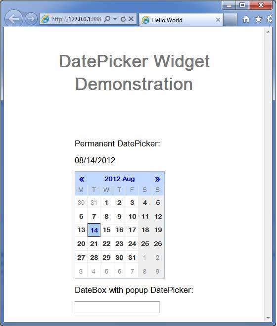
Once you are ready with all the changes done, let us compile and run the application in development mode as we did in GWT - Create Application chapter. If everything is fine with your application, this will produce following result −