- Flexbox Tutorial
- Flexbox - Home
- Flexbox - Overview
- Flexbox - Flex Containers
- Flexbox - Flex-Direction
- Flexbox - Flex-Wrap
- Flexbox - Justifying Contents
- Flexbox - Align Items
- Flexbox - Align Content
- Flexbox - Flex-Order
- Flexbox - Flexibility
- Flexbox - Align Self
- Flexbox Useful Resources
- Flexbox - Quick Guide
- Flexbox - Useful Resources
- Flexbox - Discussion
Flexbox - Justifying Contents
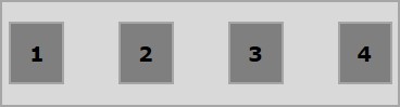
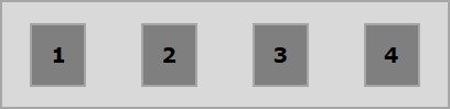
Often you can observe an extra space left in the container after arranging the flex items as shown below.
Using the property justify-content, you can align the contents along the main axis by distributing the extra space as intended. You can also adjust the alignment of the flexitems, in case they overflow the line.
usage −
justify-content: flex-start | flex-end | center | space-between | space-around| space-evenly;
This property accepts the following values −
flex-start − The flex-items are placed at the start of the container.
flex-end − The flex-items are placed at the end of the container.
center − The flex-items are placed at the center of the container, where the extra space is equally distributed at the start and at the end of the flex-items.
space-between − The extra space is equally distributed between the flex-items.
space-around − The extra space is equally distributed between the flex items such that the space between the edges of the container and its contents is half as the space between the flex-items.
Now, we will see how to use the justify-content property, with examples.
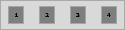
flex-start
On passing this value to the property justify-content, the flex-items are placed at the start of the container.
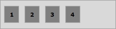
The following example demonstrates the result of passing the value flex-start to the justify-content property.
<!doctype html>
<html lang = "en">
   <style>
      .box1{background:green;}
      .box2{background:blue;}
      .box3{background:red;}
      .box4{background:magenta;}
      .box5{background:yellow;}
      .box6{background:pink;}

      .box{
         font-size:35px;
         padding:15px;
      }
      .container{
         display:flex;
         border:3px solid black;
         justify-content:flex-start;
      }
   </style>

   <body>
      <div class = "container">
         <div class = "box box1">One</div>
         <div class = "box box2">two</div>
         <div class = "box box3">three</div>
         <div class = "box box4">four</div>
         <div class = "box box5">five</div>
         <div class = "box box6">six</div>
      </div>
   </body>
</html>
It will produce the following result −
flex-end
On passing this value to the property justify-content, the flex-items are placed at the end of the container.
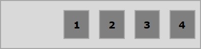
The following example demonstrates the result of passing the value flex-end to the justify-content property.
<!doctype html>
<html lang = "en">
   <style>
      .box1{background:green;}
      .box2{background:blue;}
      .box3{background:red;}
      .box4{background:magenta;}
      .box5{background:yellow;}
      .box6{background:pink;}

      .box{
         font-size:35px;
         padding:15px;
      }
      .container{
         display:flex;
         border:3px solid black;
         justify-content:flex-end;
      }
   </style>

   <body>
      <div class = "container">
         <div class = "box box1">One</div>
         <div class = "box box2">two</div>
         <div class = "box box3">three</div>
         <div class = "box box4">four</div>
         <div class = "box box5">five</div>
         <div class = "box box6">six</div>
      </div>
   </body>
</html>
It will produce the following result −
center
On passing this value to the property justify-content, the flex-items are placed at the center of the container, where the extra space is equally distributed at the start and at the end of the flex-items.
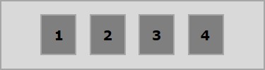
The following example demonstrates the result of passing the value center to the justify-content property.
<!doctype html>
<html lang = "en">
   <style>
      .box1{background:green;}
      .box2{background:blue;}
      .box3{background:red;}
      .box4{background:magenta;}
      .box5{background:yellow;}
      .box6{background:pink;}

      .box{
         font-size:35px;
         padding:15px;
      }
      .container{
         display:flex;
         border:3px solid black;
         justify-content:center;
      }
   </style>

   <body>
      <div class = "container">
         <div class = "box box1">One</div>
         <div class = "box box2">two</div>
         <div class = "box box3">three</div>
         <div class = "box box4">four</div>
         <div class = "box box5">five</div>
         <div class = "box box6">six</div>
      </div>
   </body>
</html>
It will produce the following result −
space-between
On passing this value to the property justify-content, the extra space is equally distributed between the flex items such that the space between any two flex-items is the same and the start and end of the flex-items touch the edges of the container.
The following example demonstrates the result of passing the value space-between to the justify-content property.
<!doctype html>
<html lang = "en">
   <style>
      .box1{background:green;}
      .box2{background:blue;}
      .box3{background:red;}
      .box4{background:magenta;}
      .box5{background:yellow;}
      .box6{background:pink;}

      .box{
         font-size:35px;
         padding:15px;
      }
      .container{
         display:flex;
         border:3px solid black;
         justify-content:space-between;
      }
   </style>

   <body>
      <div class = "container">
         <div class = "box box1">One</div>
         <div class = "box box2">two</div>
         <div class = "box box3">three</div>
         <div class = "box box4">four</div>
         <div class = "box box5">five</div>
         <div class = "box box6">six</div>
      </div>
   </body>
</html>
It will produce the following result −
space-around
On passing this value to the property justify-content, the extra space is equally distributed between the flex-items such that the space between any two flex-items is the same. However, the space between the edges of the container and its contents (the start and end of the flex-items) is half as the space between the flex items.
The following example demonstrates the result of passing the value space-around to the justify-content property.
<!doctype html>
<html lang = "en">
   <style>
      .box1{background:green;}
      .box2{background:blue;}
      .box3{background:red;}
      .box4{background:magenta;}
      .box5{background:yellow;}
      .box6{background:pink;}

      .box{
         font-size:35px;
         padding:15px;
      }
      .container{
         display:flex;
         border:3px solid black;
         justify-content:space-around;
      }
   </style>

   <body>
      <div class = "container">
         <div class = "box box1">One</div>
         <div class = "box box2">two</div>
         <div class = "box box3">three</div>
         <div class = "box box4">four</div>
         <div class = "box box5">five</div>
         <div class = "box box6">six</div>
      </div>
   </body>
</html>
It will produce the following result −
space-evenly
On passing this value to the property justify-content, the extra space is equally distributed between the flex-items such that the space between any two flex-items is the same (including the space to the edges).
The following example demonstrates the result of passing the value space-evenly to the justify-content property.
<!doctype html>
<html lang = "en">
   <style>
      .box1{background:green;}
      .box2{background:blue;}
      .box3{background:red;}
      .box4{background:magenta;}
      .box5{background:yellow;}
      .box6{background:pink;}

      .box{
         font-size:35px;
         padding:15px;
      }
      .container{
         display:flex;
         border:3px solid black;
         justify-content:space-evenly;
      }
   </style>

   <body>
      <div class = "container">
         <div class = "box box1">One</div>
         <div class = "box box2">two</div>
         <div class = "box box3">three</div>
         <div class = "box box4">four</div>
         <div class = "box box5">five</div>
         <div class = "box box6">six</div>
      </div>
   </body>
</html>
It will produce the following result −