- Adobe Flex Tutorial
- Flex - Home
- Flex - Overview
- Flex - Environment
- Flex - Applications
- Flex - Create Application
- Flex - Deploy Application
- Flex - Life Cycle Phases
- Flex - Style with CSS
- Flex - Style with Skin
- Flex - Data Binding
- Flex - Basic Controls
- Flex - Form Controls
- Flex - Complex Controls
- Flex - Layout Panels
- Flex - Visual Effects
- Flex - Event Handling
- Flex - Custom Controls
- Flex - RPC Services
- Flex - FlexUnit Integration
- Flex - Debug Application
- Flex - Internationalization
- Flex - Printing Support
- Adobe Flex Resources
- Flex - Quick Guide
- Flex - Useful Resources
- Flex - Discussion
Flex - ToggleButtonBar Control
Introduction
The ToggleButtonBar control provides a horizontal or vertical group of buttons that maintain their selected or deselected state.
Class Declaration
Following is the declaration for mx.controls.ToggleButtonBar class −
public class ToggleButtonBar
   extends ButtonBar
Public Properties
| Sr.No | Property & Description |
|---|---|
| 1 | selectedIndex : int [override] Index of the selected button. |
| 2 | toggleOnClick : Boolean Specifies whether the currently selected button can be deselected by the user. |
Public Methods
| Sr.No | Method & Description |
|---|---|
| 1 | ToggleButtonBar() Constructor. |
Methods Inherited
This class inherits methods from the following classes −
- mx.controls.ButtonBar
- mx.controls.NavBar
- mx.containers.Box
- mx.core.Container
- mx.core.UIComponent
- mx.core.FlexSprite
- flash.display.Sprite
- flash.display.DisplayObjectContainer
- flash.display.InteractiveObject
- flash.display.DisplayObject
- flash.events.EventDispatcher
- Object
Flex ToggleButtonBar Control Example
Let us follow the following steps to check usage of ToggleButtonBar control in a Flex application by creating a test application −
| Step | Description |
|---|---|
| 1 | Create a project with a name HelloWorld under a package com.tutorialspoint.client as explained in the Flex - Create Application chapter. |
| 2 | Modify HelloWorld.mxml as explained below. Keep rest of the files unchanged. |
| 3 | Compile and run the application to make sure business logic is working as per the requirements. |
Following is the content of the modified mxml file src/com.tutorialspoint/HelloWorld.mxml.
<?xml version = "1.0" encoding = "utf-8"?>
<s:Application xmlns:fx = "http://ns.adobe.com/mxml/2009"
   xmlns:s = "library://ns.adobe.com/flex/spark"
   xmlns:mx = "library://ns.adobe.com/flex/mx
   width = "100%" height = "100%" minWidth = "500" minHeight = "500">

   <fx:Style source = "/com/tutorialspoint/client/Style.css" />
   <fx:Script>
      <![CDATA[
         import mx.events.ItemClickEvent;
         private function sectionClickHandler(event:ItemClickEvent):void {
            sectionContents.text = "Contents for " + event.label;
         }
      ]]>
   </fx:Script>

   <fx:Declarations>
      <fx:Array id = "sectionList">
         <fx:String>Section 1</fx:String>
         <fx:String>Section 2</fx:String>
         <fx:String>Section 3</fx:String>
         <fx:String>Section 4</fx:String>
         <fx:String>Section 5</fx:String>
      </fx:Array>
   </fx:Declarations>

   <s:BorderContainer width = "630" height = "480" id = "mainContainer"
      styleName = "container">
      <s:VGroup width = "100%" height = "100%" gap = "50"
         horizontalAlign = "center" verticalAlign = "middle">
         <s:Label id = "lblHeader" text = "Complex Controls Demonstration"
            fontSize = "40" color = "0x777777" styleName = "heading" />

         <s:Panel id = "toggleButtonBarPanel" title = "Using ToggleButtonBar"
            width = "500" height = "300" >
            <s:layout>
               <s:VerticalLayout  gap = "10" verticalAlign = "middle"
                  horizontalAlign = "center" paddingTop = "10" />
            </s:layout>

            <mx:ToggleButtonBar itemClick = "sectionClickHandler(event);"
               dataProvider = "{sectionList}" />
            <s:BorderContainer width = "90%" height = "70%"
               borderColor = "0x323232">
               <s:VGroup verticalAlign = "middle"
                  horizontalAlign = "center" width = "100%" height = "100%">
                  <s:Label id = "sectionContents"
                     text = "Contents for Section 1" />
               </s:VGroup>
            </s:BorderContainer>
         </s:Panel>
      </s:VGroup>
   </s:BorderContainer>
</s:Application>
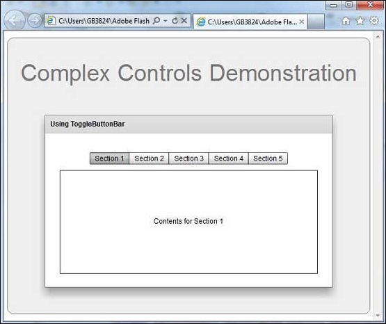
Once you are ready with all the changes done, let us compile and run the application in normal mode as we did in Flex - Create Application chapter. If everything is fine with your application, it will produce the following result: [ Try it online ]