- Adobe Flex Tutorial
- Flex - Home
- Flex - Overview
- Flex - Environment
- Flex - Applications
- Flex - Create Application
- Flex - Deploy Application
- Flex - Life Cycle Phases
- Flex - Style with CSS
- Flex - Style with Skin
- Flex - Data Binding
- Flex - Basic Controls
- Flex - Form Controls
- Flex - Complex Controls
- Flex - Layout Panels
- Flex - Visual Effects
- Flex - Event Handling
- Flex - Custom Controls
- Flex - RPC Services
- Flex - FlexUnit Integration
- Flex - Debug Application
- Flex - Internationalization
- Flex - Printing Support
- Adobe Flex Resources
- Flex - Quick Guide
- Flex - Useful Resources
- Flex - Discussion
Flex - TileList Control
Introduction
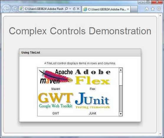
The TileList control displays a number of items laid out in tiles.
Class Declaration
Following is the declaration for mx.controls.TileList class −
public class TileList
   extends TileBase
Public Methods
| Sr.No | Method & Description |
|---|---|
| 1 | TileList() Constructor. |
Methods Inherited
This class inherits methods from the following classes −
- mx.controls.listClasess.TileBase
- mx.controls.listClasess.ListBase
- mx.core.ScrollControlBase
- mx.core.UIComponent
- mx.core.FlexSprite
- flash.display.Sprite
- flash.display.DisplayObjectContainer
- flash.display.InteractiveObject
- flash.display.DisplayObject
- flash.events.EventDispatcher
- Object
Flex TileList Control Example
Let us follow the following steps to check usage of TileList control in a Flex application by creating a test application −
| Step | Description |
|---|---|
| 1 | Create a project with a name HelloWorld under a package com.tutorialspoint.client as explained in the Flex - Create Application chapter. |
| 2 | Add a folder images to src folder. And add sample images to it. |
| 3 | Modify HelloWorld.mxml as explained below. Keep rest of the files unchanged. |
| 4 | Compile and run the application to make sure business logic is working as per the requirements. |
Following is the way to embed an image in flex application.
<fx:Script>
   <![CDATA[
      //images folder should be in src folder
      //and maven-mini-logo.png should reside inside images folder.
      [Bindable]
      [Embed(source="images/maven-mini-logo.png")]
      public var image1:Class;
   ]]>
</fx:Script>
Following is the content of the modified mxml file src/com.tutorialspoint/HelloWorld.mxml.
<?xml version = "1.0" encoding = "utf-8"?>
<s:Application xmlns:fx = "http://ns.adobe.com/mxml/2009"
   xmlns:s = "library://ns.adobe.com/flex/spark"
   xmlns:mx = "library://ns.adobe.com/flex/mx"
   width = "100%" height = "100%" minWidth = "500" minHeight = "500">

   <fx:Style source = "/com/tutorialspoint/client/Style.css" />
   <fx:Script>
      <![CDATA[
         [Bindable]
         [Embed(source = "images/maven-mini-logo.png")]
         public var image1:Class;

         [Bindable]
         [Embed(source = "images/flex-mini.png")]
         public var image2:Class;

         [Bindable]
         [Embed(source = "images/gwt-mini.png")]
         public var image3:Class;

         [Bindable]
         [Embed(source = "images/junit-mini-logo.png")]
         public var image4:Class;

         [Bindable]
         [Embed(source = "images/cpp-mini-lib-logo.png")]
         public var image5:Class;
      ]]>
   </fx:Script>

   <s:BorderContainer width = "630" height = "480" id = "mainContainer"
      styleName = "container">
      <s:VGroup width = "100%" height = "100%" gap = "50"
         horizontalAlign = "center" verticalAlign = "middle">
         <s:Label id = "lblHeader" text = "Complex Controls Demonstration"
            fontSize = "40" color = "0x777777" styleName = "heading" />

         <s:Panel id = "tileListPanel" title = "Using TileList"
            width = "500" height = "300">
            <s:layout>
               <s:VerticalLayout  gap = "10" verticalAlign = "middle"
                  horizontalAlign = "center" />
            </s:layout>

            <s:Label width = "100%" textAlign = "center" color = "0x323232"
               text = "A TileList control displays items in rows and columns." />
            <mx:TileList id = "tileList" height = "200" width = "350"
               maxColumns = "2" rowHeight = "100" columnWidth = "150">

               <mx:dataProvider>
                  <fx:Array>
                     <fx:Object label = "Maven" icon = "{image1}" />
                     <fx:Object label = "Flex" icon = "{image2}" />
                     <fx:Object label = "GWT" icon = "{image3}" />
                     <fx:Object label = "JUnit" icon = "{image4}" />
                     <fx:Object label = "C++" icon = "{image5}" />
                  </fx:Array>
               </mx:dataProvider>
            </mx:TileList>
         </s:Panel>
      </s:VGroup>
   </s:BorderContainer>
</s:Application>
Once you are ready with all the changes done, let us compile and run the application in normal mode as we did in Flex - Create Application chapter. If everything is fine with your application, it will produce the following result: [ Try it online ]
flex_complex_controls.htm
Advertisements