- Adobe Flex Tutorial
- Flex - Home
- Flex - Overview
- Flex - Environment
- Flex - Applications
- Flex - Create Application
- Flex - Deploy Application
- Flex - Life Cycle Phases
- Flex - Style with CSS
- Flex - Style with Skin
- Flex - Data Binding
- Flex - Basic Controls
- Flex - Form Controls
- Flex - Complex Controls
- Flex - Layout Panels
- Flex - Visual Effects
- Flex - Event Handling
- Flex - Custom Controls
- Flex - RPC Services
- Flex - FlexUnit Integration
- Flex - Debug Application
- Flex - Internationalization
- Flex - Printing Support
- Adobe Flex Resources
- Flex - Quick Guide
- Flex - Useful Resources
- Flex - Discussion
Flex - HGroup
Introduction
The HGroup container is a Group container that uses the HorizontalLayout class.Use the properties of the HGroup class to modify the characteristics of the HorizontalLayout class.
Class Declaration
Following is the declaration for spark.components.HGroup class −
public class HGroup
   extends Group
Public Properties
| Sr.No | Property & Description |
|---|---|
| 1 | firstIndexInView : int [read-only] The index of the first layout element that is part of the layout and within the layout target's scroll rectangle, or -1 if nothing has been displayed yet. |
| 2 | gap : int The vertical space between layout elements, in pixels. |
| 3 | horizontalAlign : String The horizontal alignment of layout elements. |
| 4 | lastIndexInView : int [read-only] The index of the last row that's part of the layout and within the container's scroll rectangle, or -1 if nothing has been displayed yet. |
| 5 | paddingBottom : Number Number of pixels between the container's bottom edge and the bottom edge of the last layout element. |
| 6 | paddingLeft : Number The minimum number of pixels between the container's left edge and the left edge of the layout element. |
| 7 | paddingRight : Number The minimum number of pixels between the container's right edge and the right edge of the layout element. |
| 8 | paddingTop : Number Number of pixels between the container's top edge and the top edge of the first layout element. |
| 9 | requestedMaxRowCount : int The measured height of this layout is large enough to display at most requestedMaxRowCount layout elements. |
| 10 | requestedMinRowCount : int The measured height of this layout is large enough to display at least requestedMinRowCount layout elements. |
| 11 | requestedRowCount : int The measured size of this layout is tall enough to display the first requestedRowCount layout elements. |
| 12 | rowCount : int [read-only] The current number of visible elements. |
| 13 | rowHeight : Number If variableRowHeight is false, then this property specifies the actual height of each child, in pixels. |
| 14 | variableRowHeight : Boolean Specifies whether layout elements are allocated their preferred height. |
| 15 | verticalAlign : String The vertical alignment of the content relative to the container's height. |
Public Methods
| Sr.No | Method & Description |
|---|---|
| 1 | HGroup() Constructor. |
Methods Inherited
This class inherits methods from the following classes −
- spark.components.Group
- spark.components.supportClasses.GroupBase
- mx.core.UIComponent
- mx.core.FlexSprite
- flash.display.Sprite
- flash.display.DisplayObjectContainer
- flash.display.InteractiveObject
- flash.display.DisplayObject
- flash.events.EventDispatcher
- Object
Flex HGroup Example
Let us follow the following steps to check usage of HGroup in a Flex application by creating a test application −
| Step | Description |
|---|---|
| 1 | Create a project with a name HelloWorld under a package com.tutorialspoint.client as explained in the Flex - Create Application chapter. |
| 2 | Modify HelloWorld.mxml as explained below. Keep rest of the files unchanged. |
| 3 | Compile and run the application to make sure business logic is working as per the requirements. |
Following is the content of the modified mxml file src/com.tutorialspoint/HelloWorld.mxml.
<?xml version = "1.0" encoding = "utf-8"?>
<s:Application xmlns:fx = "http://ns.adobe.com/mxml/2009"
   xmlns:s = "library://ns.adobe.com/flex/spark"
   xmlns:mx = "library://ns.adobe.com/flex/mx
   width = "100%" height = "100%" minWidth = "500" minHeight = "500">

   <fx:Style source = "/com/tutorialspoint/client/Style.css" />
   <fx:Script>
      <![CDATA[
         private function applyVGroupProperties():void {
            mainHGroup.paddingTop = padTopH.value;
            mainHGroup.paddingLeft = padLeftH.value;
            mainHGroup.paddingRight = padRightH.value;
            mainHGroup.paddingBottom = padBottomH.value;
            mainHGroup.gap = gapH.value;
         }
      ]]>
   </fx:Script>

   <s:BorderContainer width = "630" height = "480" id = "mainContainer"
      styleName = "container">
      <s:VGroup width = "100%" height = "100%" gap = "50"
         horizontalAlign = "center" verticalAlign = "middle">
         <s:Label id = "lblHeader" text = "Layout Panels Demonstration"
            fontSize = "40" color = "0x777777" styleName = "heading" />

         <s:Panel id = "hGroupPanel" title = "Using HGroup"
            width = "500" height = "300" includeInLayout = "true" visible = "true">
            <s:layout>
               <s:HorizontalLayout  gap = "10" verticalAlign = "middle"
                  horizontalAlign = "center" />
            </s:layout>

            <s:VGroup top = "10" left = "15">
               <s:HGroup verticalAlign = "middle">
                  <s:Label text = "Gap:" width = "100" />
                  <s:NumericStepper id = "gapH" maximum = "400" />
               </s:HGroup>

               <s:HGroup verticalAlign = "middle">
                  <s:Label text = "Padding Top:" width = "100" />
                  <s:NumericStepper id = "padTopH" maximum = "400" />
               </s:HGroup>

               <s:HGroup verticalAlign = "middle">
                  <s:Label text = "Padding Left:" width = "100" />
                  <s:NumericStepper id = "padLeftH" maximum = "400" />
               </s:HGroup>

               <s:HGroup verticalAlign = "middle">
                  <s:Label text = "Padding Right:" width = "100" />
                  <s:NumericStepper id = "padRightH" maximum = "400" />
               </s:HGroup>

               <s:HGroup verticalAlign = "middle">
                  <s:Label text = "Padding Bottom:" width = "100" />
                  <s:NumericStepper id = "padBottomH" maximum = "400" />
               </s:HGroup>

               <s:Button label = "Apply Properties" click = "applyVGroupProperties()" />
            </s:VGroup>

            <s:HGroup left = "300" top = "25" id = "mainHGroup">
               <s:BorderContainer width = "50" height = "50"
                  borderWeight = "2" color = "0x323232" />
               <s:BorderContainer width = "50" height = "50"
                  borderWeight = "2" color = "0x323232" />
               <s:BorderContainer width = "50" height = "50"
                  borderWeight = "2" color = "0x323232" />
            </s:HGroup>
         </s:Panel>
      </s:VGroup>
   </s:BorderContainer>
</s:Application>
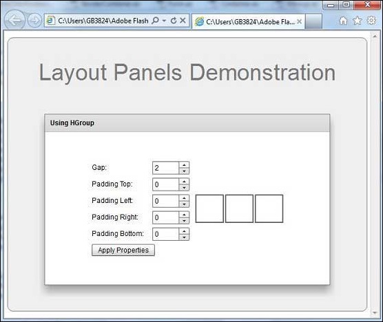
Once you are ready with all the changes done, let us compile and run the application in normal mode as we did in Flex - Create Application chapter. If everything is fine with your application, it will produce the following result: [ Try it online ]